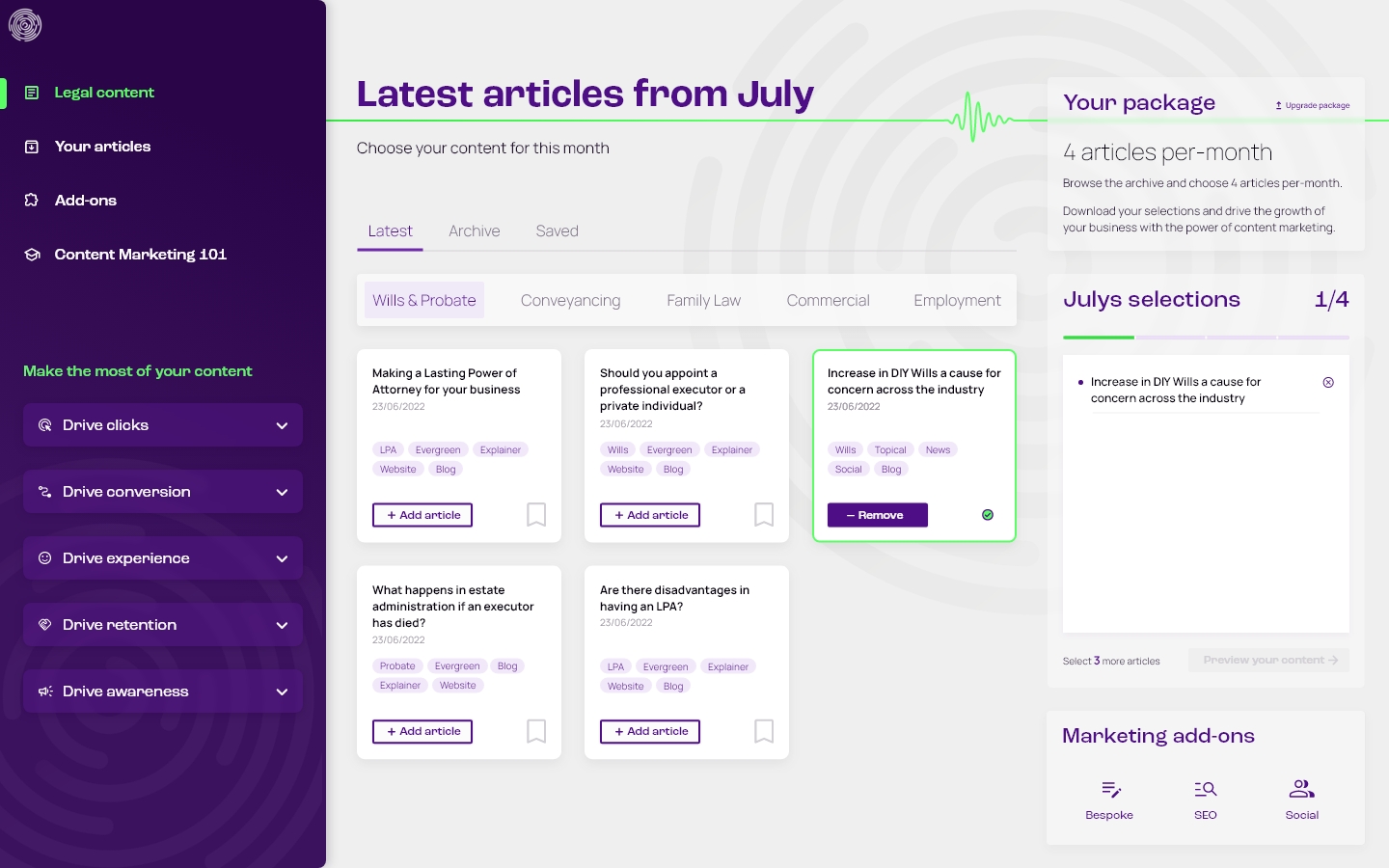
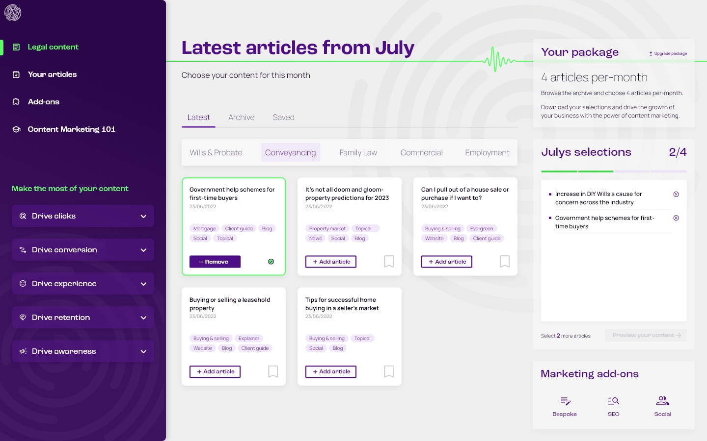
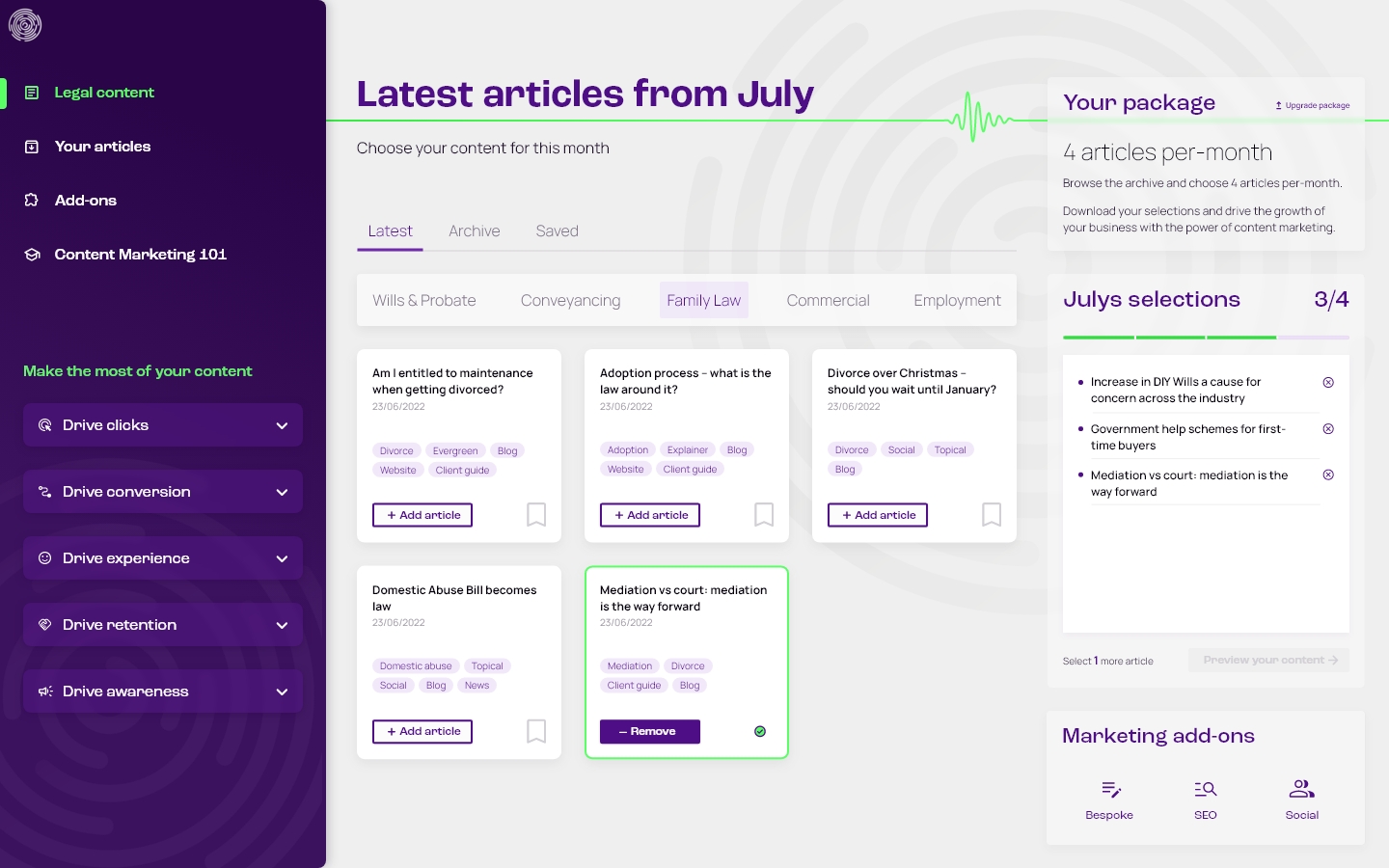
Today’s Media content archive
End-to-end greenfield project designing a subscription site for this legal publishers, delivering their monthly pre-written articles for law firms to use in their marketing, with a landing page to drive sign-ups.
Previously delivered via email, the objective was to automate the process, so customers could log in each month to preview, select and download new articles for the promotion of their business through content marketing.
Goal-led design
Summarising the goals and objectives of content marketing was the foundation of this project, with the identification of five key principles that shaped the concept and features of the platform.
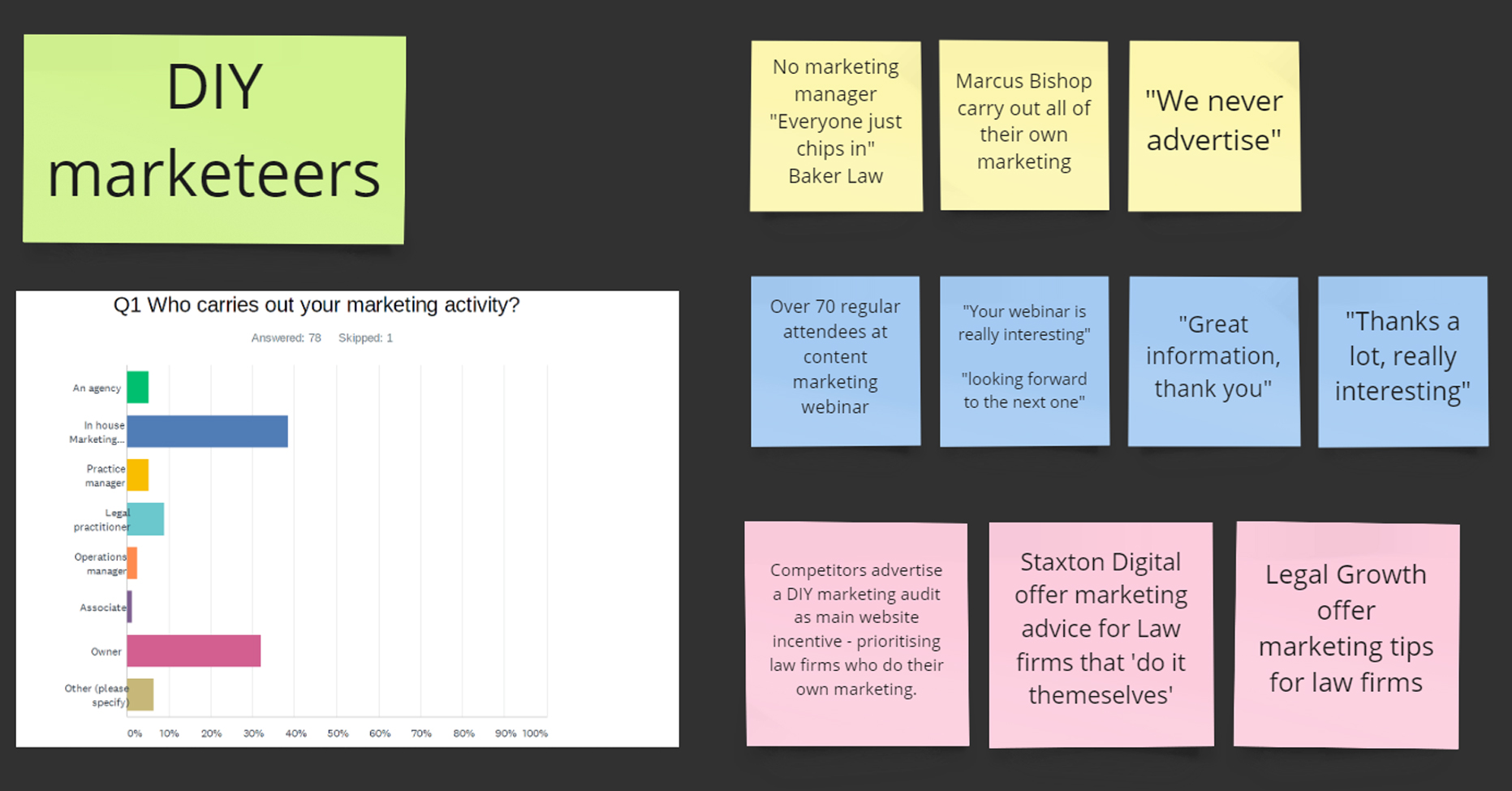
Educating DIY marketeers
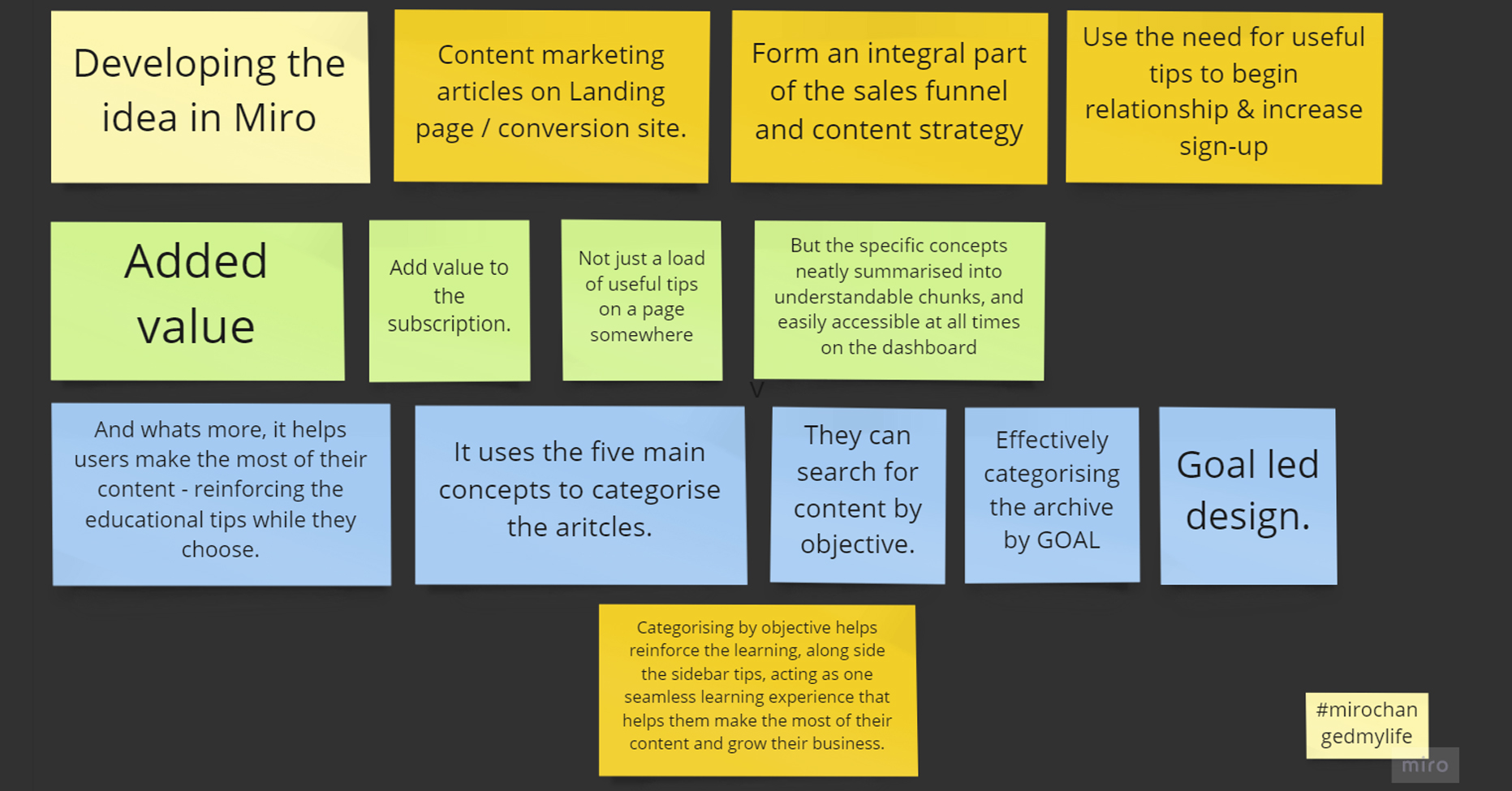
Small law firms often make use of DIY marketing techniques to attract clients. Tutorials within the dash offer added value by explaining these five principles so they can make the most of their content, and help them grow their business.
Goal-led categorisation
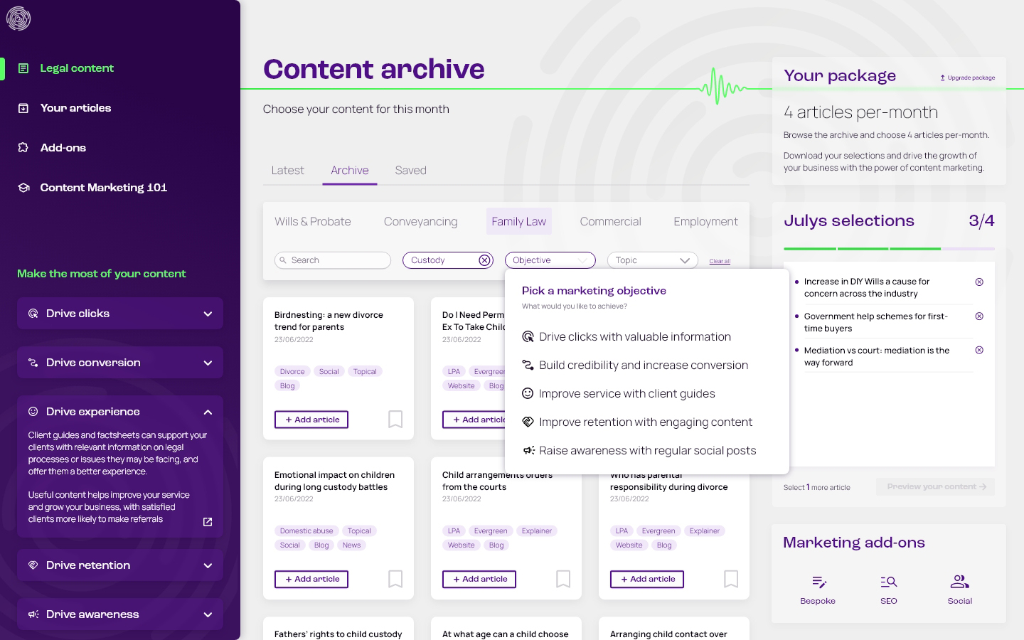
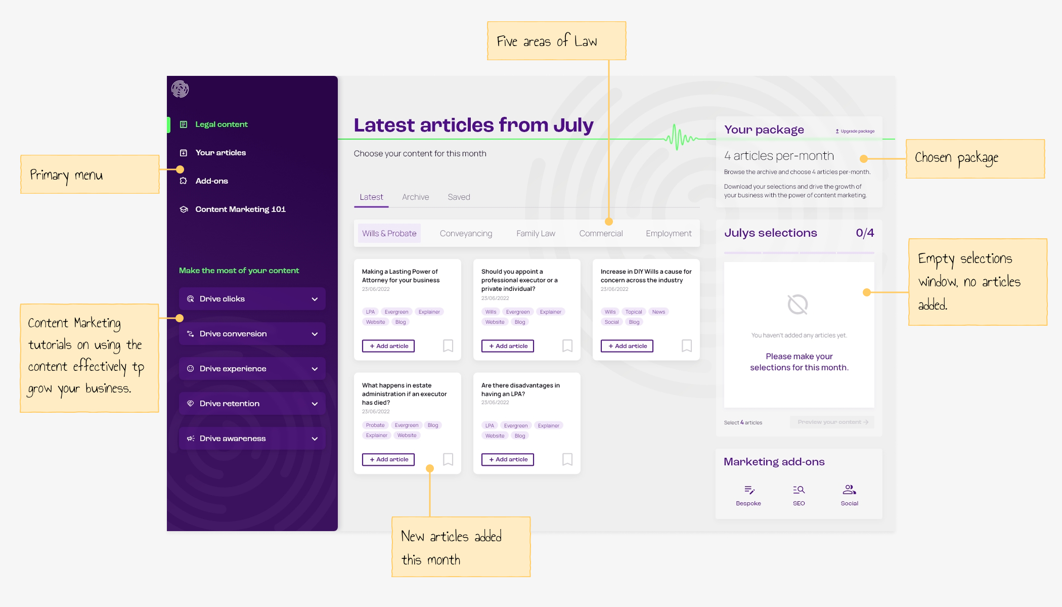
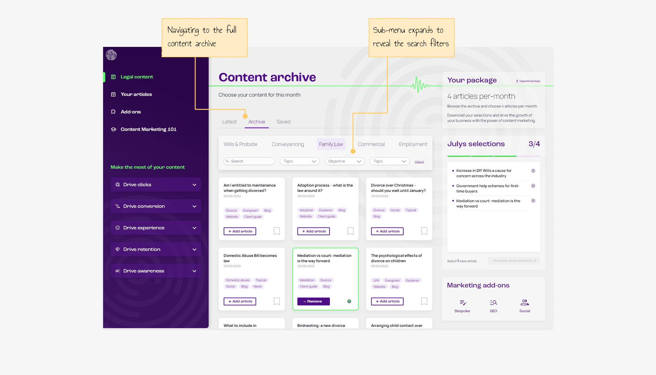
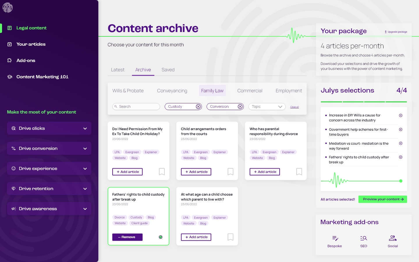
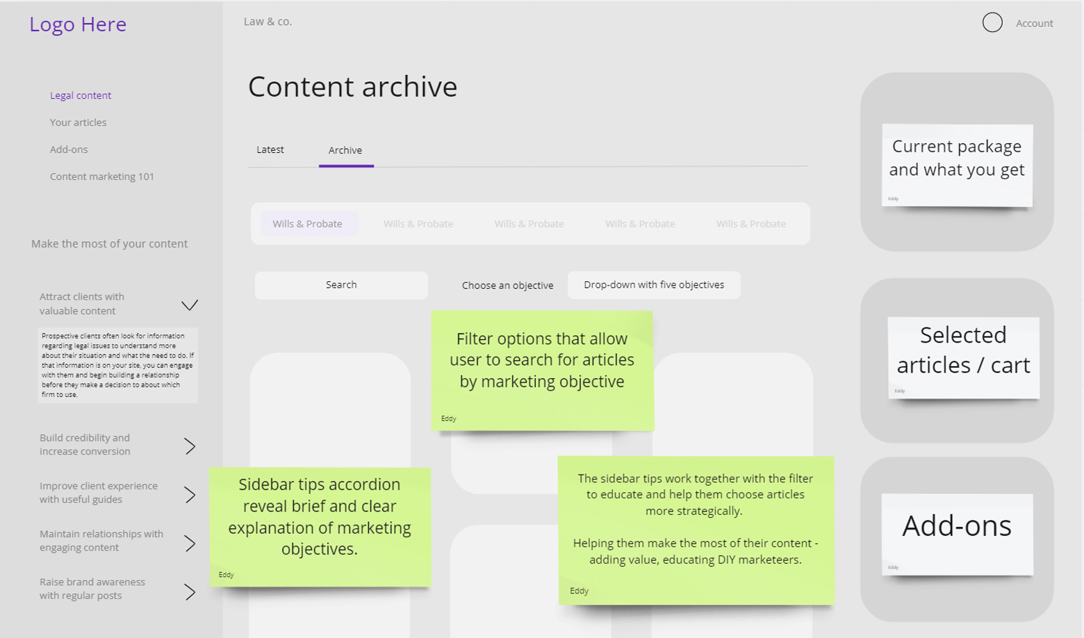
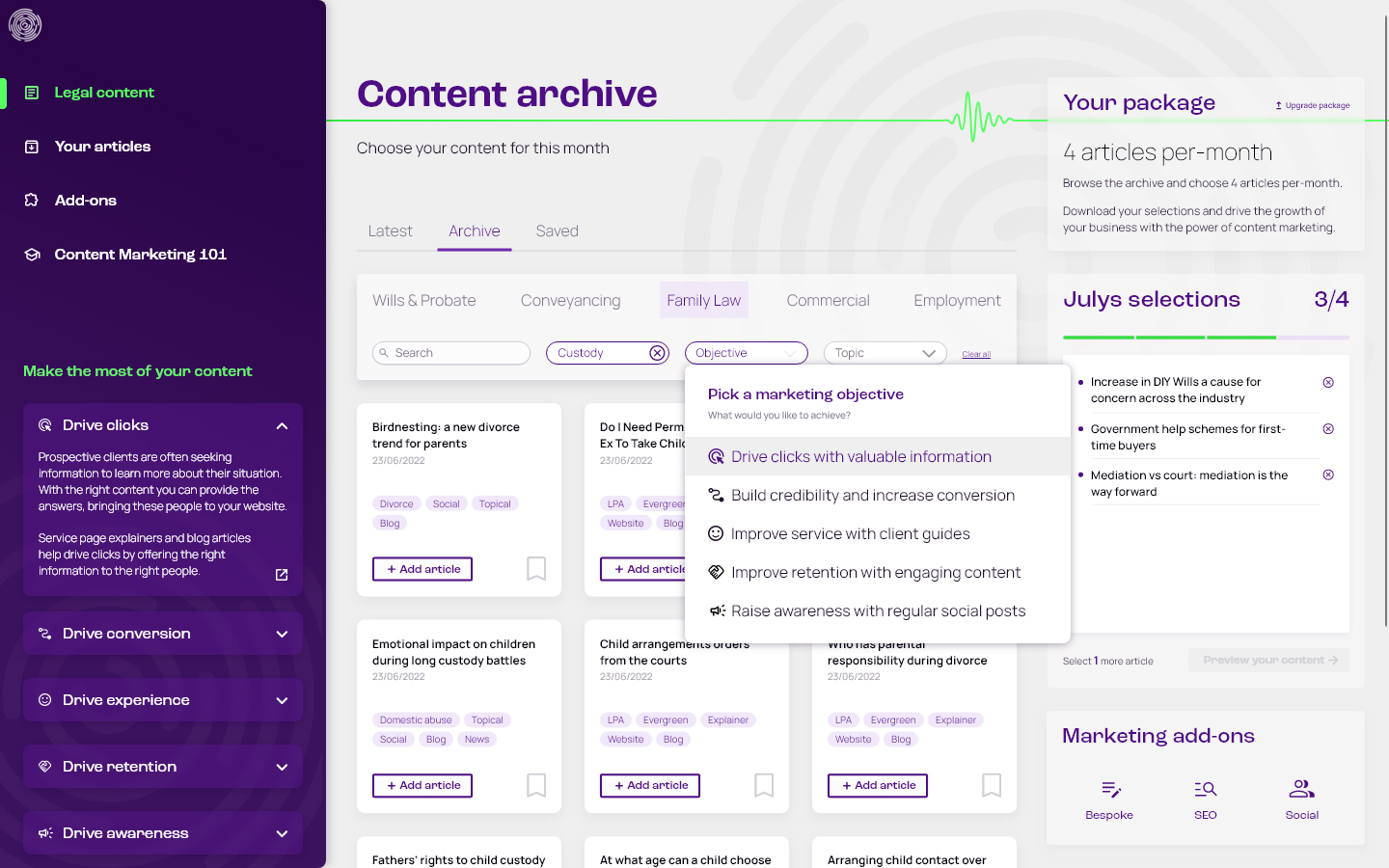
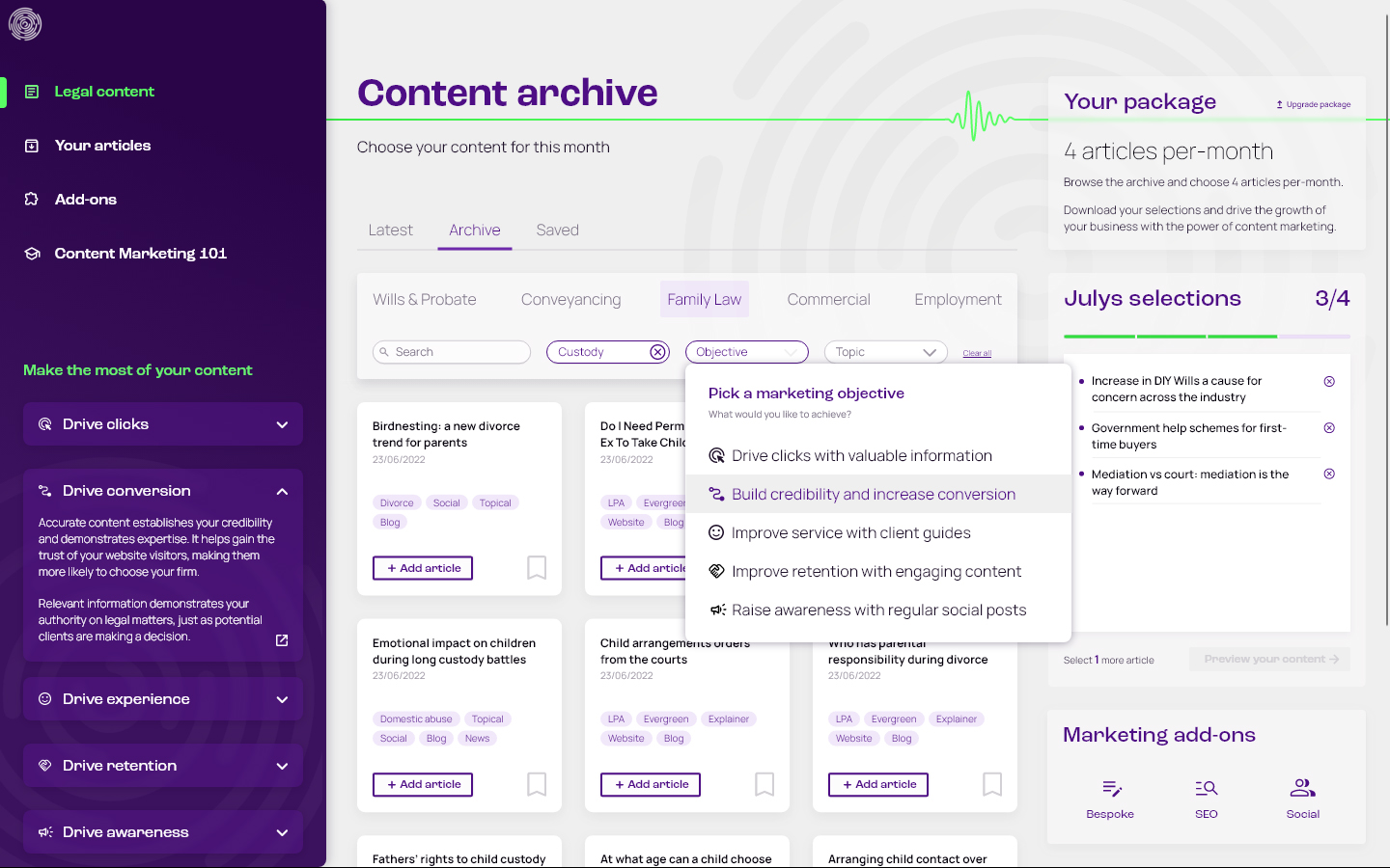
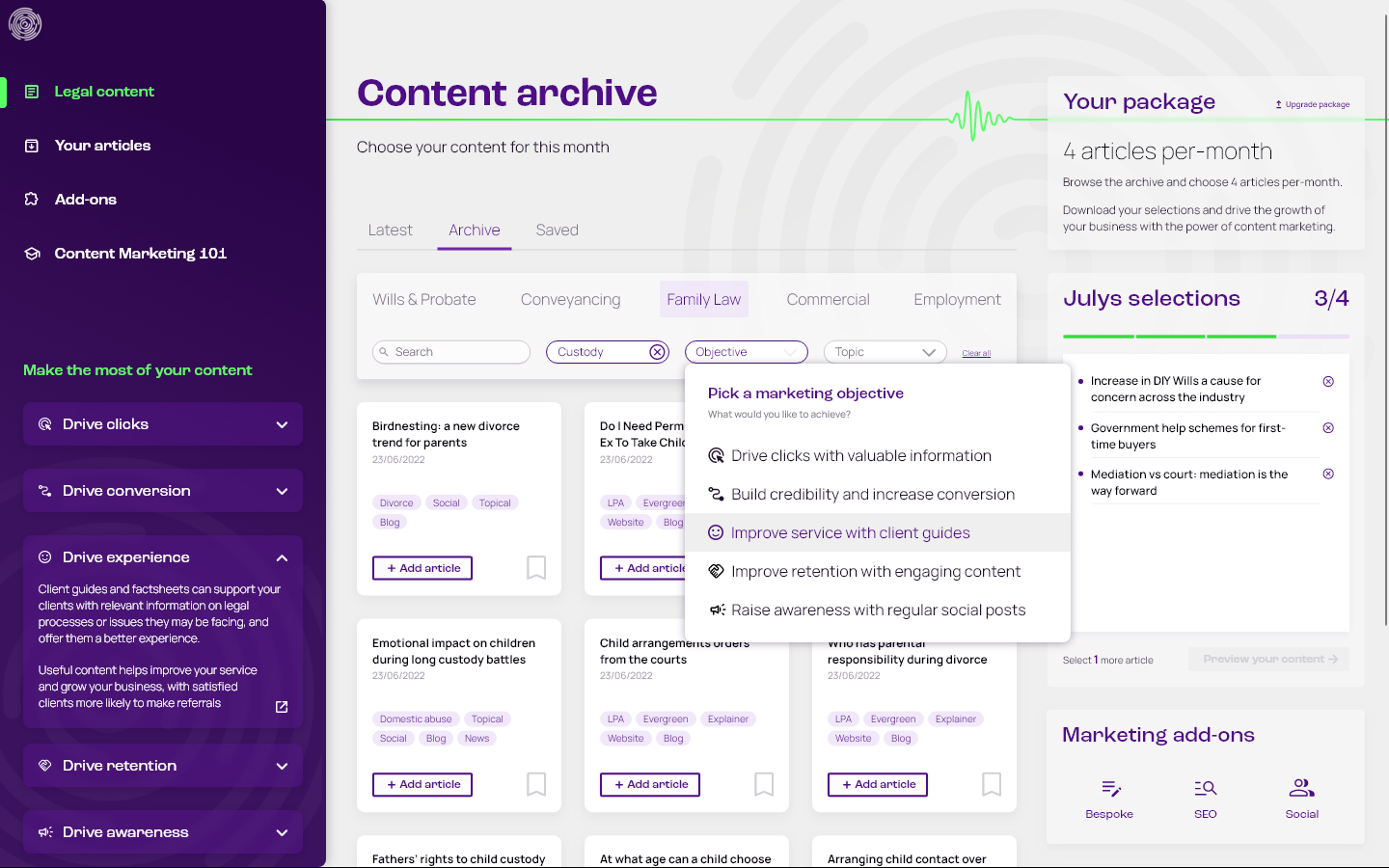
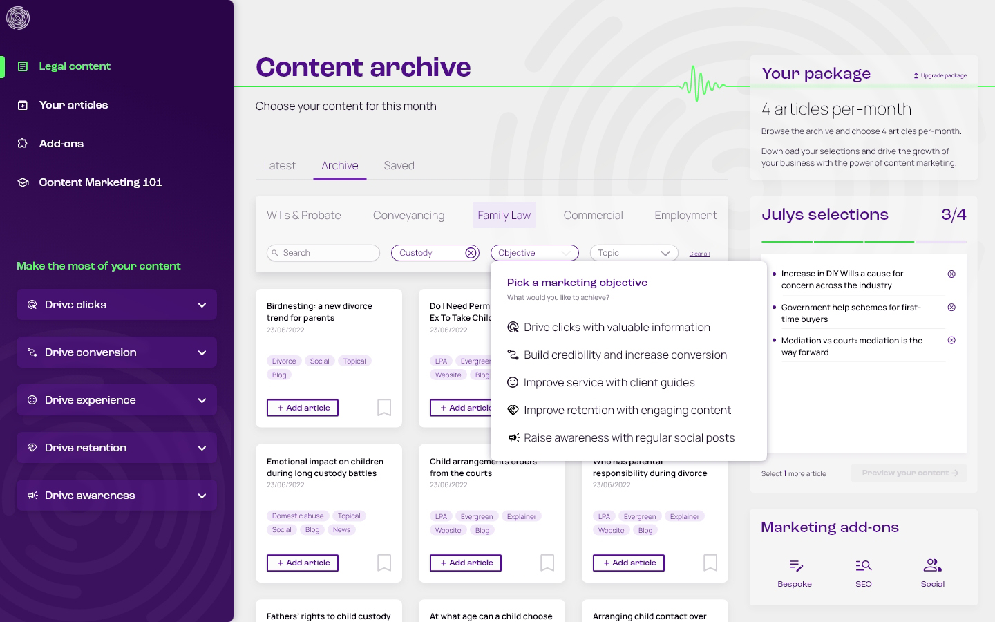
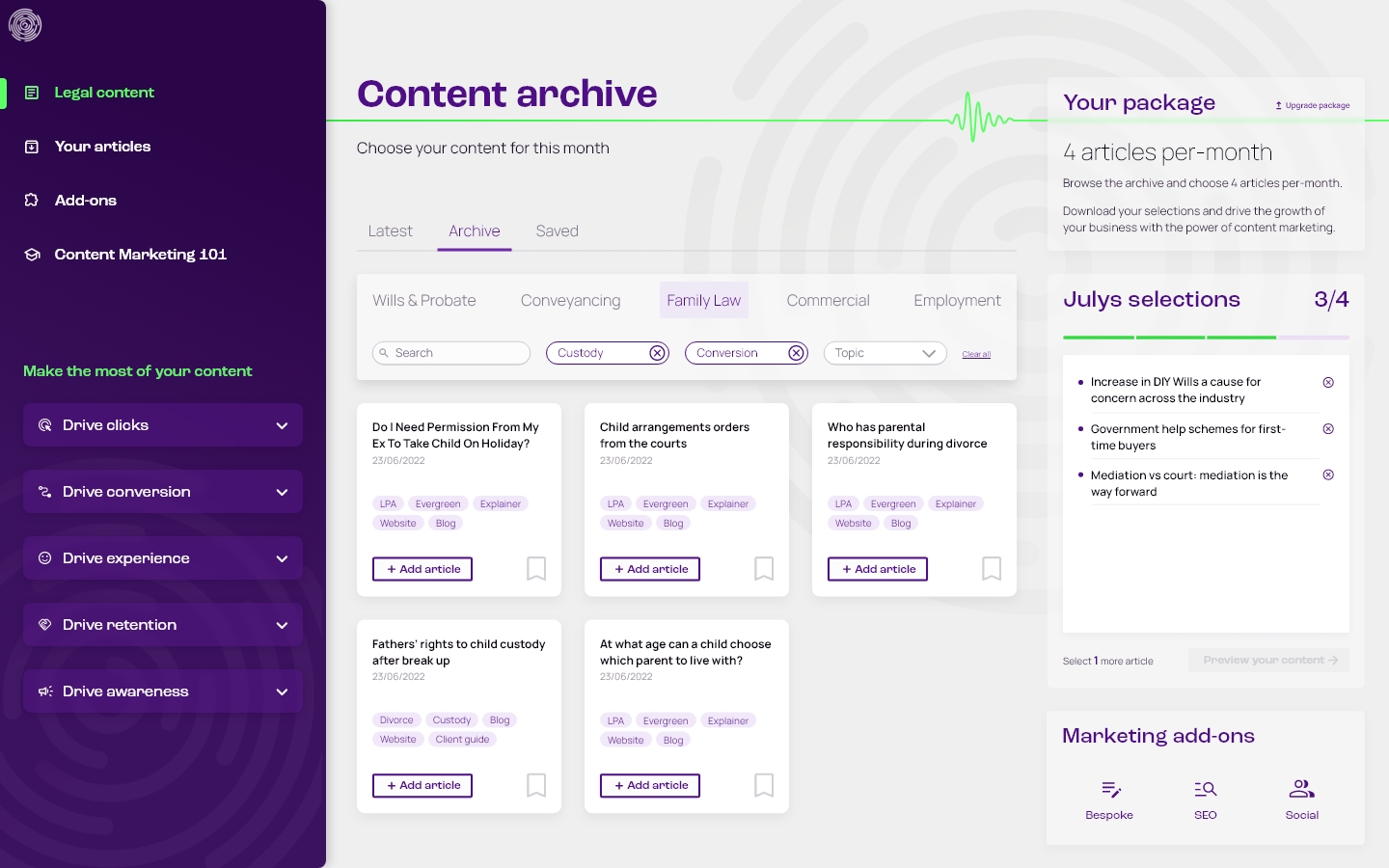
The archive was categorised by the five principles, so articles can be searched for by marketing objective. This categorisation corresponds directly with the tutorials, supporting their understanding and helping them apply the marketing techniques.

Asking the right questions
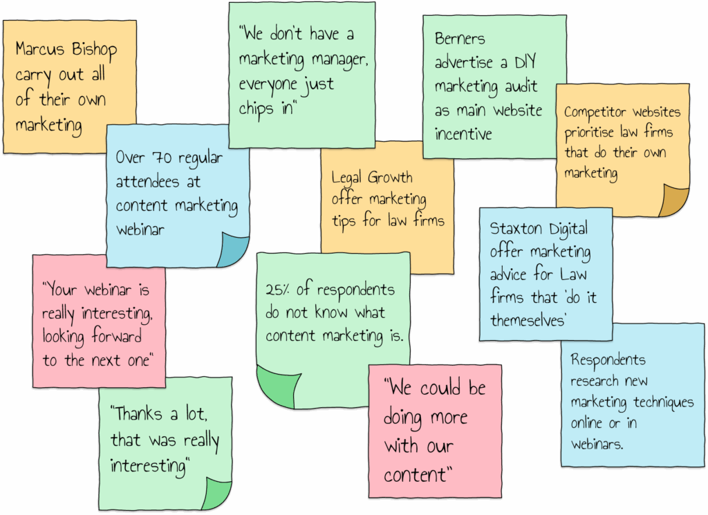
Research objectives included discovering how law firms use marketing to grow their business, how written content plays a role in marketing activity, and how this fits into their day-to-day operations.
User interviews
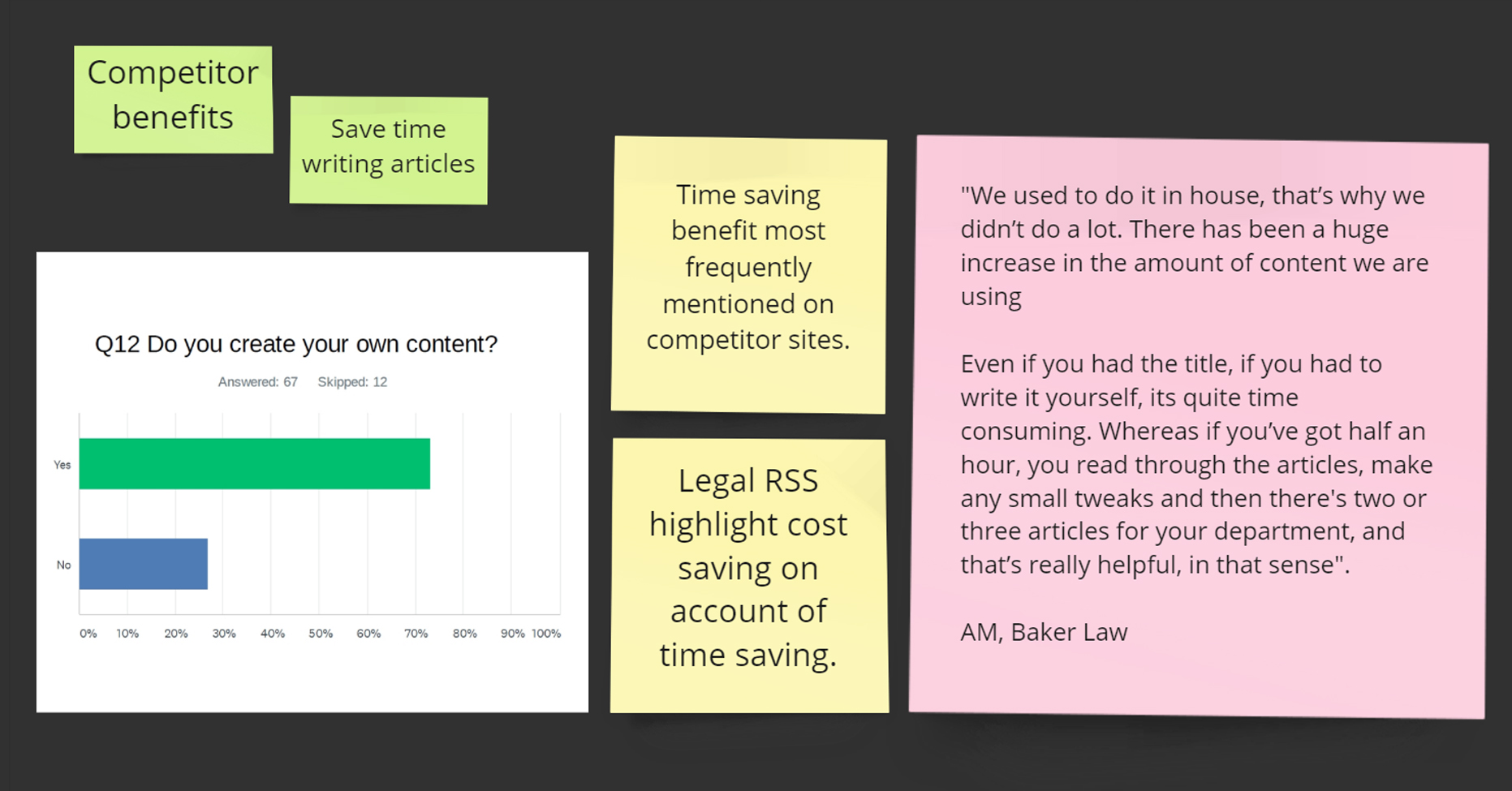
Conversations with both a full-service law firm and an independent financial advisor provided the most useful insights. They describe the benefits in simpler terms than competitor websites – no spiel, just their goals, and how they use it.
Competitor review
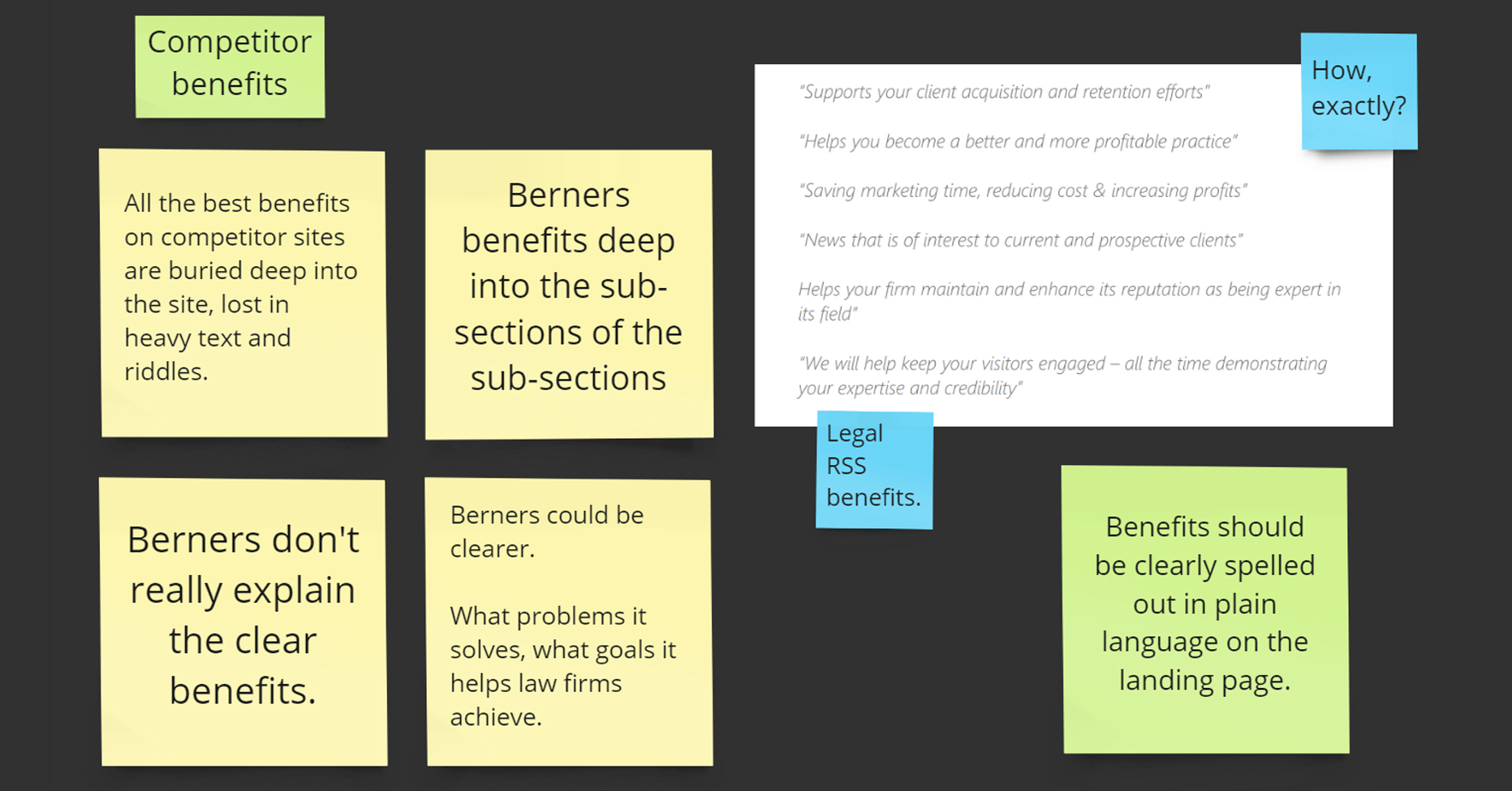
A detailed review of competitor websites gave insights on the product space. Overall, the benefits of written content were unclear and buried in jargon, and samples were only available on request. There was a lot to improve on.


Finding the right insights
Profile
- Small to medium sized law firms who carry out their own marketing activity to grow their business
- They understand the value of marketing, but may not have knowledge of the different ways that content can be used
- DIY marketing tips are therefore useful, and simple guidance is readily appreciated and in demand
Day-to-day operations
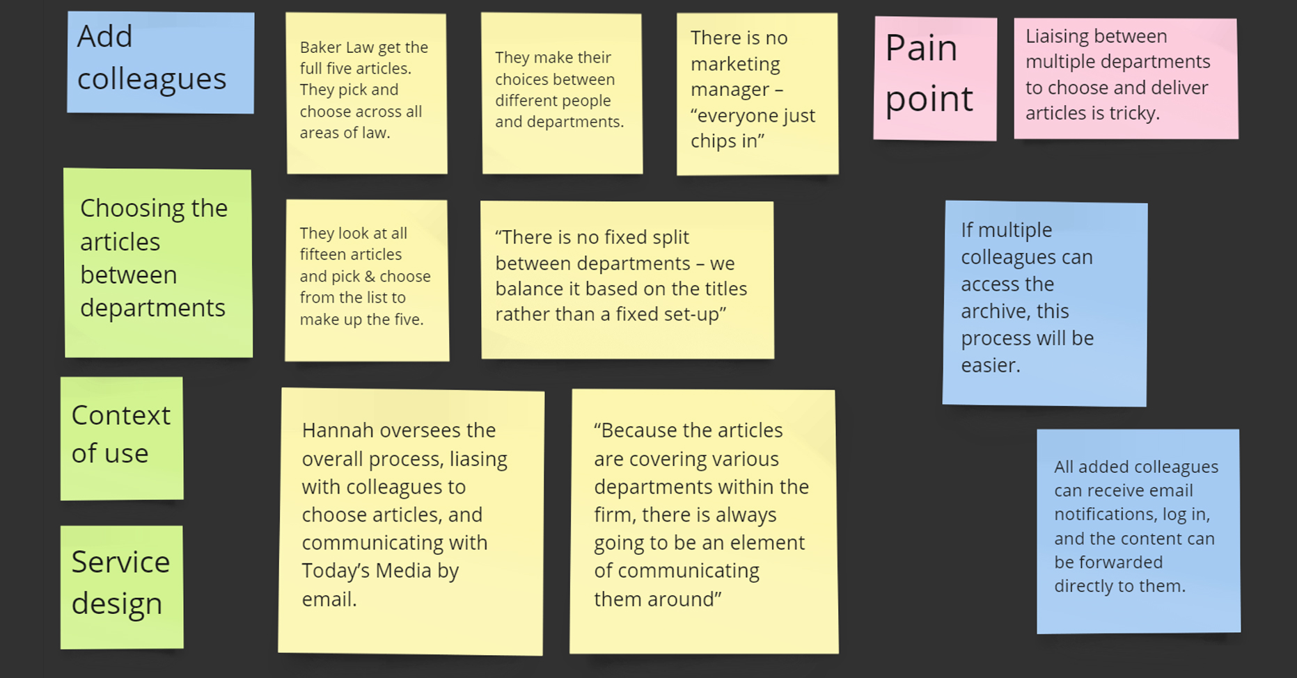
- Busy law firms with multiple departments liaising to choose articles each month, in between their billable case work
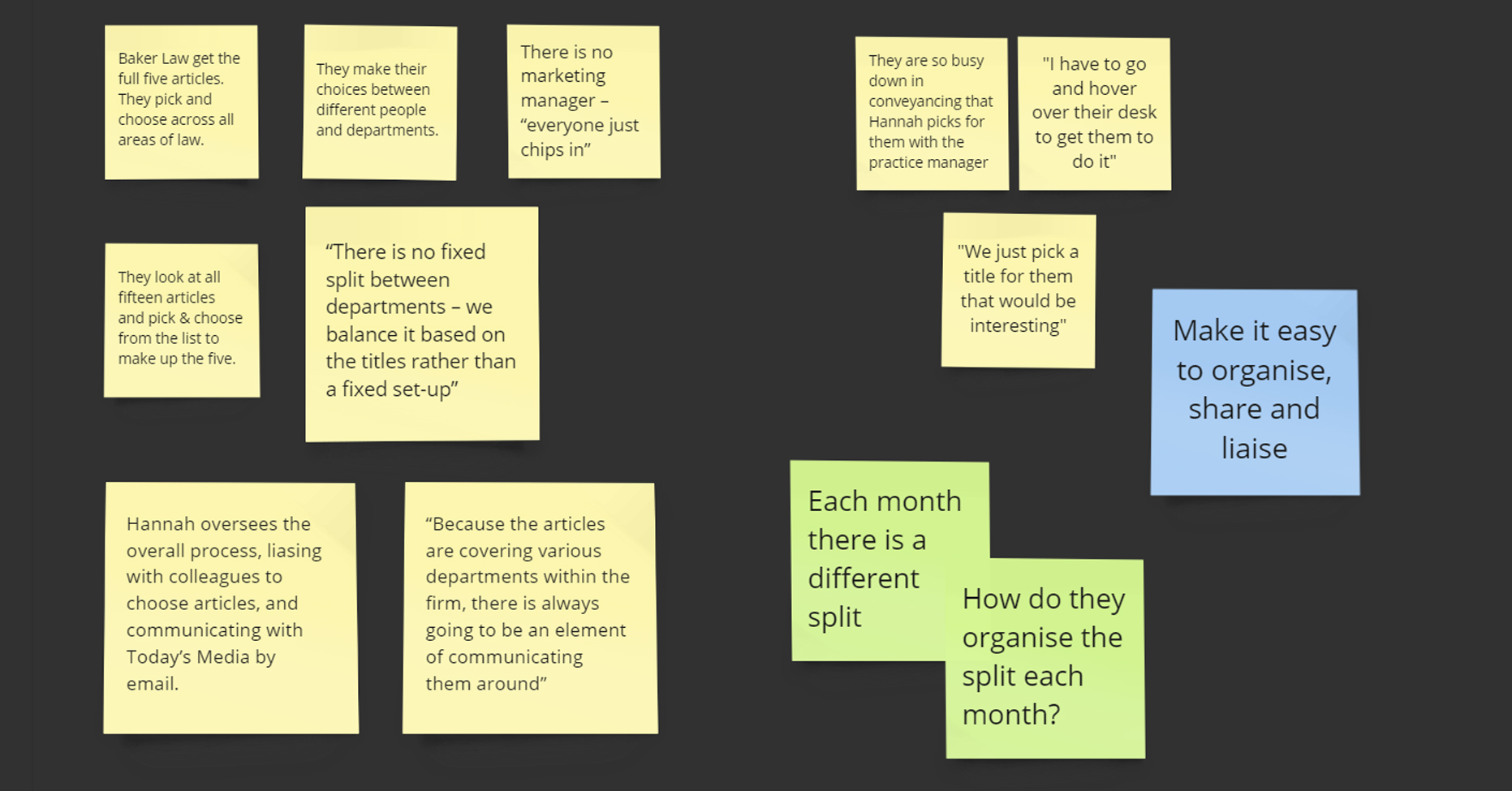
- Often there is no dedicated marketing manager to oversee this process, so the lawyers or office manager take responsibility
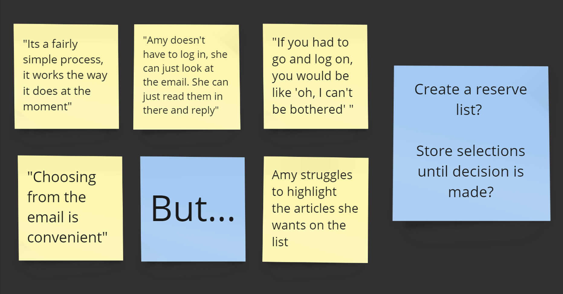
- Emails are sent back & forth between solicitors to preview articles each month, and make final decisions

Content Marketing
Research analysis identified five key objectives of how content marketing can be used to help promote and grow their business.
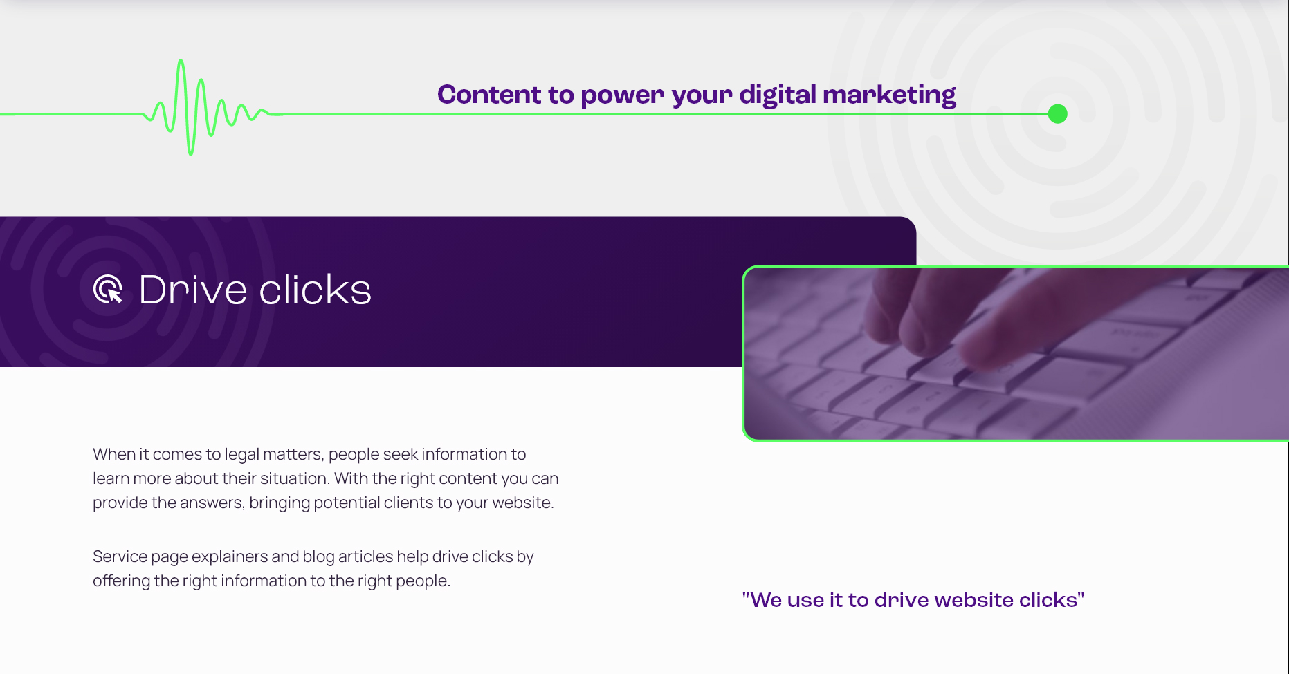
- Attracting prospects with valuable content
- Building credibility to increase conversion
- Client support to improve service
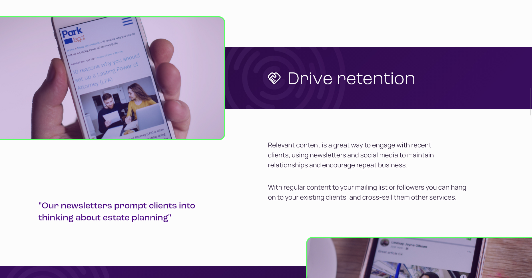
- Engaging content to maintain relationships
- Regular communications for brand awareness
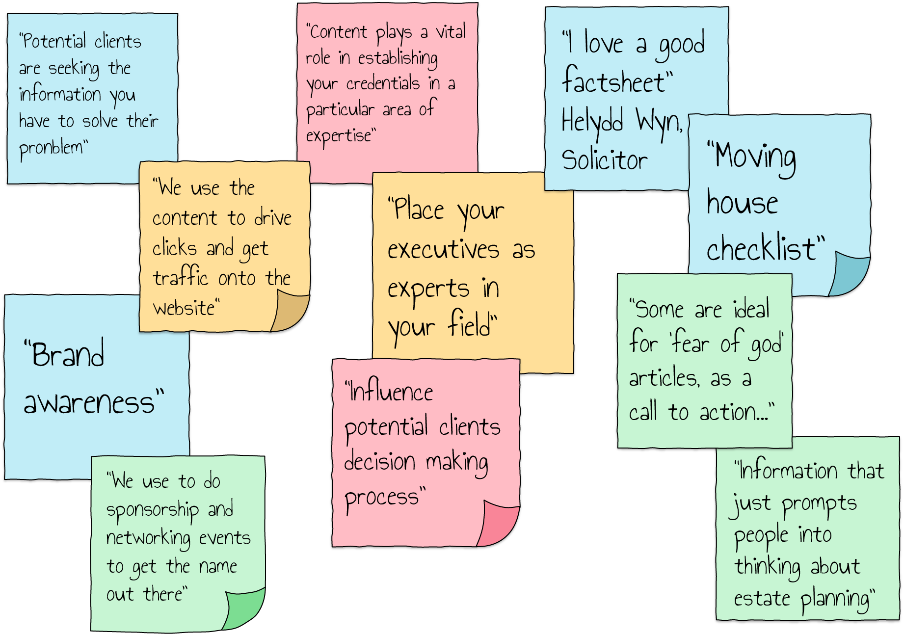
Channels
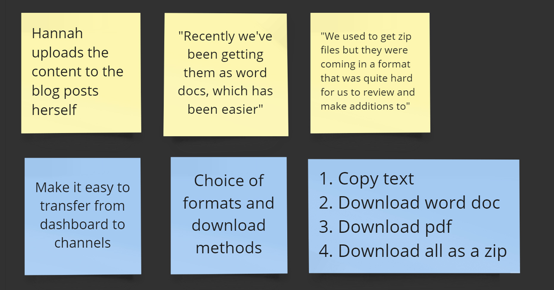
Content is used on website pages, blog posts, social channels and newsletters, providing information on legal matters, or topical, news-style articles.
Editing the content
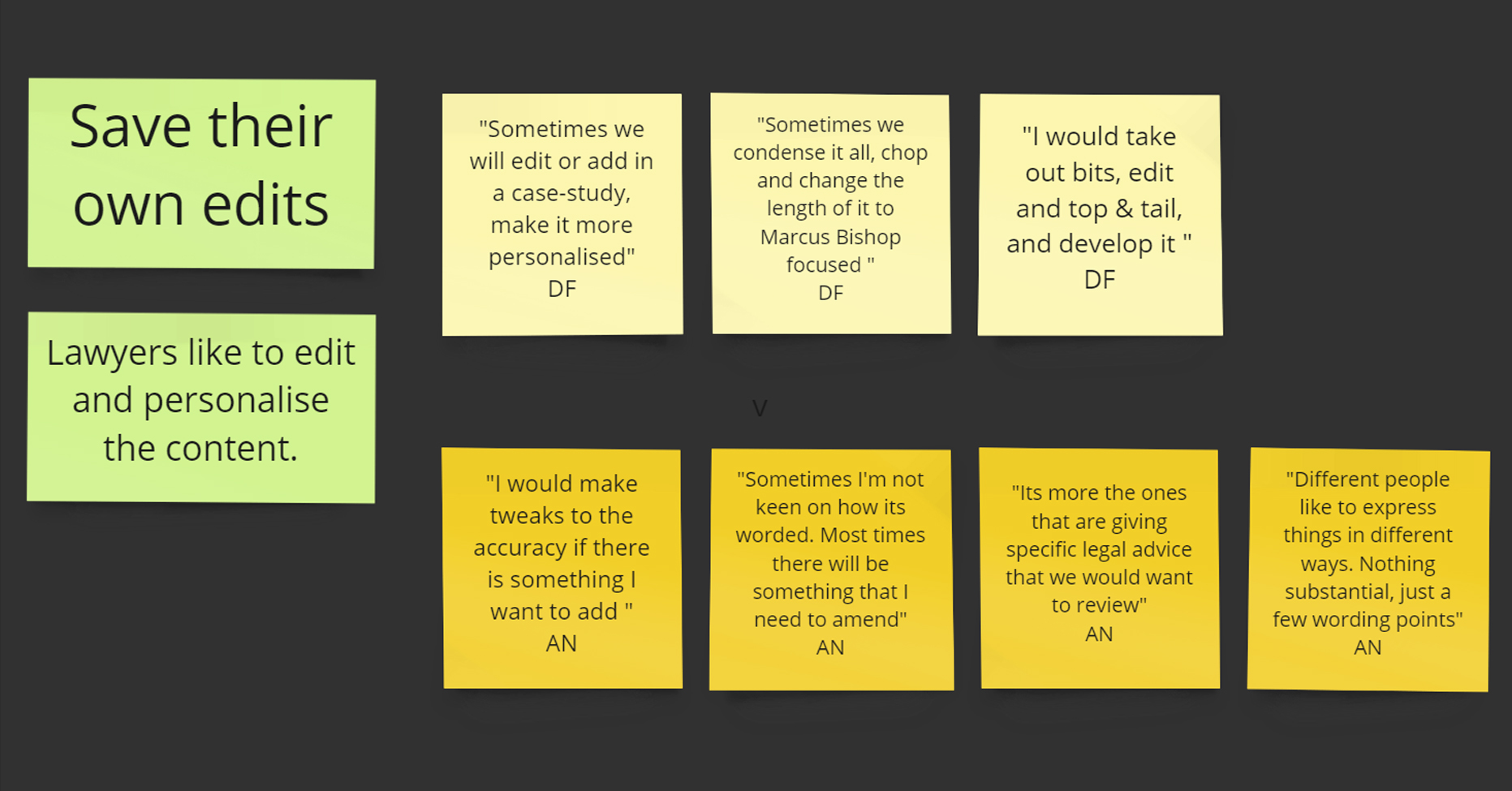
Lawyers make their own edits to tailor the articles to their firm. They still save time writing the articles from scratch, but they can add their own slant.
Re-purposing old articles
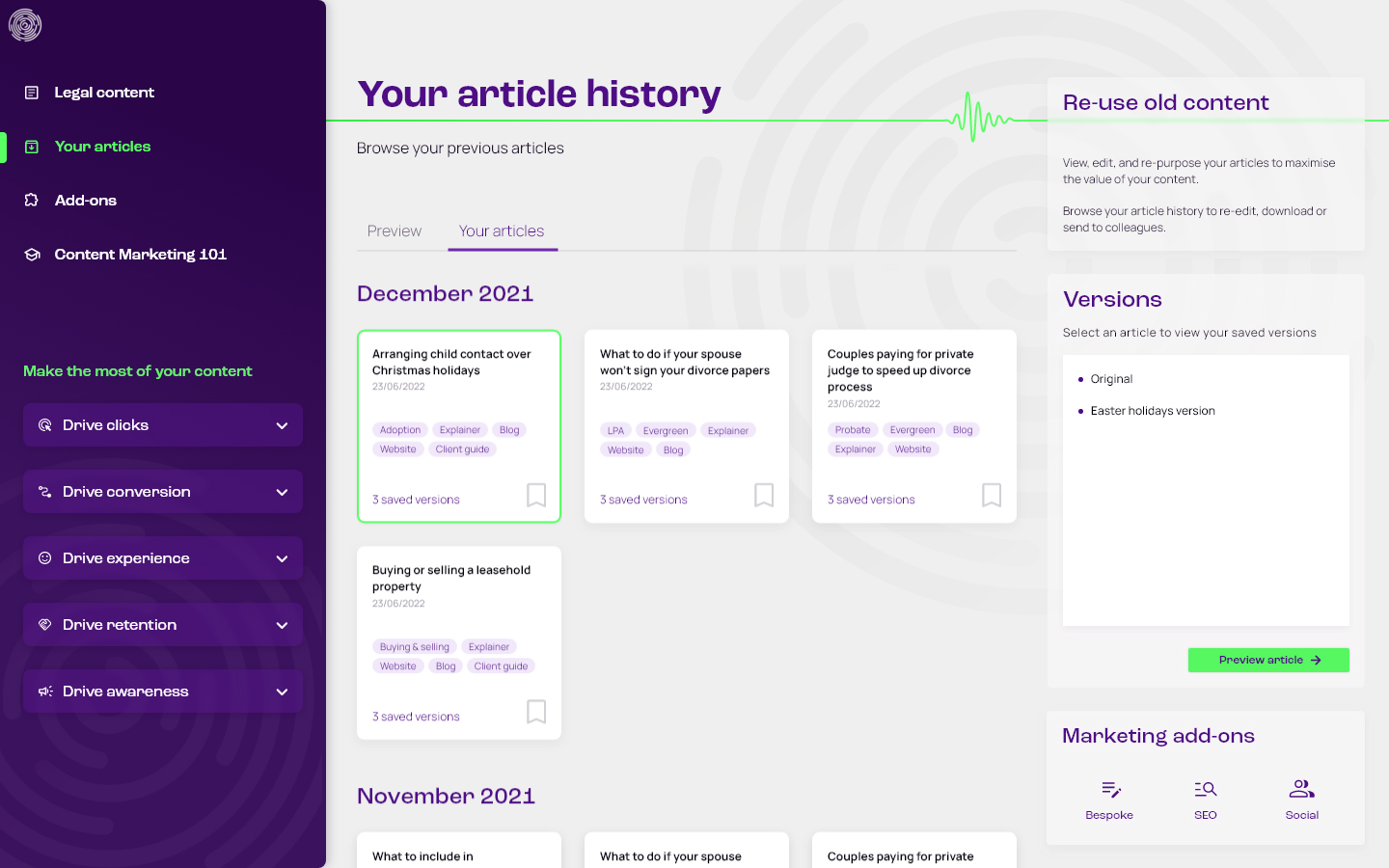
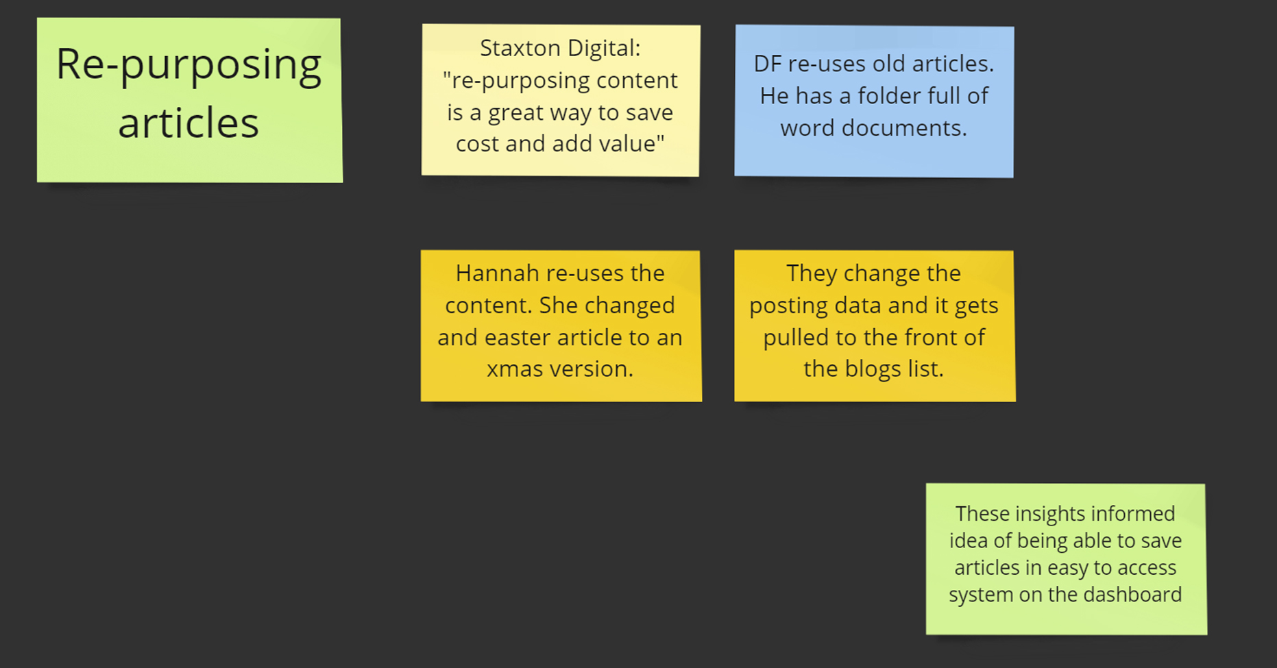
Some articles can be re-used more than once. For example an article about child custody during school holidays can be used in the summer and at Christmas.

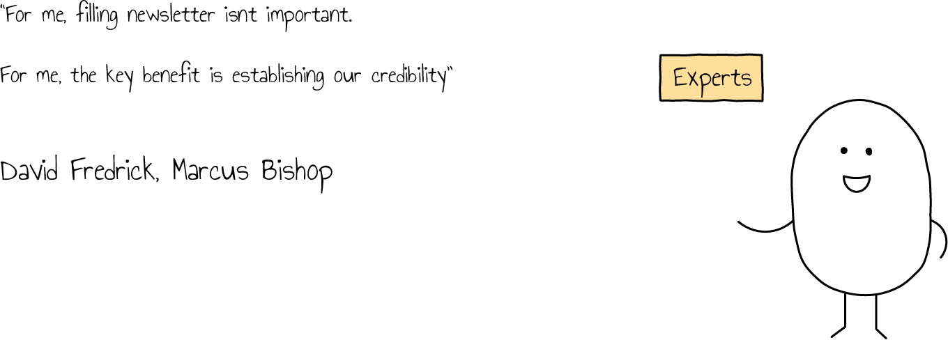
Designing the right solution
Taking the research insights into account, the platform was designed to offer more than just an archive of pre-written articles.
- Tutorials within the dash to help these DIY marketeers grow their business, and make the most of the content
- Article categorisation that corresponds with the tutorials to help them apply the marketing techniques, and search for content by objective
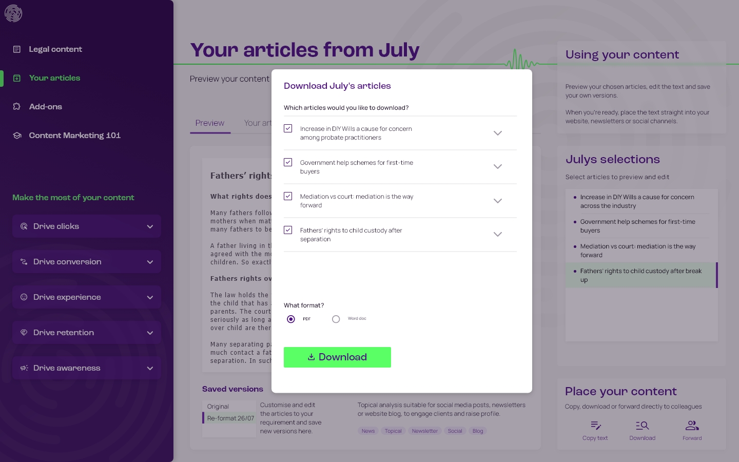
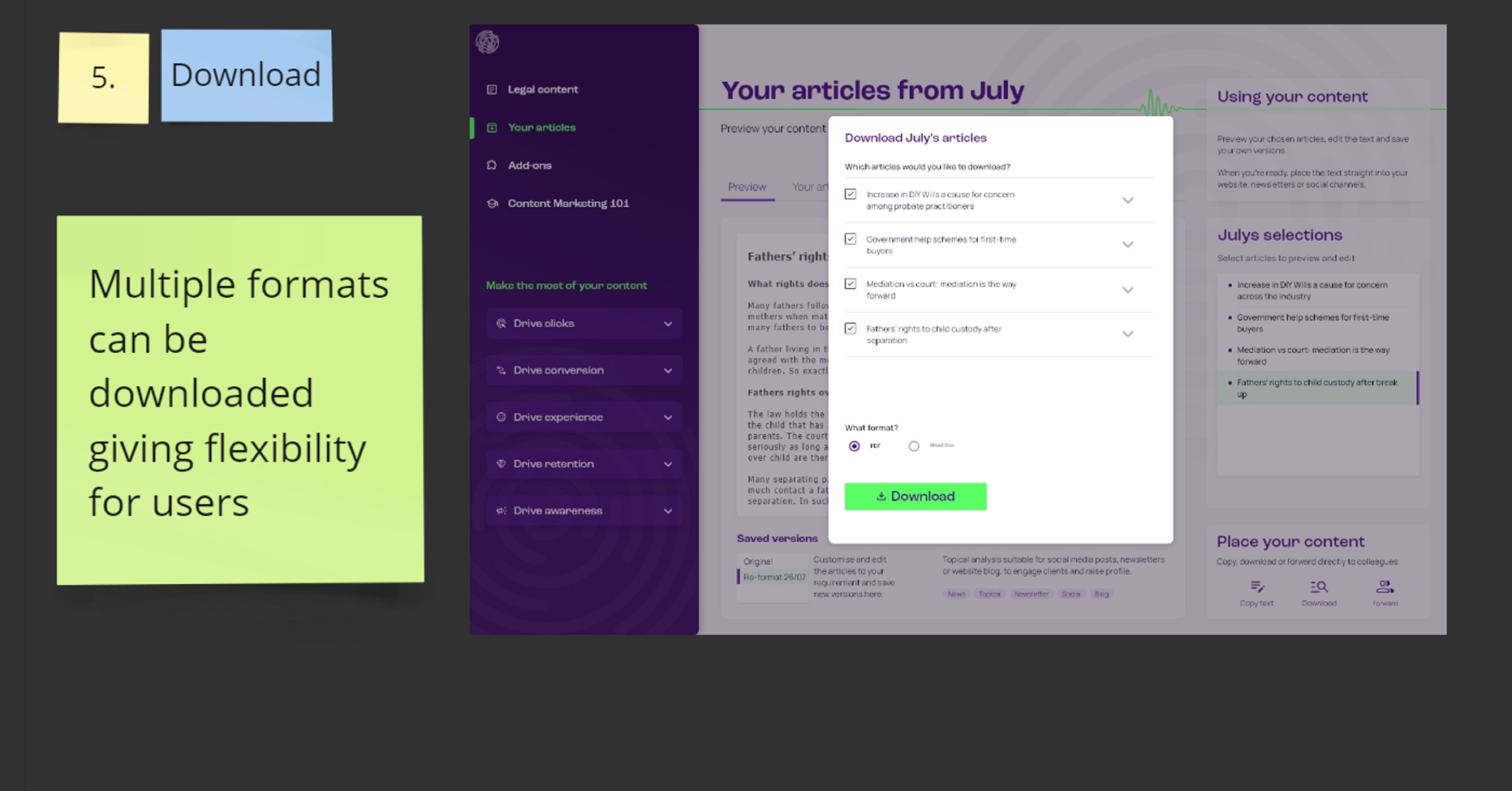
- Monthly delivery process that supports their day-to-day operations, allowing multiple users to log in, make selections, and download articles
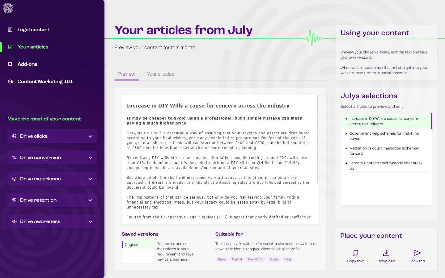
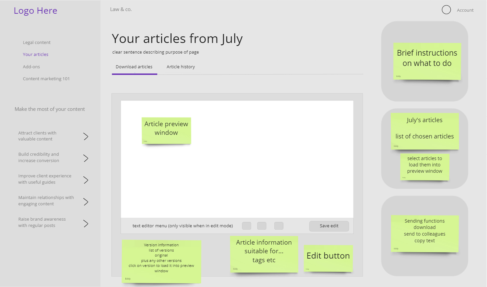
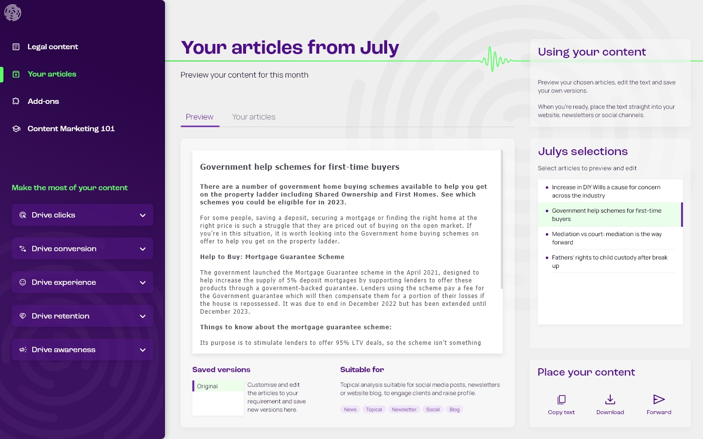
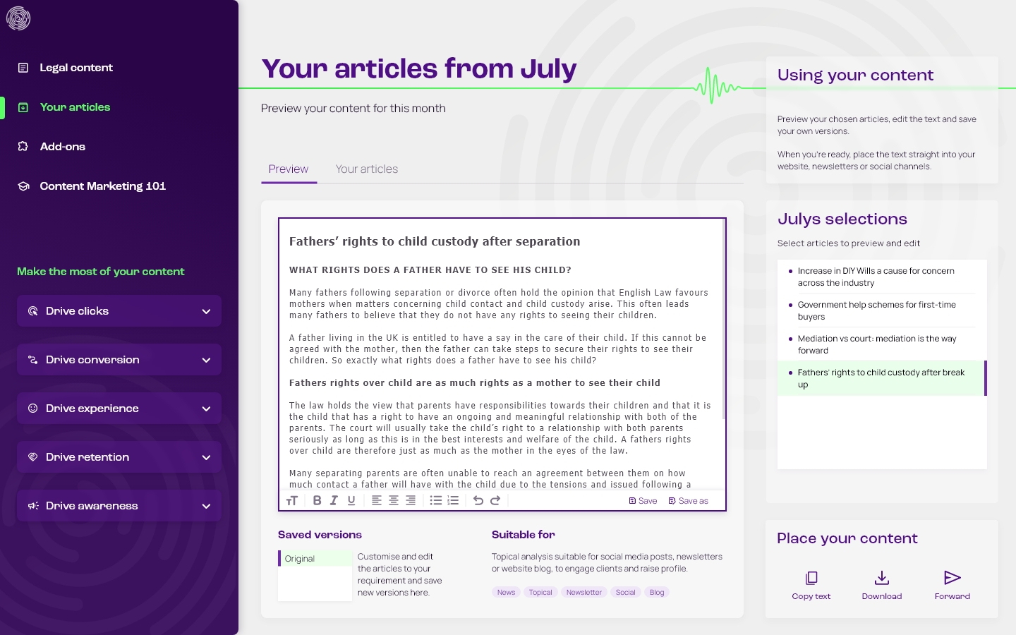
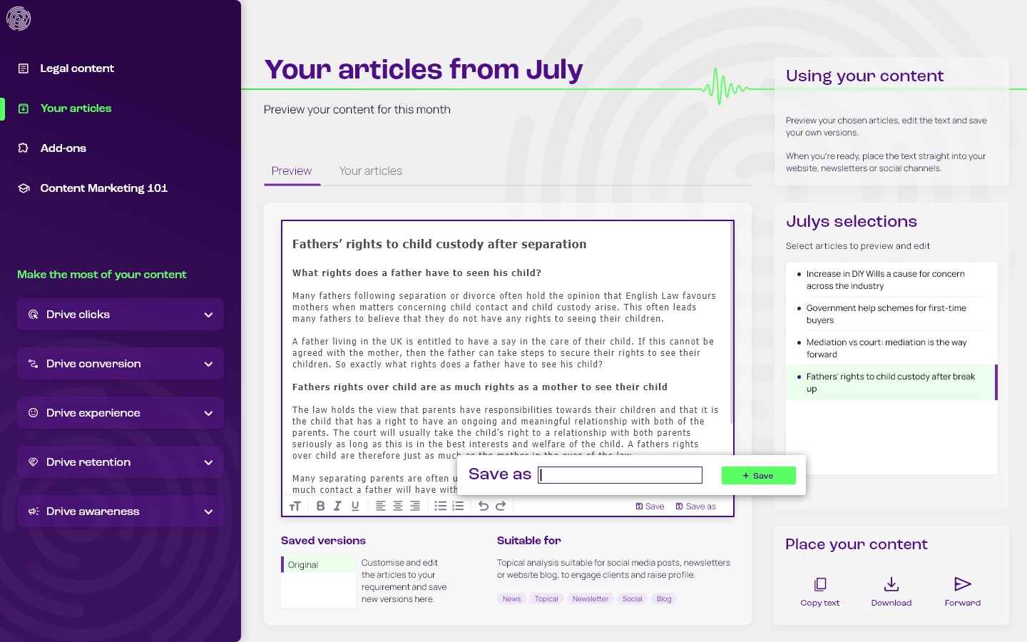
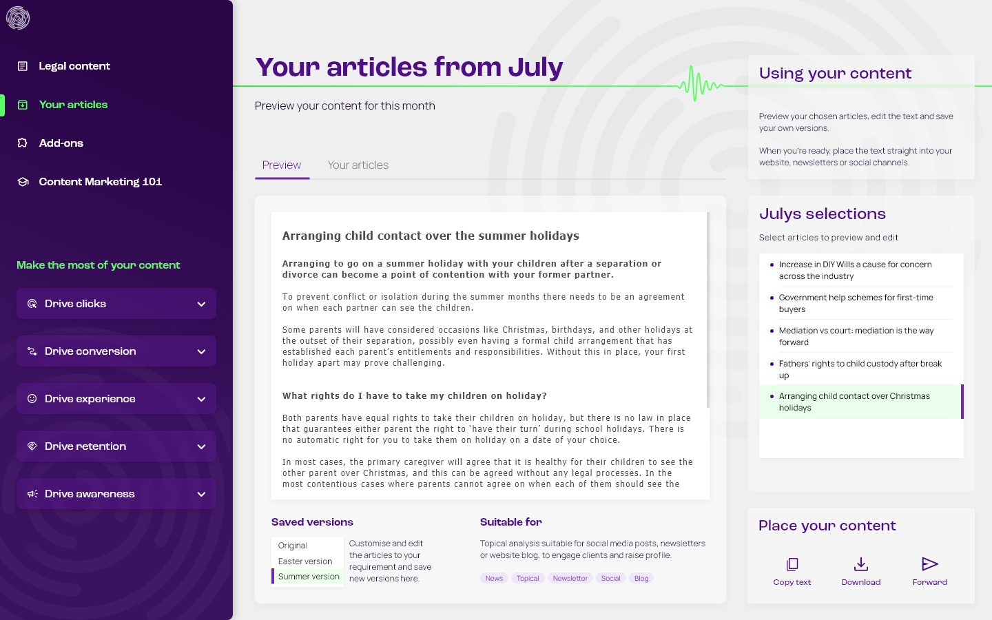
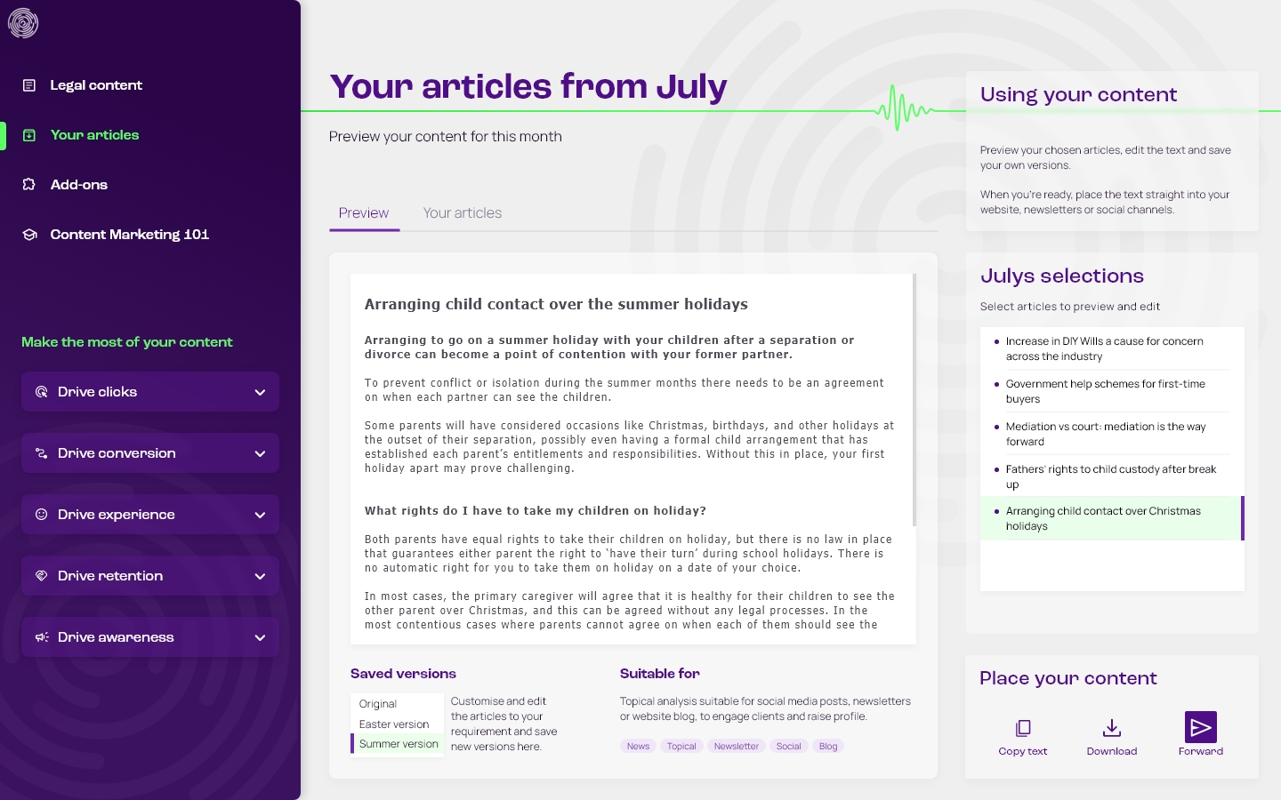
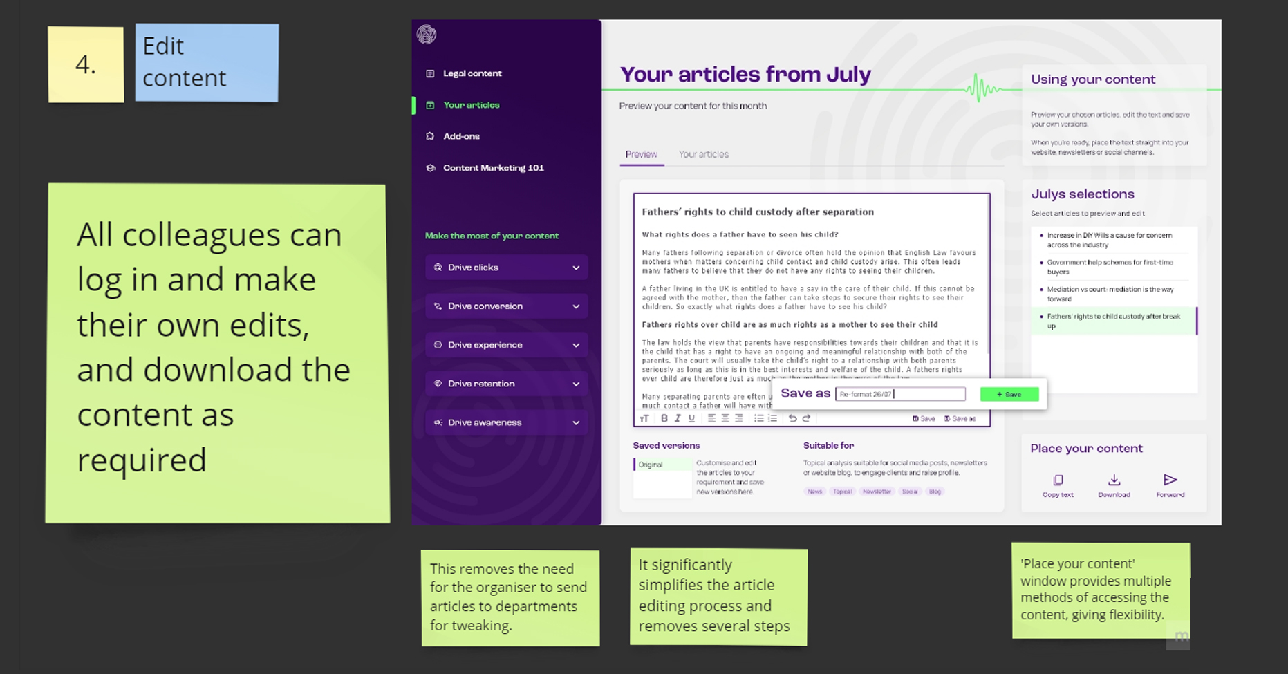
- Editing functionality so lawyers can edit and tailor the articles, and save new versions within the interface
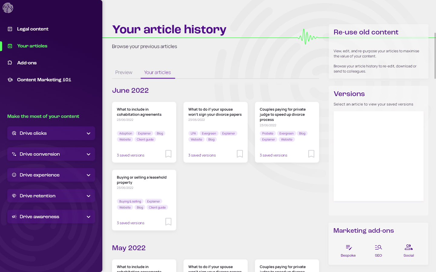
- Order history to enable the re-purposing of previously purchased articles, maximising their value with repeat use
- A landing page and value proposition that clearly and immediately conveys the benefits of pre-written content
- A simple and friction-free sign-up, with a free tier that provides access to browse the full archive
- A clean, simple, and intuitive UI that supports the primary goals and functions of the platform
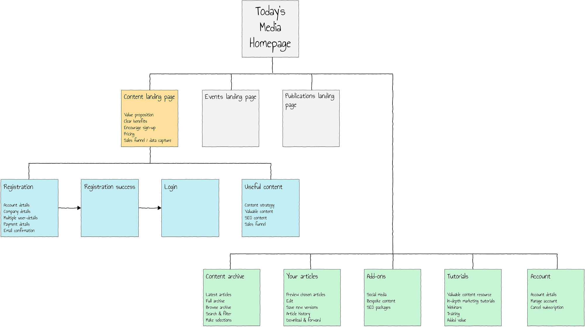
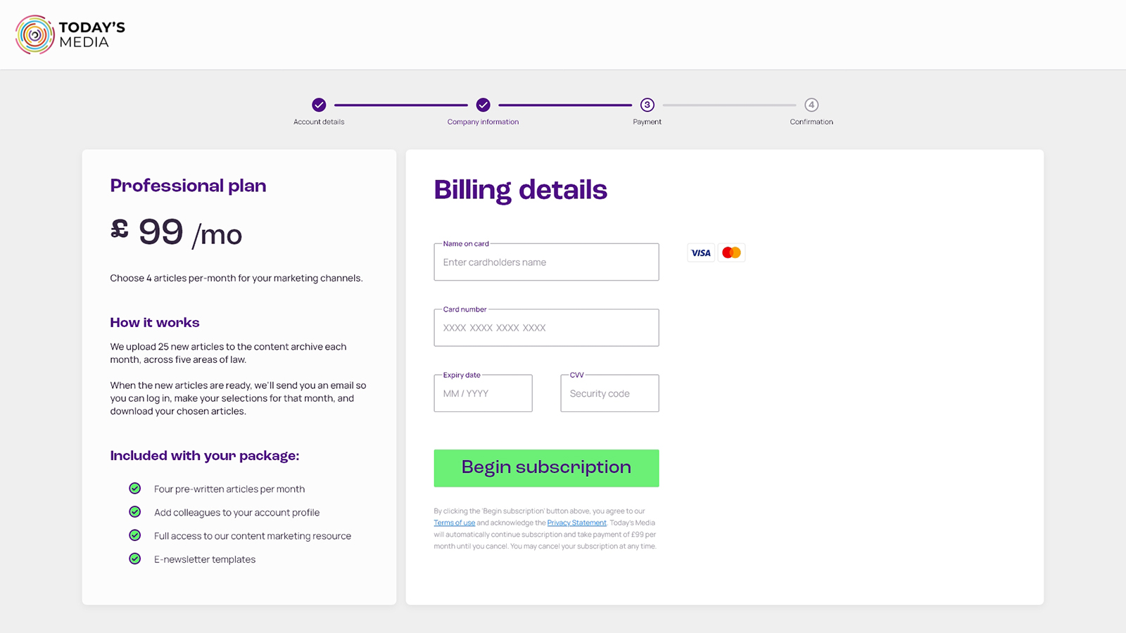
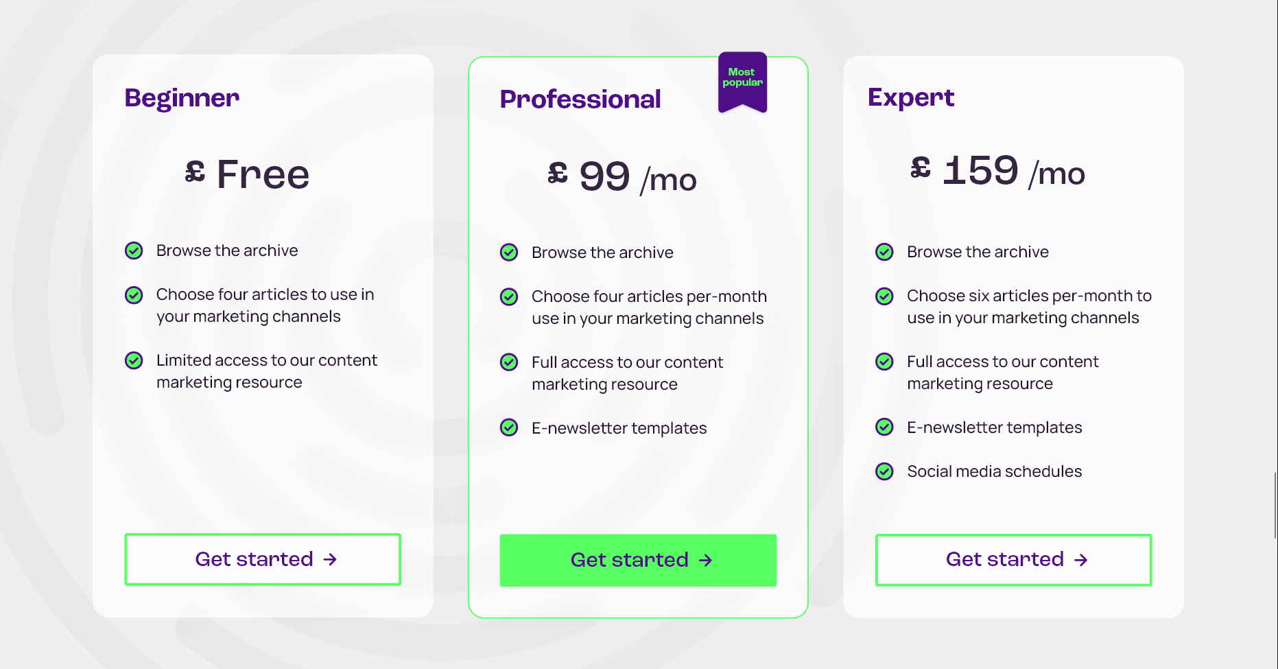
Subscription packages
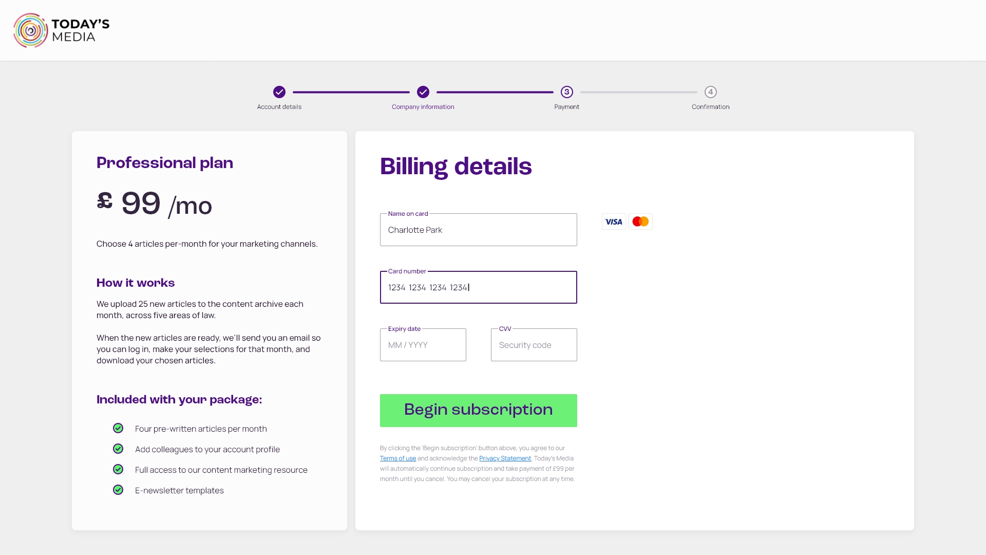
- Subscribers have access to a full archive of articles across five areas of law.
- Each month, 25 new articles are added to the archive across these five areas.
- Packages allow the selection of either four or six articles each month.
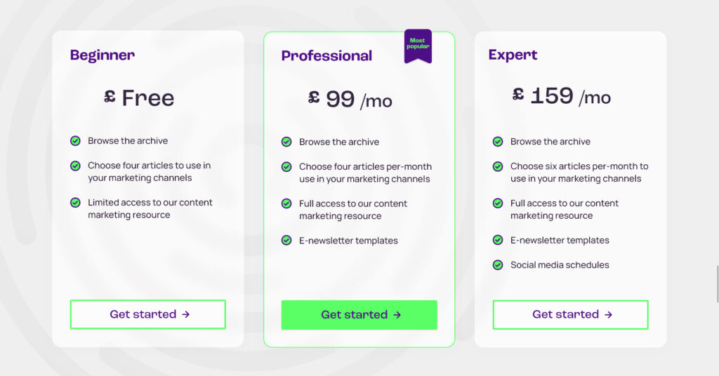
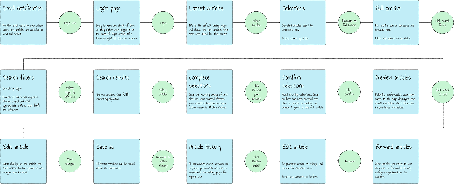
Monthly selections
- 25 new articles are added to the archive each month
- Subscribers receive a notification email when the new articles are available
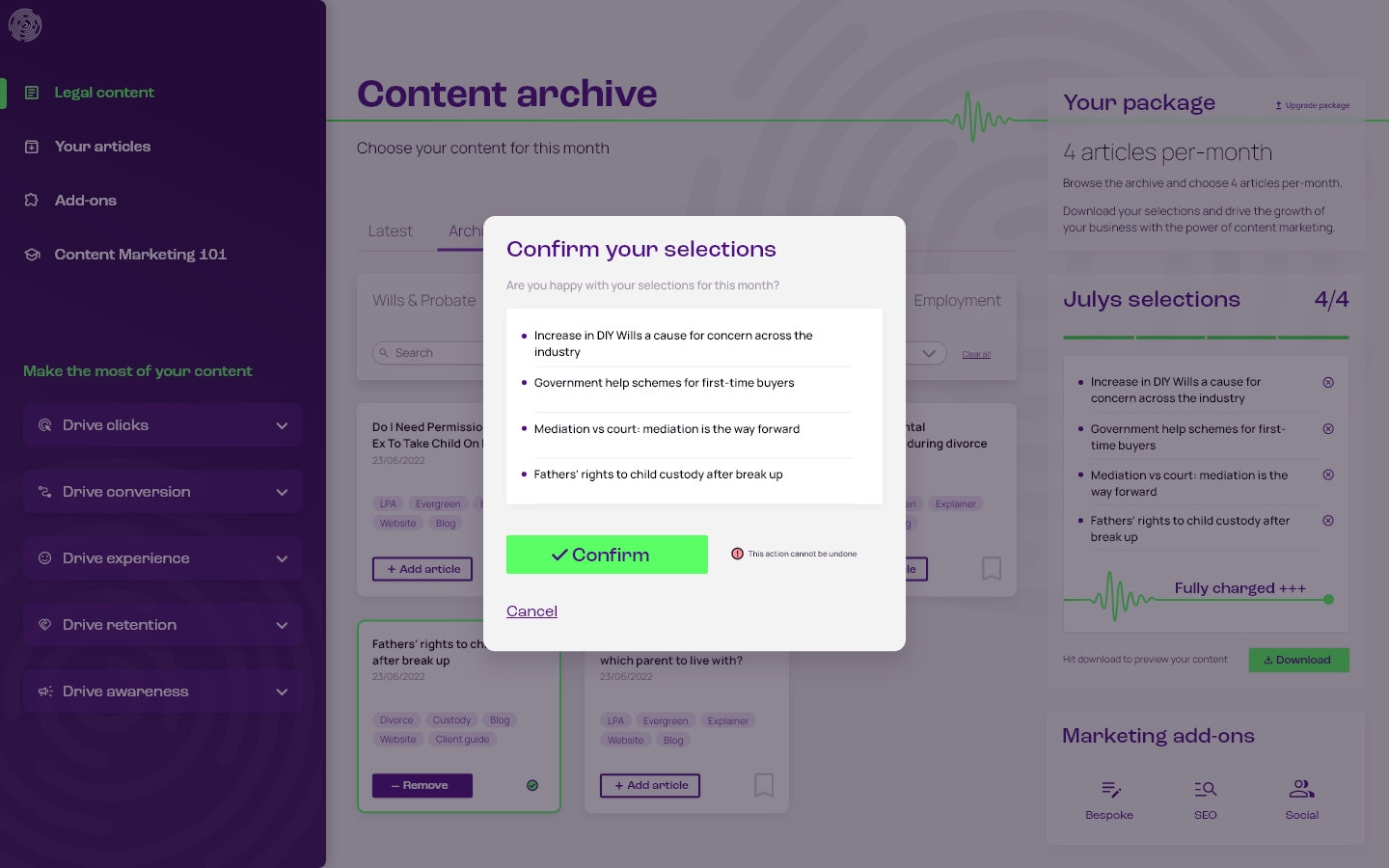
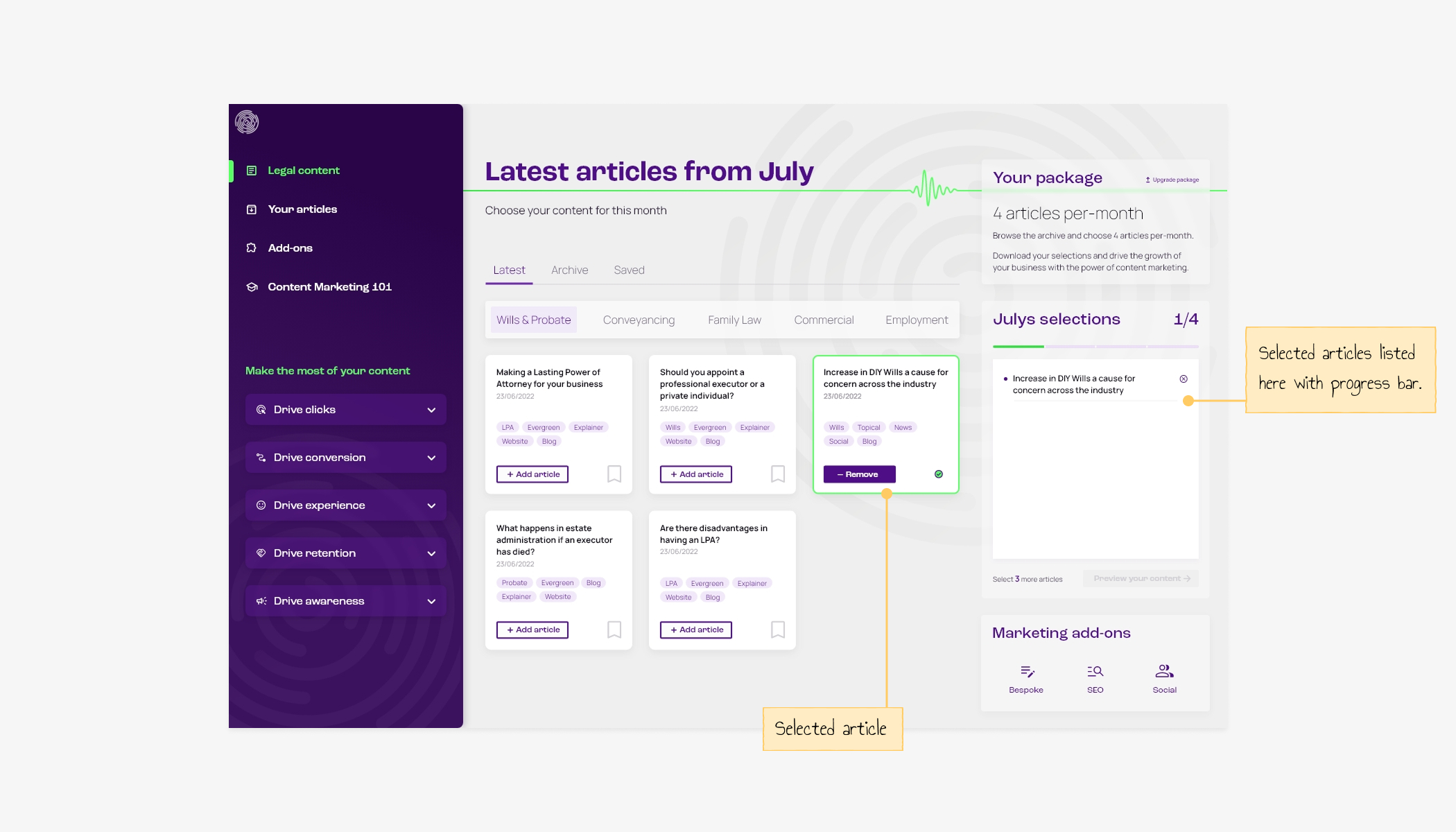
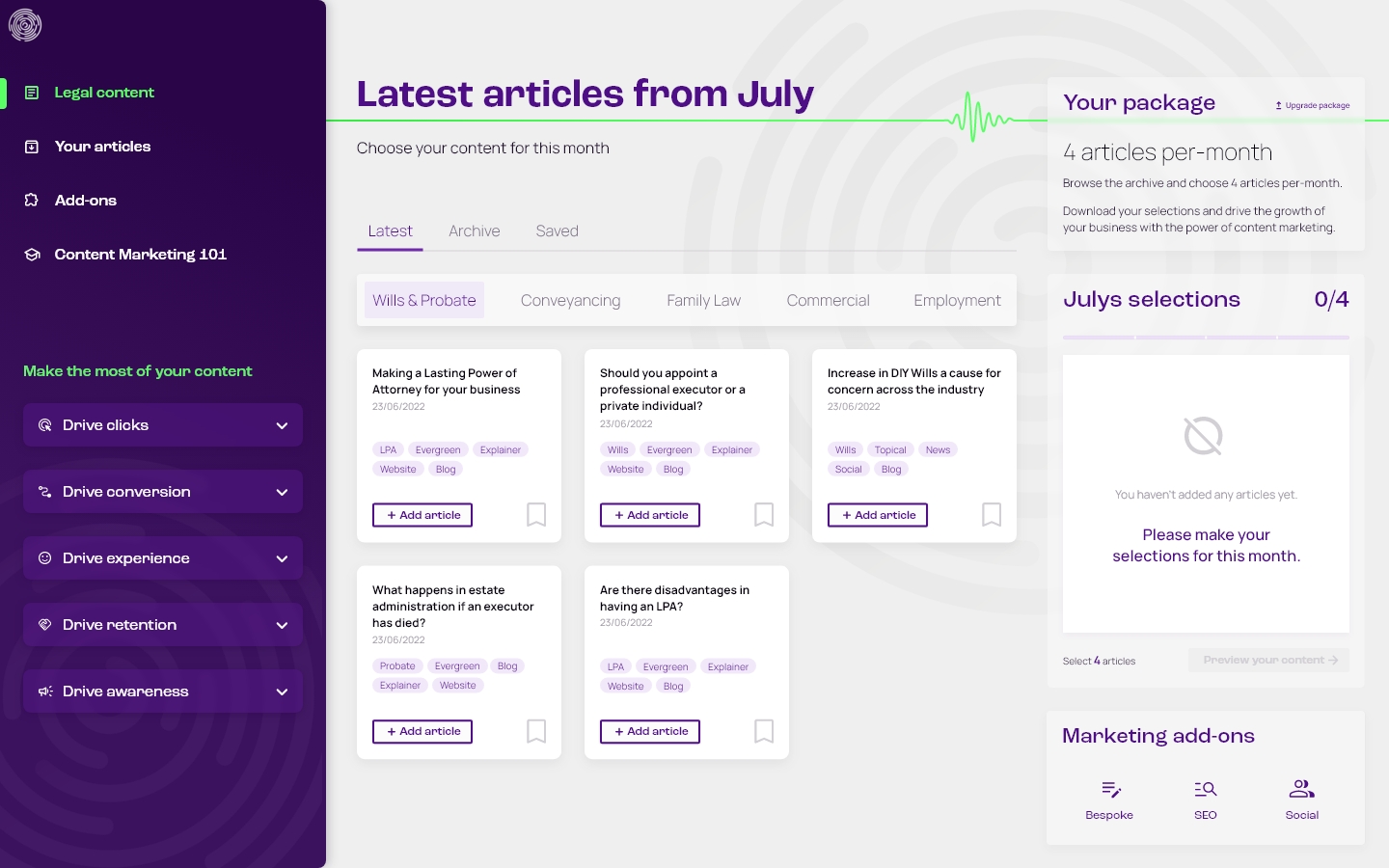
- From here they can log in to preview, select, and download their monthly quota.
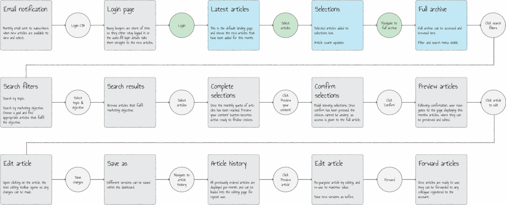
This case study is currently being updated, old case study below.
Landing page
Primary objective
Conversion / sign-up / subscriptions / new customers.
Explain the benefits in plain terms, make it easy to sign up.
Secondary objective
Sales funnel / content strategy / useful content / data capture
More details
Clear benefits
Finding the clear benefits on competitor websites was very hard. The ultimate goal for the end-user is to grow their business, and written content can be used in different ways to achieve that. So it makes sense to explain these different ways in clear terms, using language that lawyers and small business owners understand.
I want them to understand very quickly, exactly what the content can do for them and how it does it.
Explaining the five pillars of content marketing on the landing page both summarises all the benefits, and introduces clients to the five objectives by which they can search for content with the filters.
The free tier
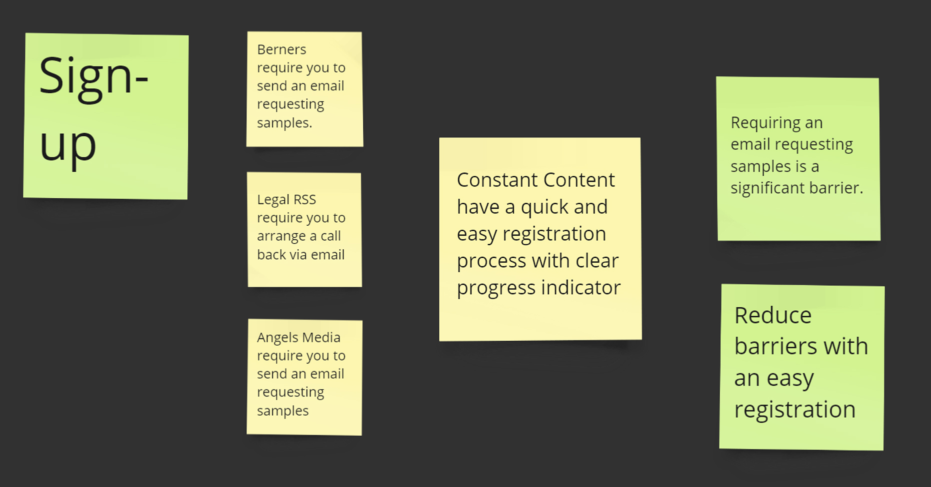
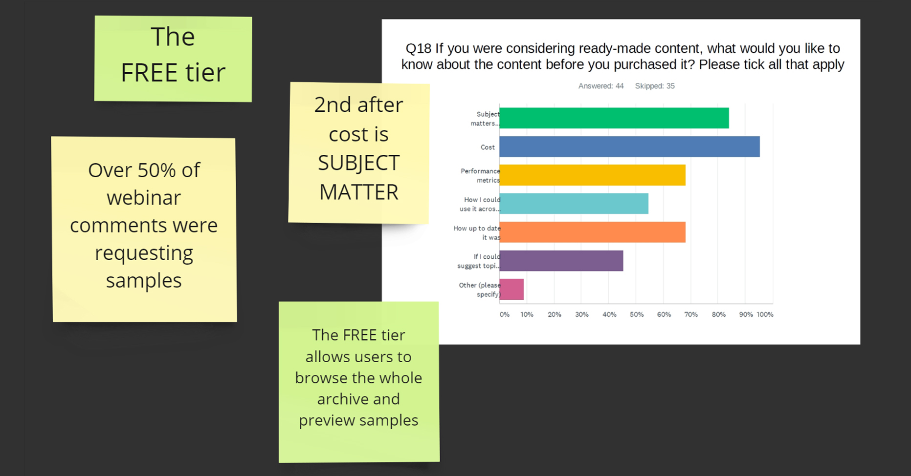
Competitors all require users to request samples via email or telephone call, which seems like a significant barrier.
Over 50% of webinar comments were requesting samples.
The CTA/registration took these points into consideration – rather than filling in a contact form to request samples, prospective customers can sign up to a ‘Free tier’ with a quick and easy registration process.
Once signed-up they can browse the full archive to see all the topics and subjects available. With the free tier, they can download three sample articles to use. After the three have been downloaded, they can only access more by upgrading to a paid tier.
This means:
- They can easily see the samples and browse the archive.
- There is a structural bond with them so further marketing/sales funnel activity can encourage them upgrade to a paid tier.
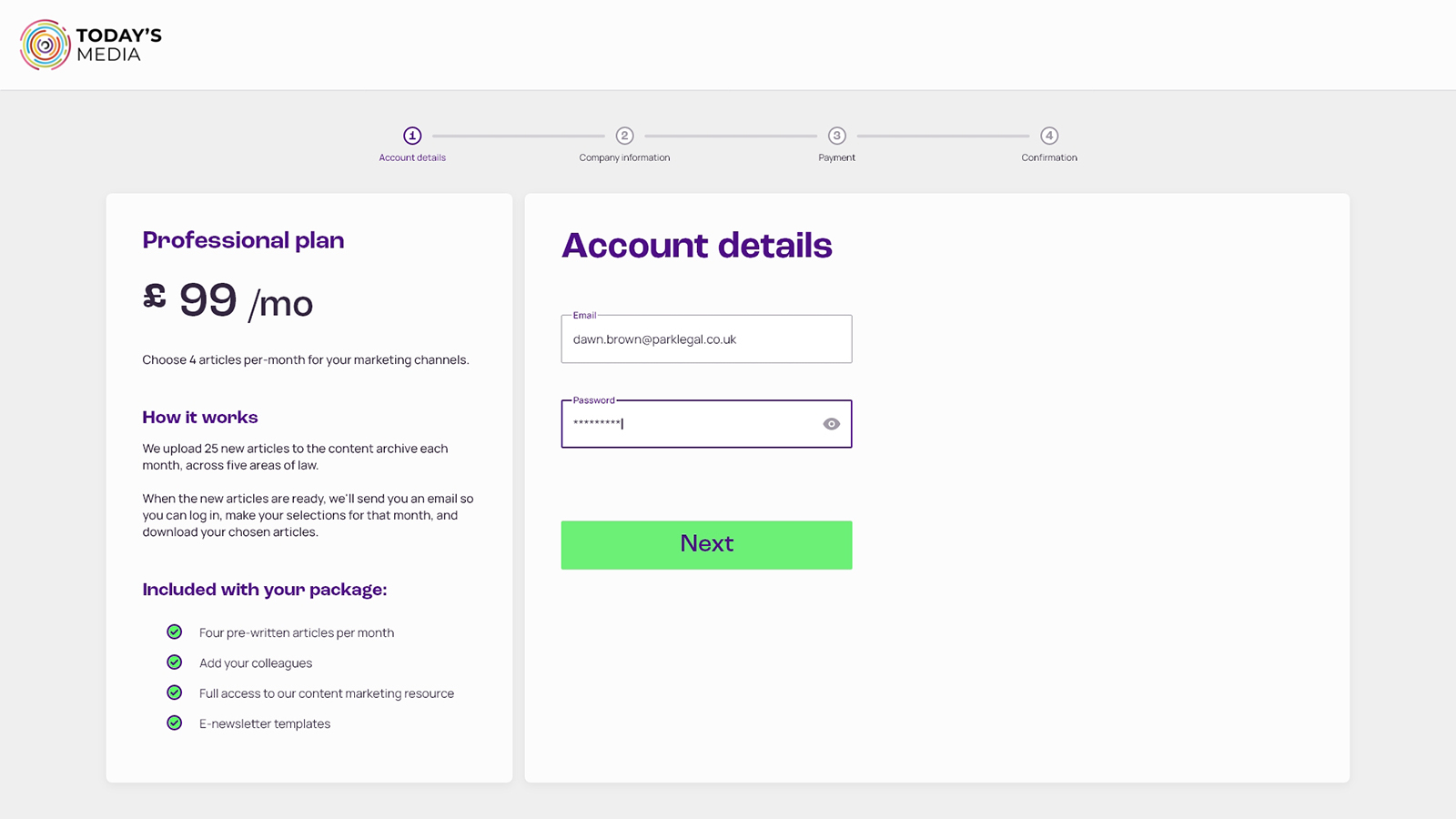
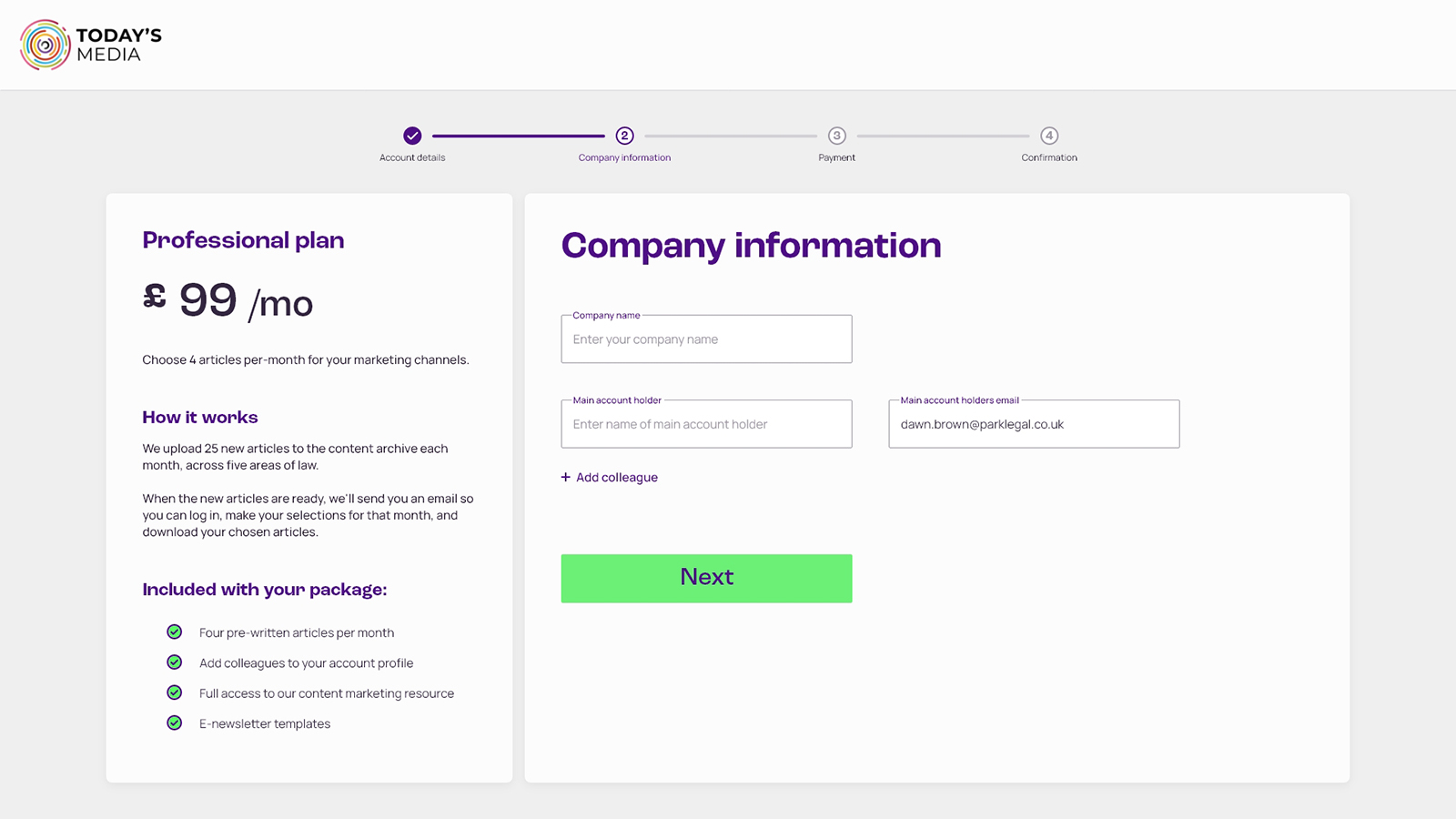
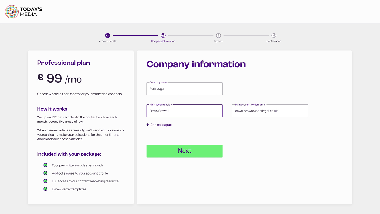
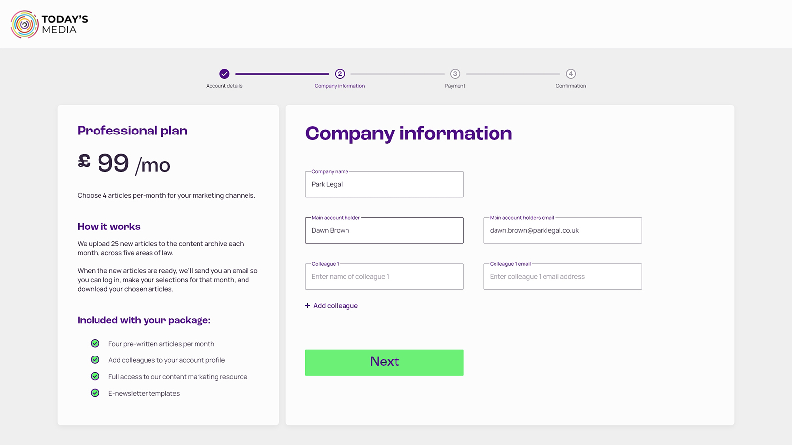
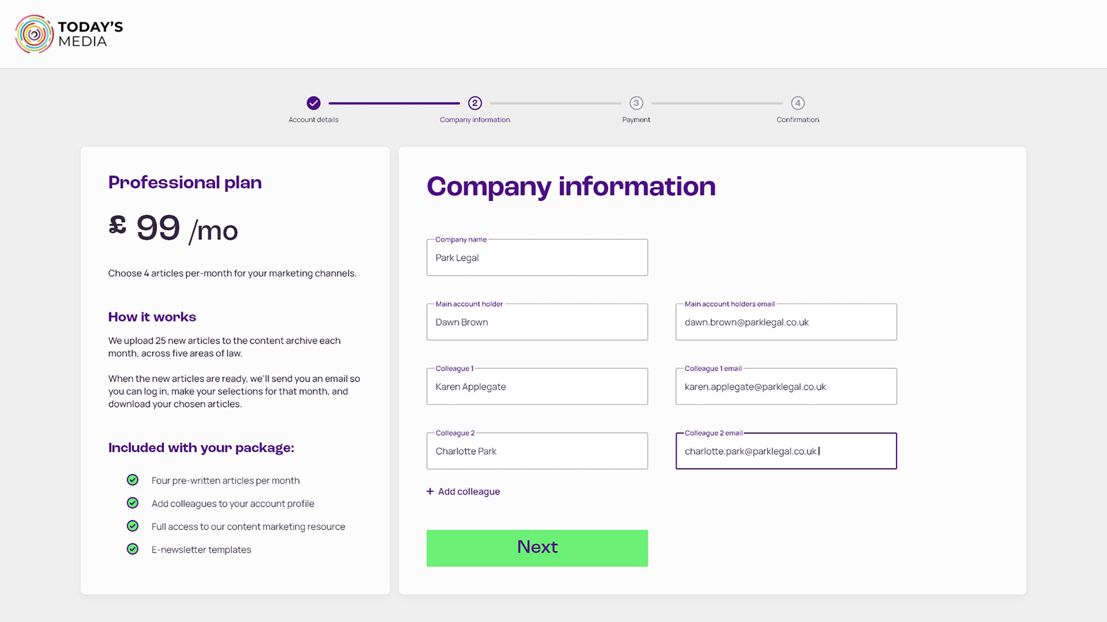
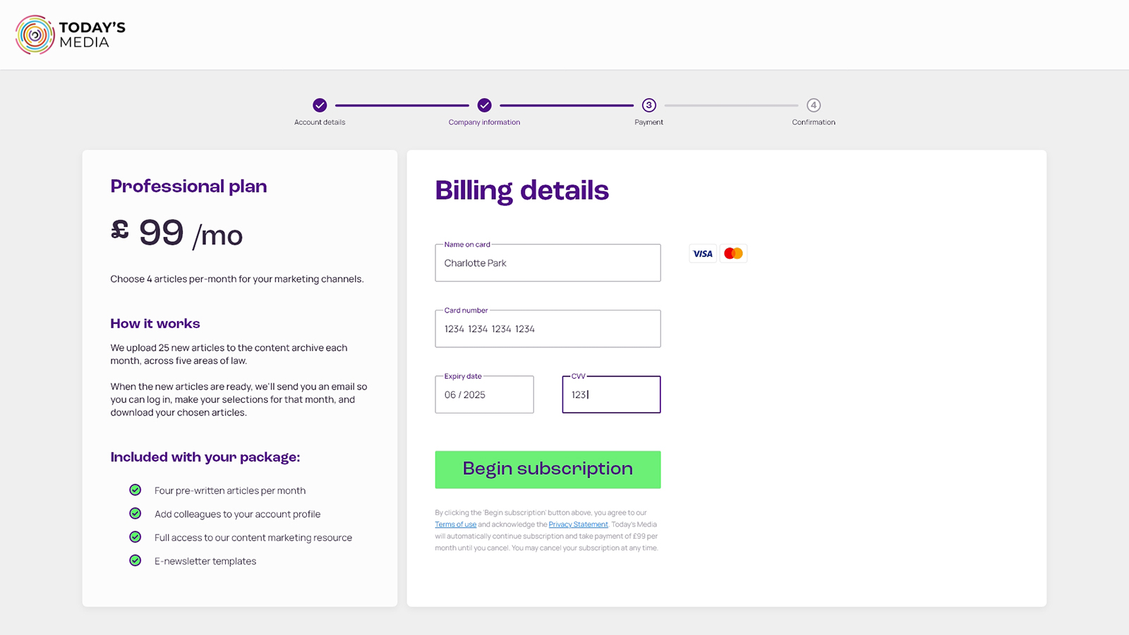
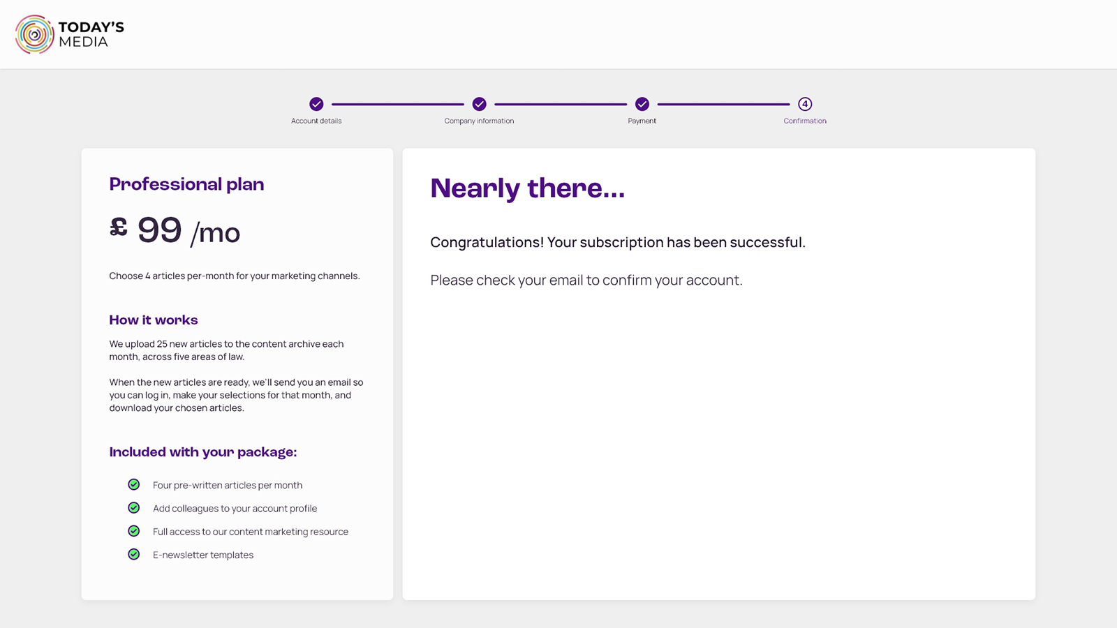
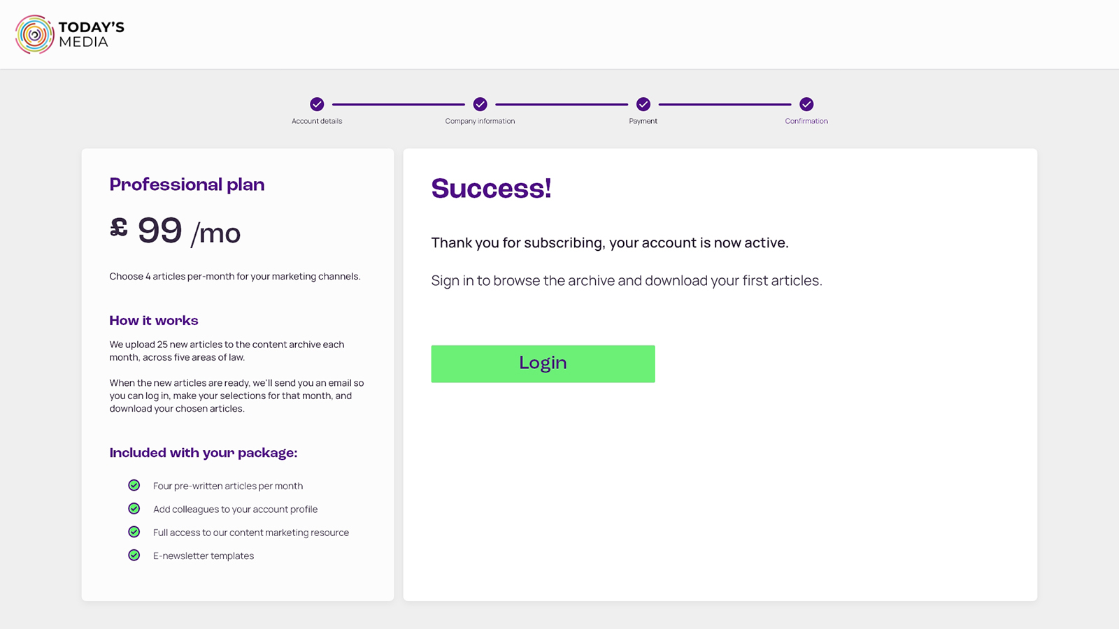
Subscribe flow
Objective
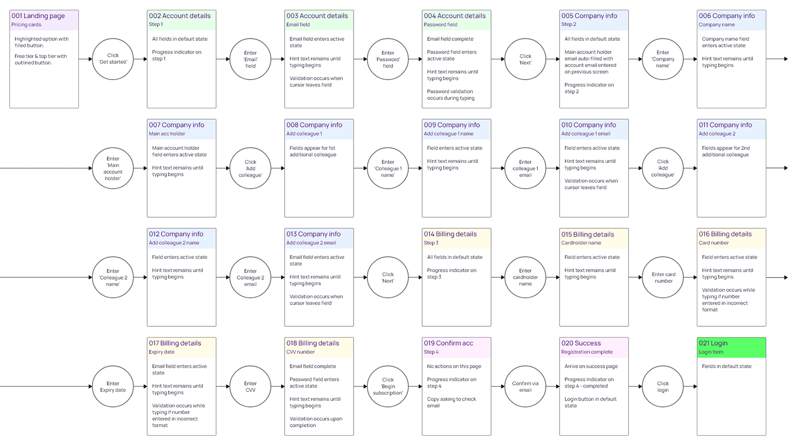
Quick and easy sign-up.
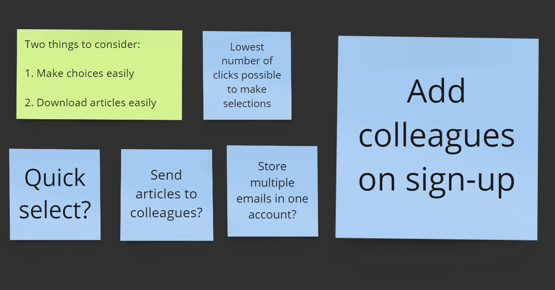
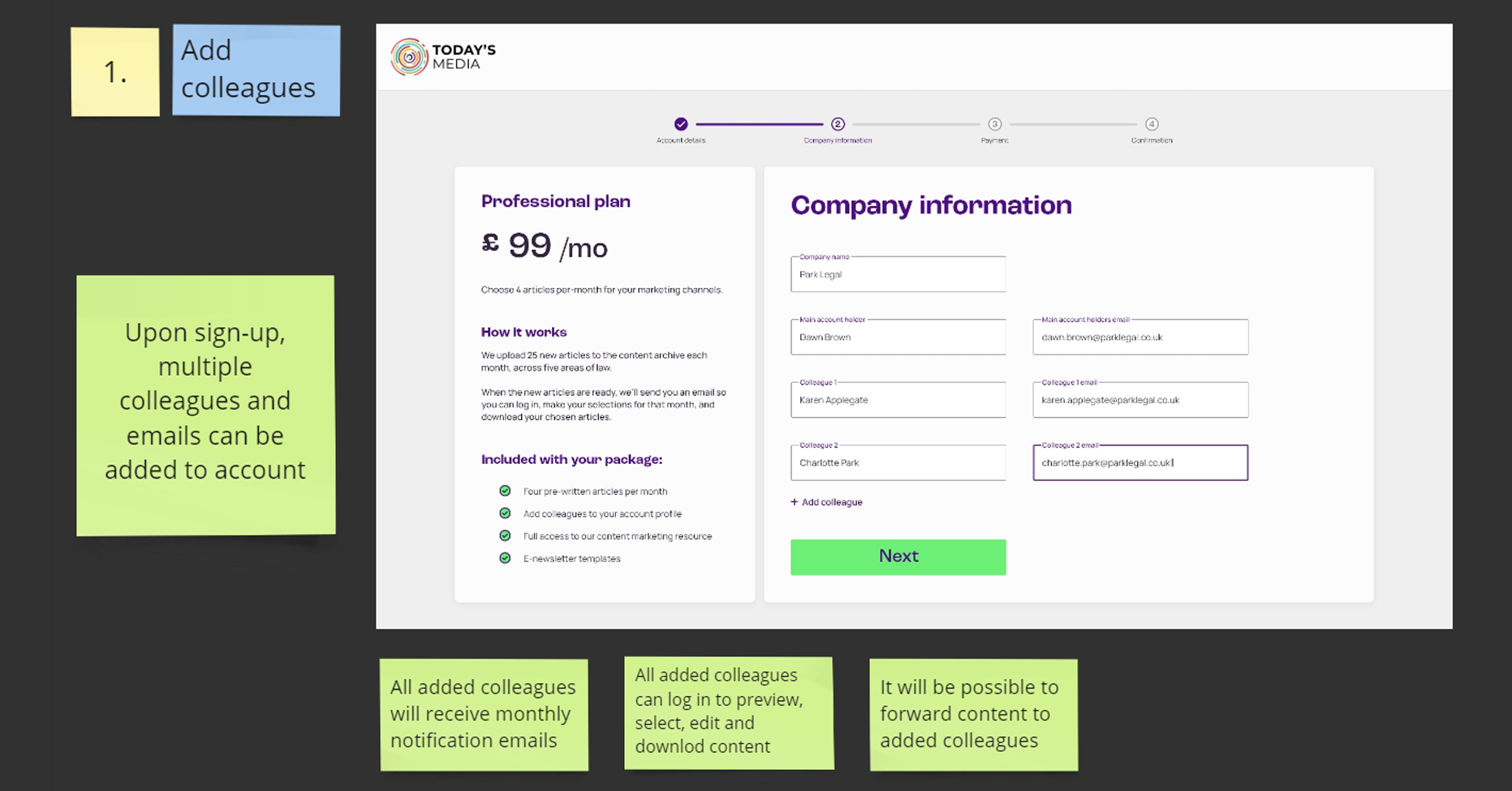
Option to add colleagues so multiple departments can login, select articles, and use content.
More details
This flow is for a paid tier. The free tier requires a different flow without the payment details page.
I aimed to keep the number of fields as low as possible to increase completed sign-ups. It may be that Today’s Media would also like some more information about the firm, i.e. what kind of firm they are, how big, and what areas of law they cover. This would increase the number of clicks to subscribe but the information may be useful for future insights.
Validation rules not shown here.
Registration flow clip
Article selection flow
Objective
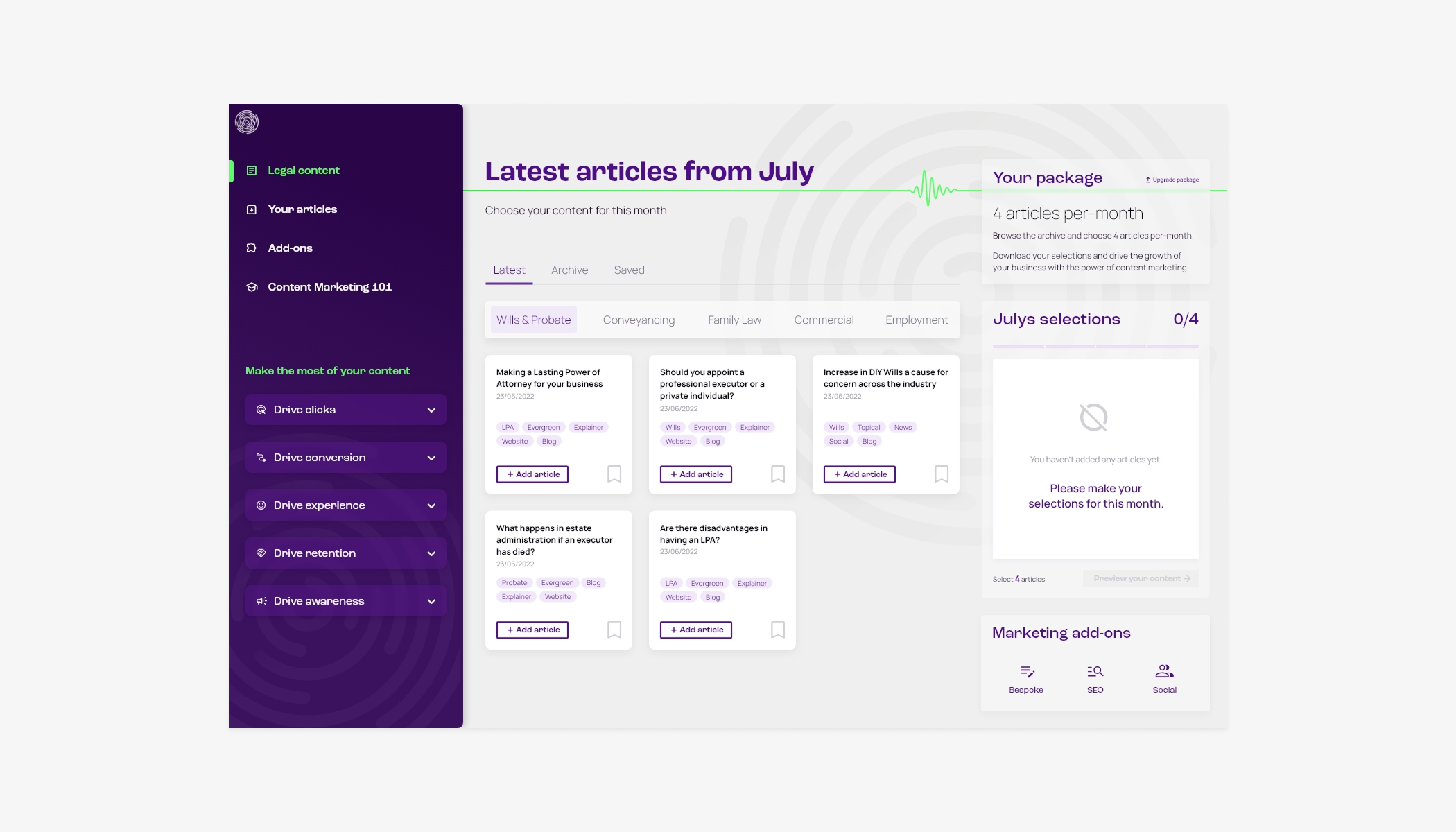
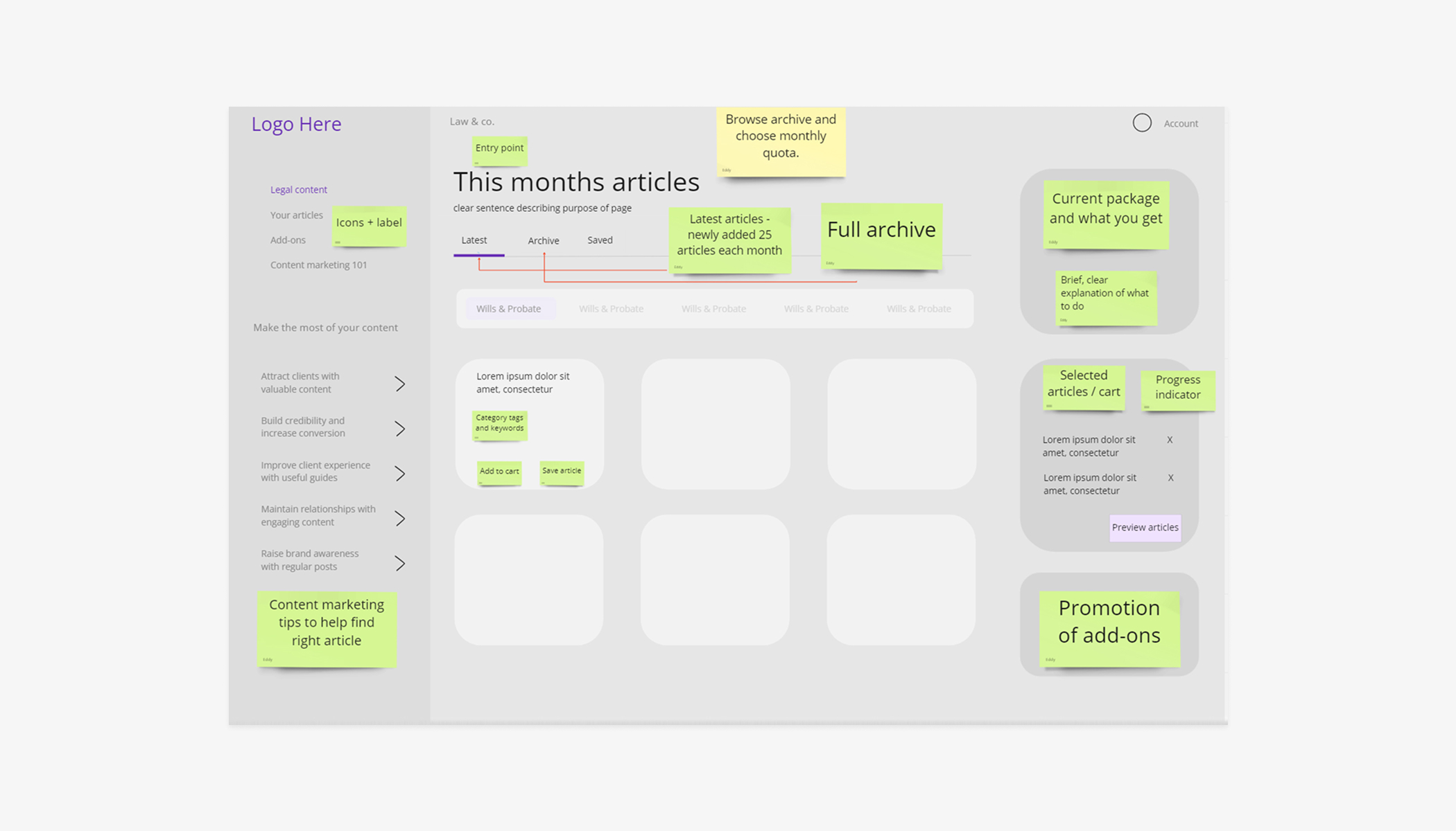
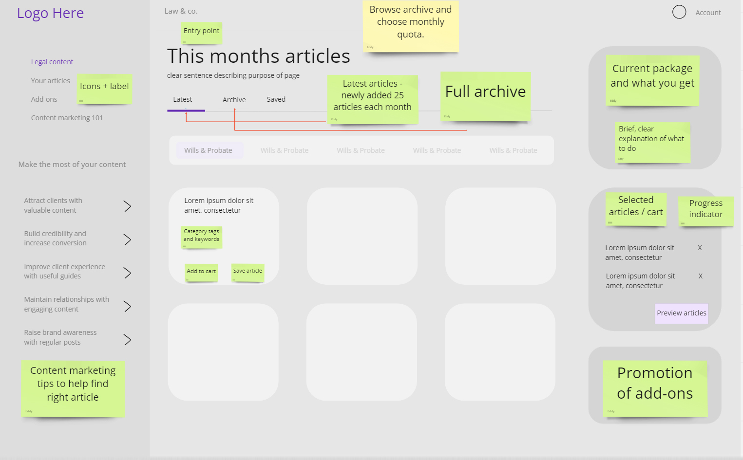
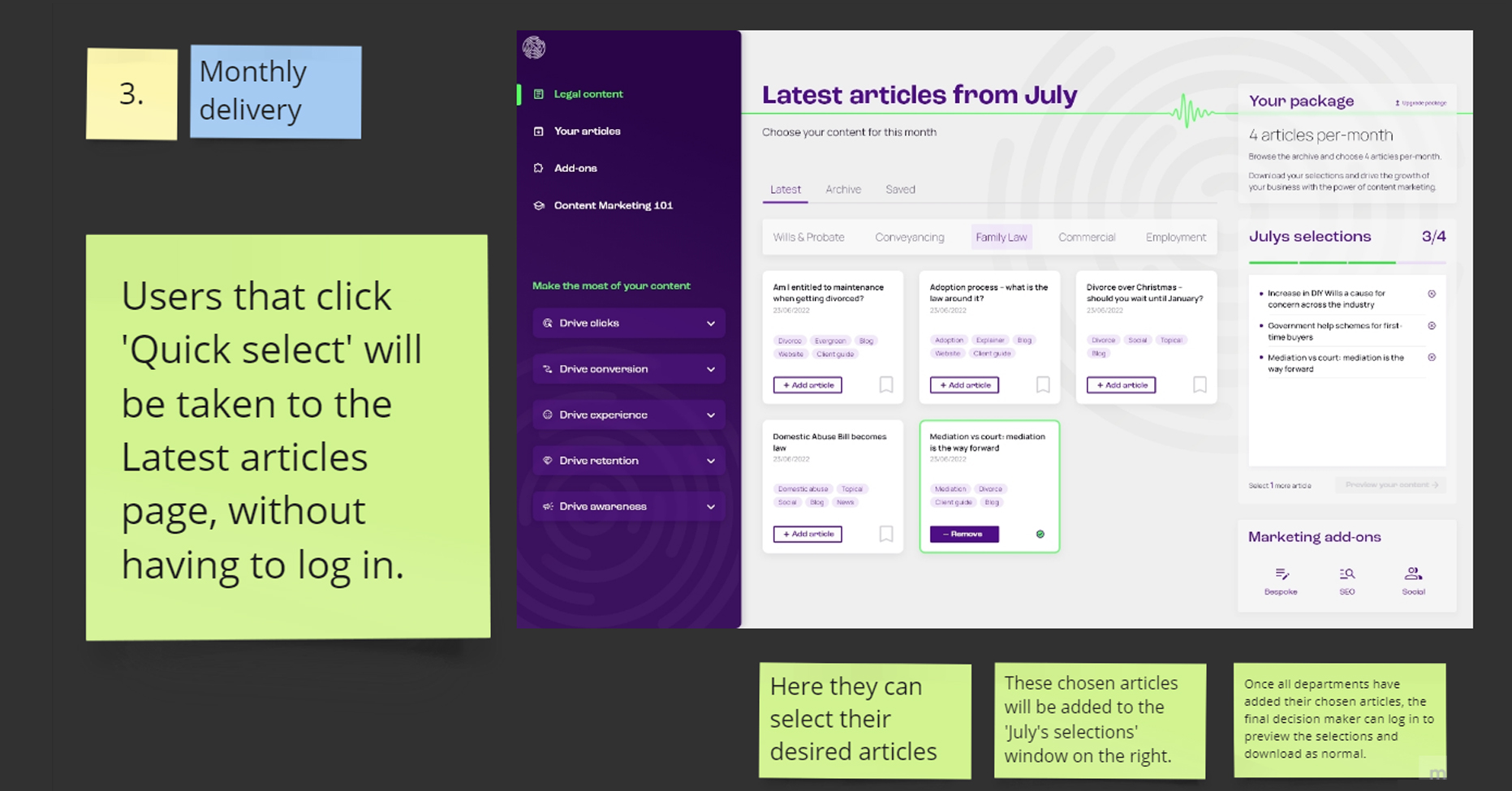
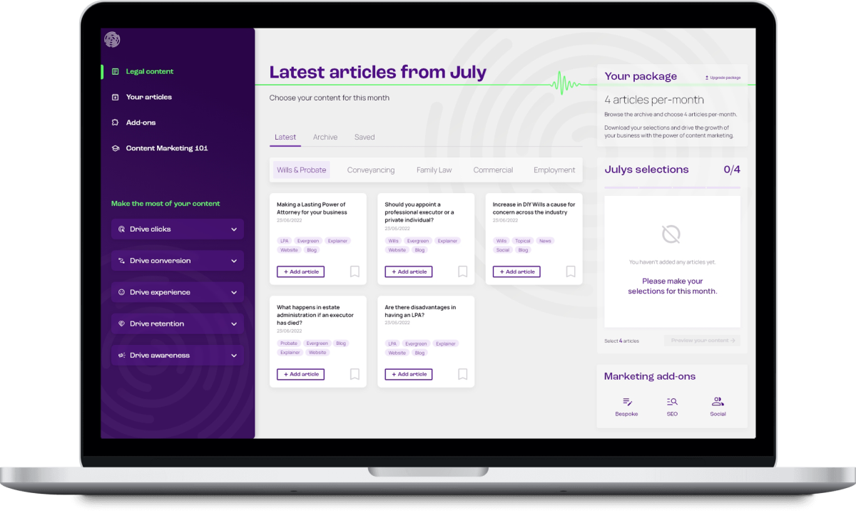
Preview the latest added articles – 25 added each month as per brief.
User lands on page with latest new articles, and can navigate to the full archive in top menu.
User browses content and makes choices for each month, adding articles until monthly package quota met.
Article selection clip
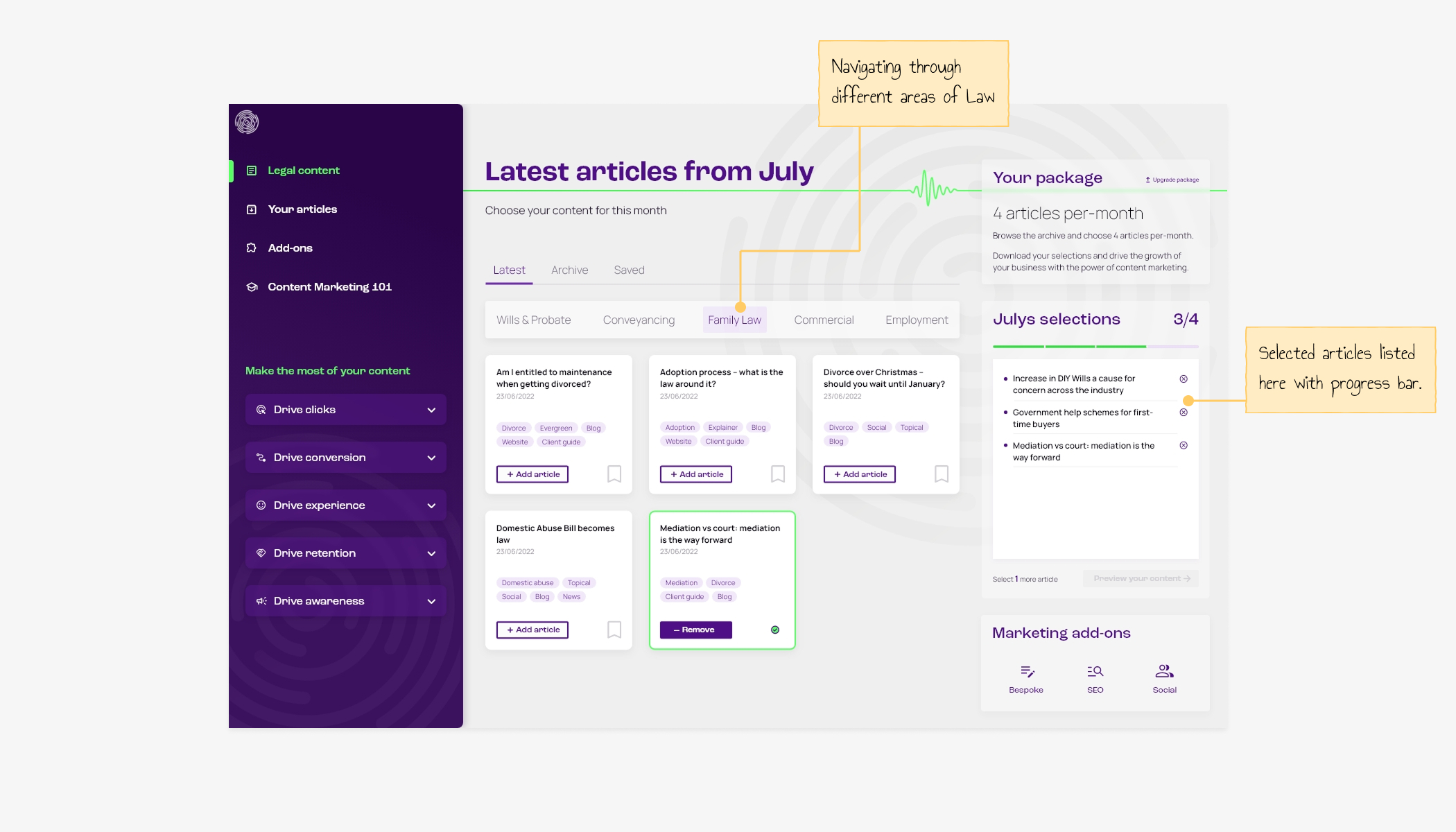
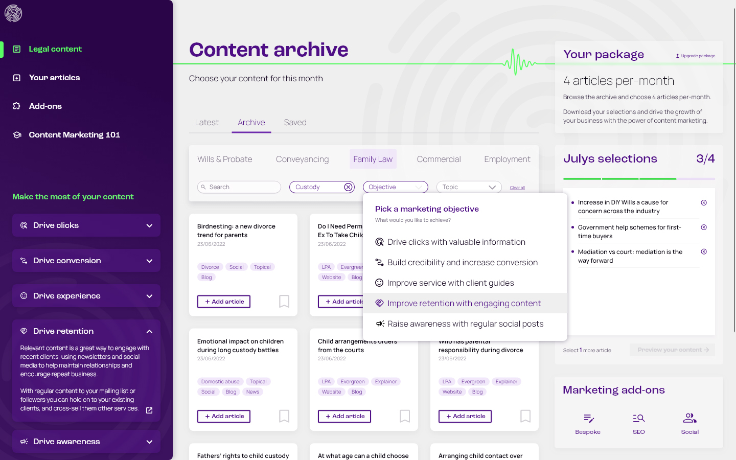
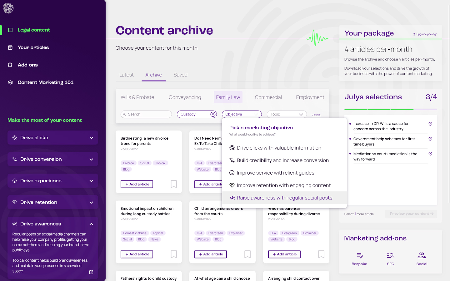
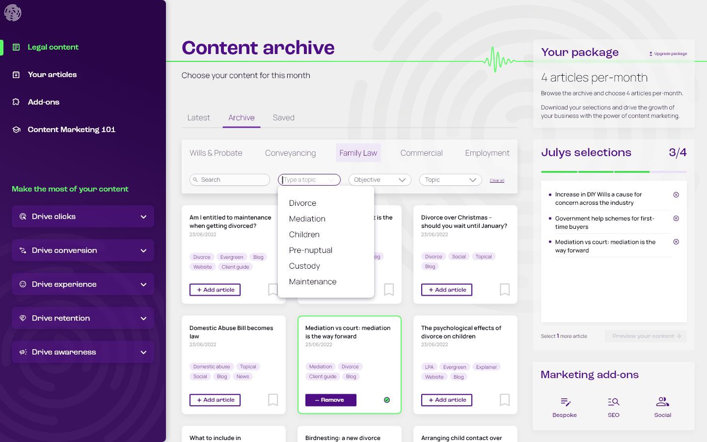
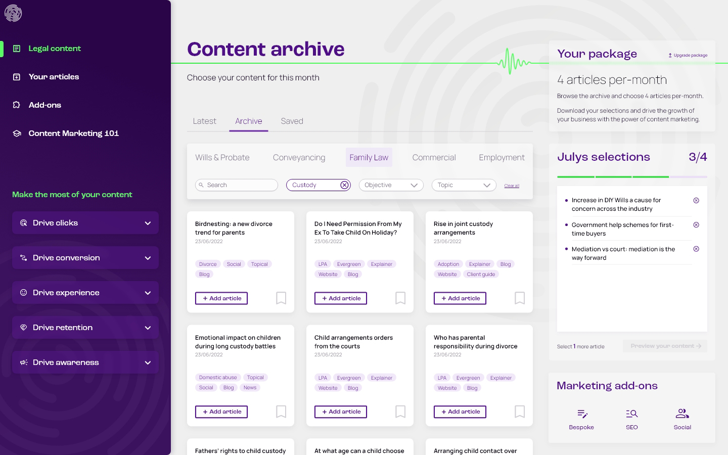
Using the filters to search the full archive
The big idea – DIY marketeers
The design aims to support DIY marketeers, helping educate them about different content marketing objectives, and allowing them to search for articles that can be used for those objectives – goal led design.
This flow demonstrates the sidebar tips and search filters that support this concept
Use-case example
A law firm has recently received a number of website enquires from fathers about child custody following divorce, but found that none of them were converting. They want to find useful articles around this topic for their website, that explain more about parents rights. This may encourage these website visitors to hire their services.
Preview and edit articles
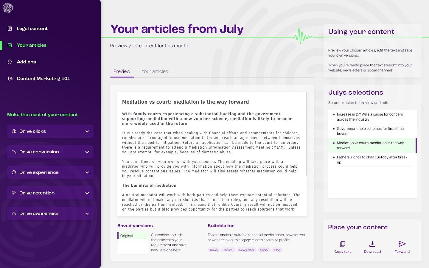
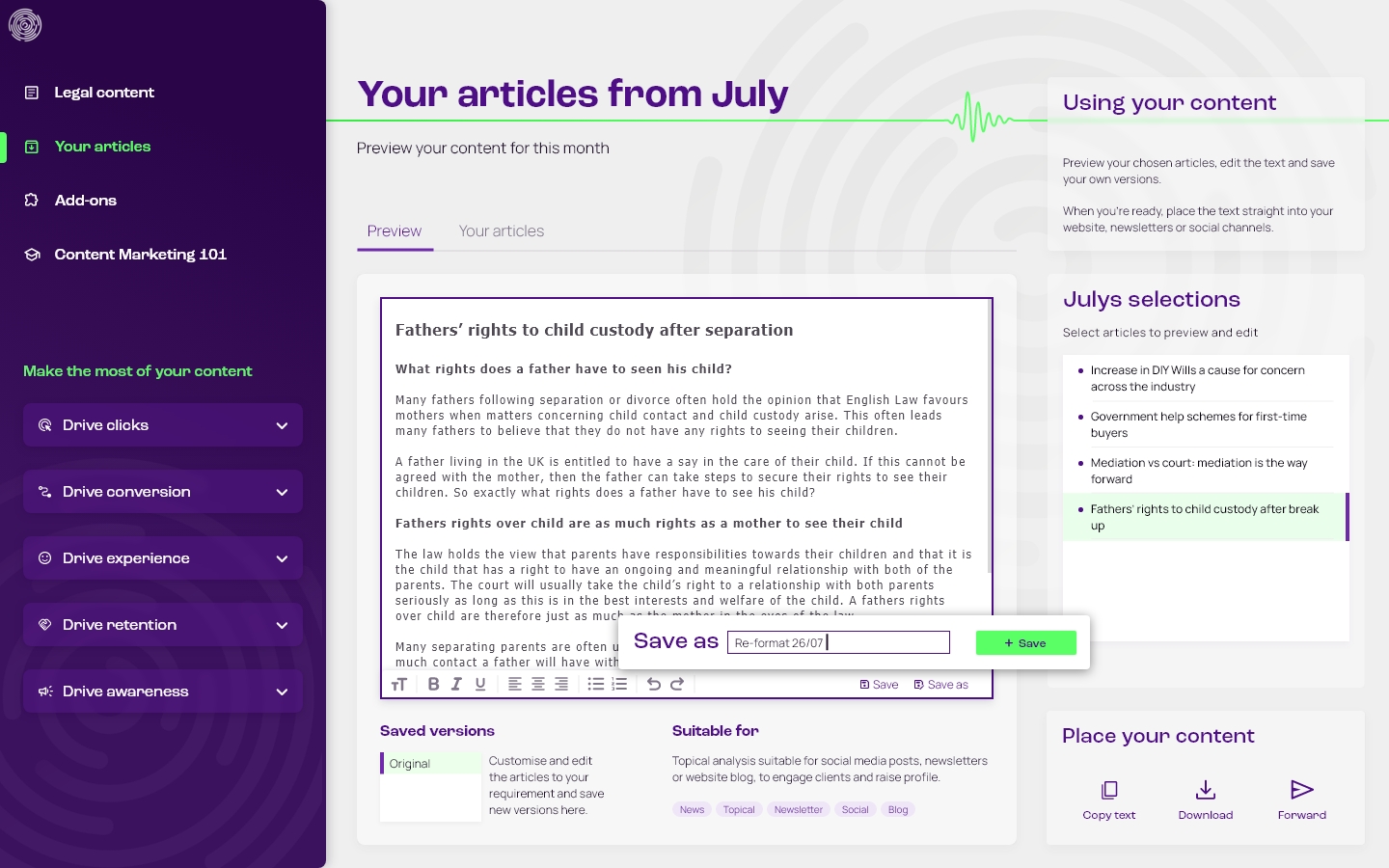
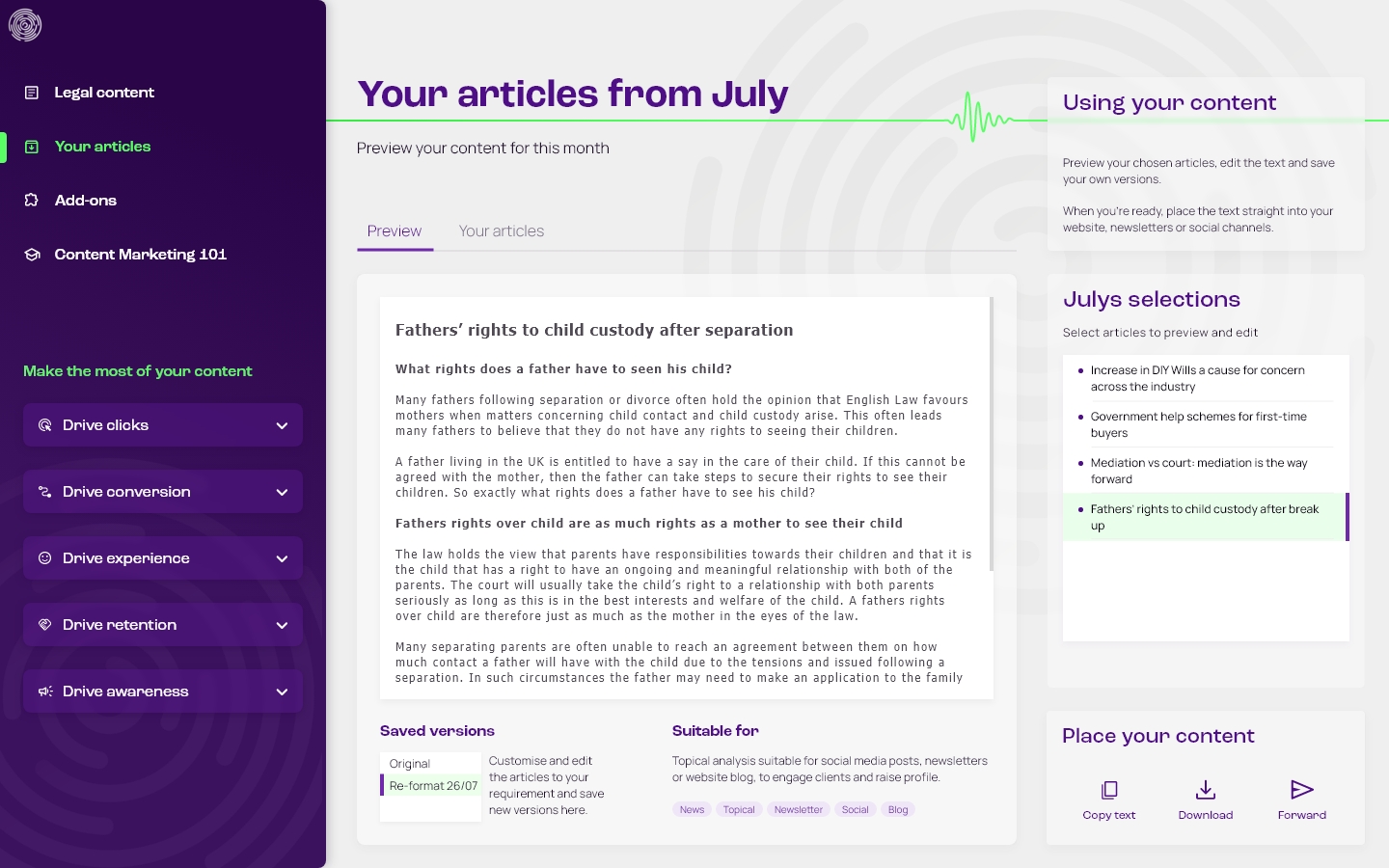
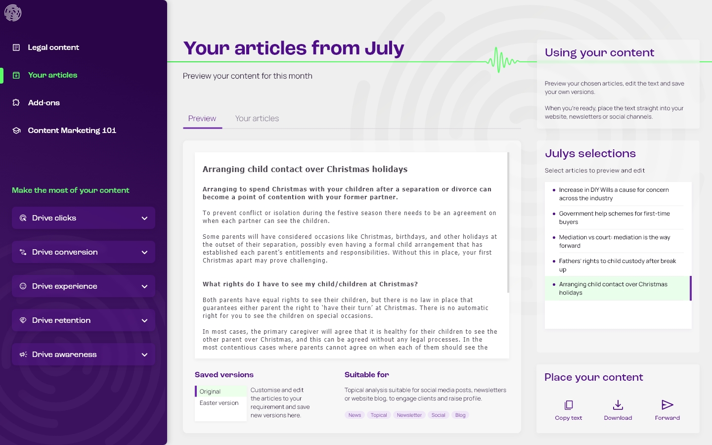
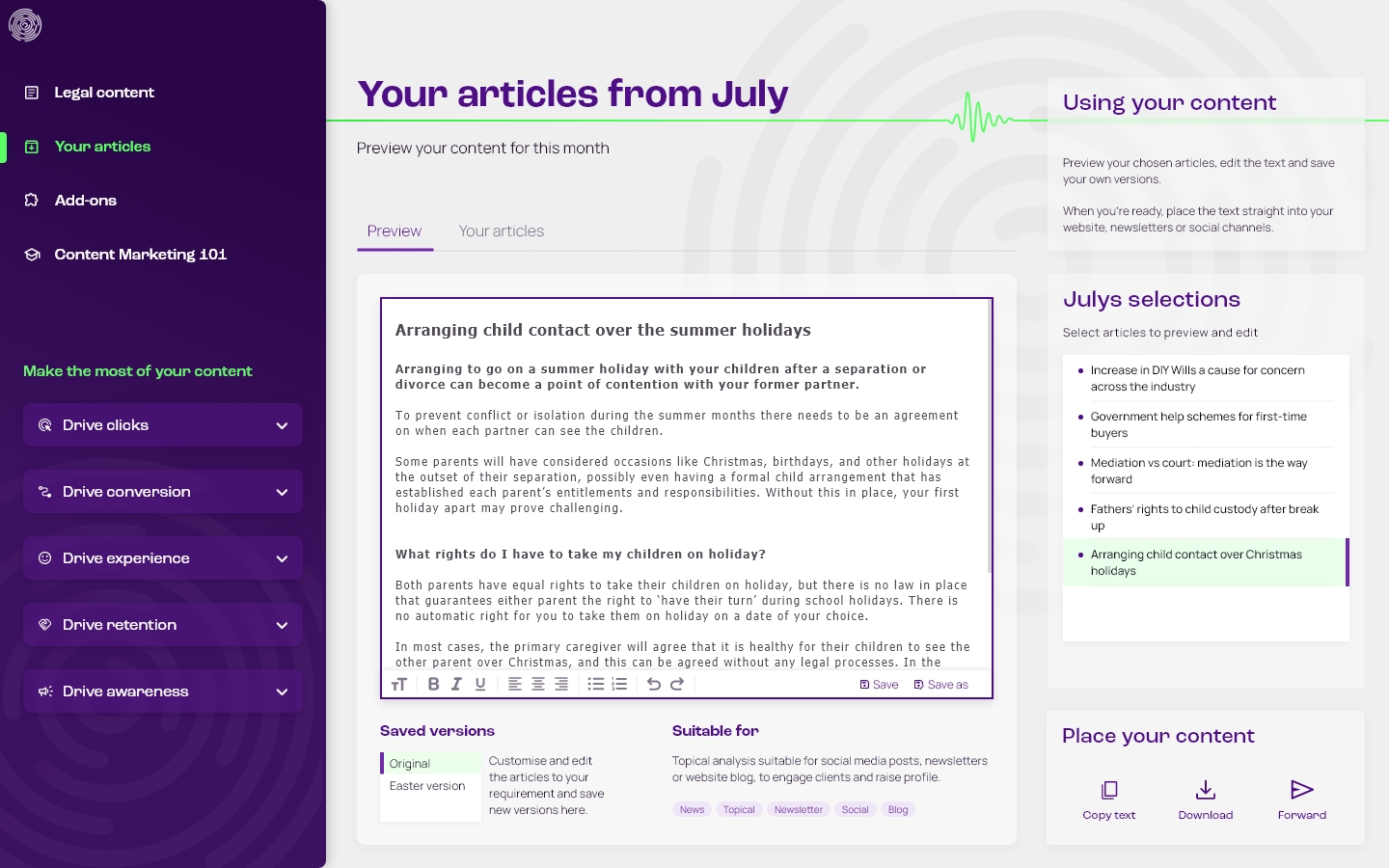
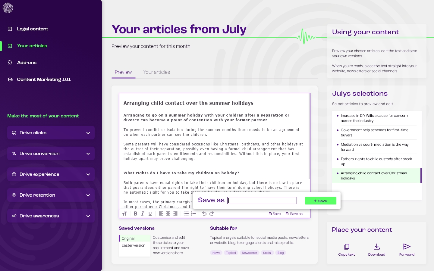
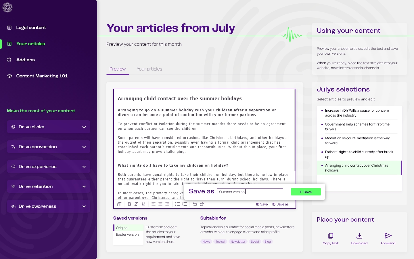
Once the content quota for each month has been chosen, users can preview and edit the articles, and save their own new versions.
Browse article history and re-purpose
Subscribers can access all of their previously downloaded articles.
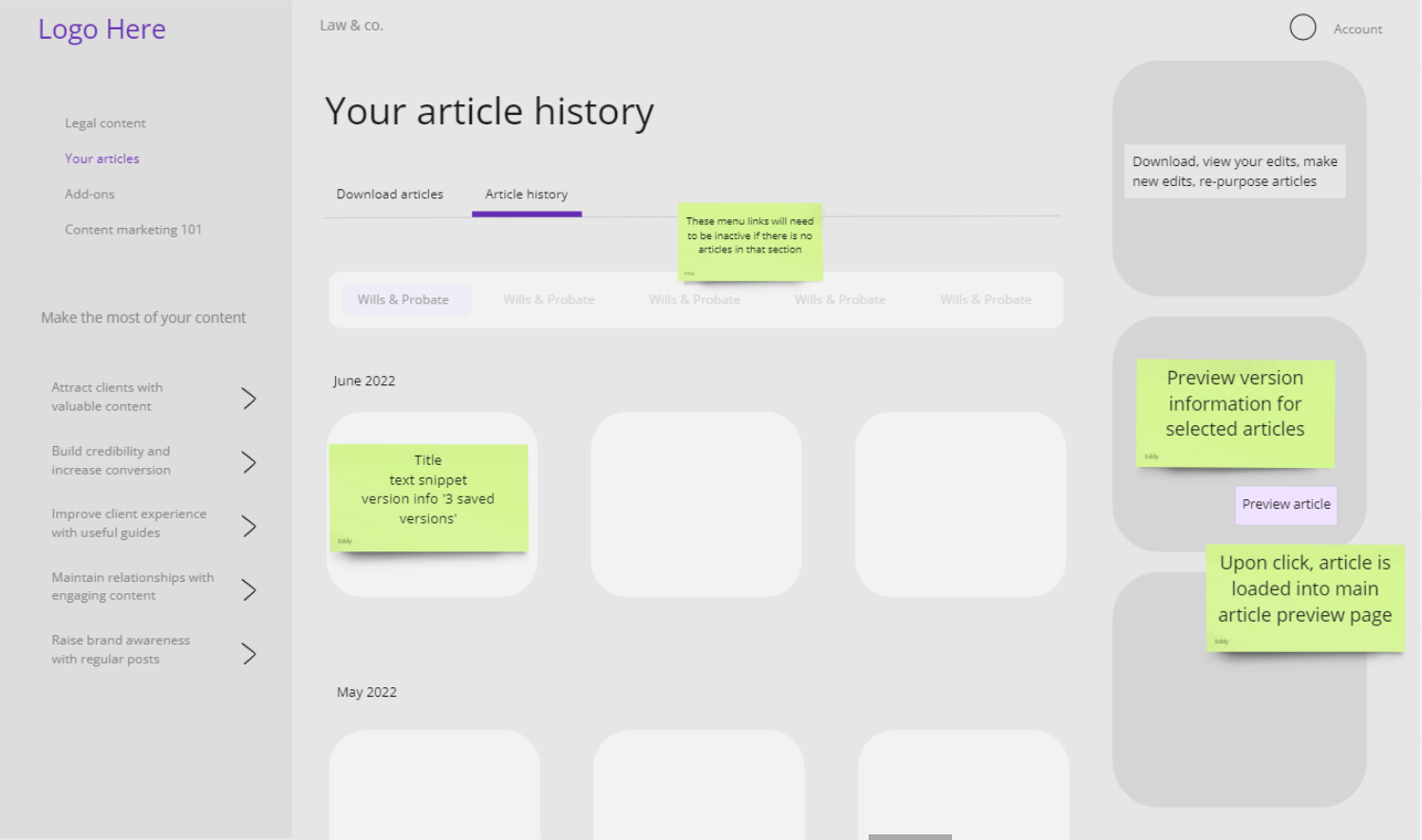
Lawyers can re-purpose and re-use old articles to maximise value. Typically, these would be MS Word docs stored in a folder somewhere. The design enables them to easily re-access their article history, and save new versions to re-purpose.
An example described in the user interview used an article about child contact over the Christmas holidays, and re-used it for the summer holidays.
This flow shows how to find the article, load it up into the preview page, make changes and save as new version.
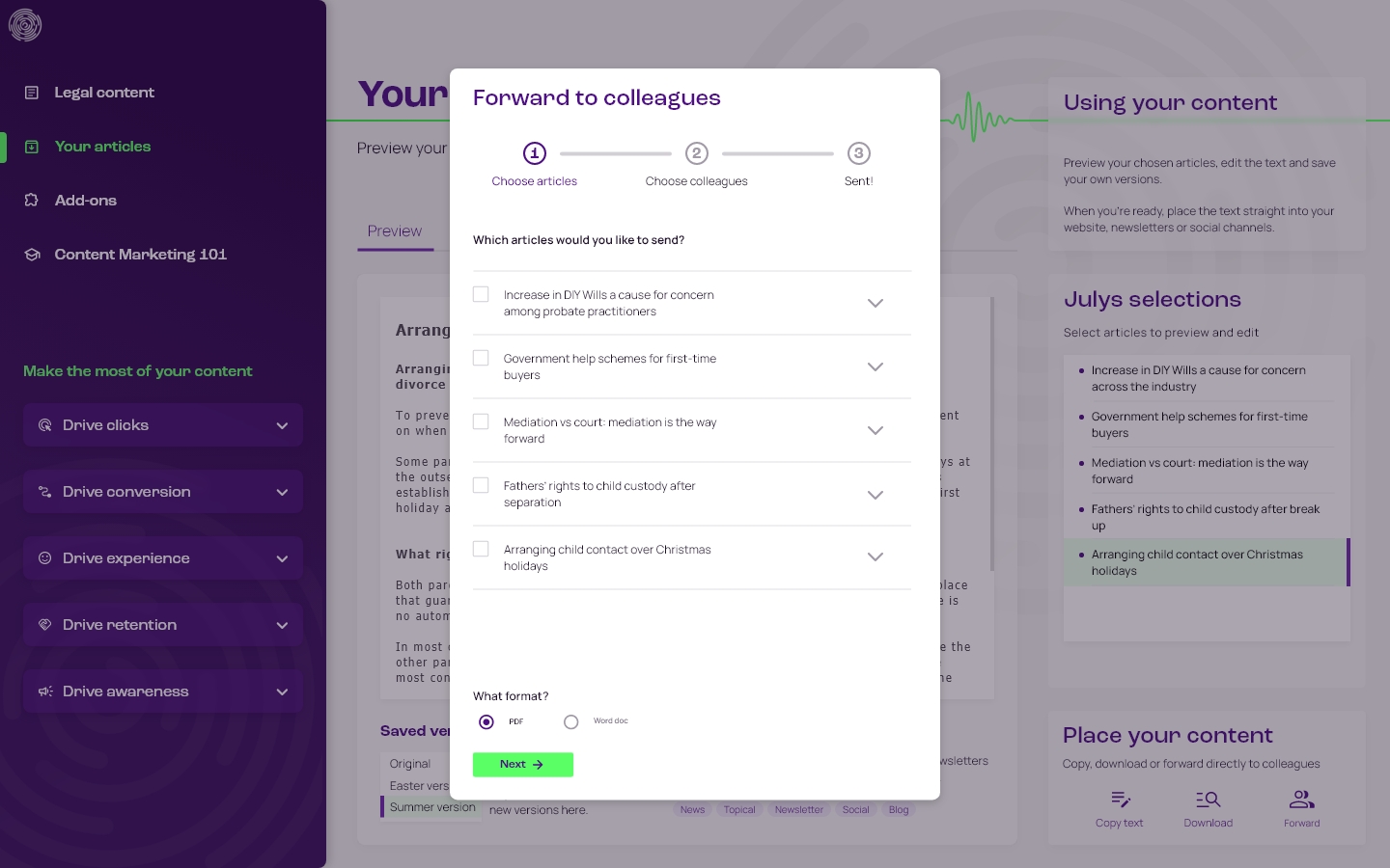
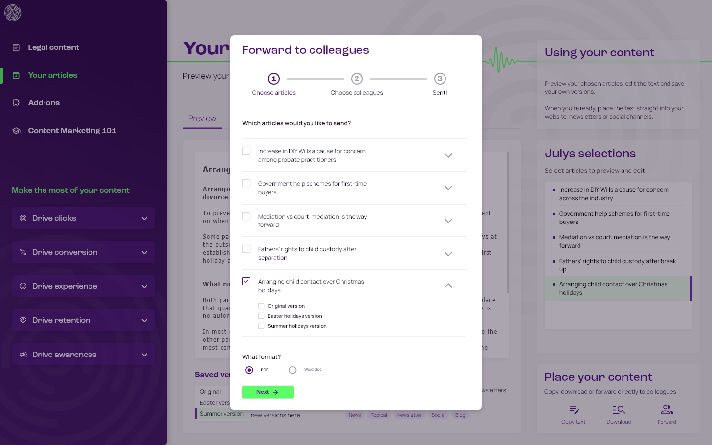
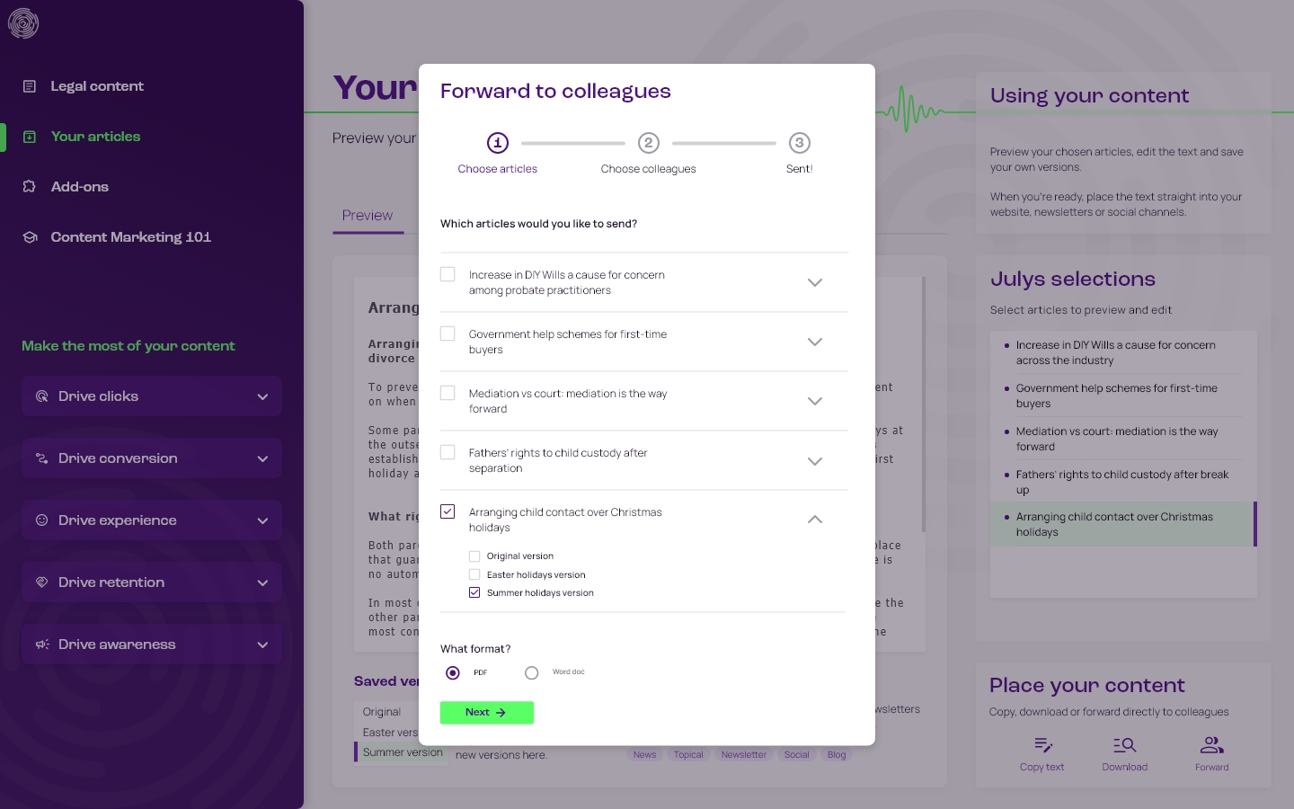
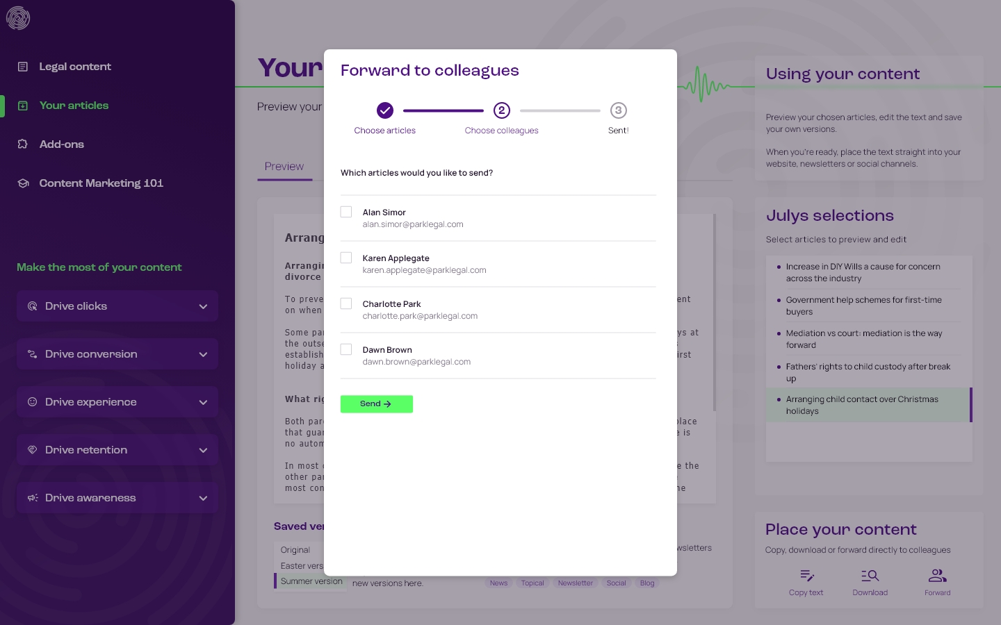
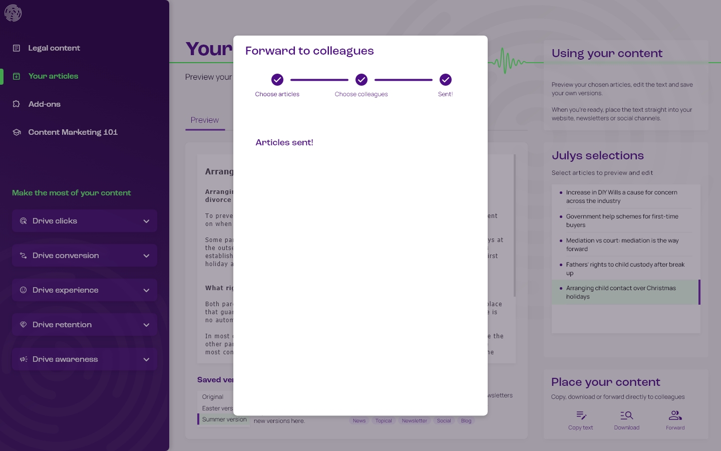
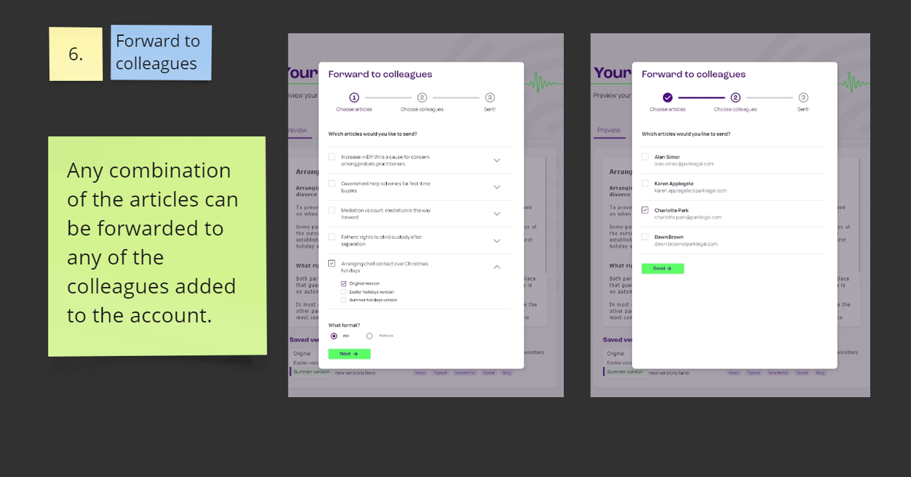
Forward articles to colleagues
With no dedicated marketing manager to oversee the process, being able to forward articles to colleagues makes the process of distributing the content easier.
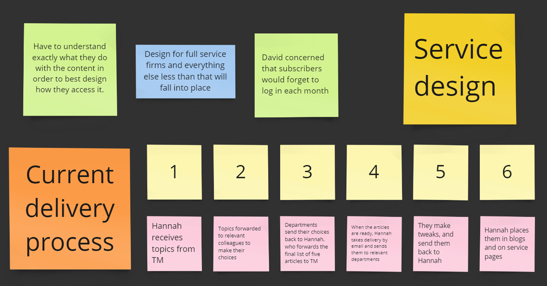
Monthly content delivery
A key objective of the design was devising a monthly delivery process that fits in with the day-to-day operations of busy law firms, with no dedicated marketing manager to oversee the article selection between departments. Research and solution via automated emails outlined below.
