Photography portfolio
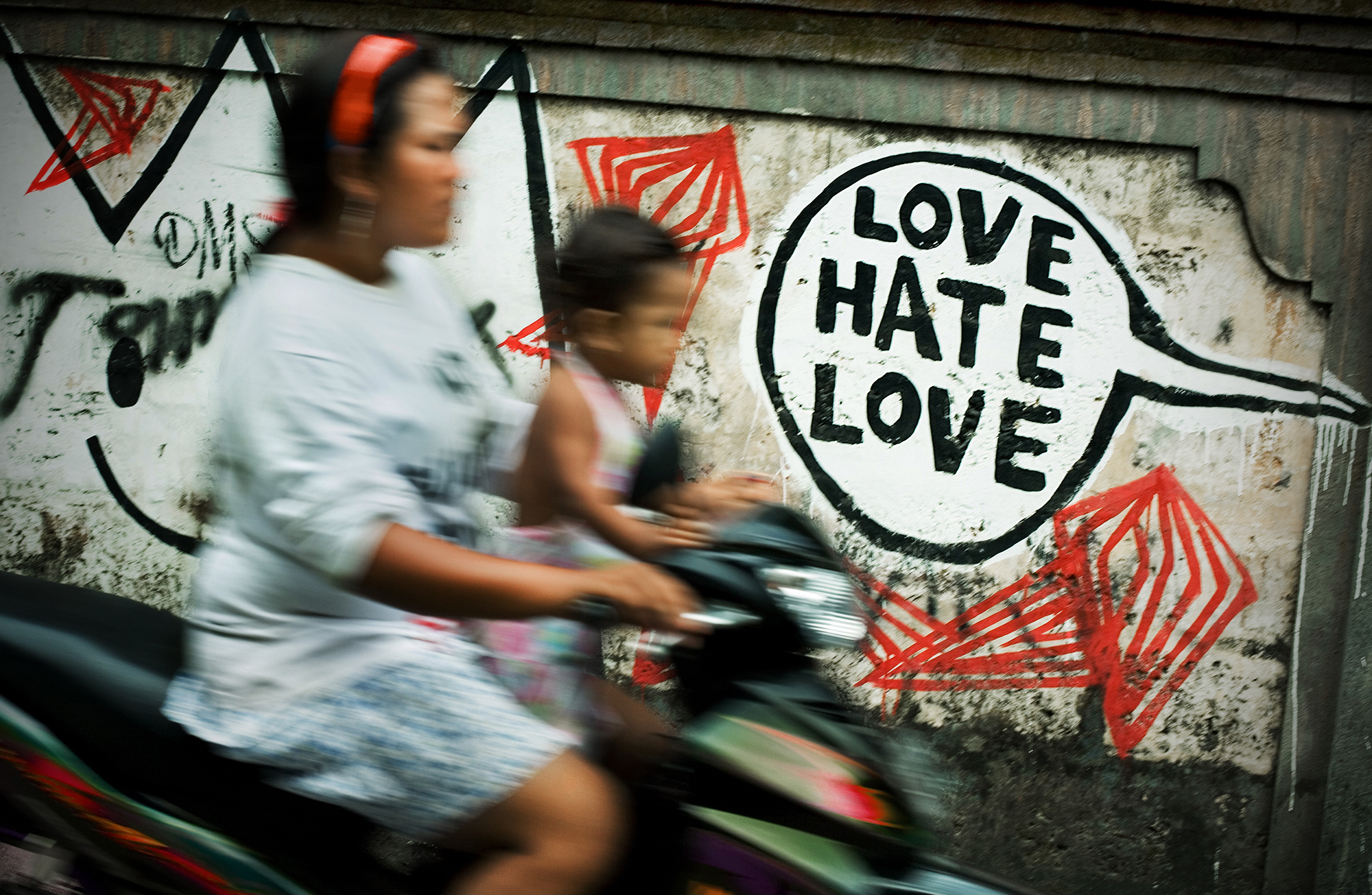
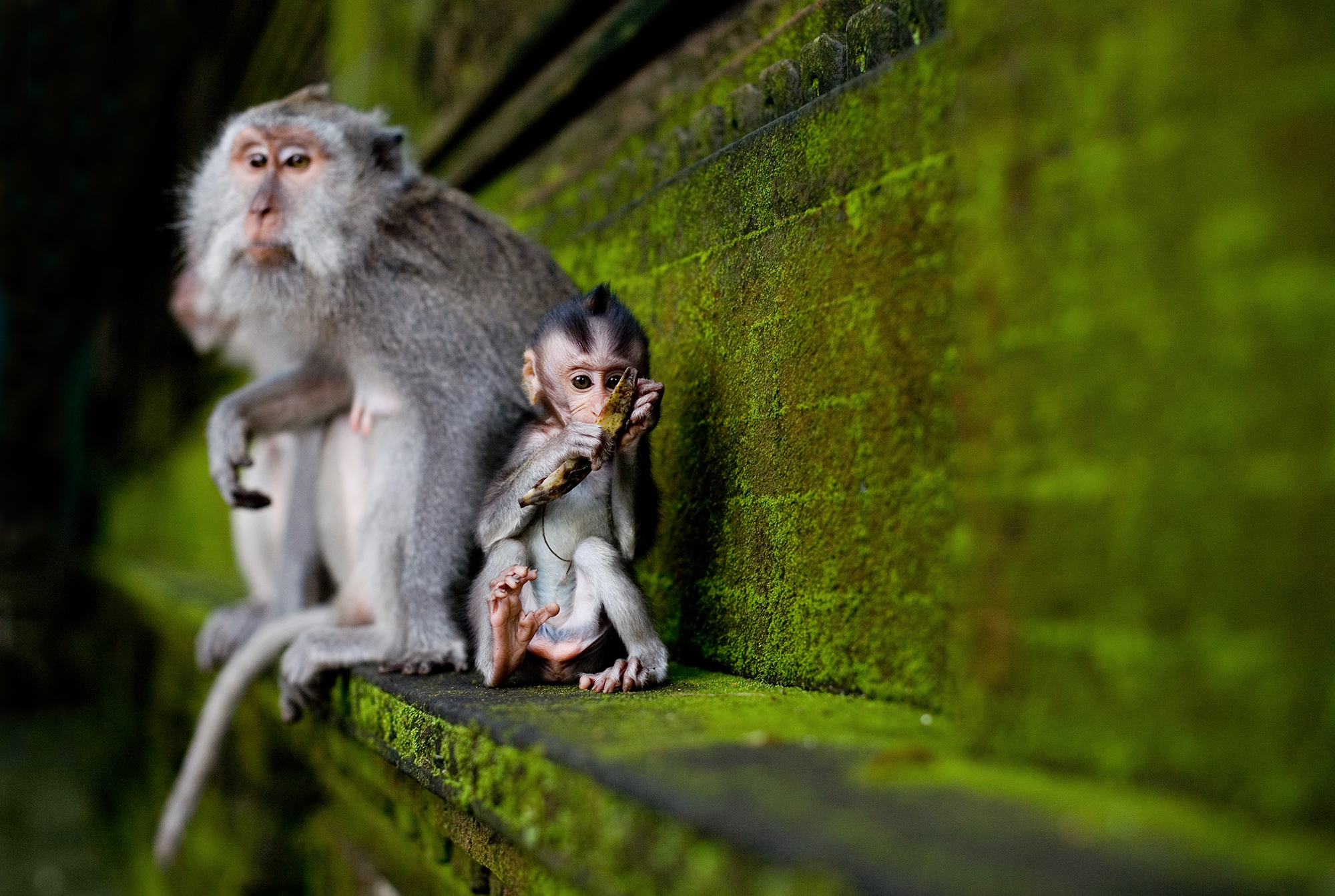
I became interested in photography as a hobby around 2006, initially street photography and photo journalism. I liked the Magnum agency, and their style of photography. Henri Cartier-Bresson and his ‘decisive moment’. I liked reportage and documentary photography that tells a story, and has a human element.
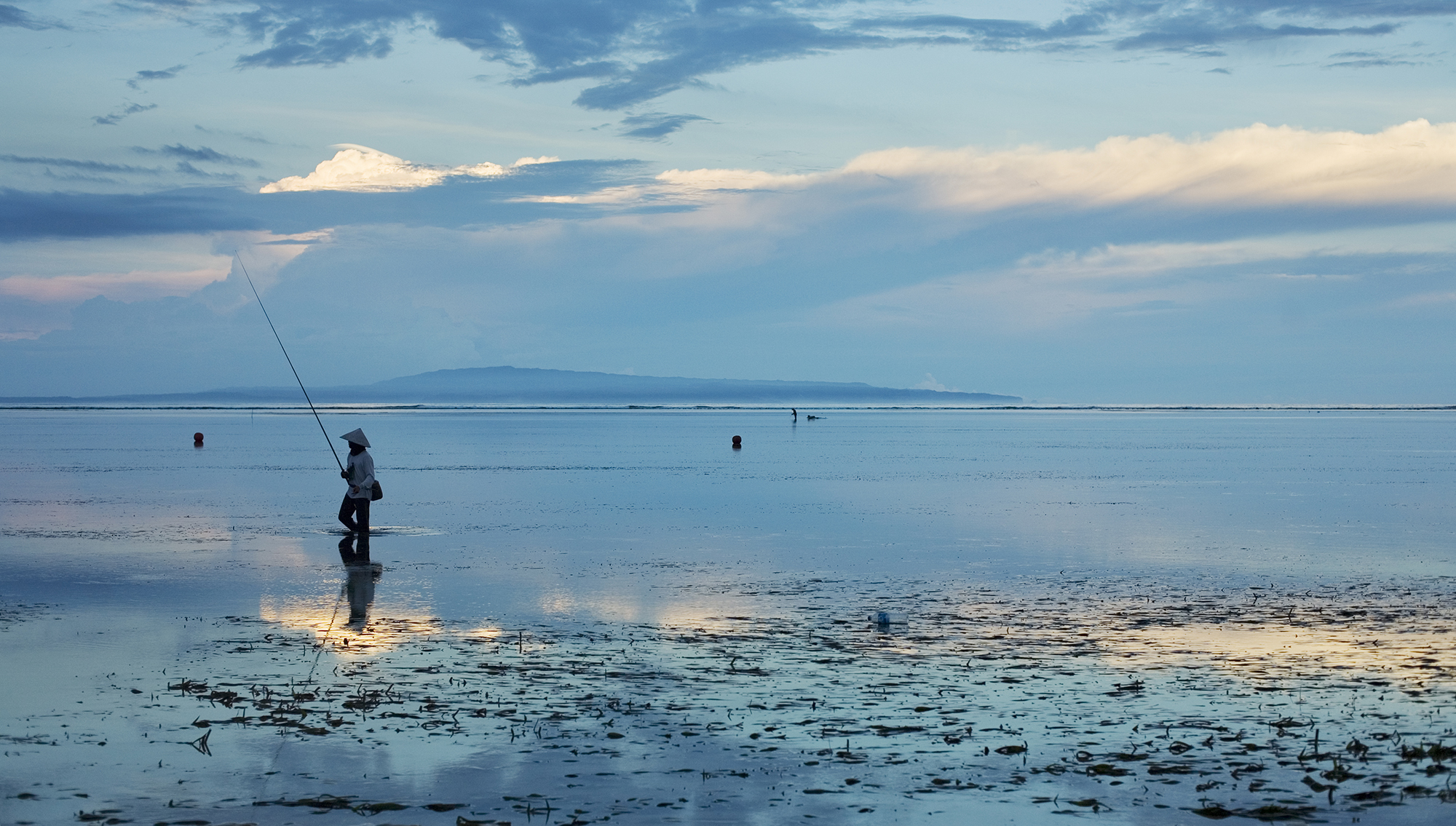
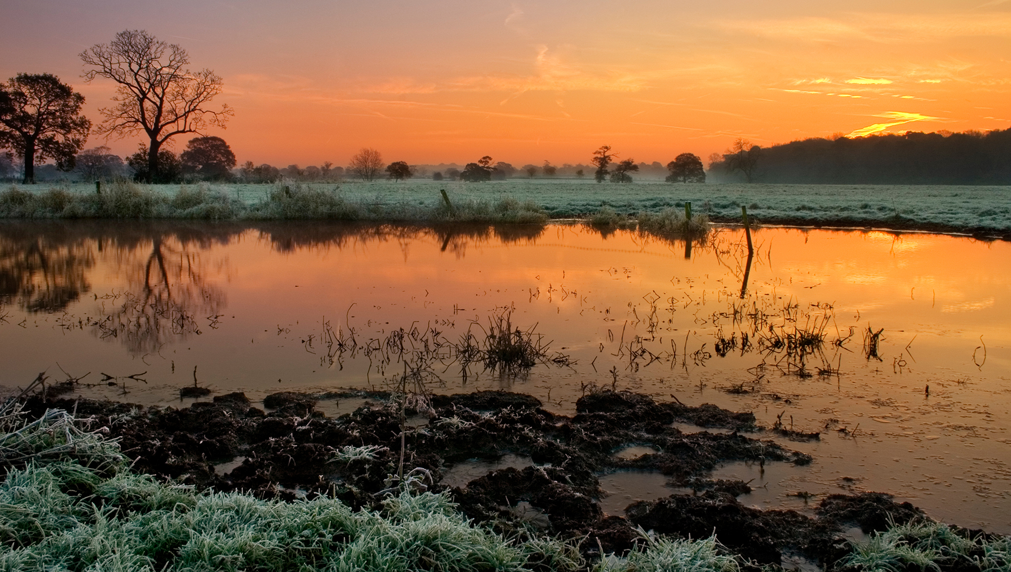
While a good landscape is a technical accomplishment – finding the right location and composition, waiting for the perfect light, and using the right settings to get the sharpest image and perfect exposure – I found it boring unless there was some kind of story or human element. To me, National Geographic has the best landscape photography, as there is always some kind of narrative around people and their relationship with the environment.
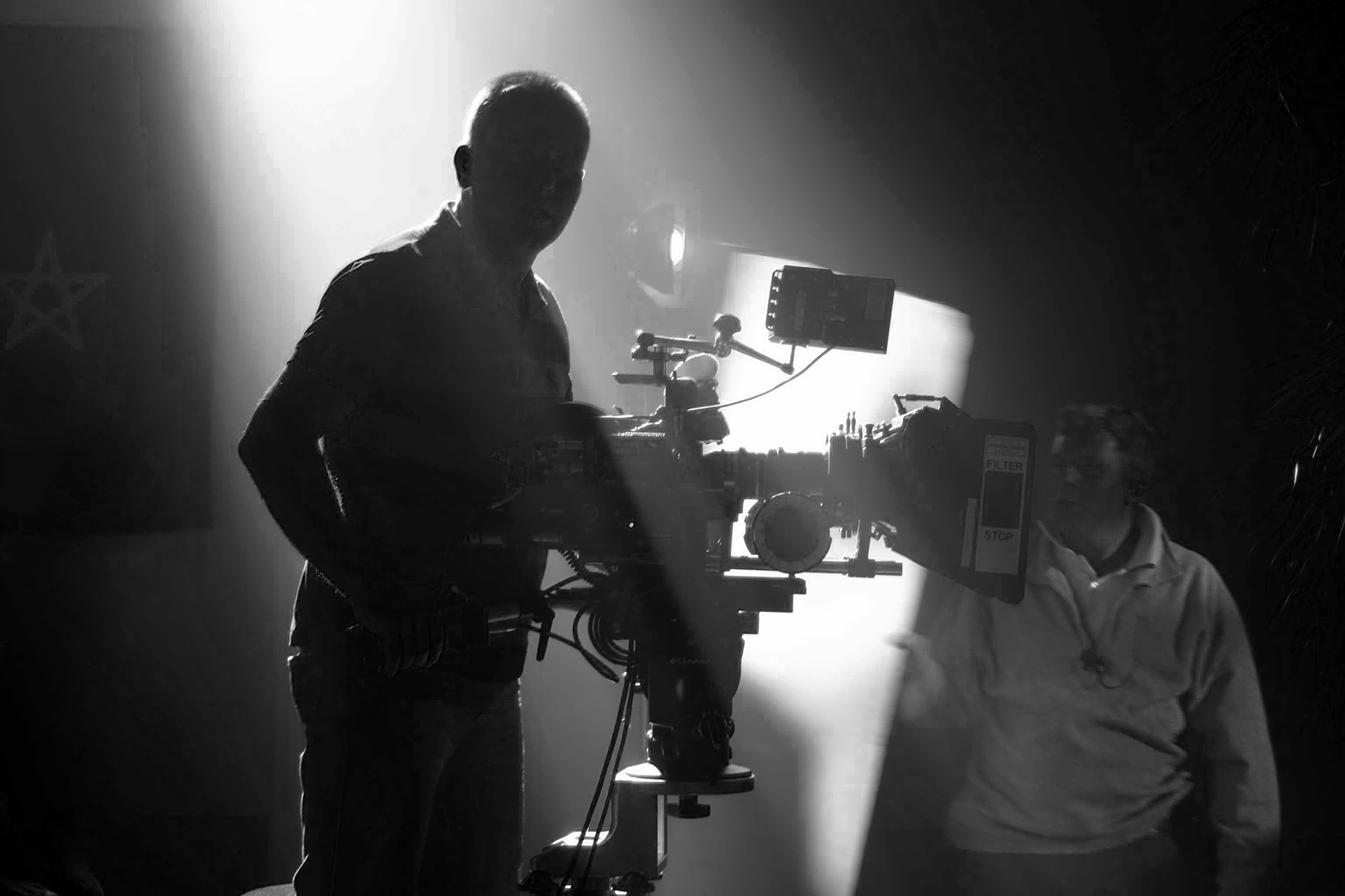
While working on drama productions I became very interested in lighting, and filmsets are a great place to learn about that. With my amateur interest in photography and experience on sets I ended up with a job in a portrait studio. It was very sales orientated so I soon left and fell into school photography. I reconciled the fact I was taking school shots when my interest was in photojournalism, by focusing on the human element. Capturing a character, with candid shots that tell a story about a person. And despite never intending to work as a school photographer, I became very interested in portraiture.

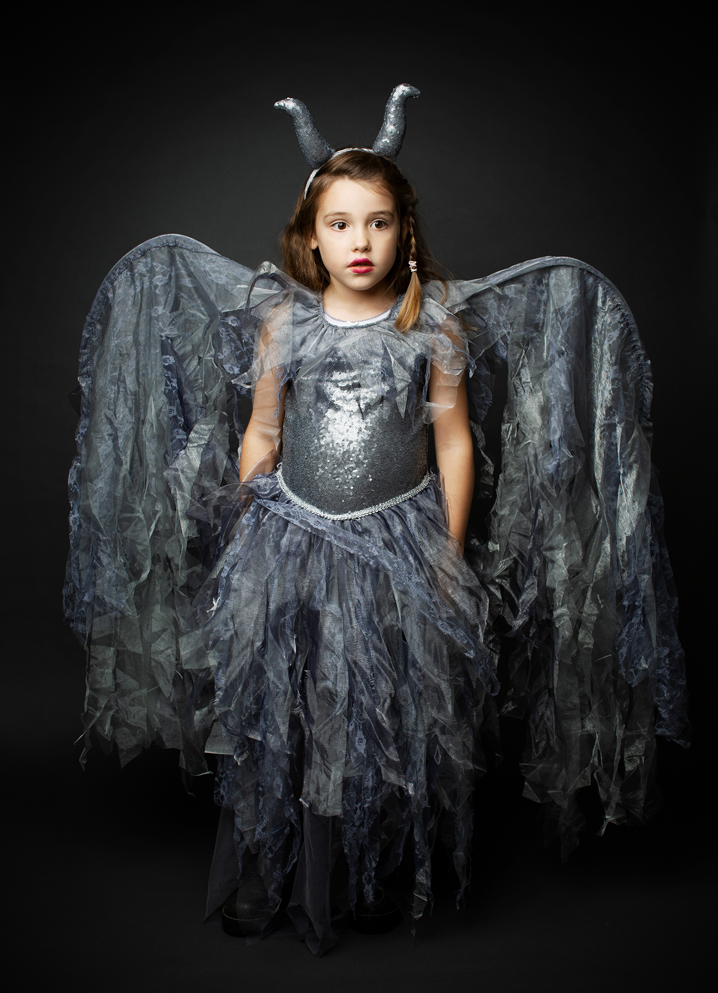
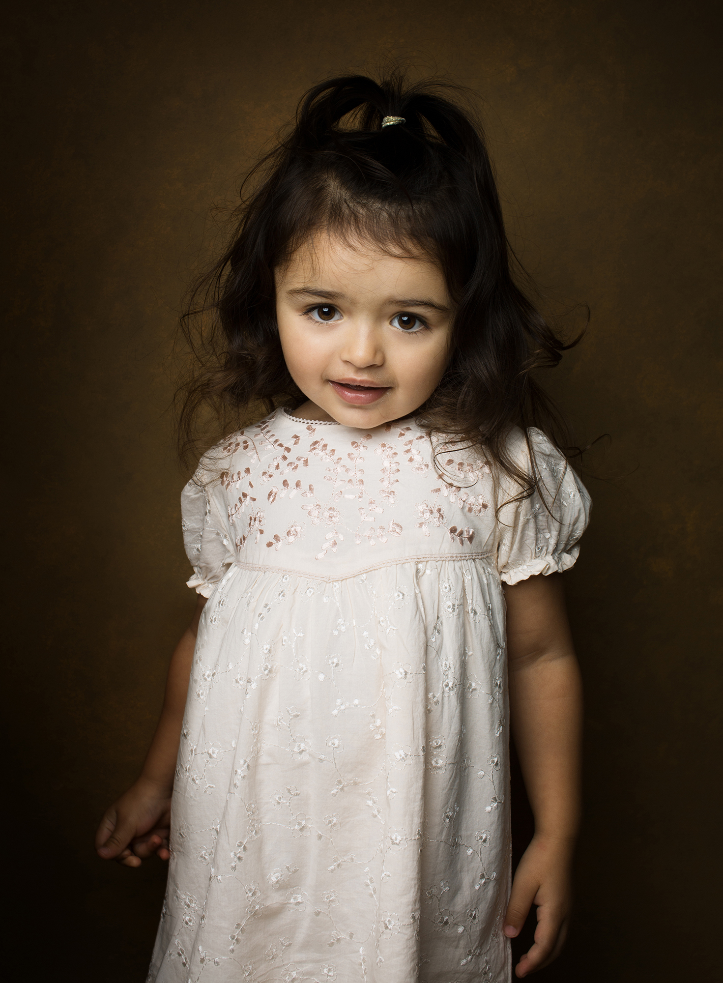
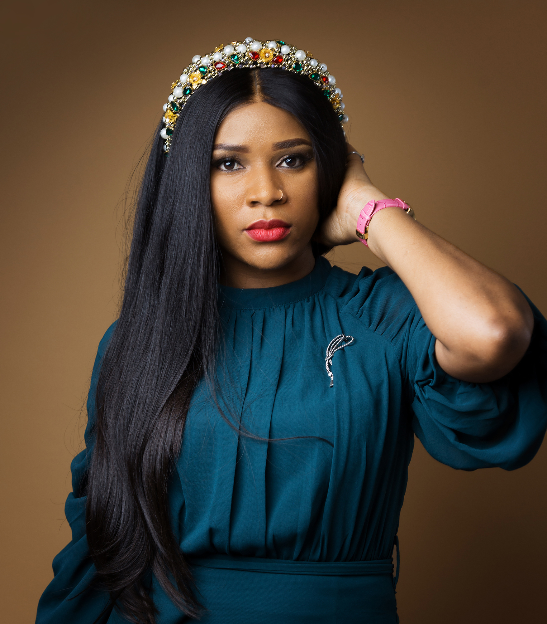
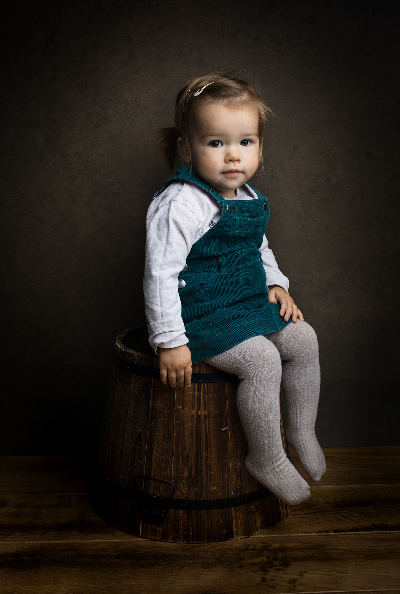
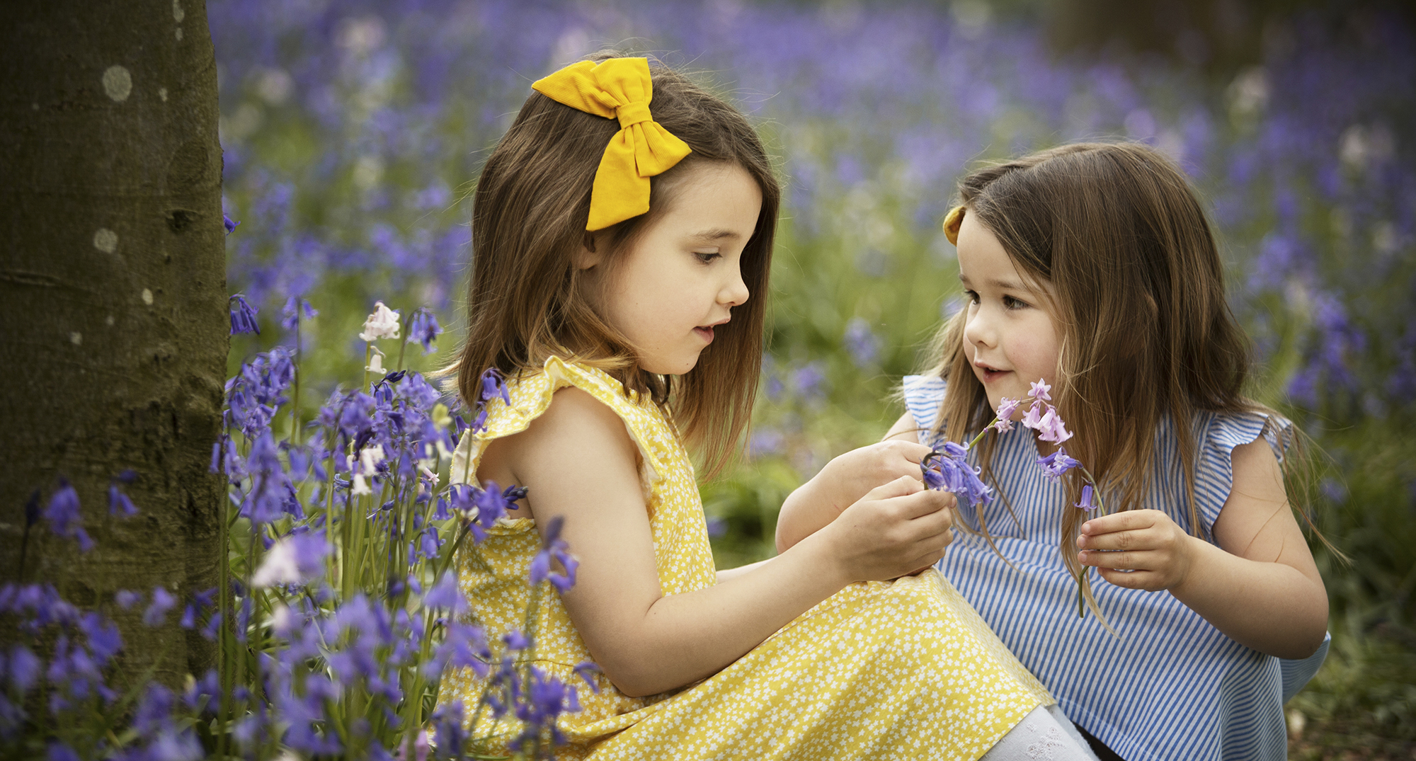
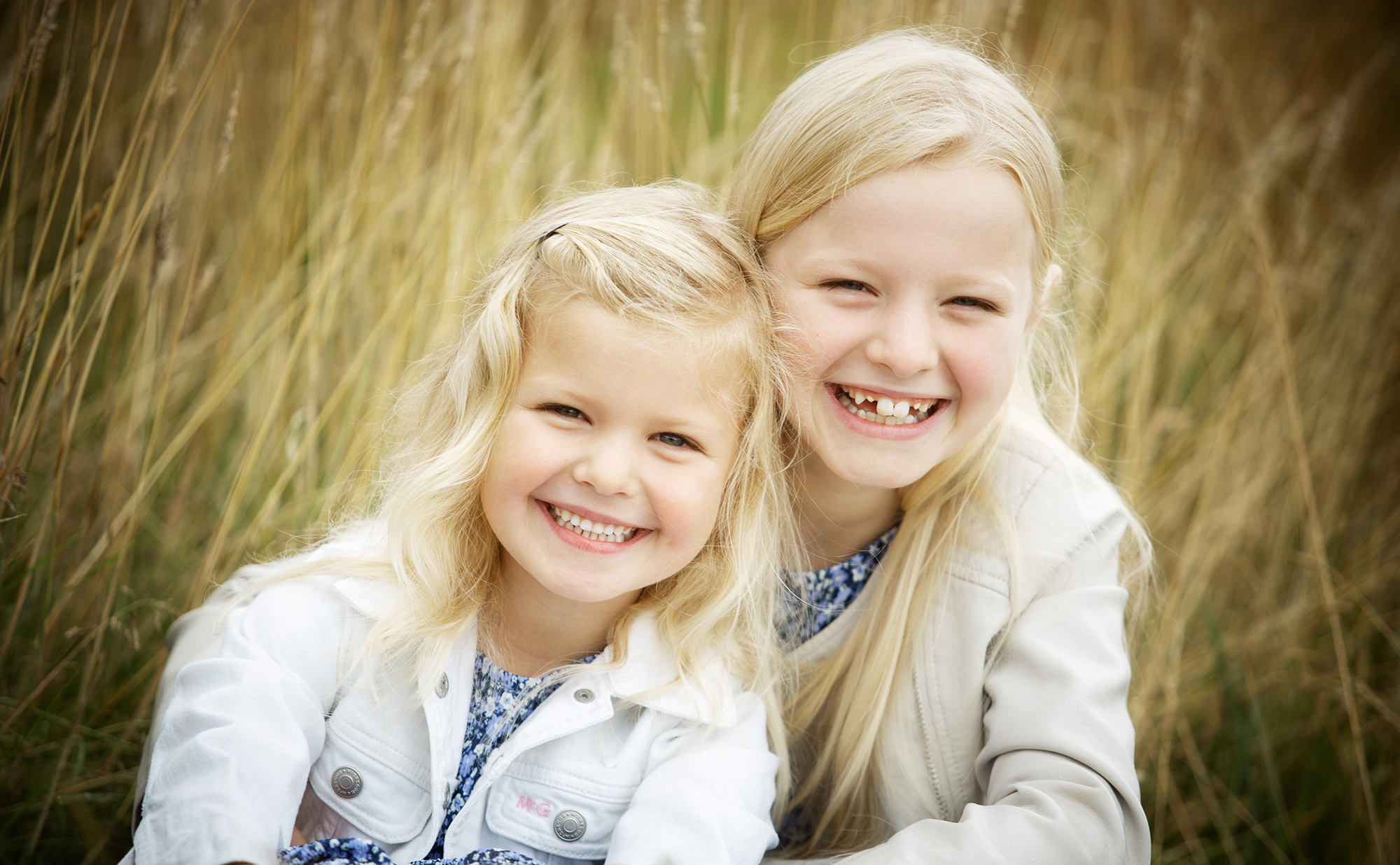
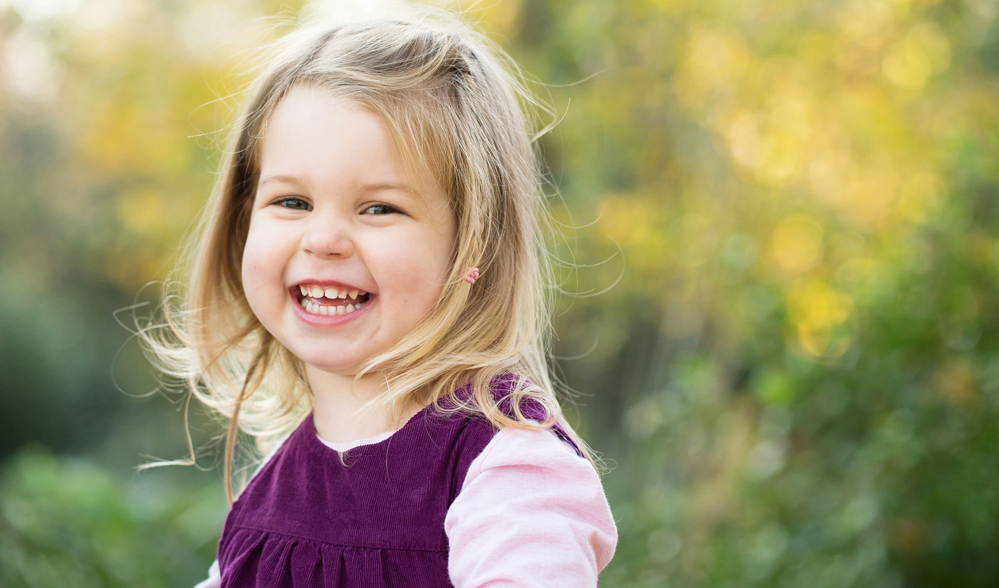
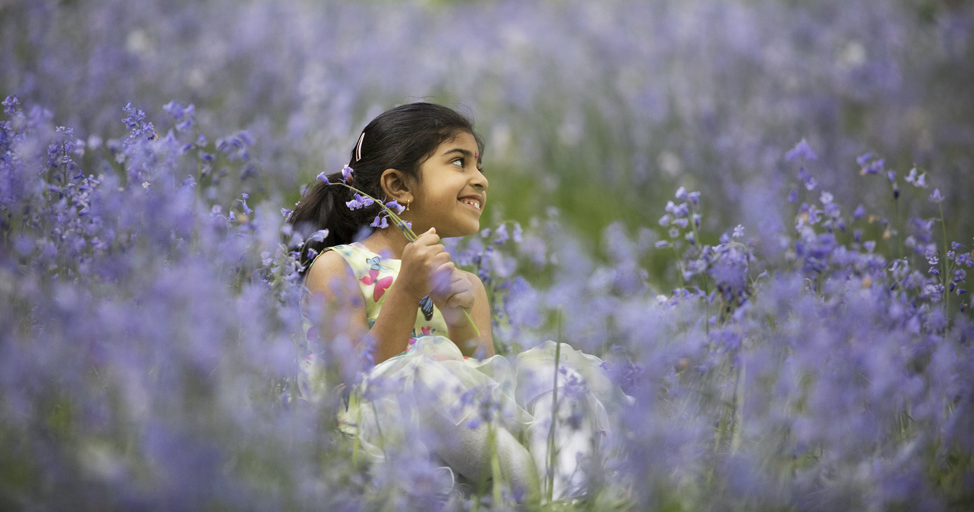
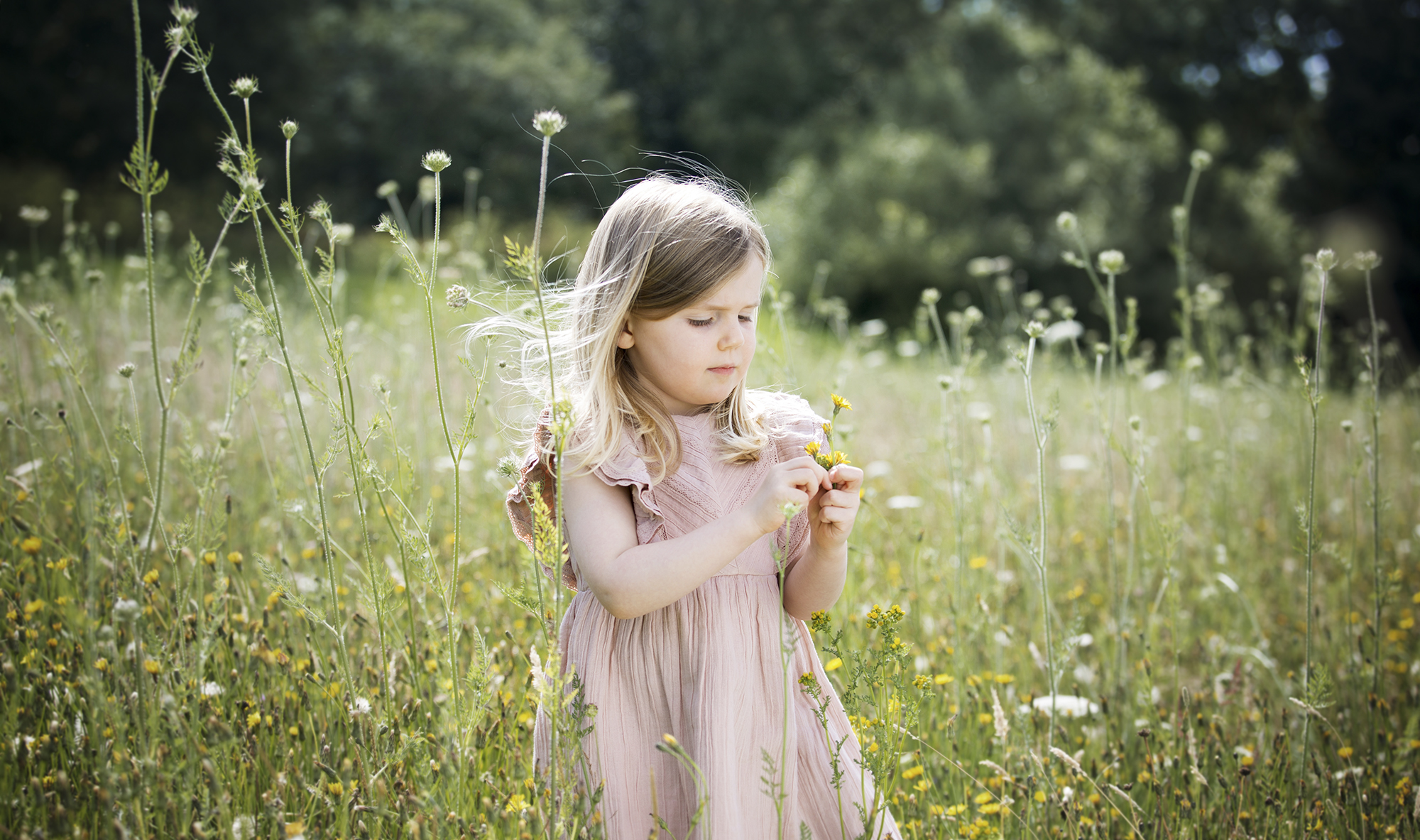
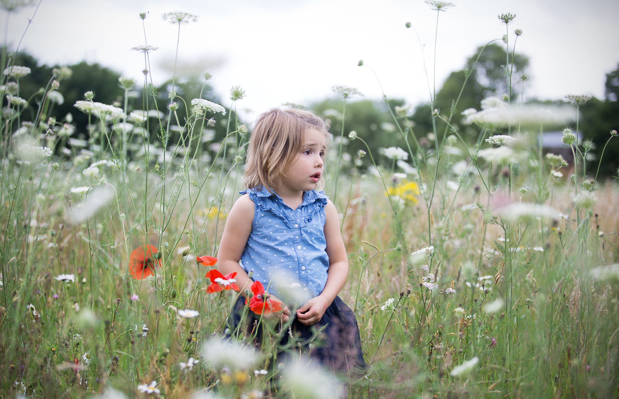
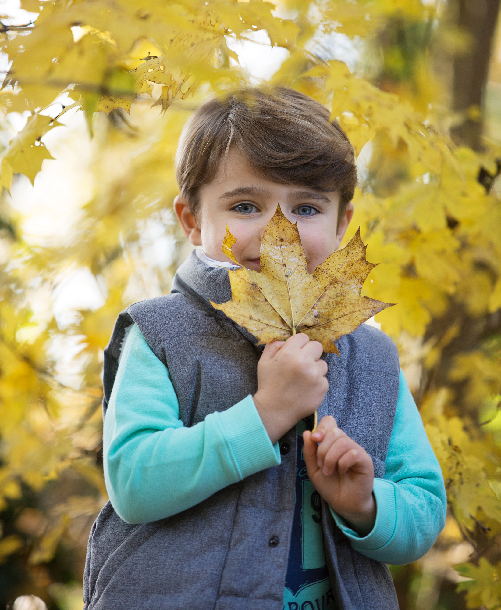
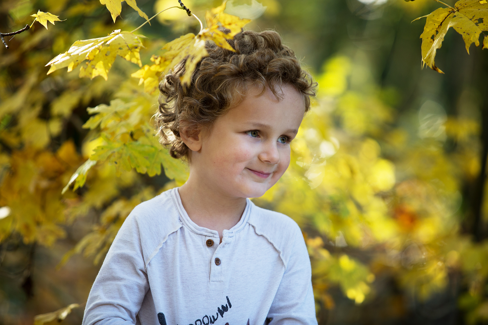
Location portraits
Natural light, natural backdrop.

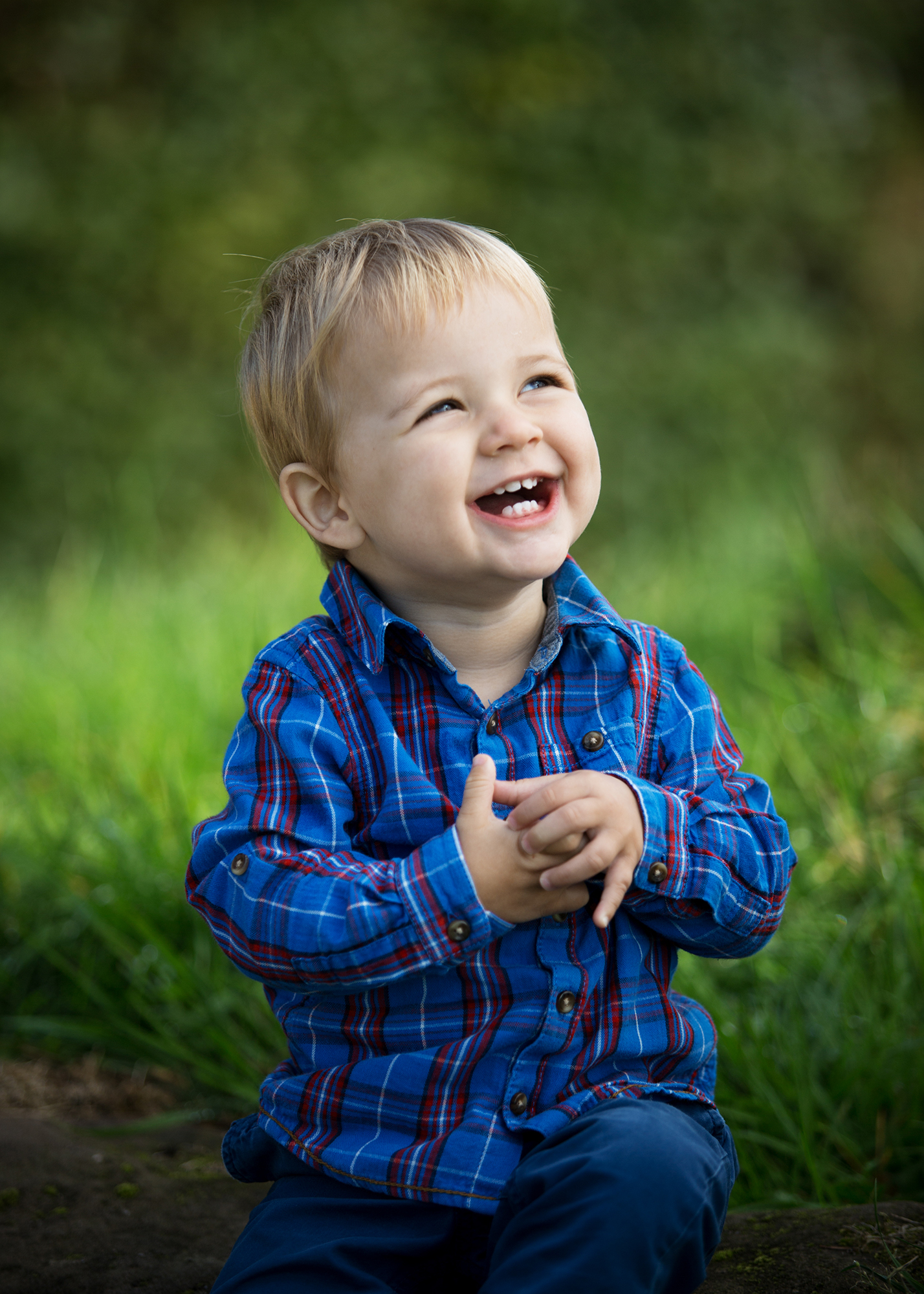
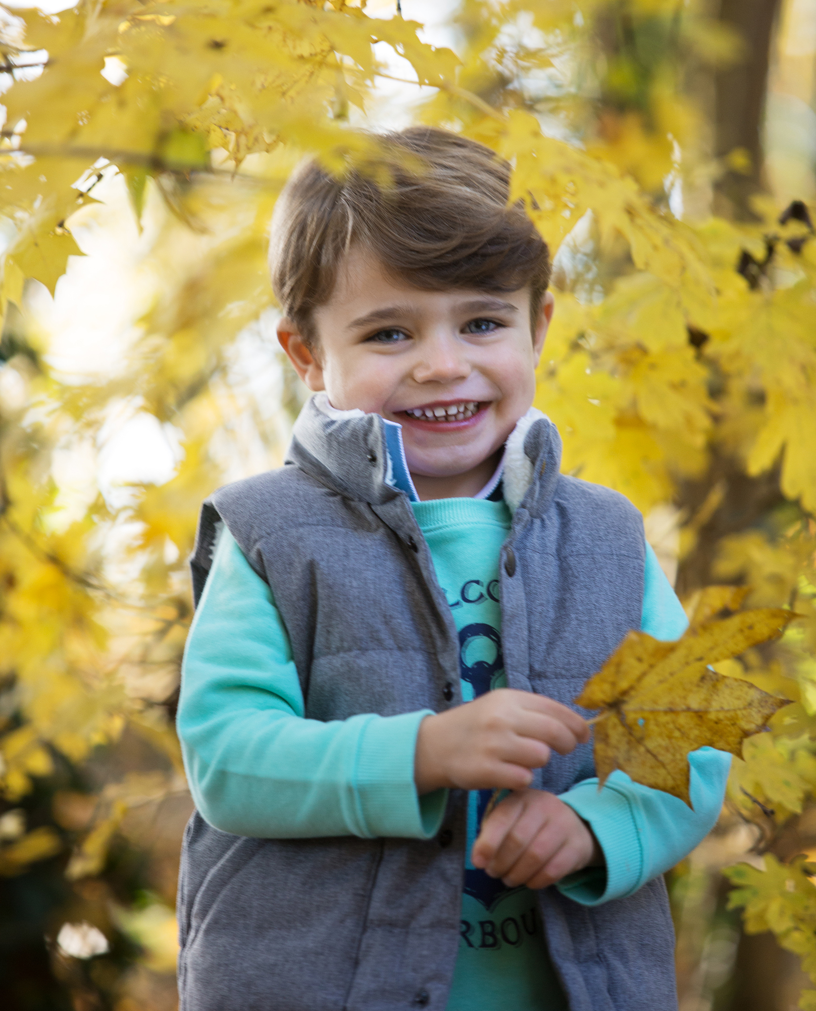
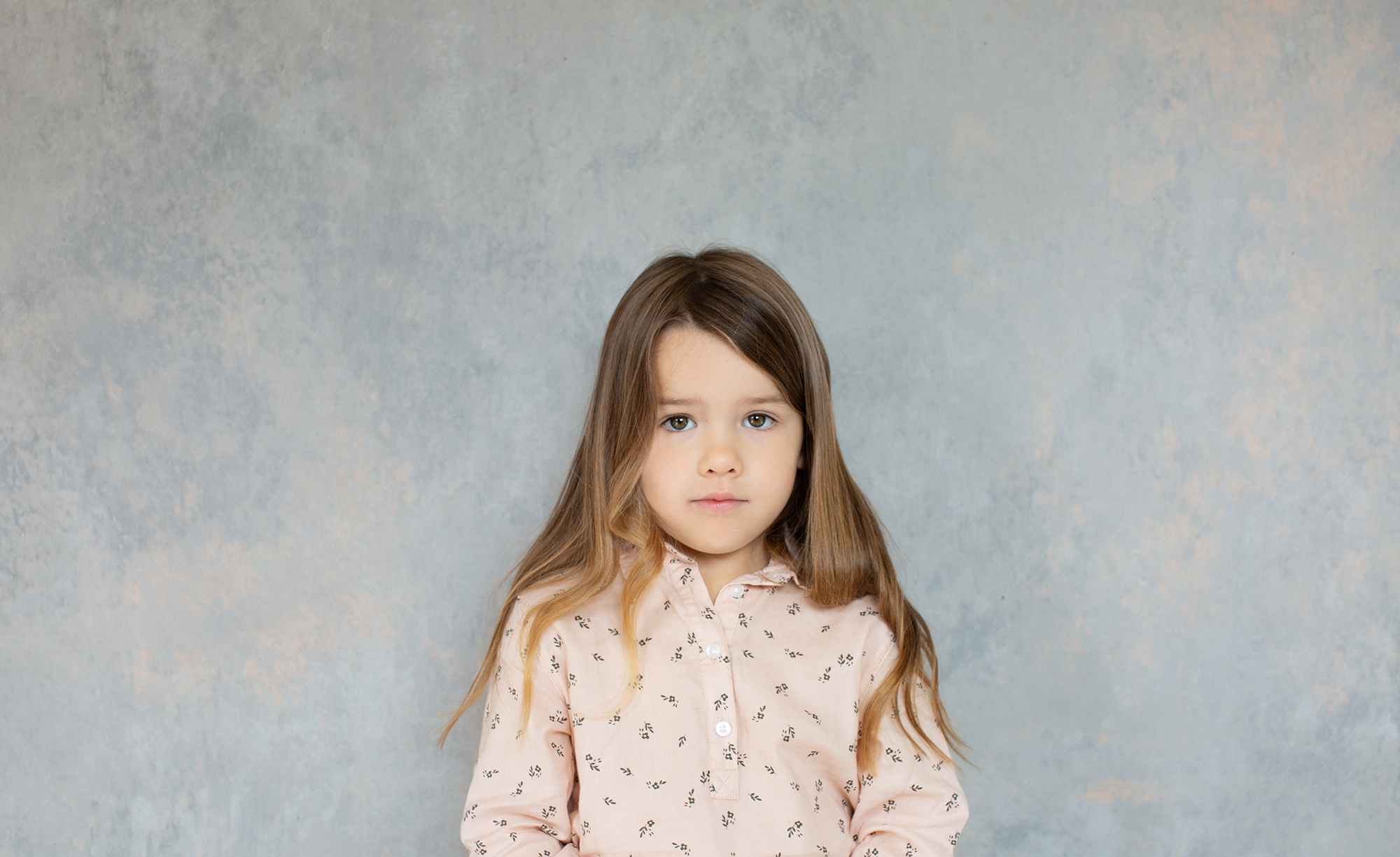
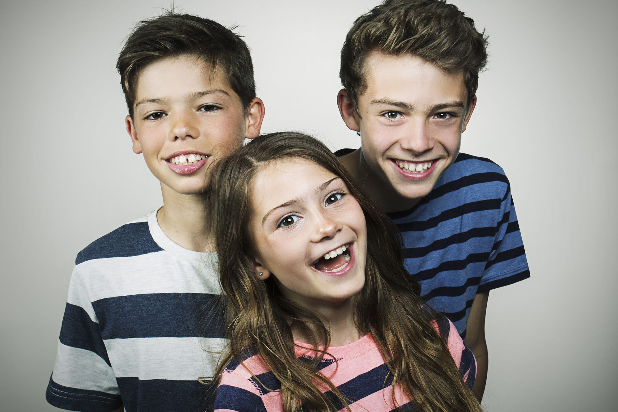
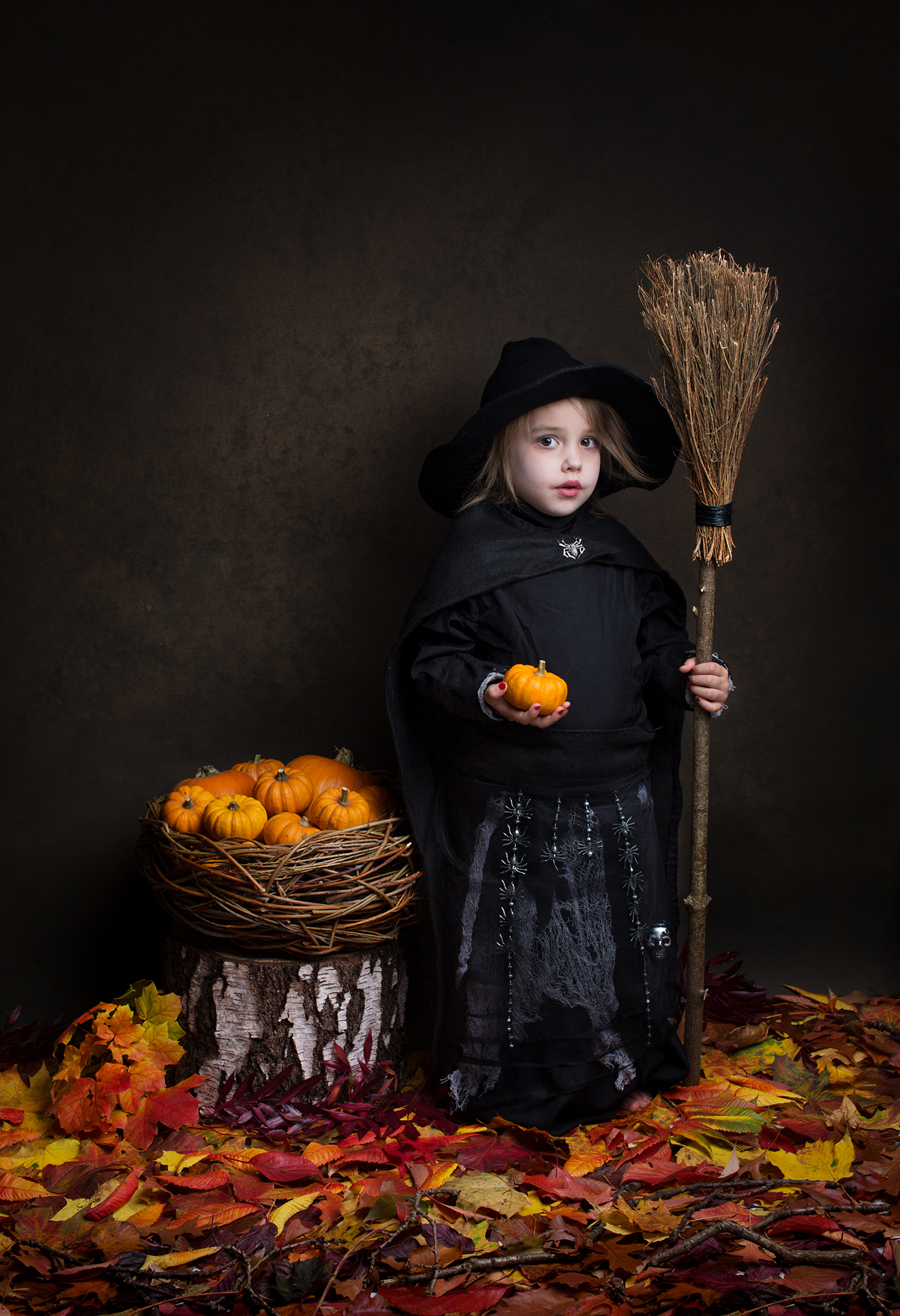
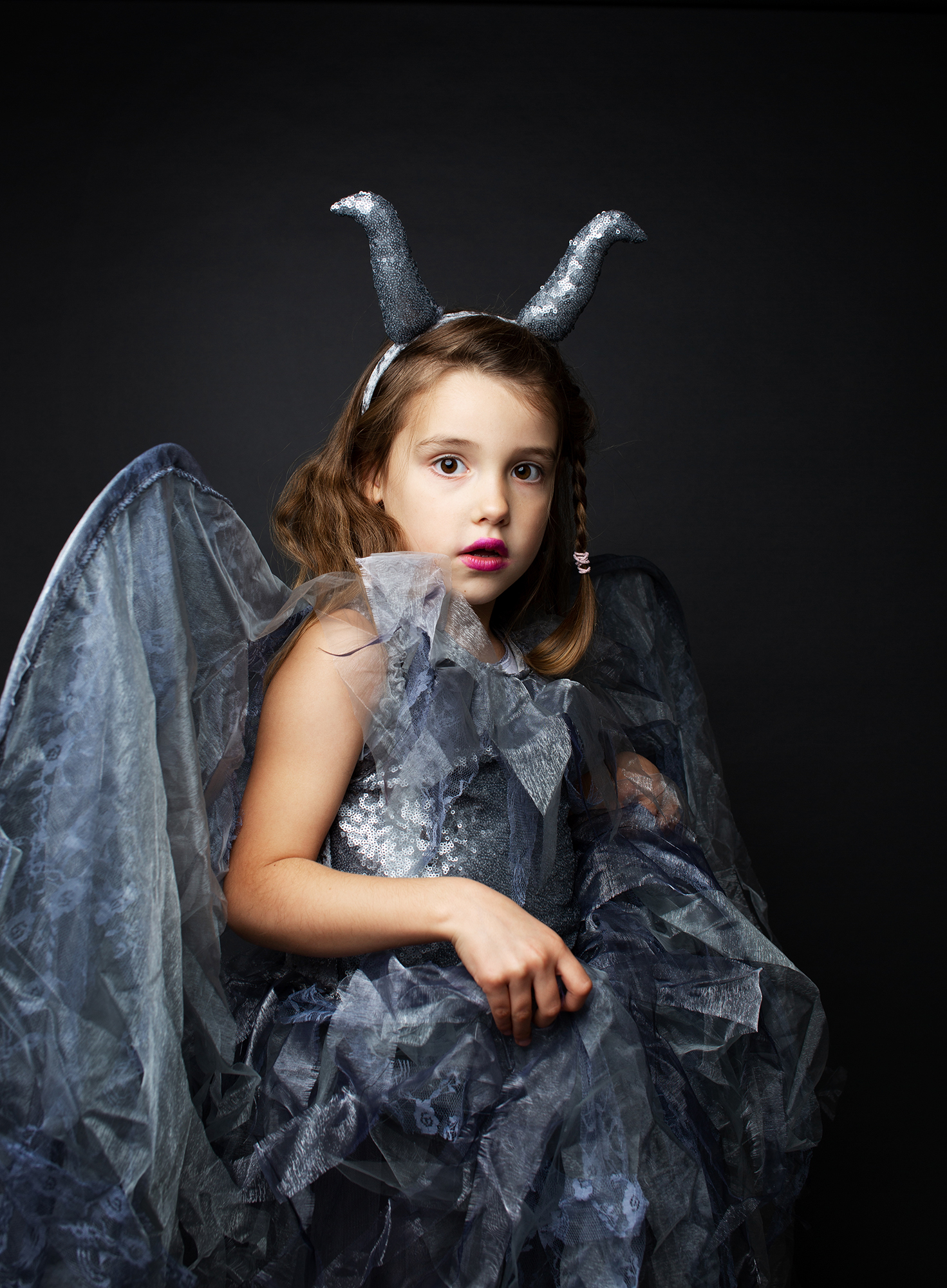
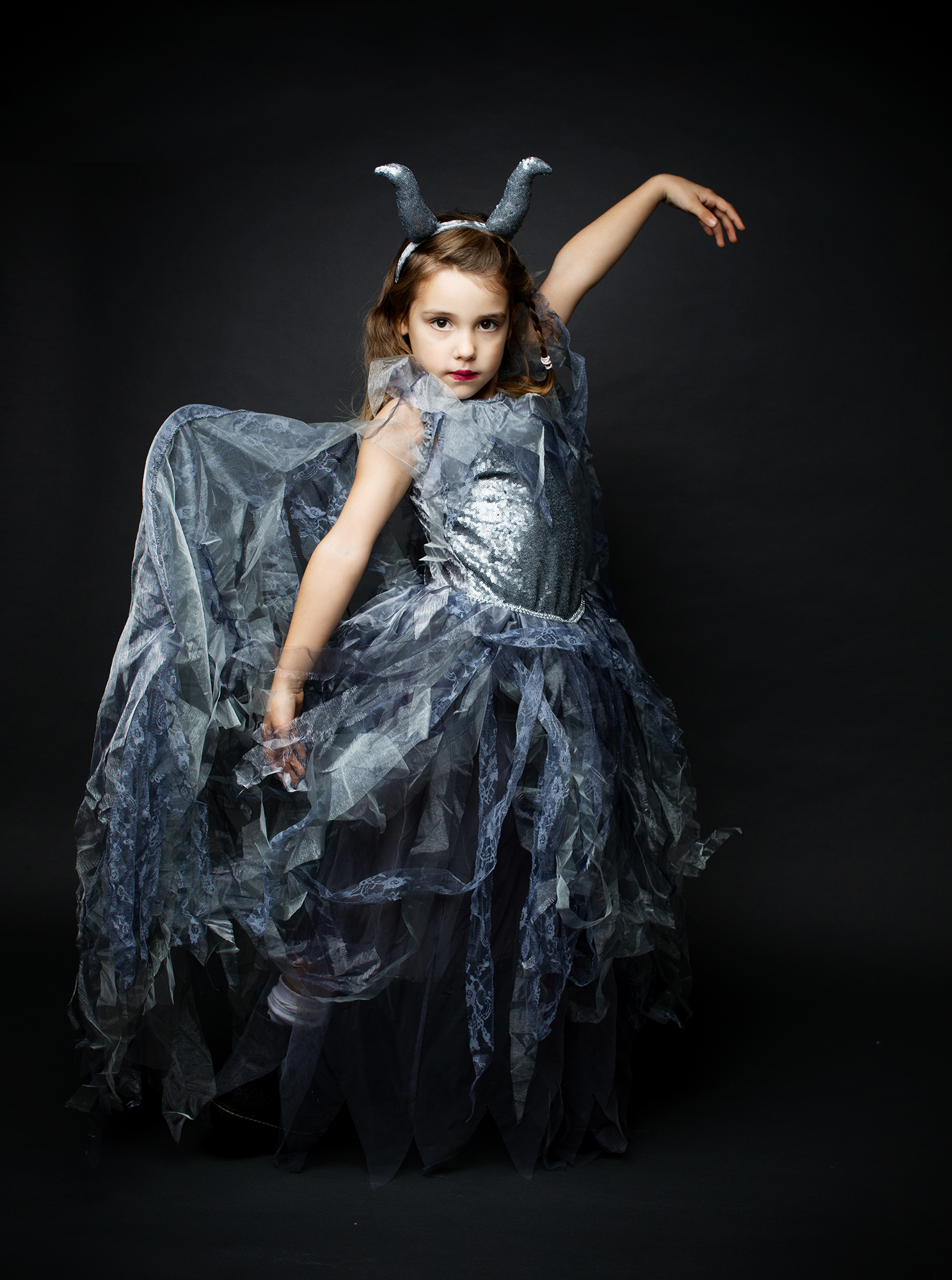
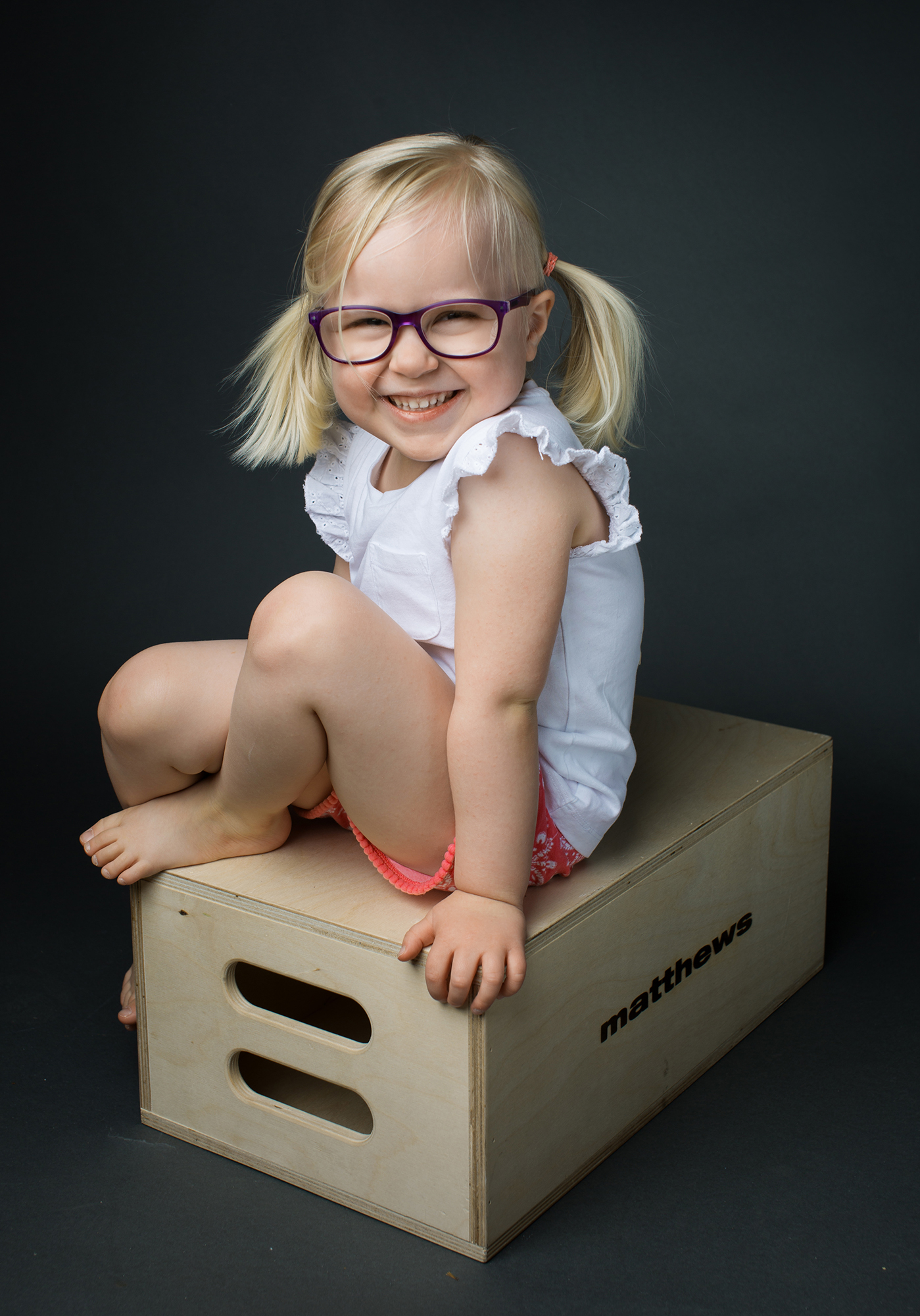
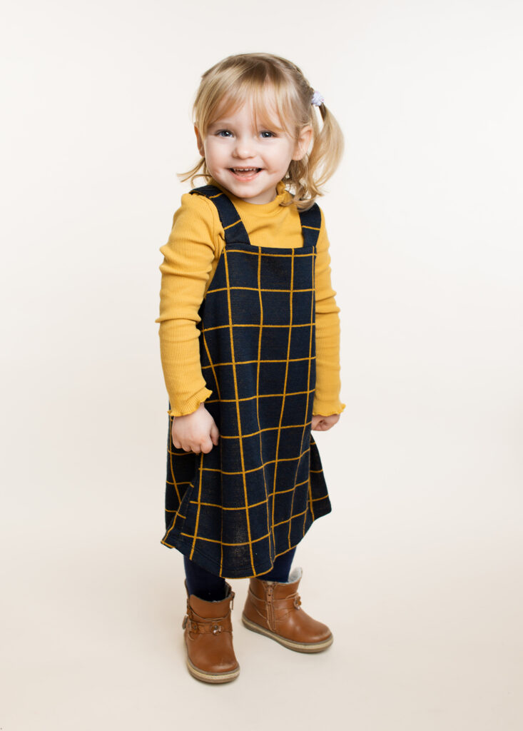
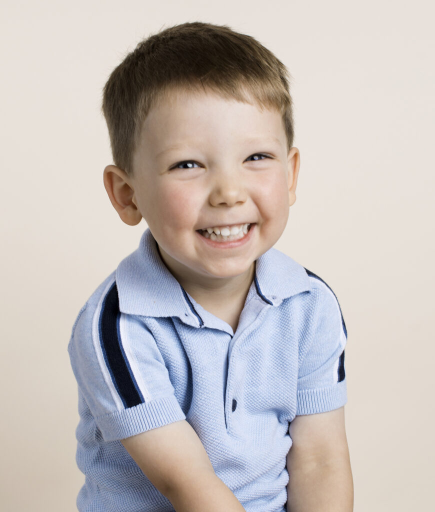
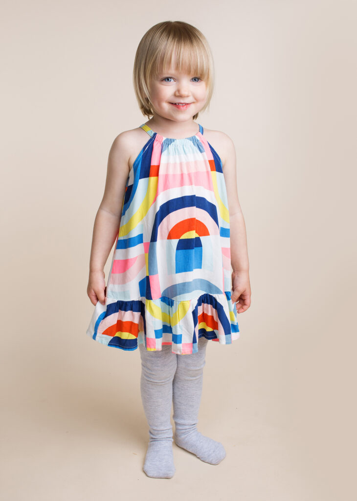
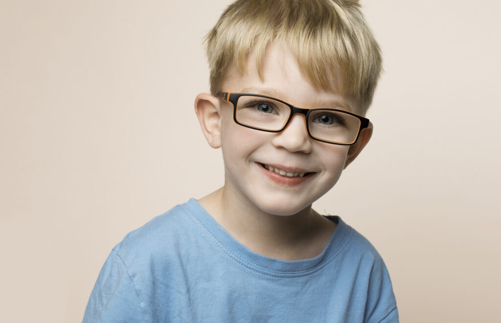
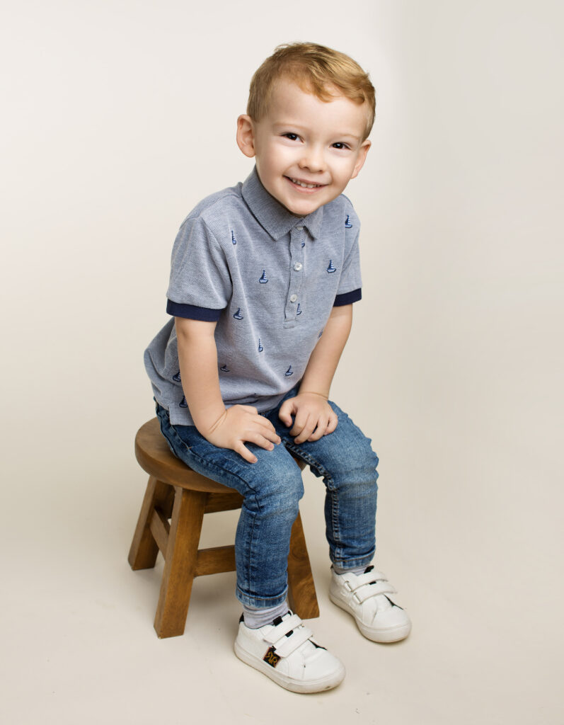
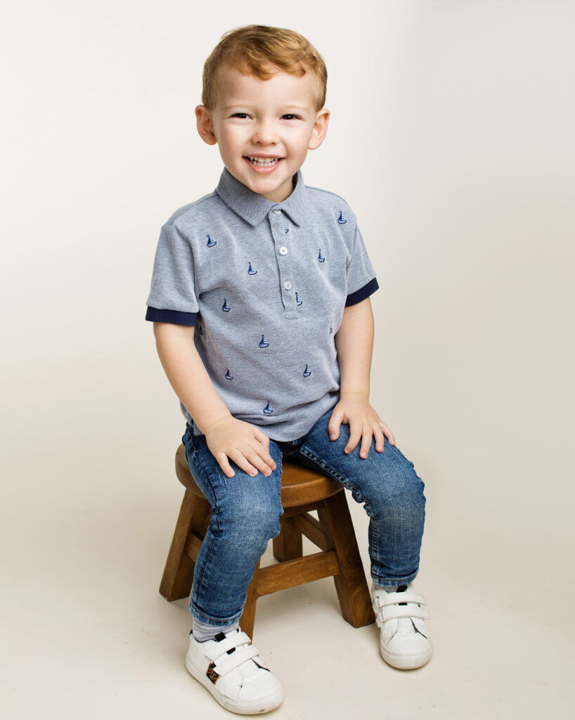
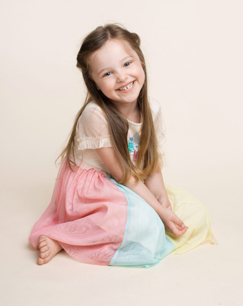
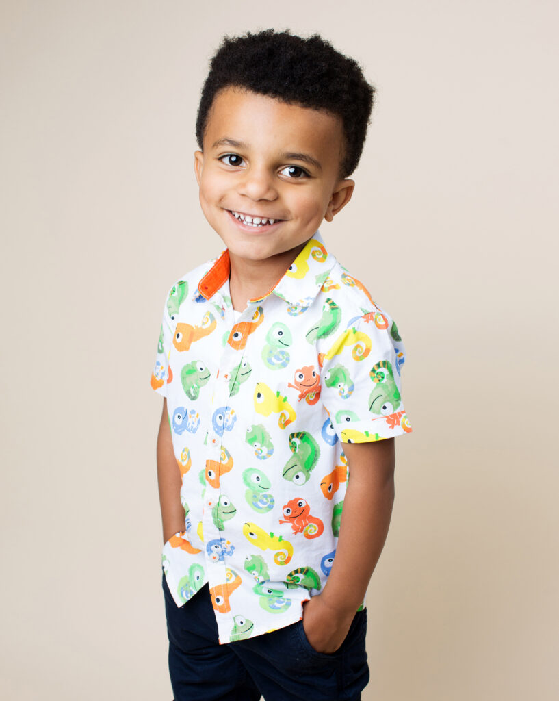
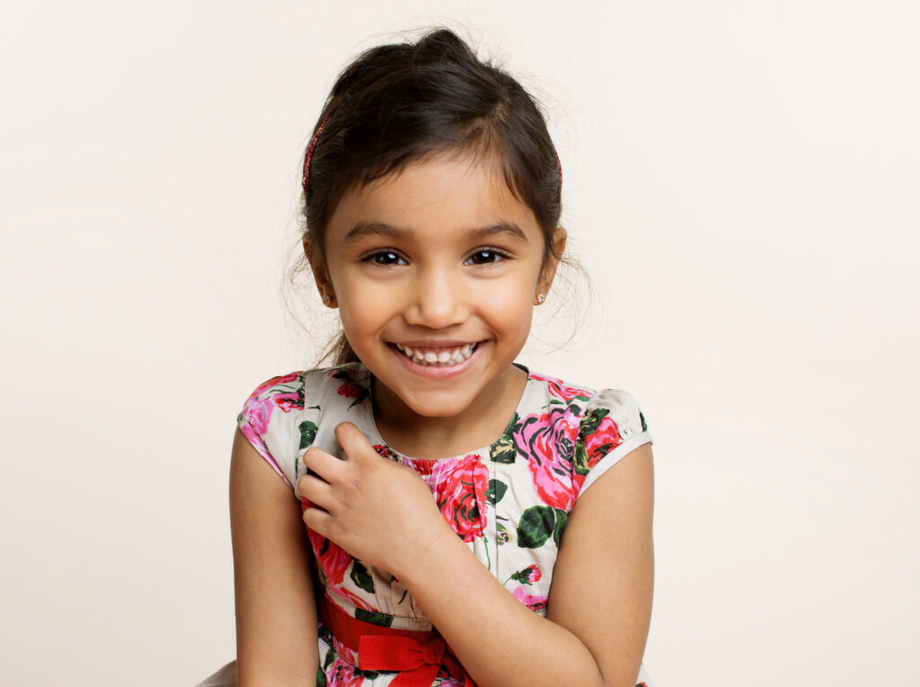
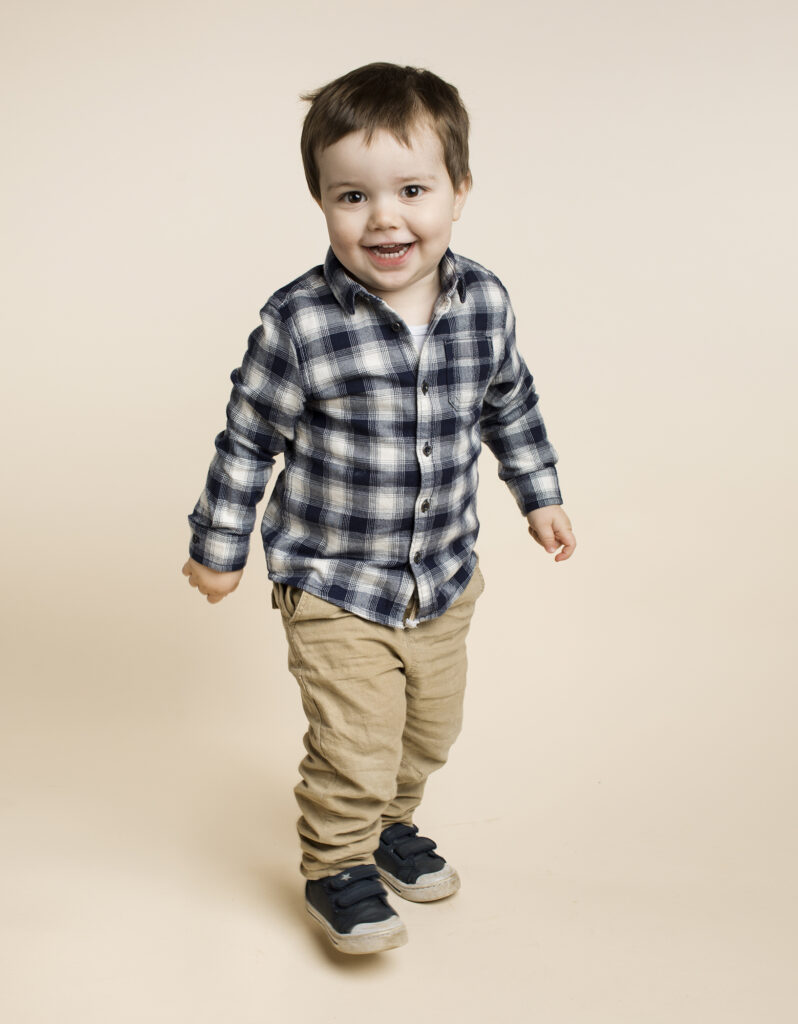
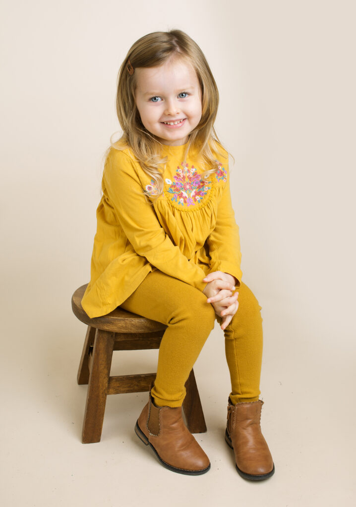
School photography
Some people can pick up a camera and immediately take amazing, artistically composed shots with no effort. I was never naturally talented like that, I always had to try hard to improve, and I always had imposter syndrome. But one thing I was good at was interacting with the subjects. Earn their trust, put them at ease, build a rapport and make them forget about the camera for a moment. And then capture their character, unguarded and with no self-consciousness.
Modern school portraits tend to be high-key, harsh lighting and white background. Functional, but not particularly pleasing to the eye. I wanted to at least put in a bit more effort, so I used off-white bone or oyster seamless, with a deep, feathered Octabox for a soft light that maintains directionality and depth.


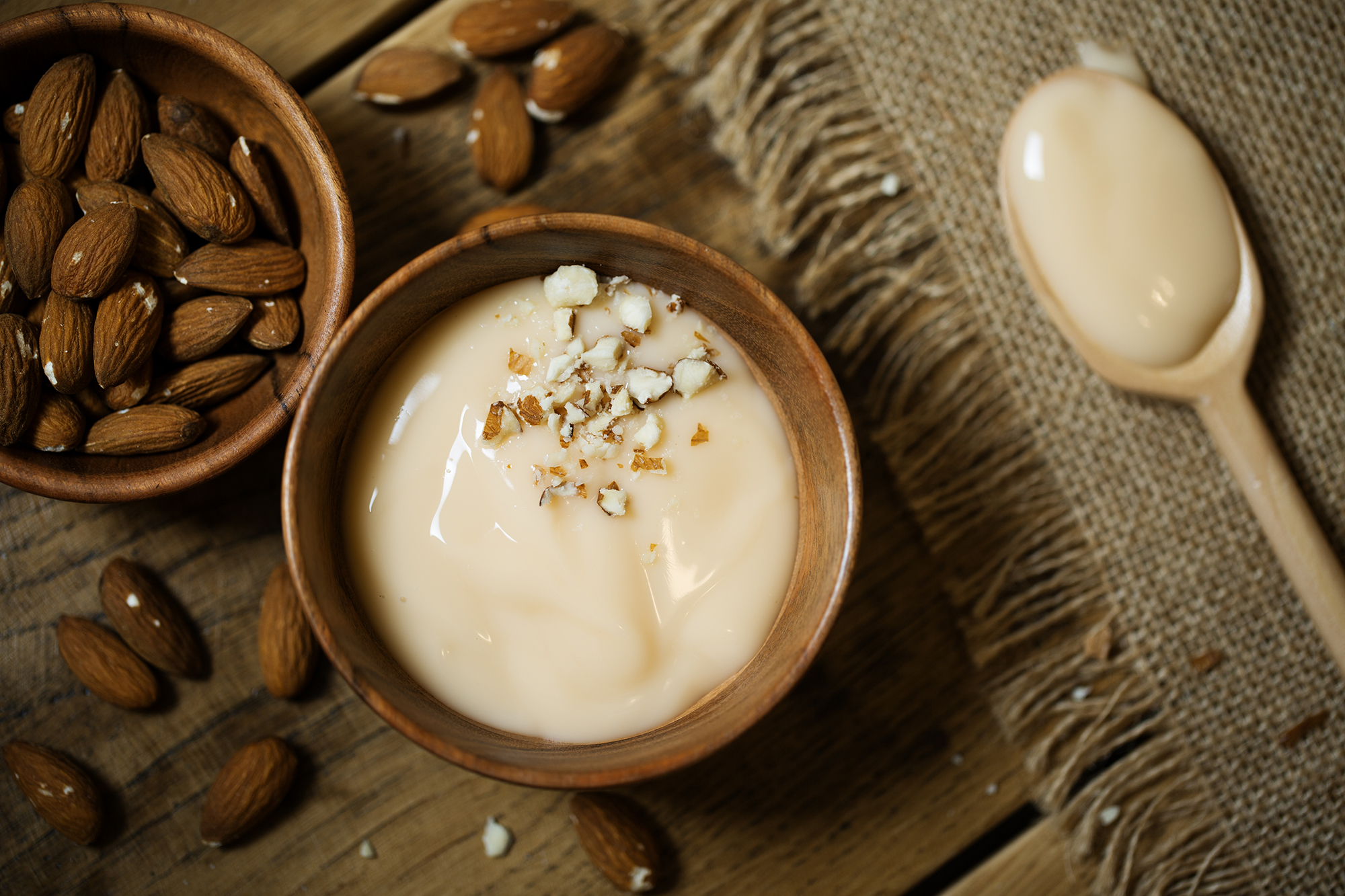
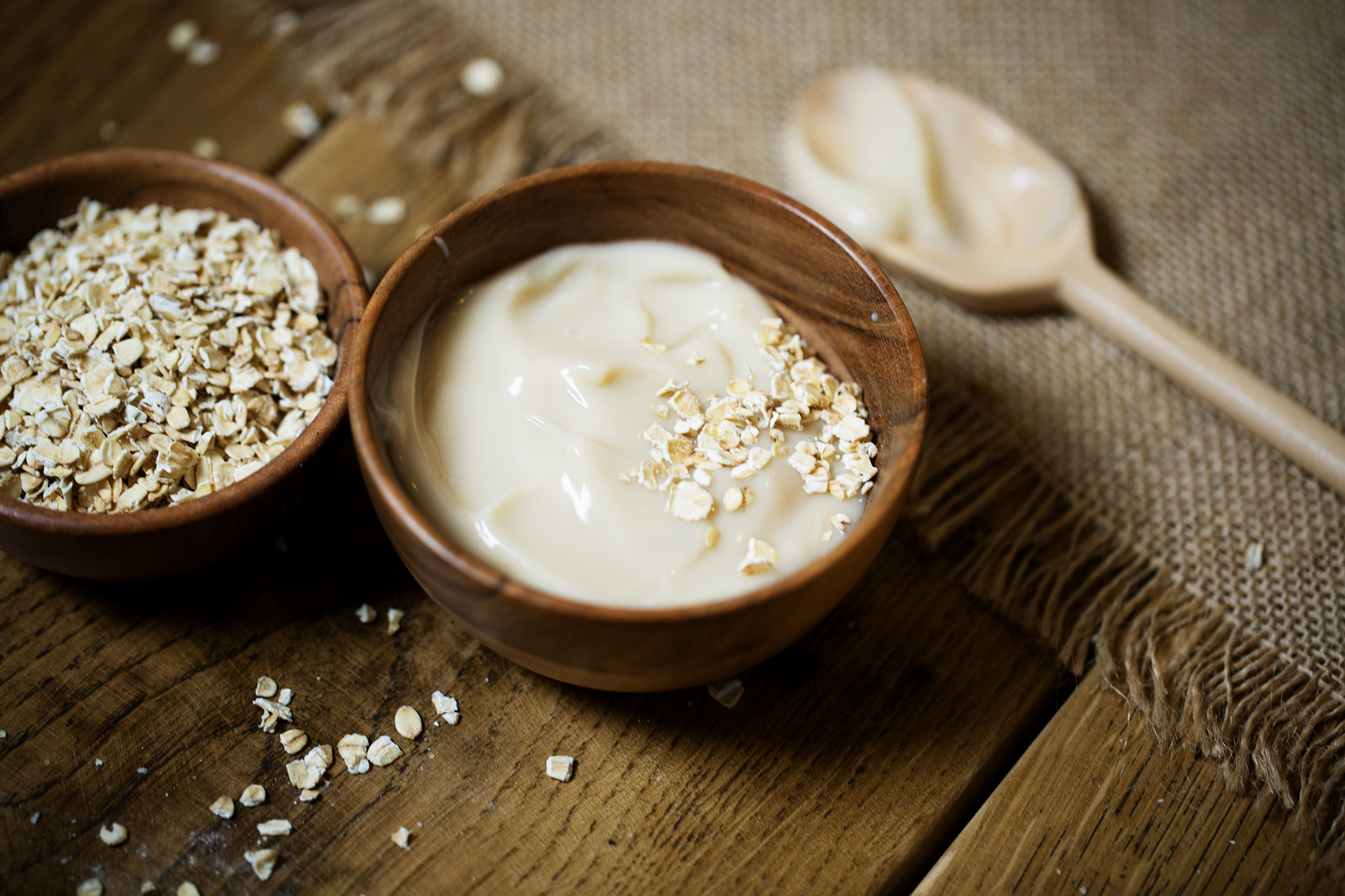
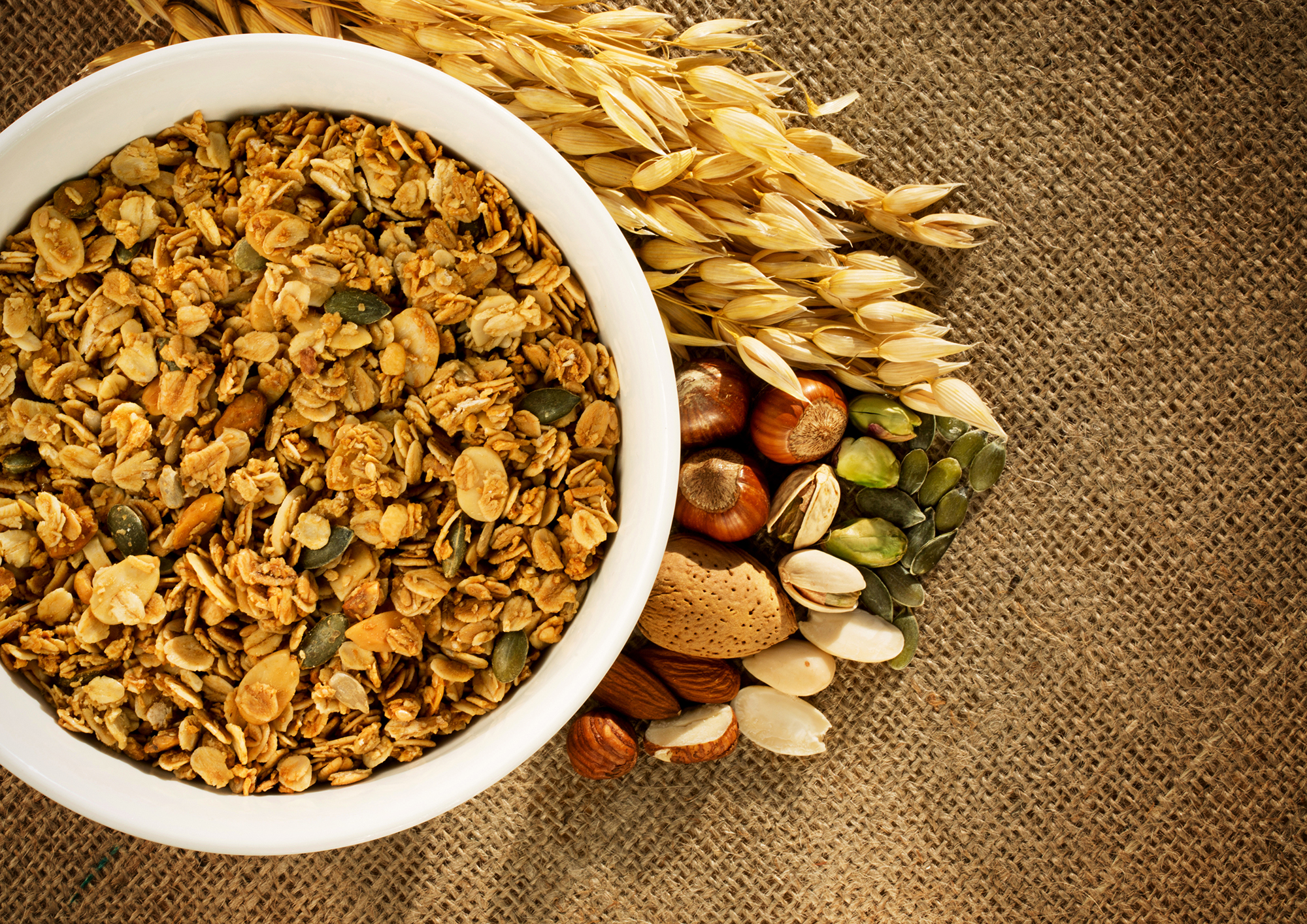
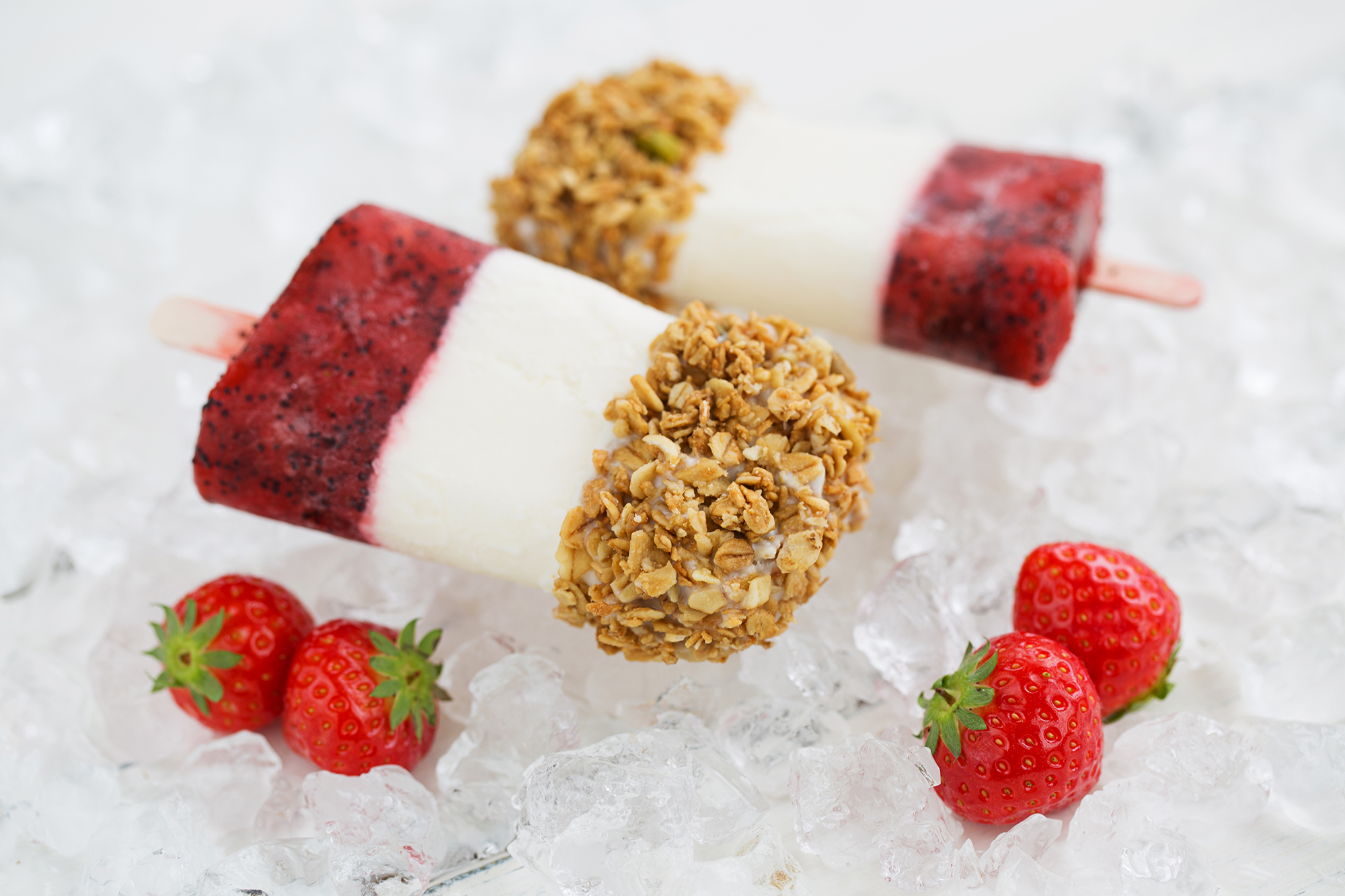
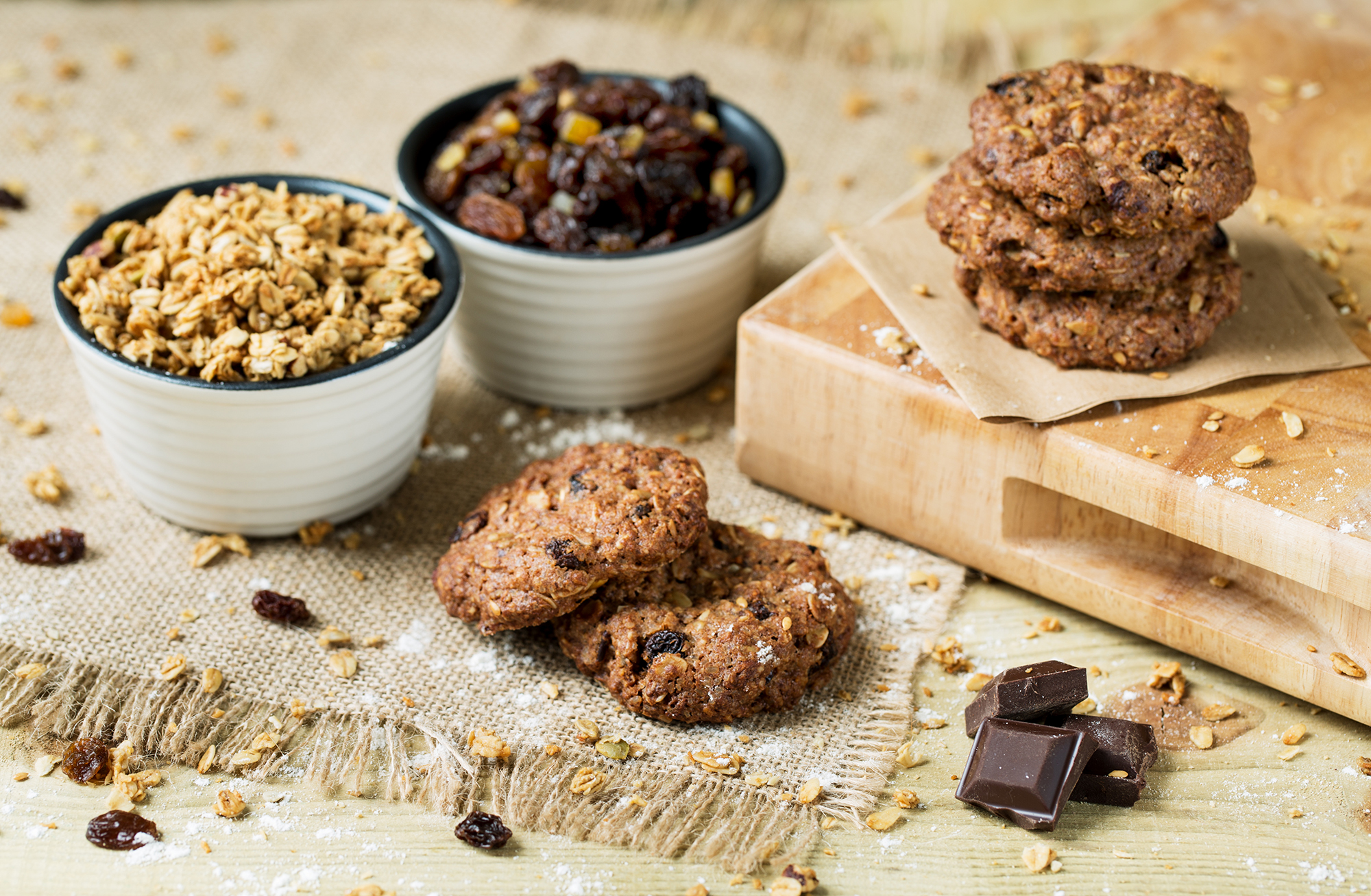
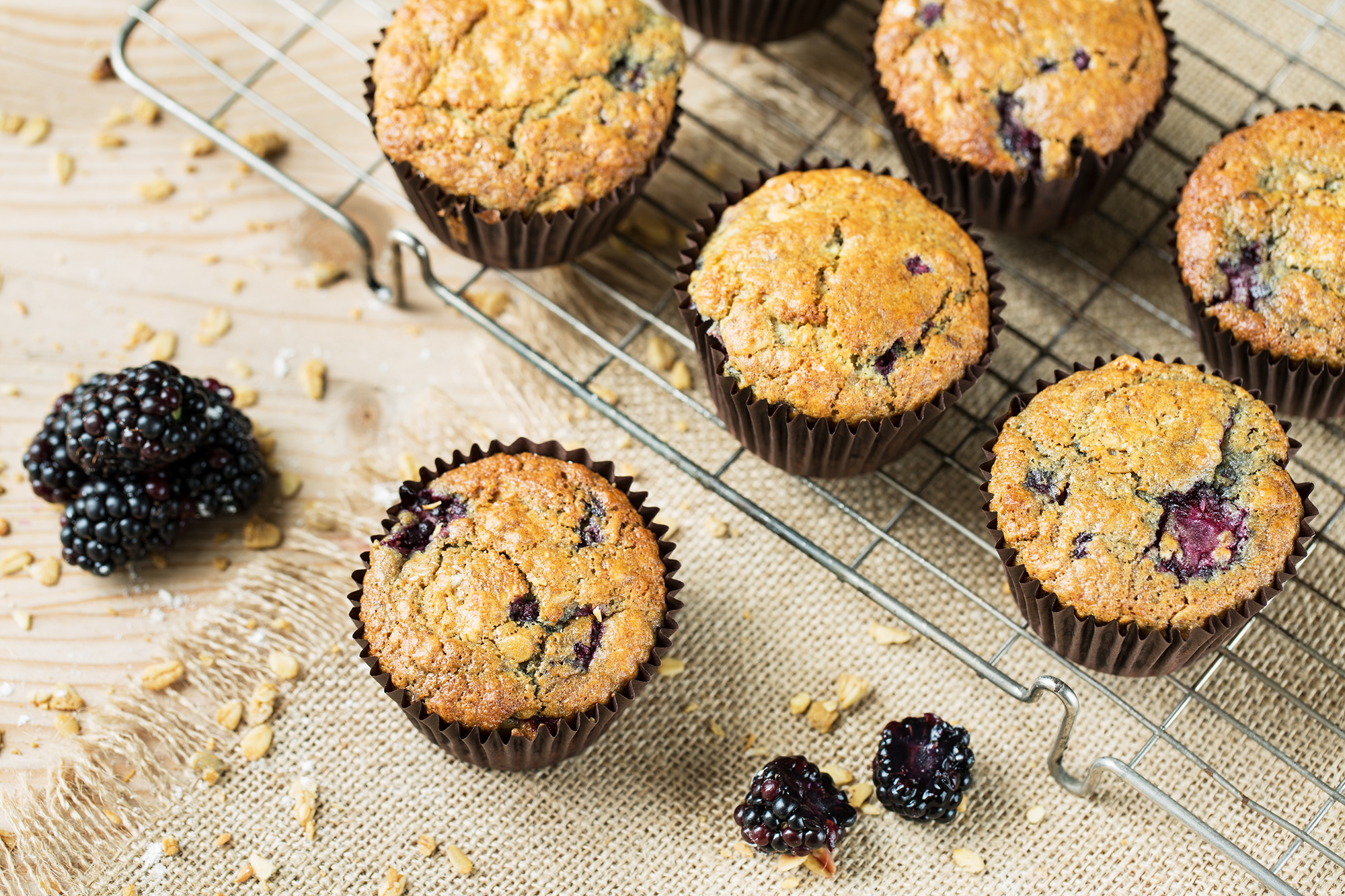
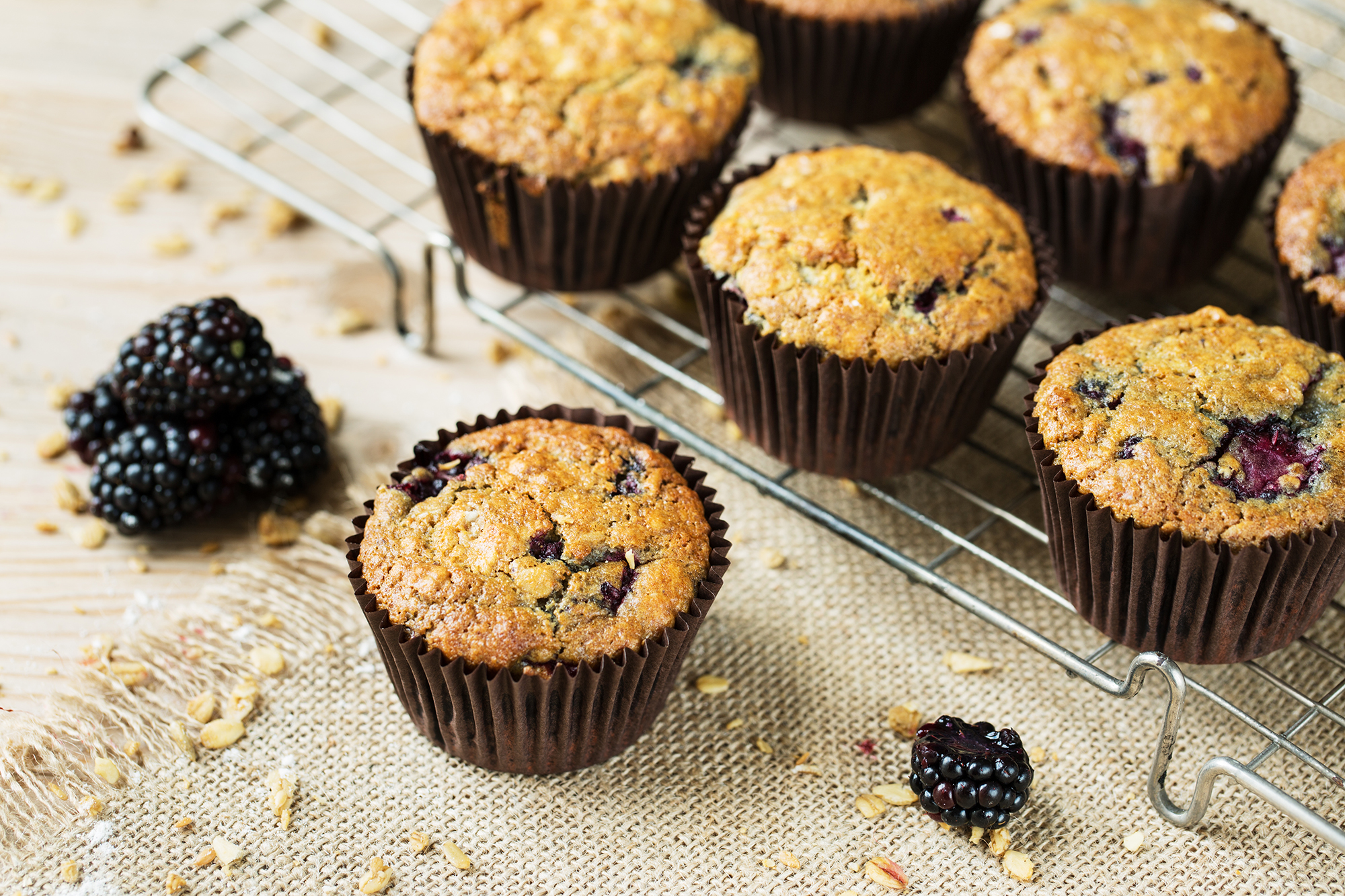
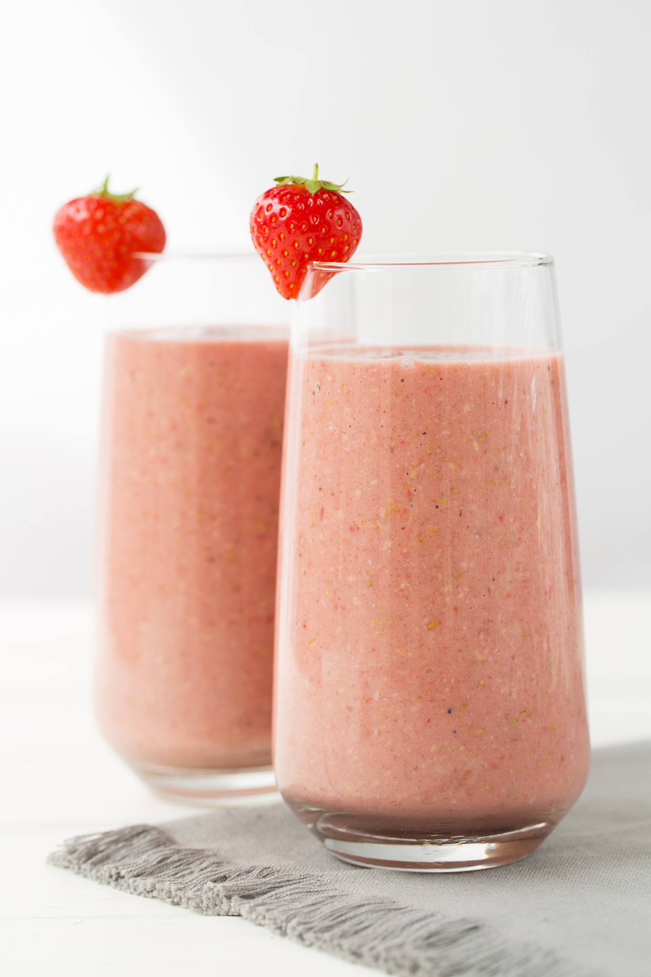
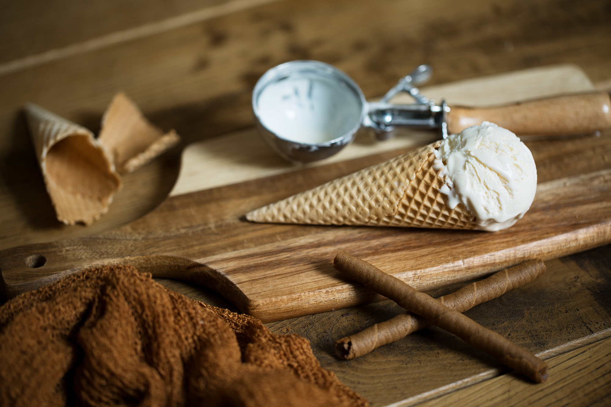
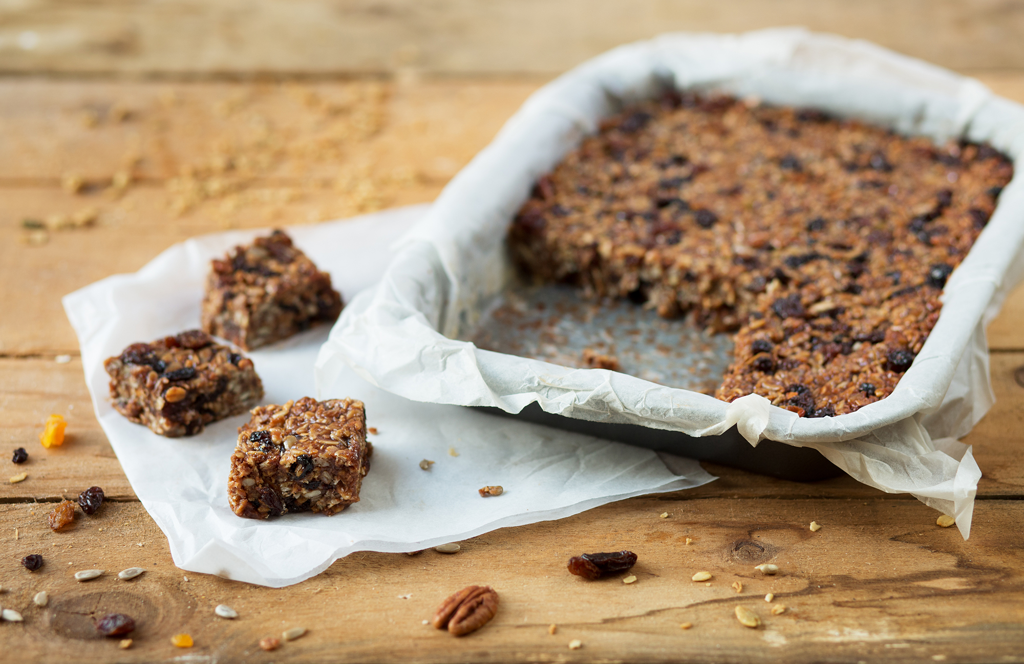
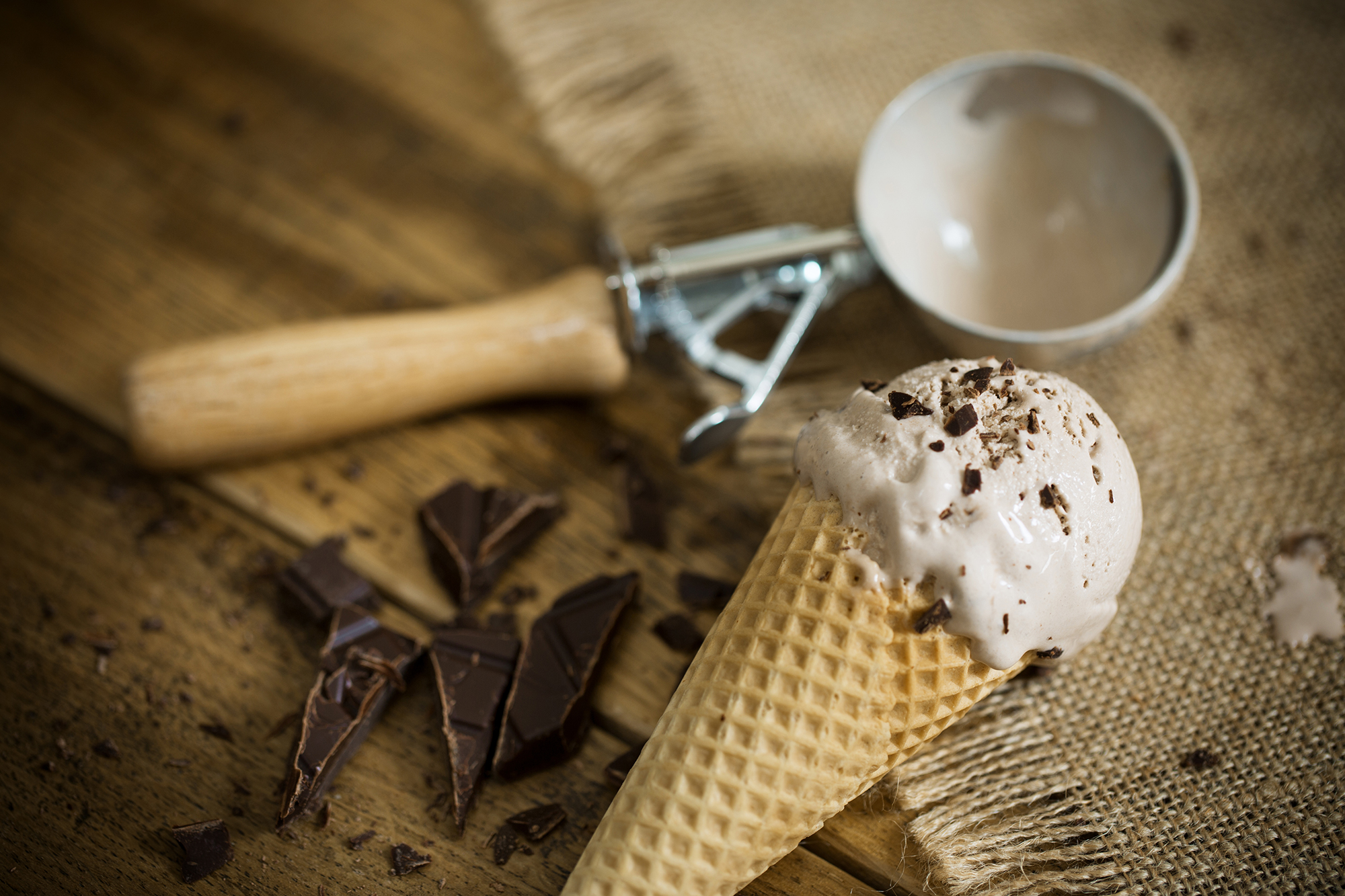
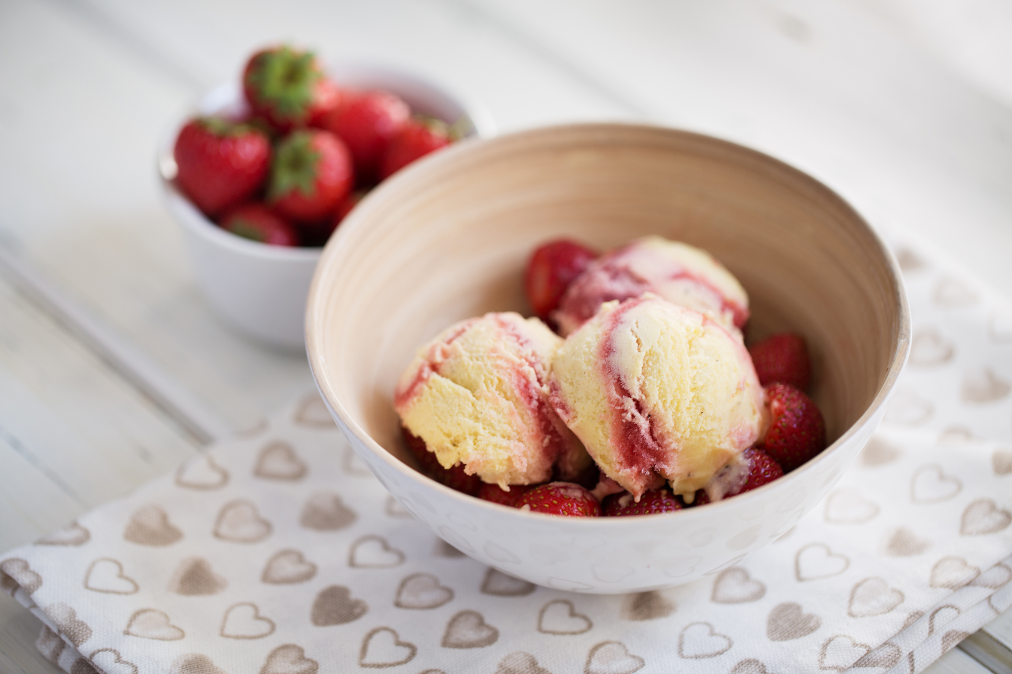
Food styling
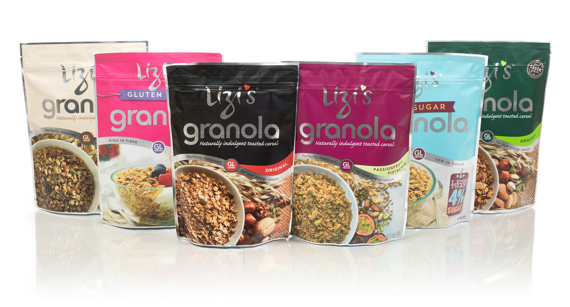
We carried out several briefs for the food company that make Lizzi’s granola. We did packaging shots, serving suggestion images, and worked with their PR agency to provide a range of images for their marketing campaign around recipes using the granola. They would send us the recipe, and we would devise a concept, source the props, cook the recipe and photograph the results. They looked nicer than they tasted, but I had fun using window light and a whole load of different wooden surfaces to create the images. Packaging shots always needed re-shooting to get an accurate ratio of seeds to granola without misleading.