Flight booking website
For my diploma project I designed a flight booking website for a fictitious airline and learnt all about user-centred design, gathering research and turning the findings into usable insights.
A lone junior wouldn’t typically be tasked with the complete design of an airline booking site, but it was a great way to learn about focusing on the goals of an audience – in this case, anyone who is going on a trip that requires a flight.
Any trip, any scenario.
I approached this by learning about the exact steps people take from the moment they decide to go on a trip, right through to getting booked up.
What are their first thoughts?
What are their first actions?
How does flight booking fit in with that?
Design process
- Competitor analysis
- User interviews & usability tests
- Quantitative & qualitative Surveys
- Research analysis and customer journey mapping
- Sketching and iteration of wireframes & user flows
- Paper prototype
- Medium-fidelity prototype in XD
- User testing
The big idea…
The full flow from landing page to payment had a huge scope, but the main focus was around how people compare different flights and come to a final decision.
The results page layout and visibility of flight details have the biggest impact in terms of supporting peoples flight booking process.
To make a decision, users need all the right details, in the right place, at the right time, and the research informed exactly what is required, and why.
Supporting user goals
More details…
This is a research project…
This project is very much a research led ‘UX‘ project, rather than a UI project. The medium-fidelity prototype screens are little more than wireframes with a poor colour scheme, but my focus was on following the user-centred design process.
This project hasn’t got beautiful, pixel-perfect screens, but the research and synthesis of the data into actionable insights demonstrates my ability in user-centred design, problem-solving, and design thinking.
Understand the audience – people planning trips – understand their goals and behaviours, and use the insights to design features, functionality and content that supports their trip planning process.
Competitor review
First up was checking out the competitors to establish conventions, looking for things to improve, and borrowing things that work well.
Click the logos to see full write ups
Key findings…
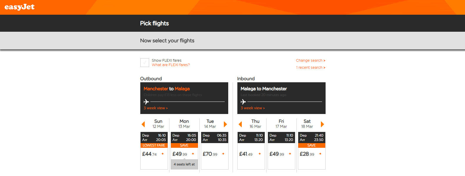
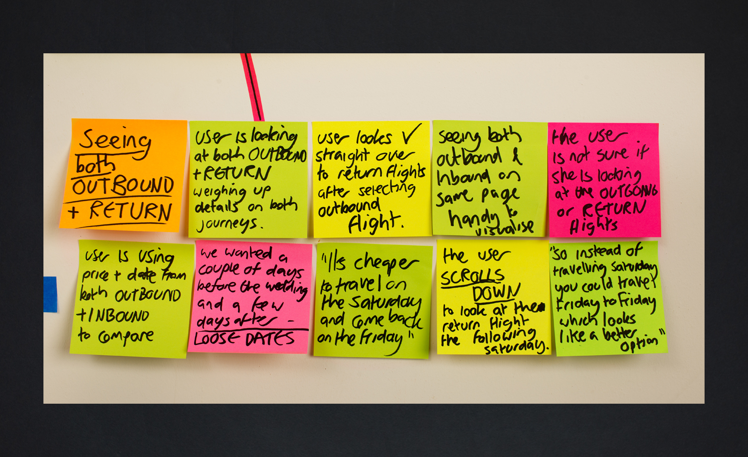
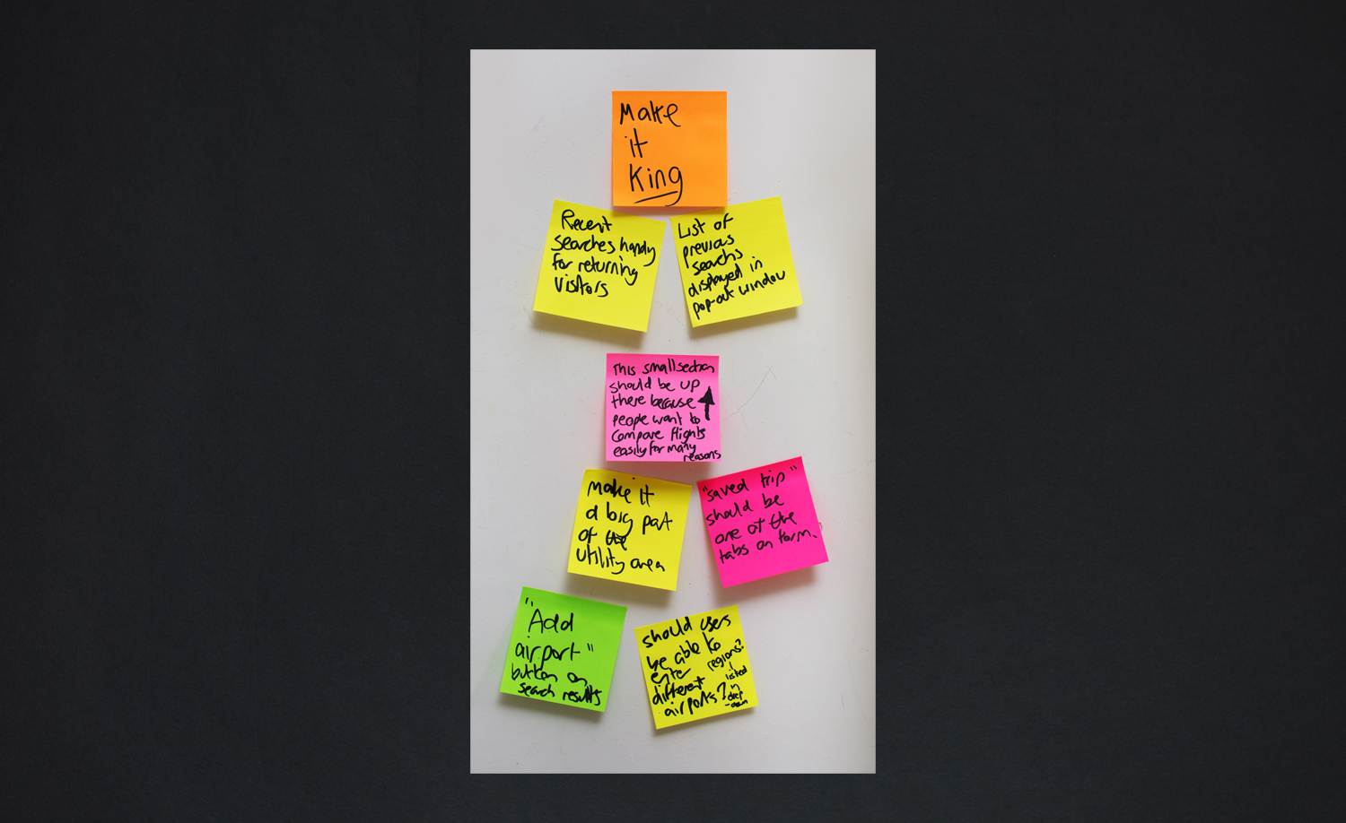
Results page layout
- For most airlines, flight selection is sequential
- You choose the outbound flight, then you choose the return
- Either listed down the page, or even on a new page like British Airways
- EasyJet do it differently
- Outbound and return are side-by-side
- This seemed much easier
- Research later demonstrated exactly why
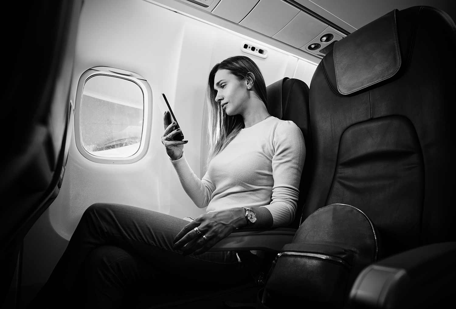
User research
I wanted to learn everything about the steps people take from the moment they decide to go on a trip, and how flight booking fits in with those steps.
What are their first thoughts?
What are their first actions?
What do they need to know?
Why do they need to know it?
What are their goals?
How do they achieve them?
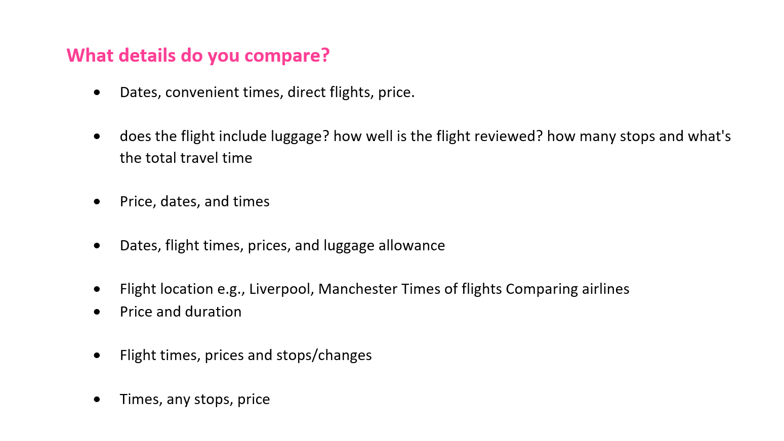
1. First survey
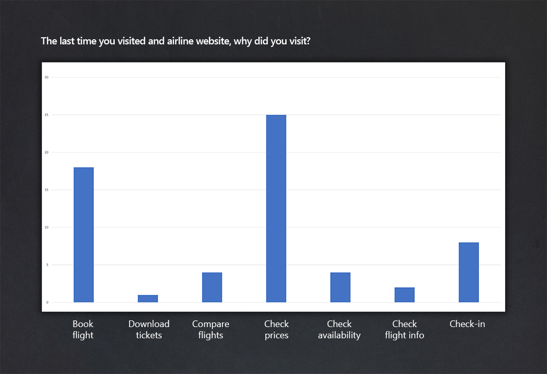
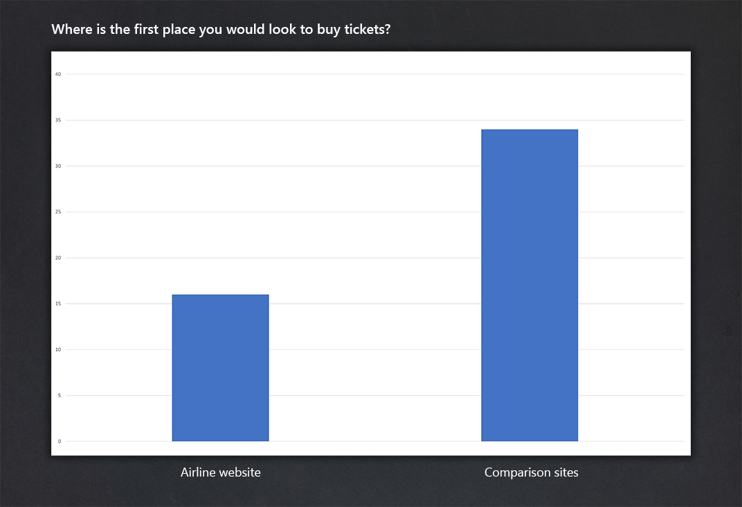
The first of two surveys provided initial insights, with high a response establishing fundamentals of airline website usage.
- People visit initially to check prices
- Most people visit comparison sites first
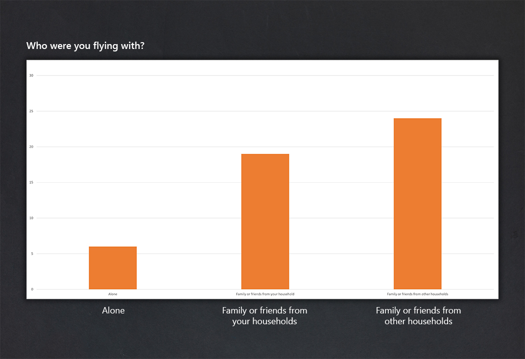
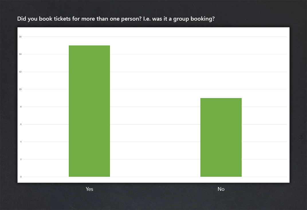
- People mainly book tickets in groups
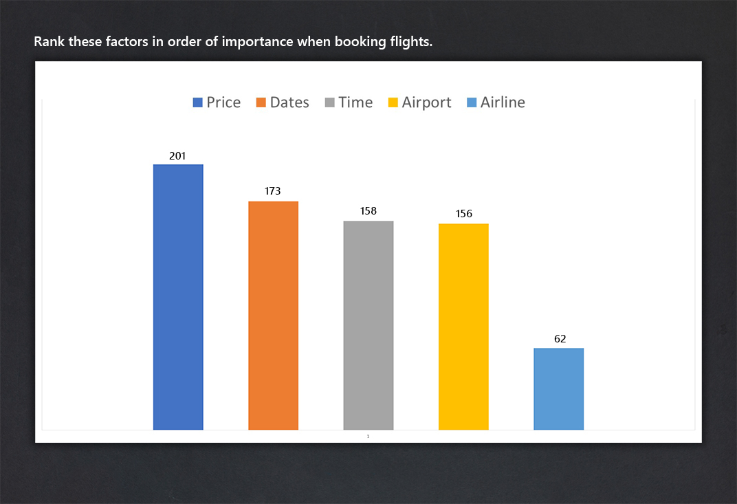
- Important details – price, times & dates
More details
Redundant questions
Looking back now, there were wasted questions. Out of the ten questions, only five were useful. How old someone is doesn’t tell us anything, and how often they fly might seem relevant, but the website needs to account for people who don’t fly very often at all, so knowing that some people fly regularly doesn’t really add any value.
Quantitative data with a high response
The survey had around sixty respondents, so the questions that were useful gave a clear indication, and this was correlated with the later research. The main findings listed above were fundamentally important in the design.
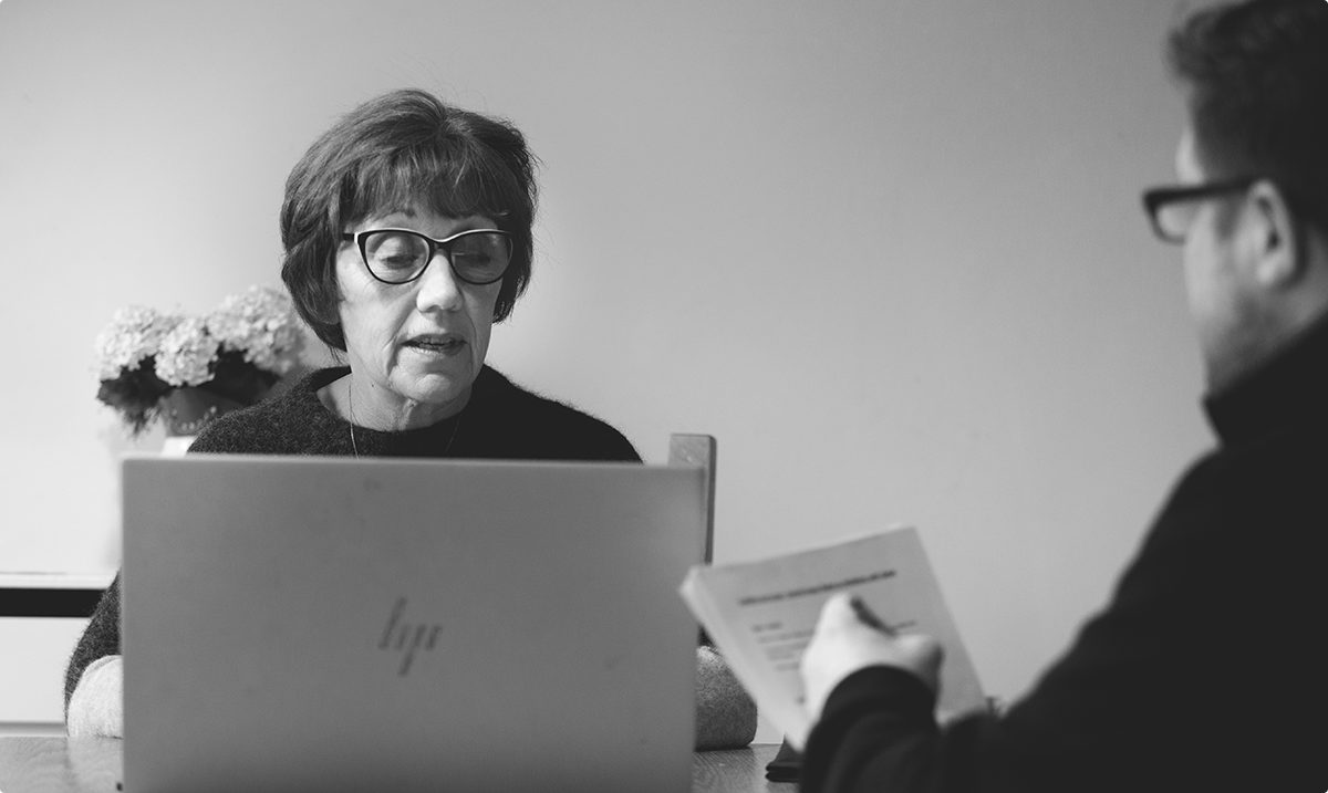
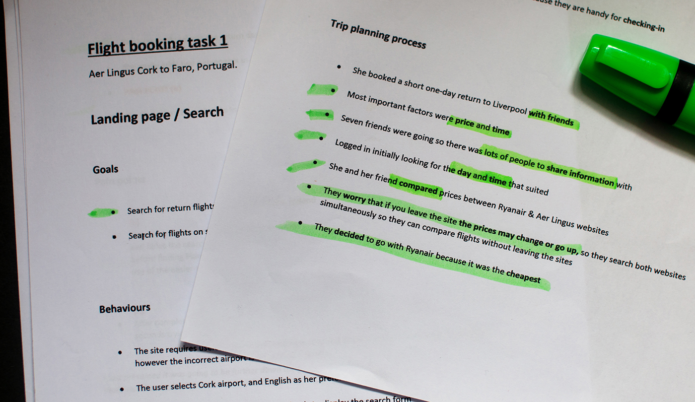
2. First interviews
Pre-recorded interviews and usability tests on the Aer Lingus and Eurowings websites built on the insights from the first survey.
- Learnt about trip planning in more detail
- Learnt about how users compare flights
- Important details
- Group bookings
- Established mental models
- Identified pain points
More details
Patterns beginning to emerge
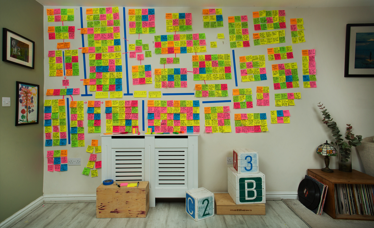
The research data gathered from the first survey & interviews was beginning to come together, and highlight key issues. The structure of the diploma meant that research analysis wasn’t due to start until the next projects, but in practice, the affinity diagram had already begun in my head, and on scraps of paper all over my desk.
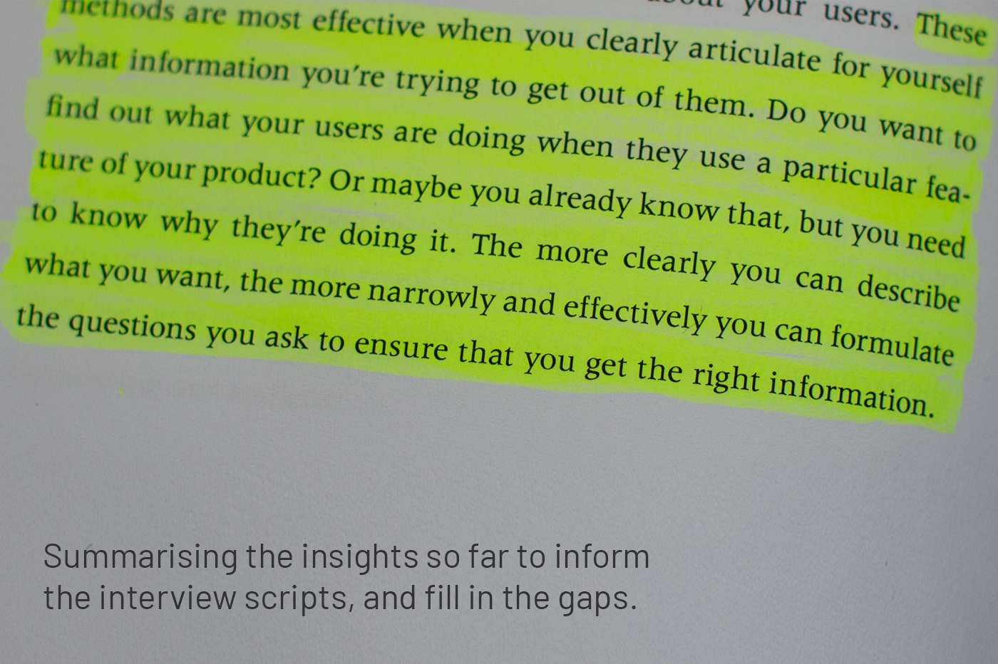
These initial insights informed the next stage of the research and defined the issues to focus on with two further interviews. I could see what the important issues were, so I wrote the scripts and questions to fill in the gaps.
Organisation / disorganisation of notes
I struggle with the anxiety of missing important and relevant information from these insight-rich interviews, and this led me to make a million notes. Before I discovered post-its, these were stored in piles of A4 paper all over the place, which is inefficient, disorganised and messy.
Since this project, I have worked hard to:
a. Take less notes, and make them more concise. The more practice you get, the more you can see which information will be relevant, and which information is unimportant.
b. Use Miro. Discovering post-its for research analysis felt like a life-changing moment. Then discovering Miro blew my mind. Interview notes go straight into Miro now. No more disorganised piles of paper, you can immediately begin to form groups to identify key insights, you can see everything together all at once, and its better for the environment. Win-win-win.
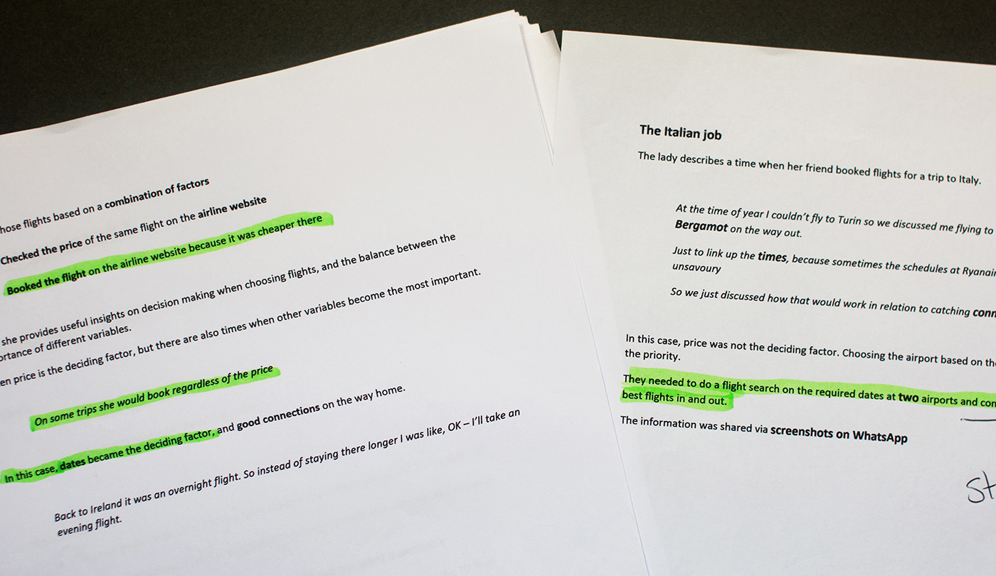
3. Second interviews
Initial research insights were roughly summarised and used to formulate the interview objectives. Scripts were devised carefully to explore key issues further.
- Lesley’s interview explored comparing different airports, times, and deciding on the best flight.
- Rachel’s interview focused on group bookings, and how larger groups come to a decision together.
Usability tests were carried out on the EasyJet, British Airways and Qatar websites.

More details
Different use-cases
The diploma only required one interview and usability test, but I knew from the initial insights that I wanted to find out about a wider range of issues. I knew Lesley had often considered different airports and flight times for her family holidays, and I knew Rachel had often travelled in larger groups. Both interviews proved extremely informative, with lots more data to analyse, but giving a much better picture of trip planning across different use-cases.
Results page
During the competitor analysis I had noticed the difference in usability between the EasyJet results page, and the other airlines. The usability tests on these websites clearly backed up what I had found, and made a strong case for the EasyJet style layout.
Sound engineer and photographer
I have previous experience in both location sound recording and photography/video, so you might think I had the technical set-up covered. But I managed to mess up both on the first interview. My laptop microphone is super-directional, so didn’t pick up my voice sitting next to the interviewee. And my laptop camera was covered up for the first half of the interview. So I couldn’t hear the questions, or see their reactions during the usability test.
Lessons: Use a stand-alone microphone, omni-directional. Or if you haven’t got one, record the sound with your mobile phone. And check the camera is working before you start. Hearing the questions and seeing their reactions when using a website is very important. And you need to capture it first time because they won’t be repeating the answers naturally, twice.
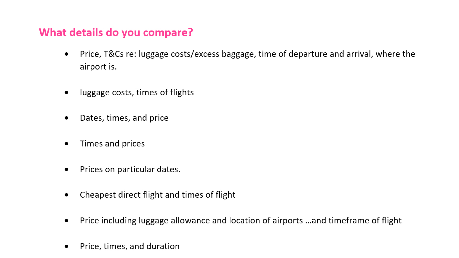
4. Final survey
One last qualitative survey was carried out to firm-up the research insights. I wanted respondents to describe how they compare flights in their own words.
The responses really gave substantial weight to the insights, with some valuable quotes from a low response.

More details
Rich qualitative insights from a low response
The first survey had a high response which was good for confidently identifying broad insights. This survey only had 18 respondents, but the qualitative questions proved far more useful in understanding and clarifying how people plan trips and book flights. I used carefully worded questions to explore the main insights the from the interviews, and every response was like a mini-interview in itself.
Flight booking is not just another task that needs carrying out
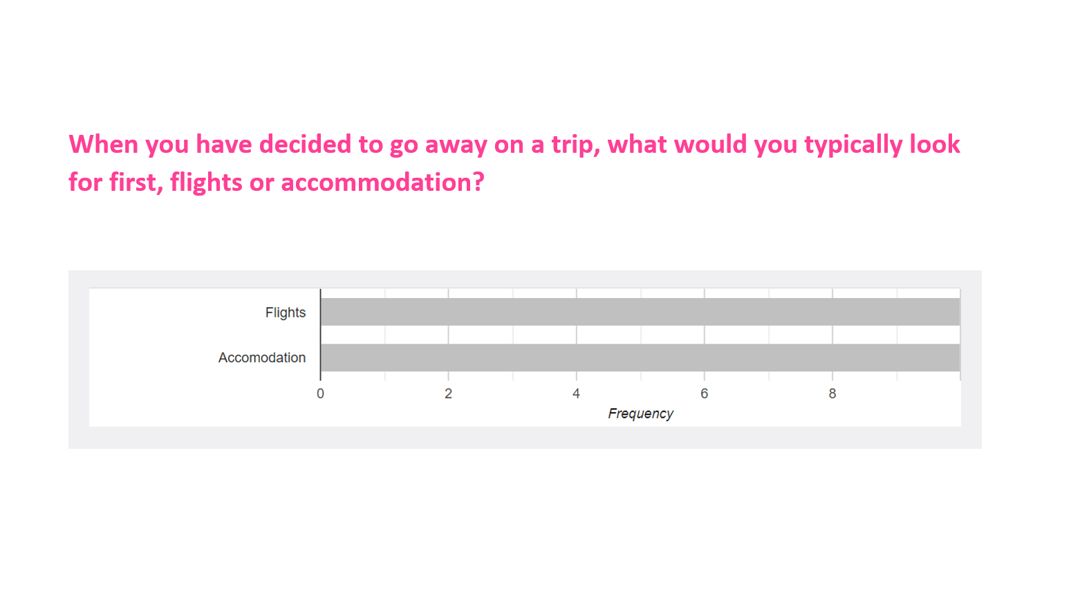
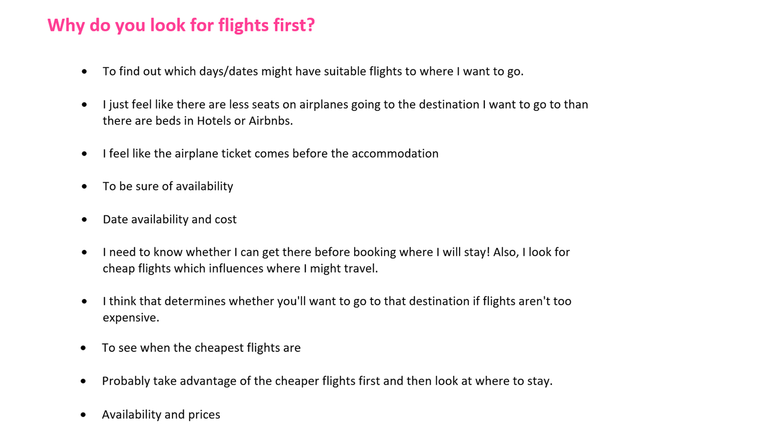
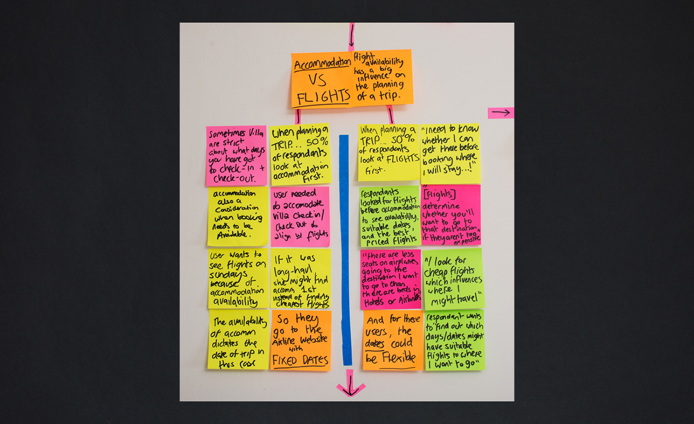
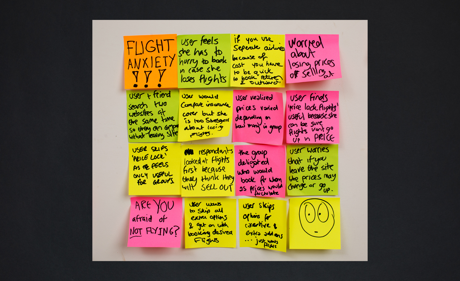
By now, it was clear that when it comes to trip planning, booking a flight is not just another task on the list, like car hire or travel insurance. Flight availability can have a significant impact on the trip arrangements, and I wanted to explore this further.
To do this, I asked respondents what they look for first – flights or accommodation. 50% of respondents find flights first, confirming the importance of flight availability on trip planning. By asking them WHY they look for flights for, and leaving the question open, I had around 8 or 9 people explaining exactly why flights have such significance. Recognising why flights are so important was vital to designing a website that fits in seamlessly with trip planning, and supports the users thought process.
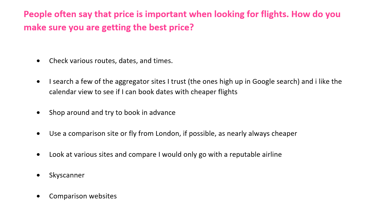
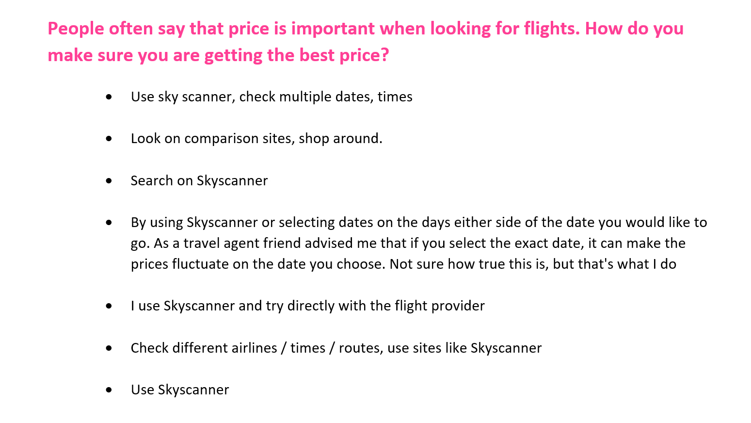
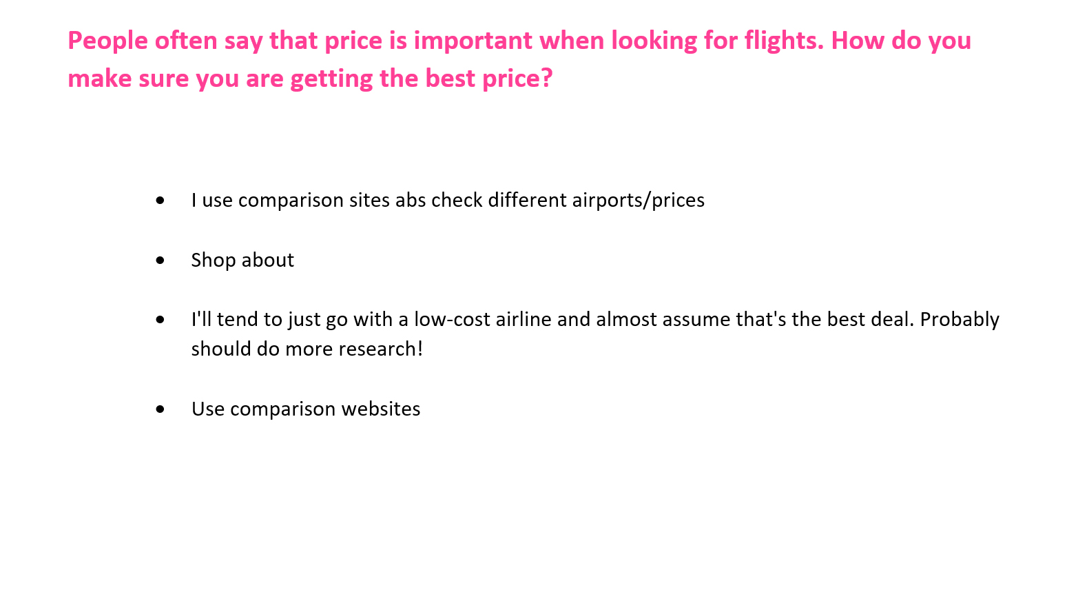
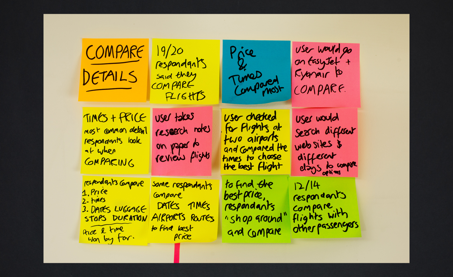
Asking if and how they compare flights, without asking if and how they compare flights
By now, it was clear that comparing flights was an important issue to focus on, and I wanted to find out more about how people do it, without asking them directly ‘how do you compare flights?’
So instead I asked how they find the best priced flights. The answers gave a really clear picture of flight comparing, and had a real impact on the design of the website.
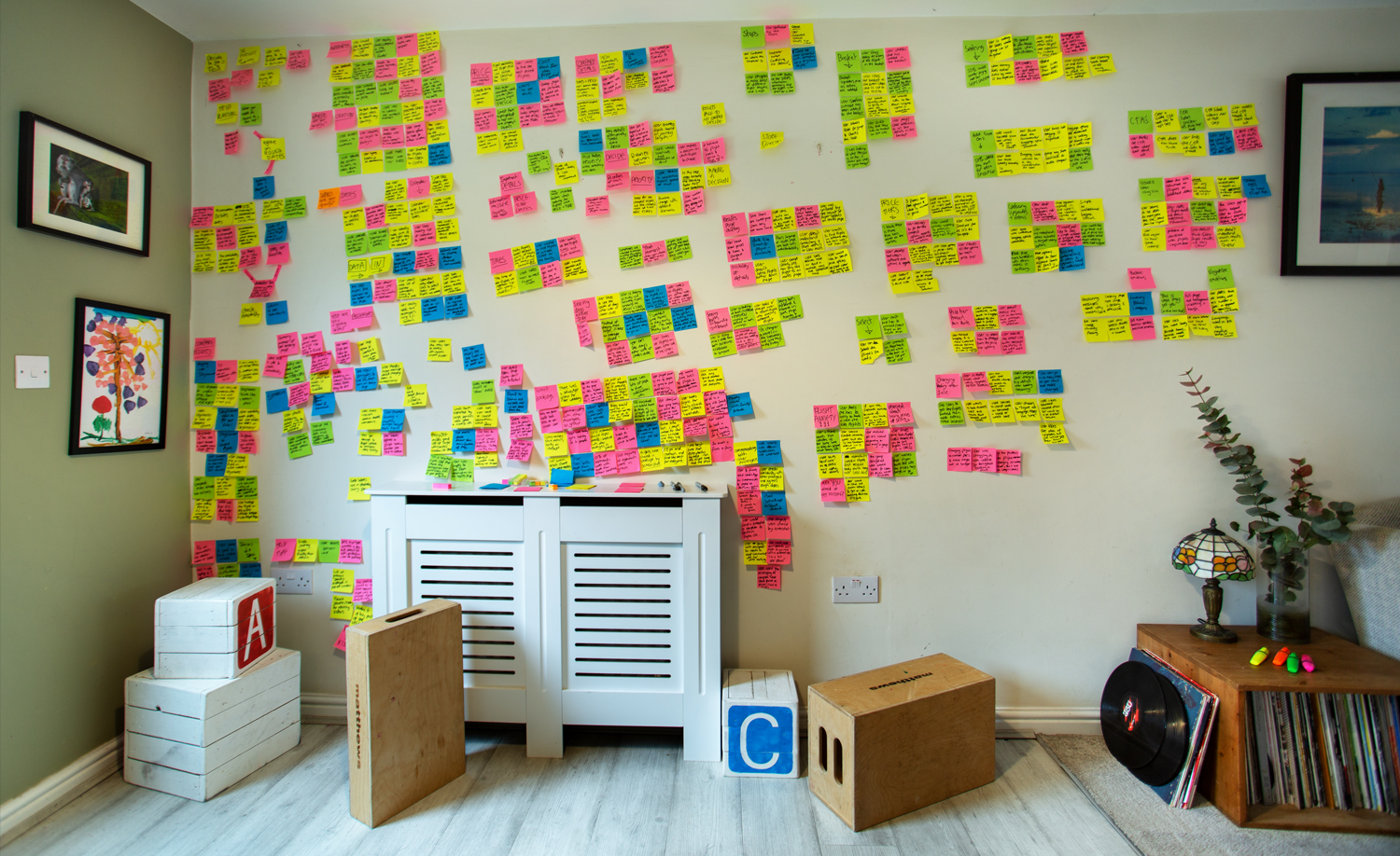
Analysis
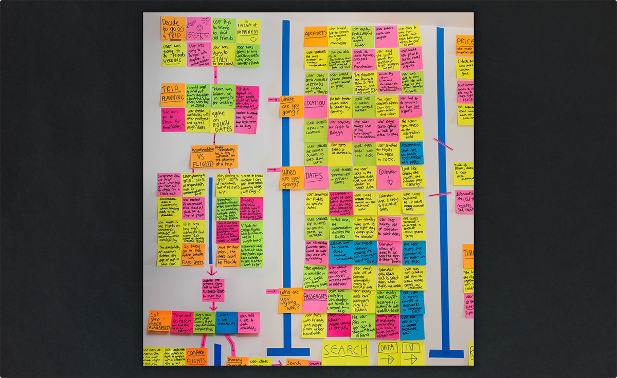
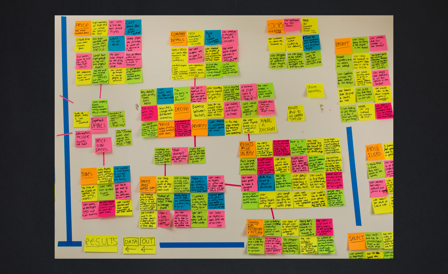
The research insights were refined with post-its, and clear picture of the trip planning process was mapped out.
- Affinity Diagram
- Customer Journey Map
Actionable insights
Being my first user-centred research project, I wanted to demonstrate exactly how I brought the research together into clear, actionable insights.
The videos below tell the story of the trip planning process, and make a compelling argument for how the solution should be designed.

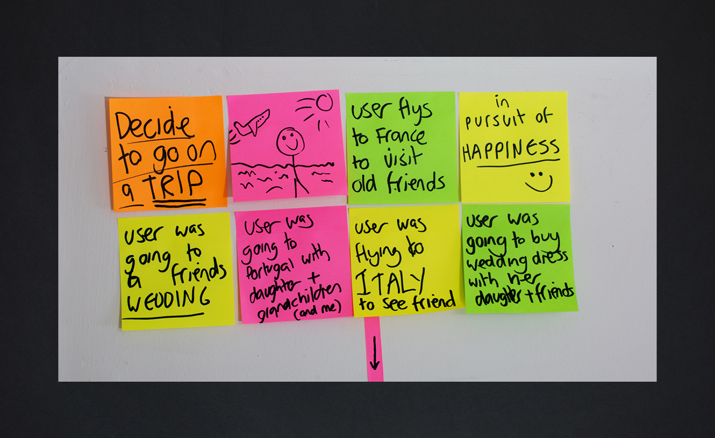
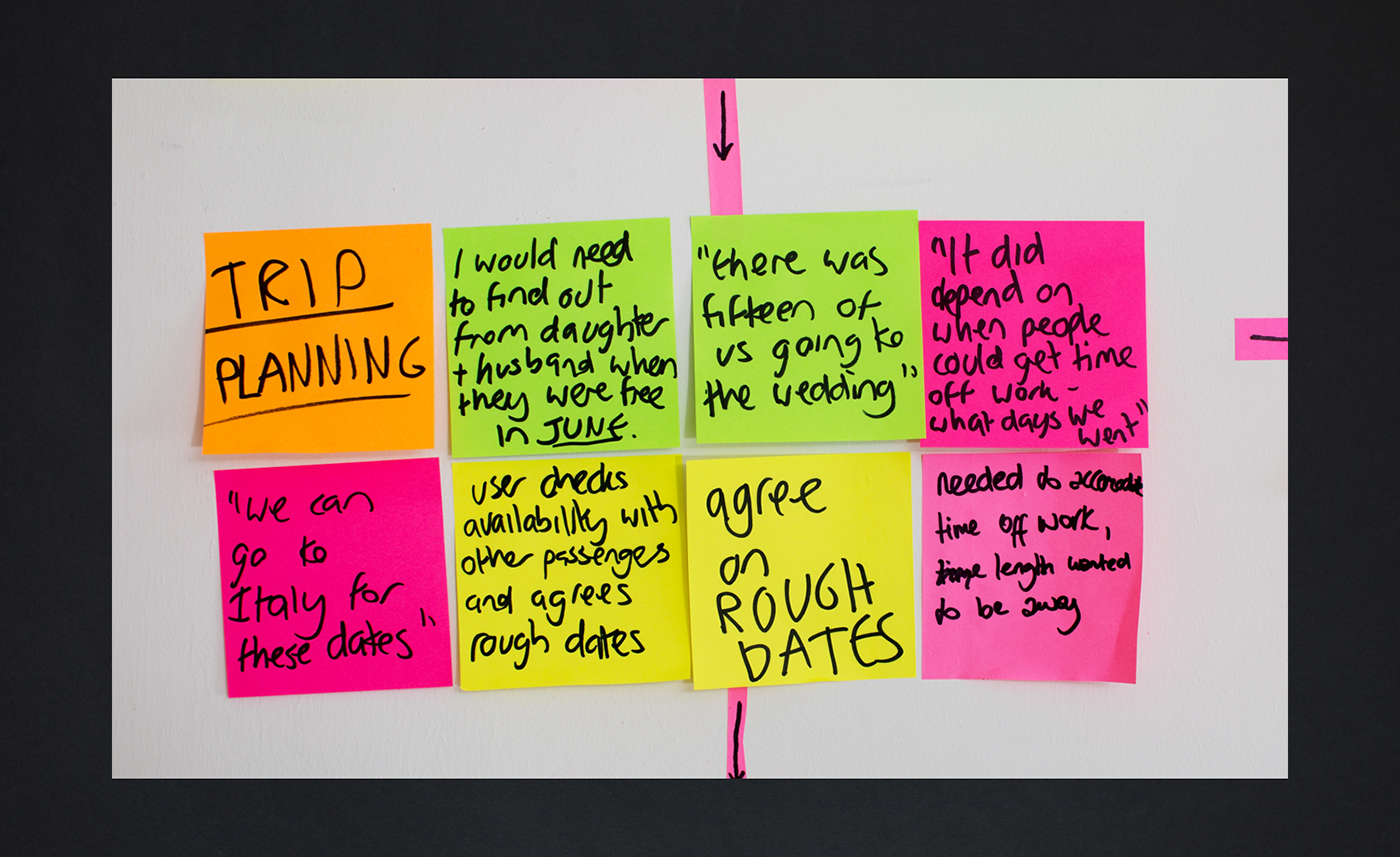
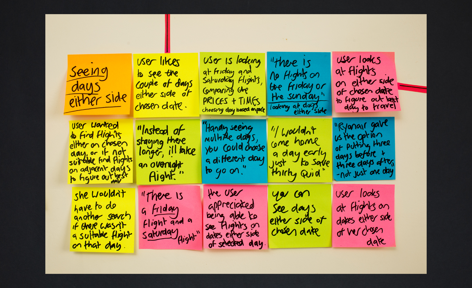
Ultimate goal Make a rough plan – where? when? who? Find flights & accommodation Take the rough plan and enter the details into the airline website Results page Compare flight details Its good to see multiple days Its good to see both outbound and return at the same time Make a final decision on which flight is the most suitable Share the details with fellow passengers Get them booked before we lose them! The big idea. To affinity, and…

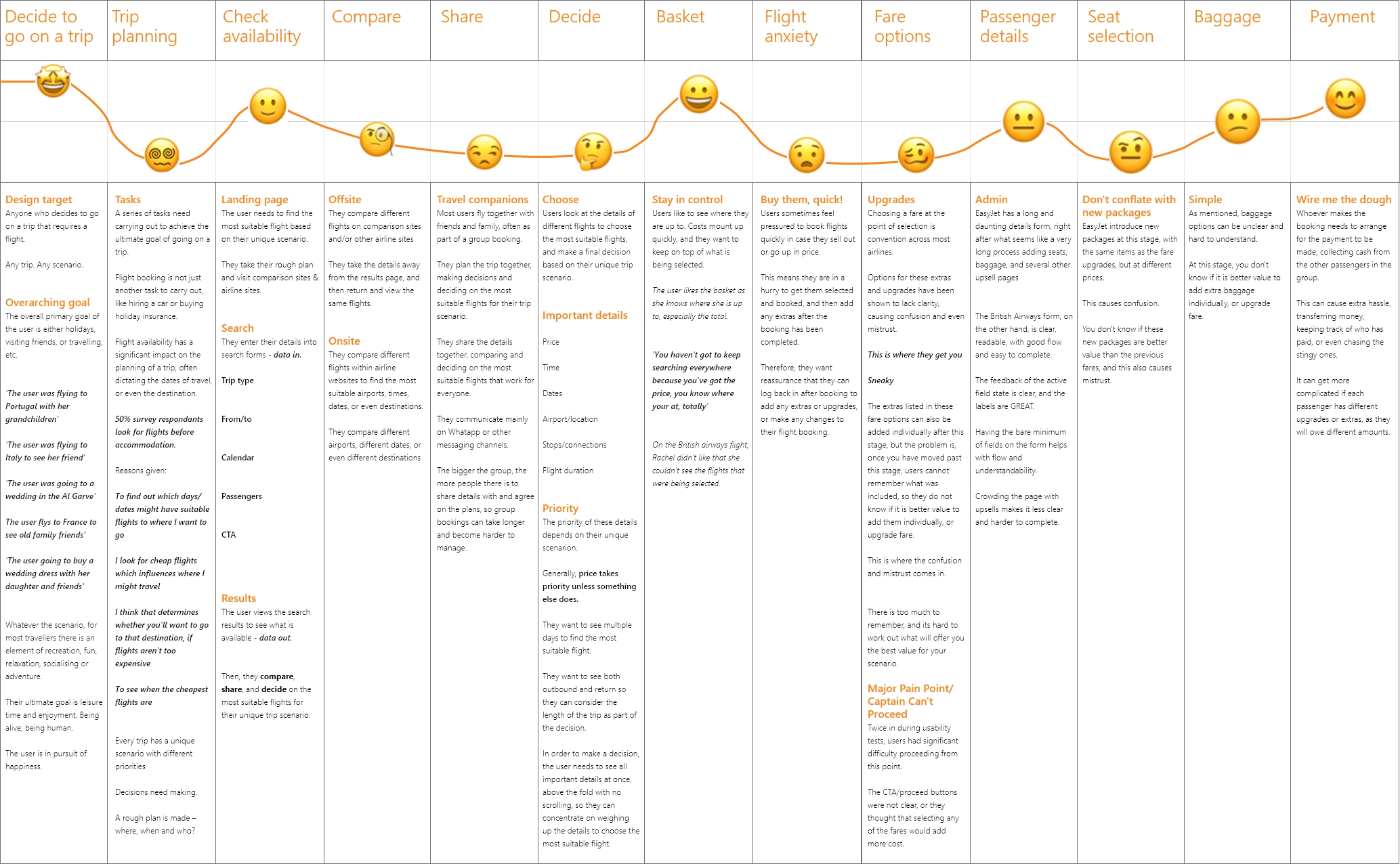
Trip planning
Flight booking is not just another task to carry out, like hiring a car or buying holiday insurance. Flight availability has a significant impact on the planning of a trip, often dictating the dates of travel, or even the destination.
- Make a rough plan
- Where? When? Who?
- Visit different websites & check availability
- Compare, share, and decide
The site needs to fit in seamlessly with this process to make flight booking smooth & stress-free. Booking holidays should be fun!
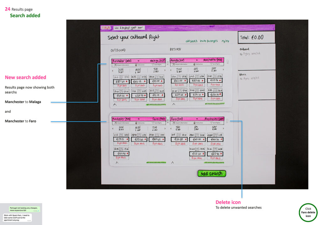
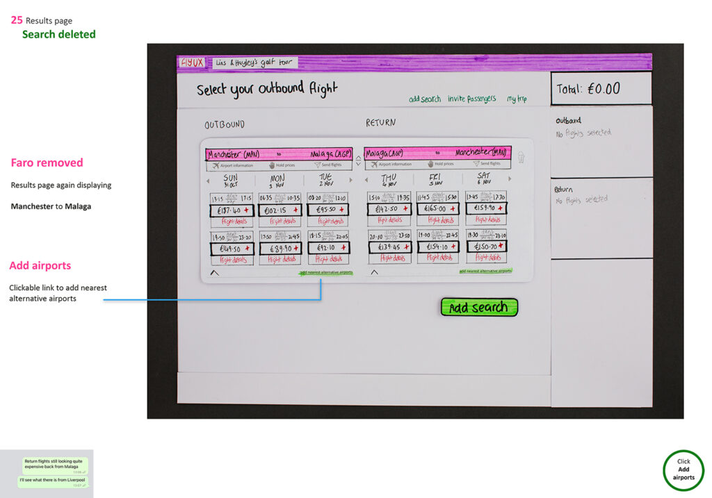
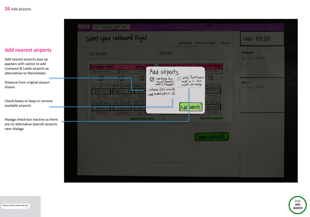
Compare
Users compare different flights to find the most suitable for their unique trip scenario, at the best price.
- They compare different airline websites and comparison sites like Skyscanner.
- They compare different flights within airline websites to find the most suitable airports, times, dates, or even destinations.
The website needs to support these behaviours, and make it easy to compare flights, both onsite and offsite.
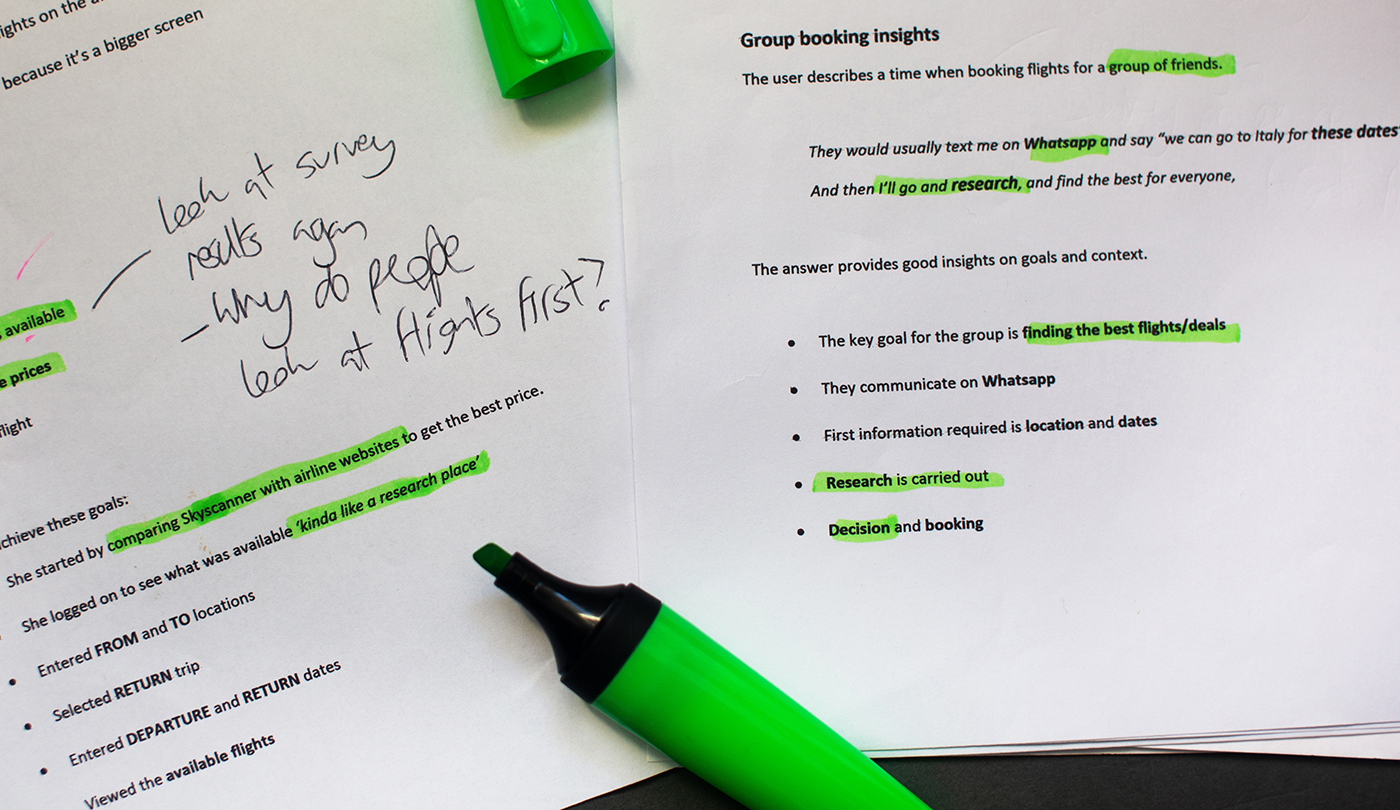
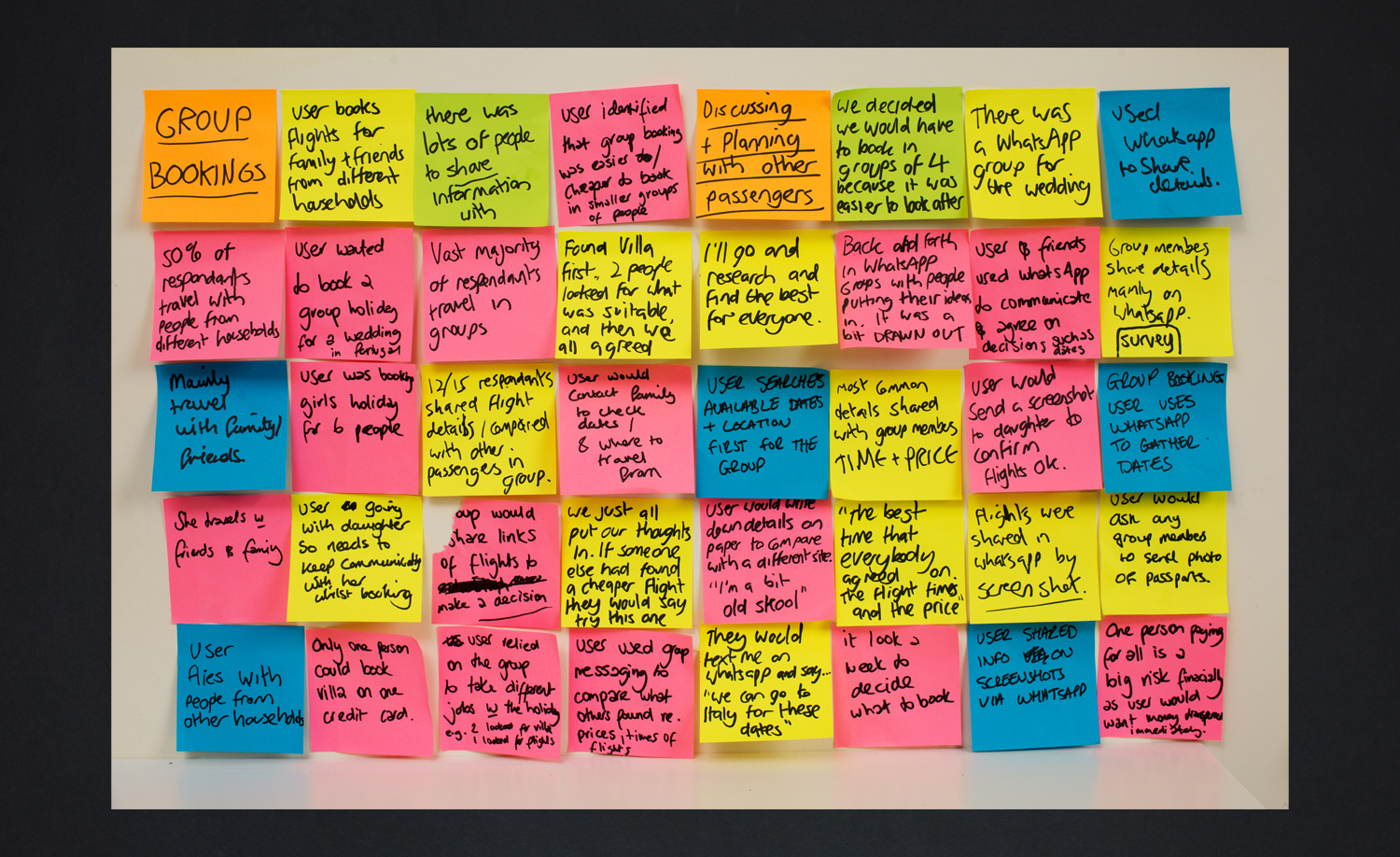
Share
- They share the details from the airline websites to find flights that suit everyone
- They make the final decision together
- They often share the details on WhatsApp
- The bigger the group, the more complicated this becomes
The website needs to make it easy for groups to share the details and reach a final decision together.
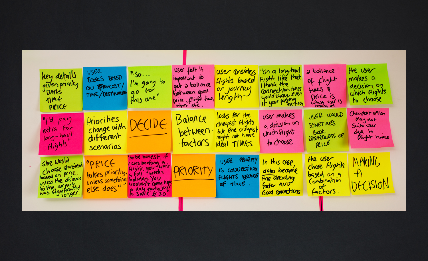
Decide
- Users decide on the most suitable flight by weighing up the important details.
- Price, times and dates.
- The priority depends on the unique trip scenario.
- Generally, price takes priority, unless something else does.
The results page needs to support the decision making process, with all required info in one place so the user can concentrate on finding the right flight, without having to remember details.
Designing the solution
With the research insights ready to go, the design of the first iteration began.
- Sketching & ideation of screens & user flows
- Paper prototype / interaction design
- 1st usability test
- Medium-fidelity prototype in XD
- 2nd usability test
The user flow was based on a single use-case, from landing on the homepage through to completing the booking.
More details
Keeping it real
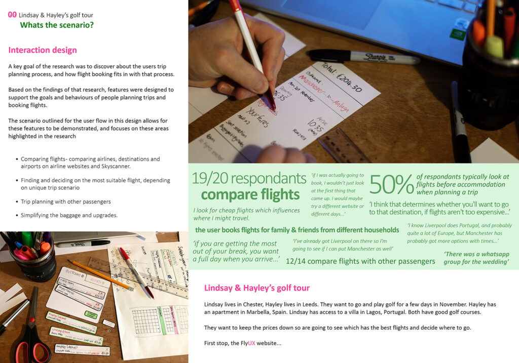
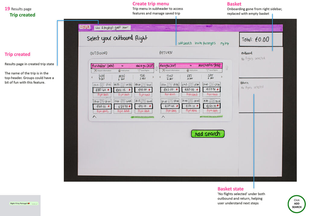
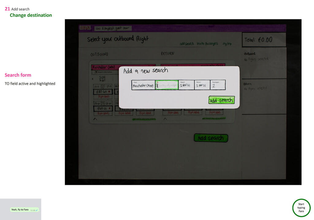
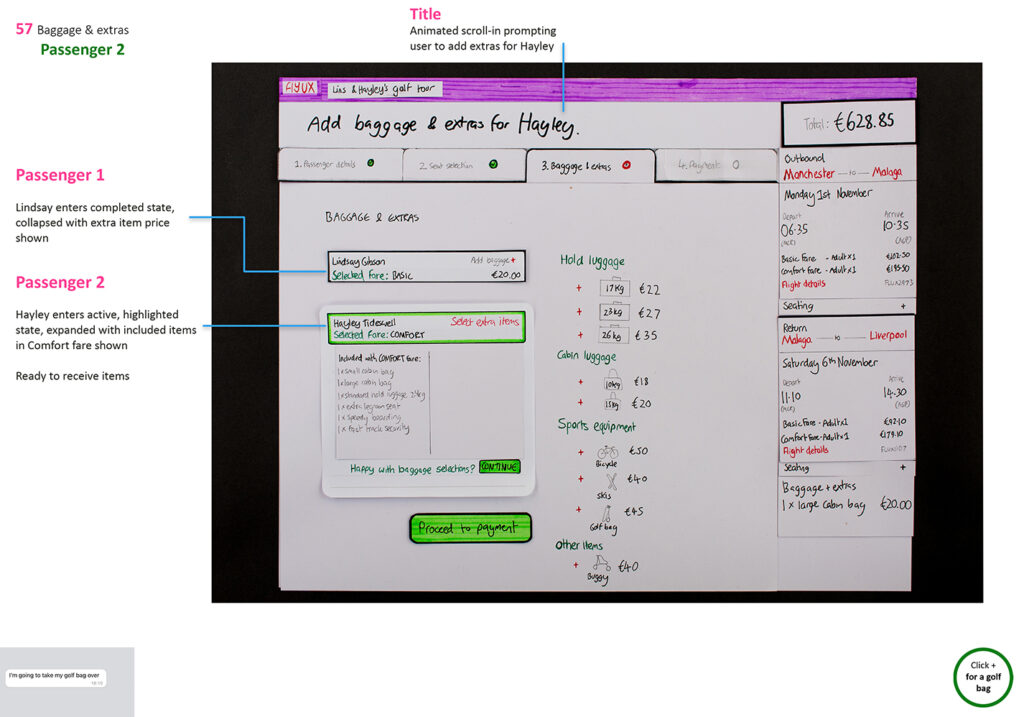
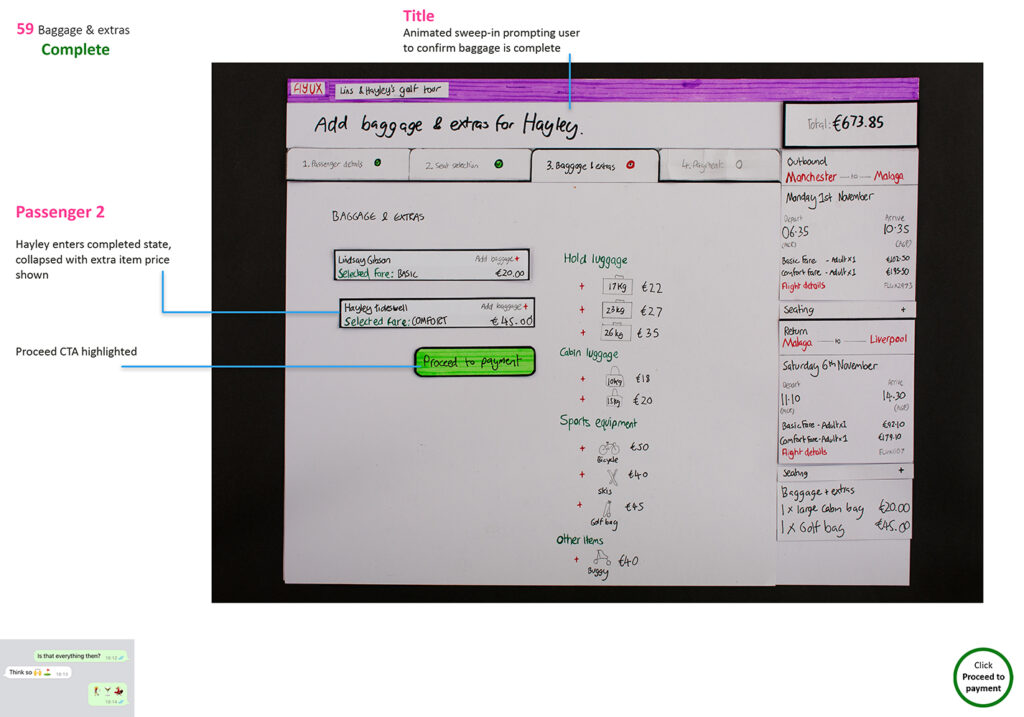
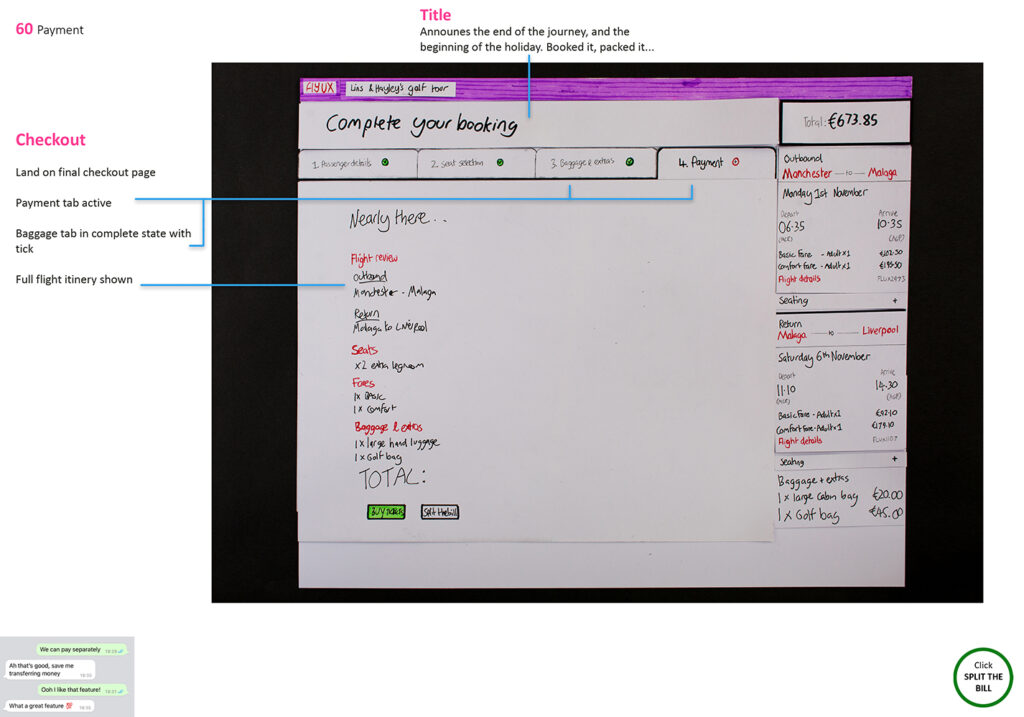
The use-case was based on a potentially real life scenario, a golf trip with two family members comparing prices, times and airports.
Hayley has an apartment in Marbella, Spain, and Lindsay has access to an apartment in Lagos, Portugal – both near good golf courses. The scenario was based on Hayley & Lindsay choosing which destination to fly to for the golf trip, depending on which flights were most useful.
The purpose was to demonstrate the features that support comparing flights, but using family members also helped me envisage how the features would work in practice, like real-life personas, with Hayley and Lindsay comparing flights together and coming to a decision.
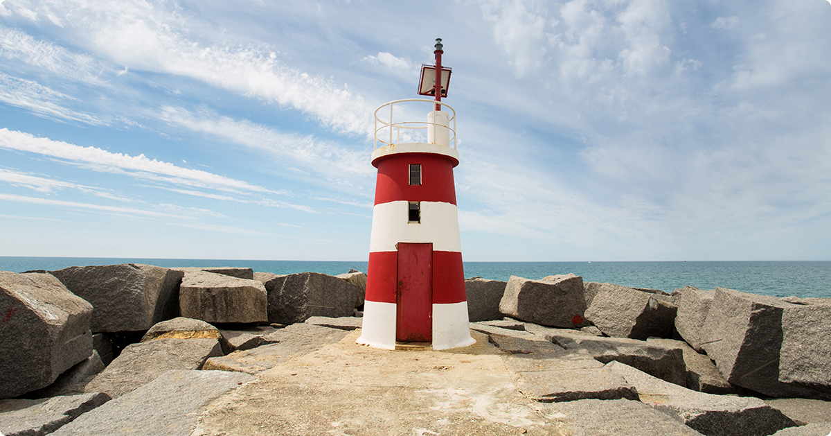
Lagos, Portugal.
Screens or flow first?
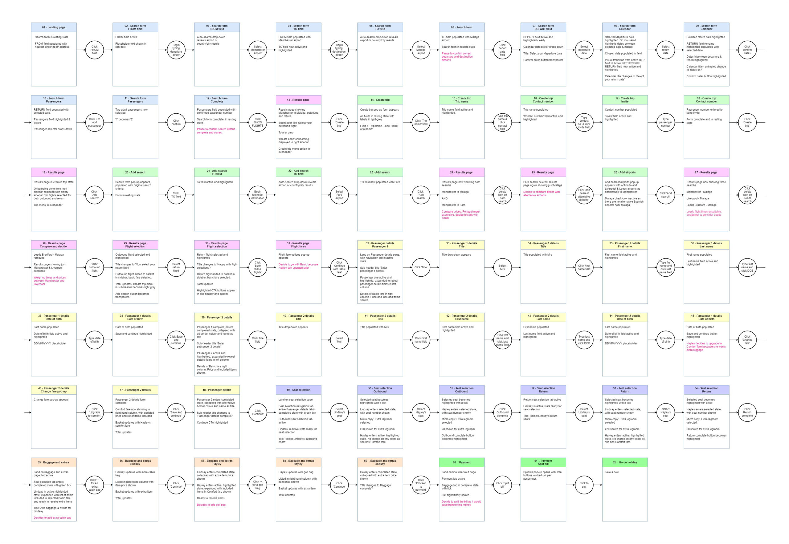
The structure of the diploma projects meant the user flow would be designed before the screens, but in practice I designed them at the same time. Basic high-level flow sketched out, then rough screens to visualise how that would look. Then they were both iterated and refined until every click was accounted for, in full detail with 61 screen states in total.
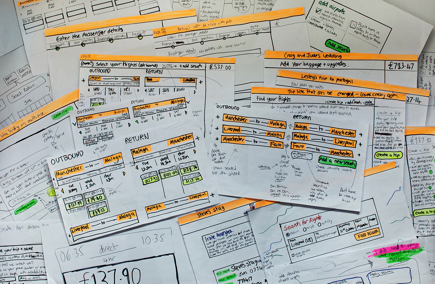
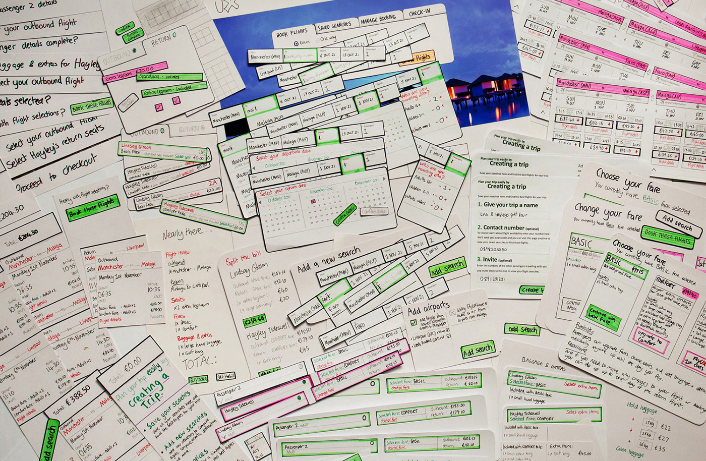
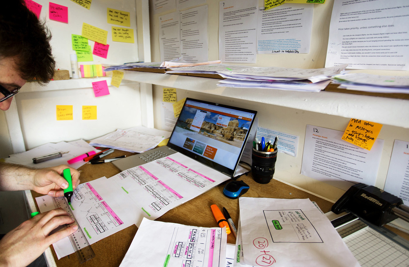
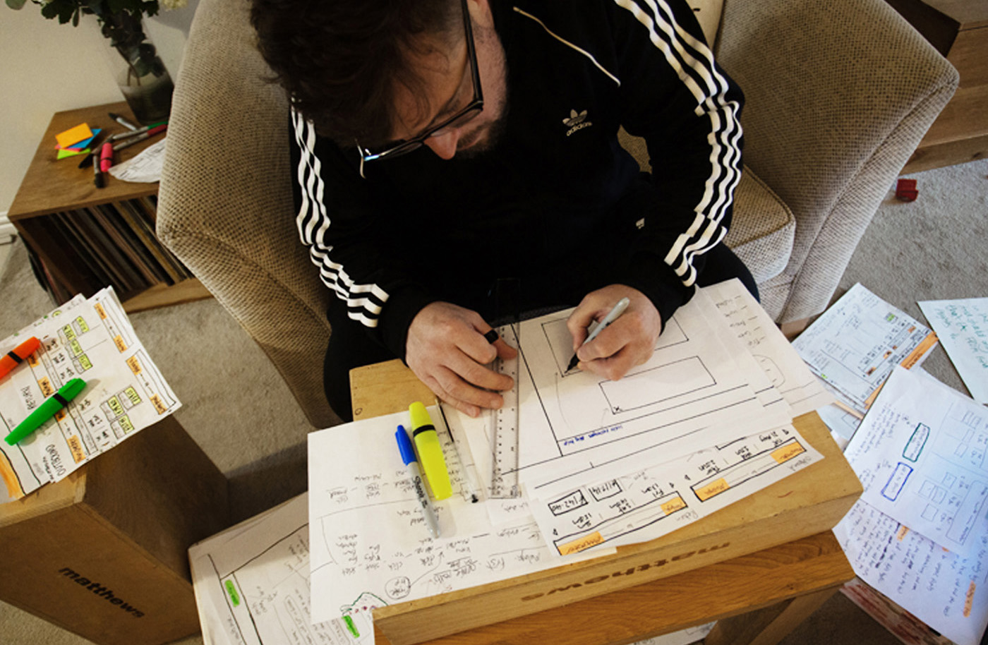
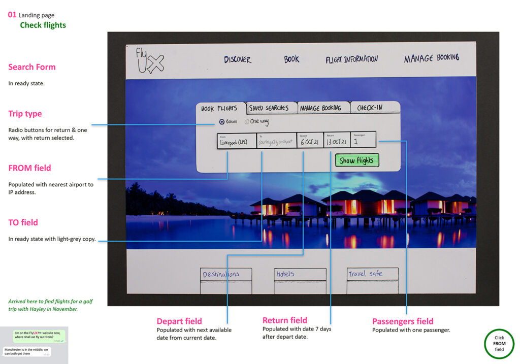
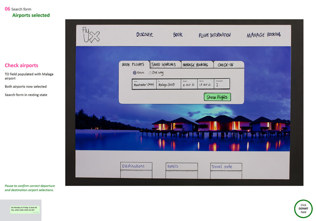
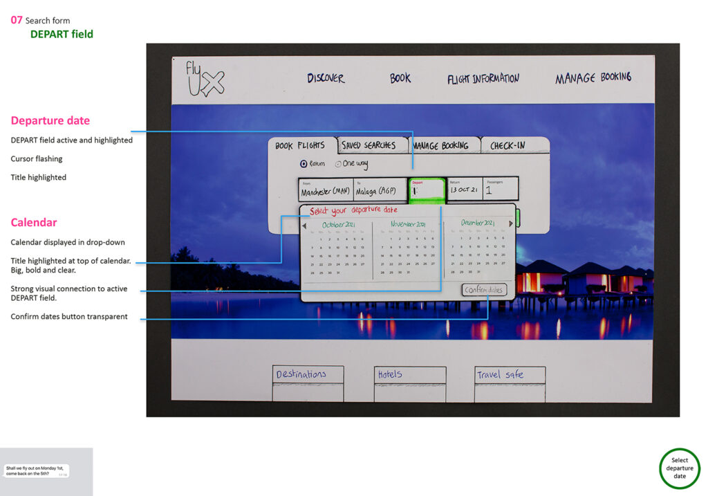
Paper prototype
Interaction design
The sketches culminated in a full paper prototype, and a usability test was carried out to make final iterations before the digital prototype was built.
There is a selection of annotated screens below or you can see the full flow with all 61 screen states here.
To keep the persona and use-case scenario in mind, I included WhatsApp messages along with the annotations.


More details
Analogue vs digital – UX vs UI
As mentioned at the beginning of the case study, this project was very much a UX project, and I wanted to focus on learning the user-centred design process. Gathering research, turning the data into usable insights, and using those insights to design the functionality and user flows, solving the problem of booking flights.
I had never built a prototype before, or used XD, so I wanted to complete a first complete iteration of the solution before I opened XD, so I didn’t have to worry about learning how to use the software, or worry about pixels and colour schemes or UI principles.
I wanted to the solve the problem in full analogue. Vinyl records, silver-halide film, paper prototype.
I didn’t set out to create a complete paper prototype, the sketches just evolved and grew into a full-blown, Blue Peter-style design system. And I was inspired by this video about paper prototyping by Google.
Of course, I wouldn’t go anywhere near this level of detail on paper now – everything but the very first, rough ideas, would go straight in XD, or even Miro. But at that point in time, when I was learning about the principles behind User-centered design, and turning research insights into solutions, doing it on paper kept my focus on that process.
And having a heavy-duty guillotine next to me on the desk helped too.
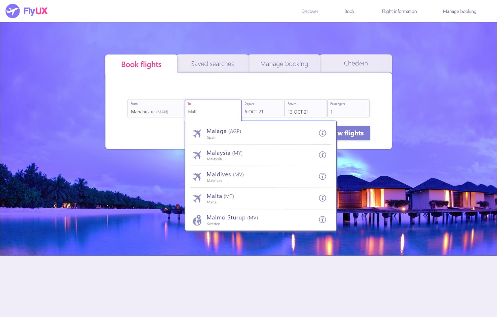
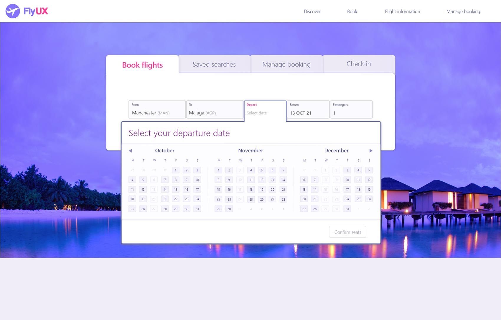
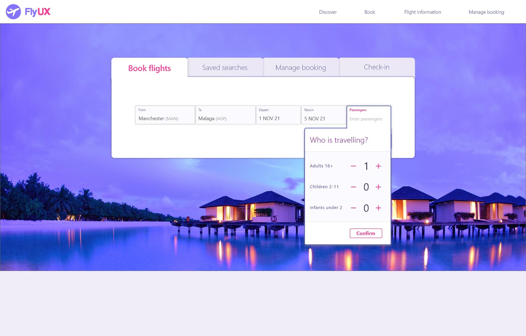
The solution
Screen flows
- Landing page
- Results page & flight selection
- Passenger details
- Seat selection
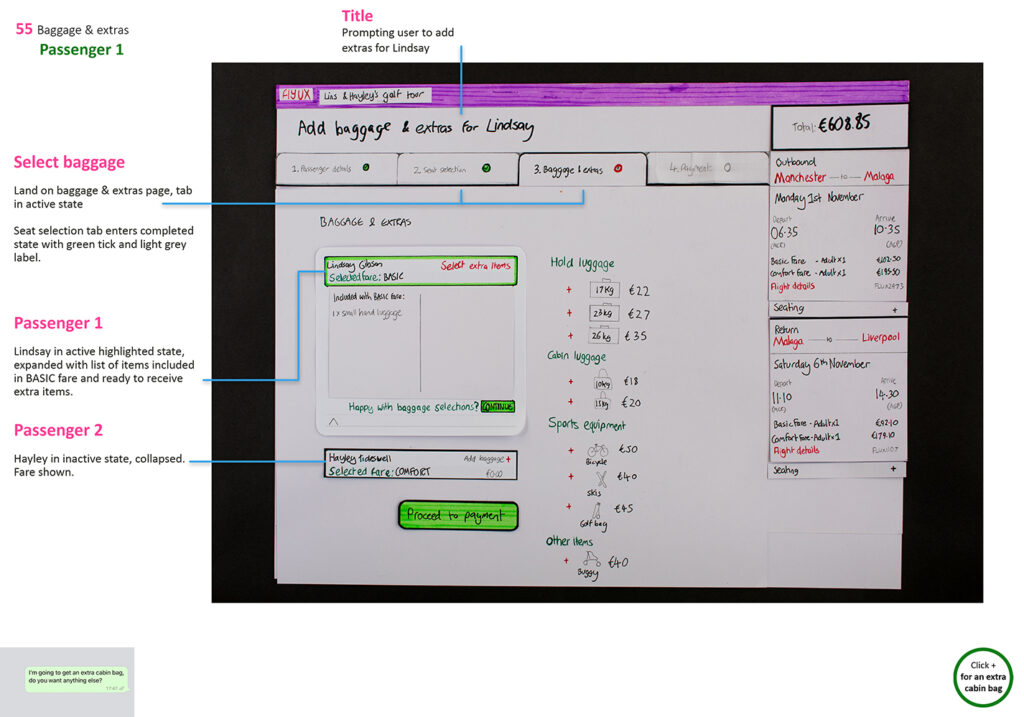
- Baggage options
- Payment
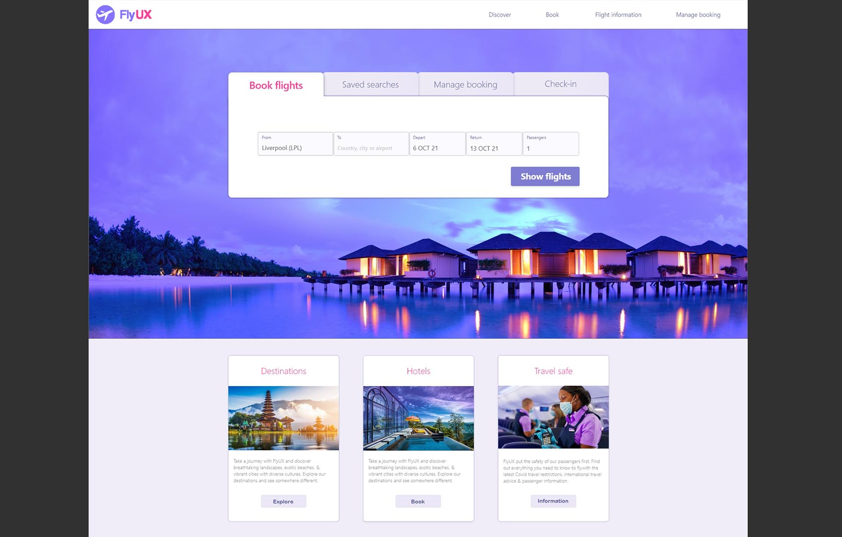
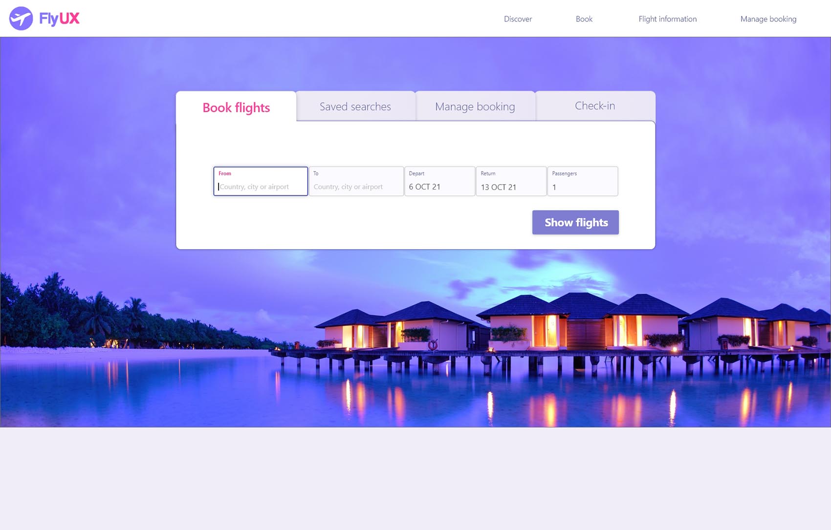
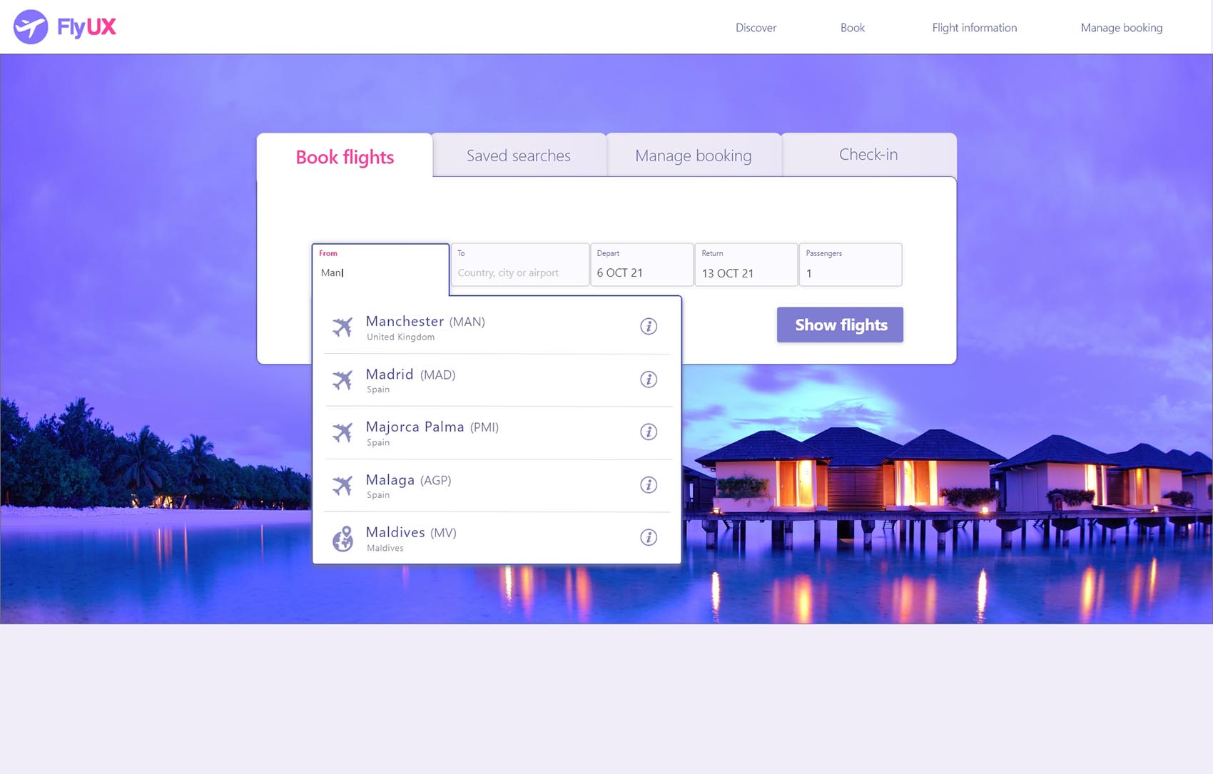
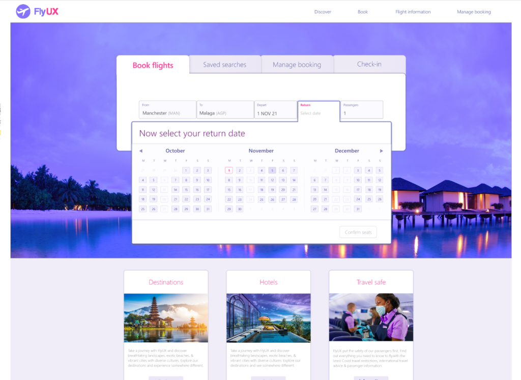
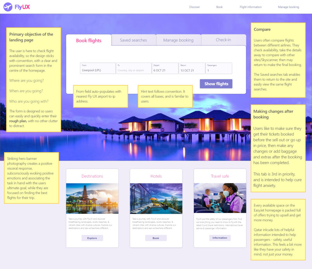
Landing page // UPDATING – SCREENS COMING SOON //
Notes about the landing page – 2 bullets max – primary purpose of the landing page – shall I incorporate the use-case story?
You’ve made your rough plan, you’ve got the details – where, when, who, just need to stick them in here quick as possible and see what is available.


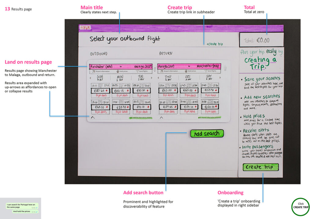
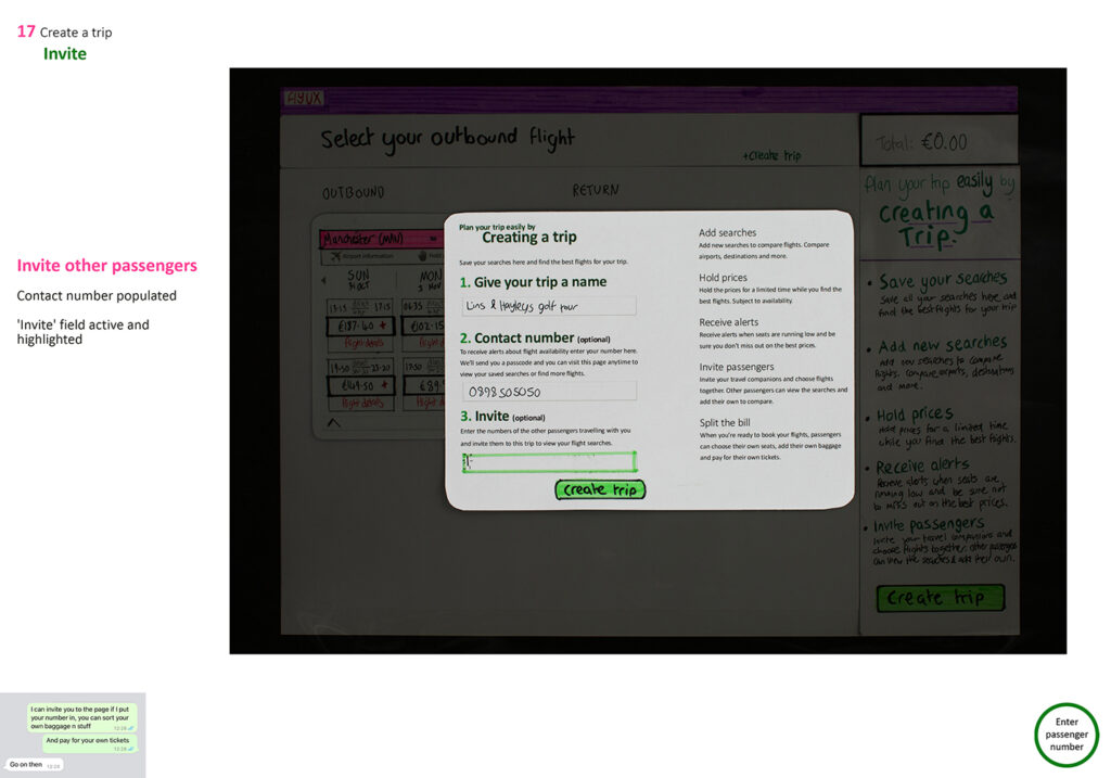
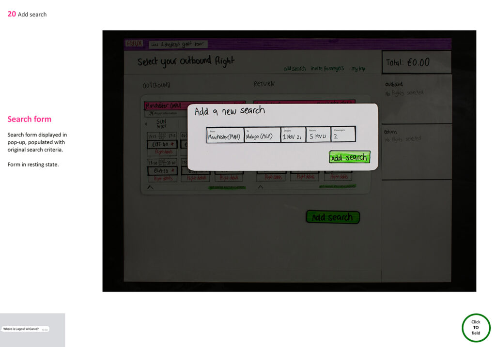
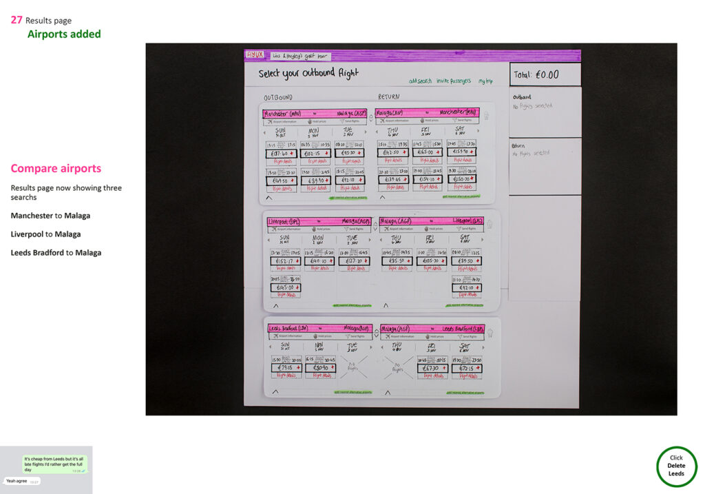
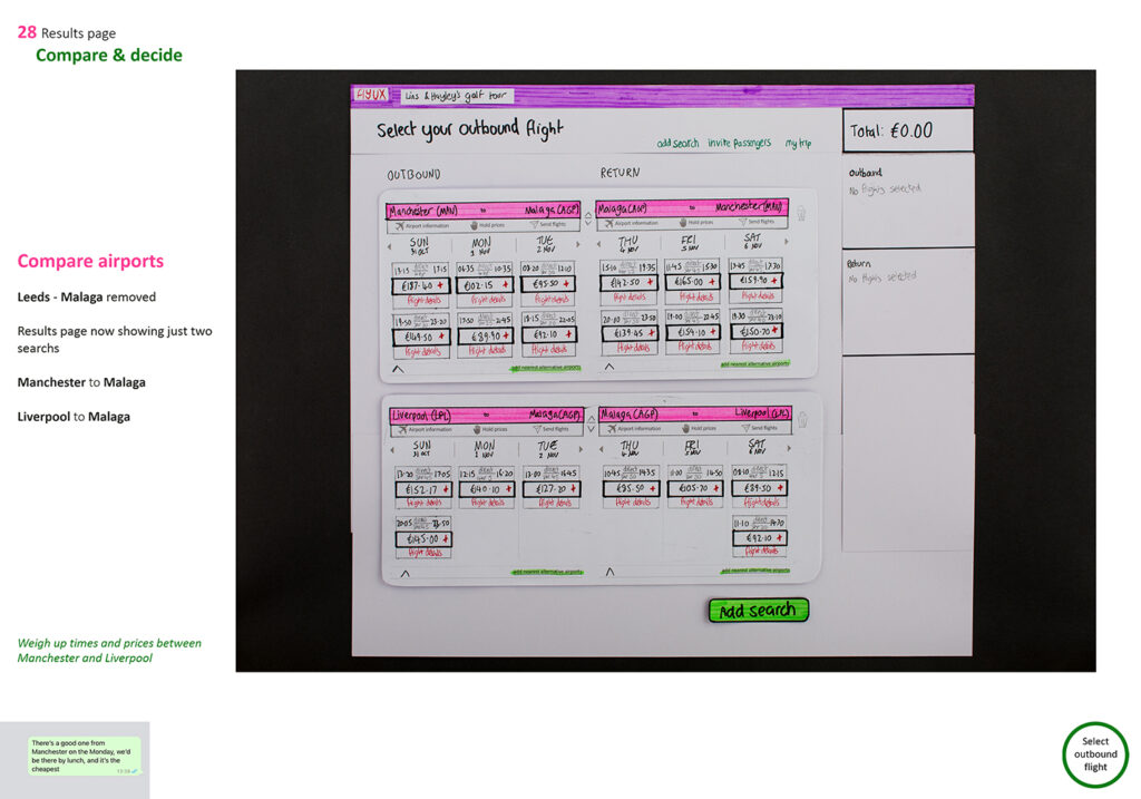
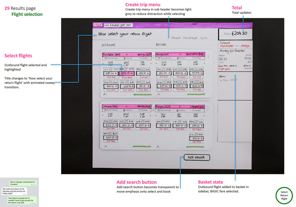
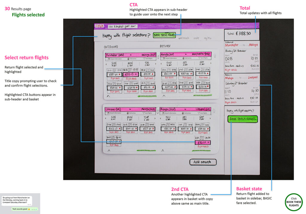
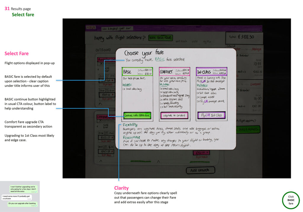
Results page & flight selection
Compare, share and decide.
This is where the action happens.
Create trip
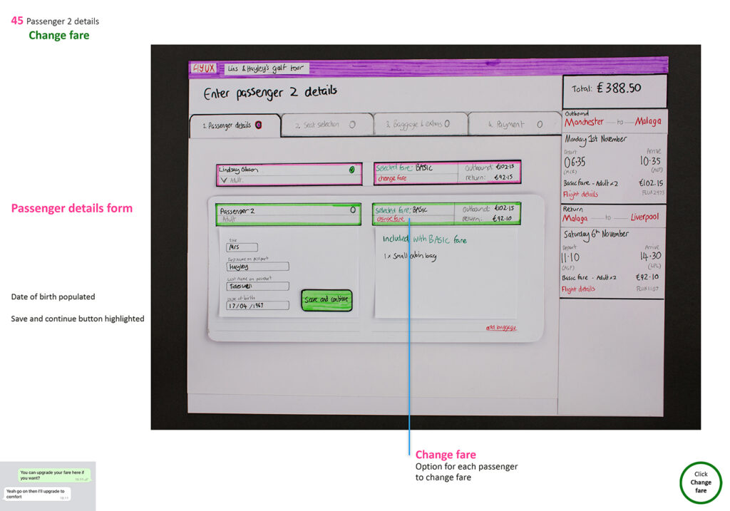
Passenger details
Compare, share and decide.
This is where the action happens.
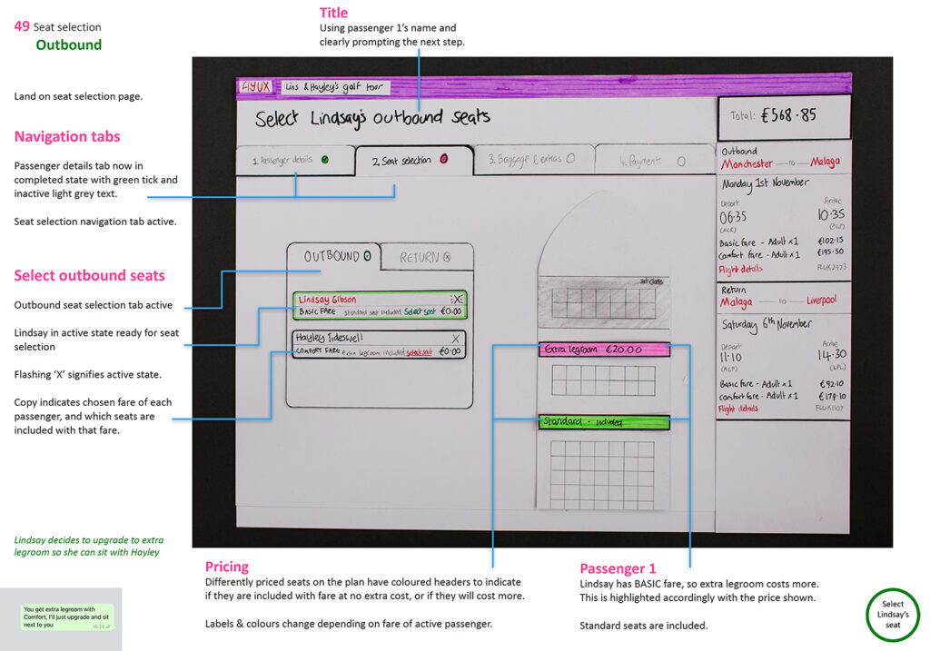
Seat selection
Compare, share and decide.
This is where the action happens.