Bounce Photography
Bounce was our school photography company, trading for fourteen years until the pandemic, and closing in 2022.
Volume photography requires workflow solutions to run all aspects of the sales process, starting offline, with a chain of communications and touchpoints along the customer journey.
The nature of this process required the close planning of how we interacted with our customers along the sales process. Many solutions exist, but we wanted the flexibility to sell from our own WordPress website.


An all-in-one WordPress platform was developed, with a login-area, image galleries and eccommerce store for parents to view and buy their school portraits. The platform took all school revenue for the last five years of trading.
The development of the platform became the main focus of the business, with an aim of selling it to other volume photographers. At the time there were no other companies that offered a solution within your own website, which gives useful advantages for digital marketing and growing a strong volume photography business.
Although the objectives were viewed from a marketing perspective, creating a good sales process follows the UX mindset. Every element was tailored around understanding of the audiences. Simplifying the process and improving the service was the overall goal.

Target audiences
It was designed with three audiences in mind
- End users Customers, parents, people ordering photographs.
- Schools Nursery owners/managers, school office staff, teachers, decision makers.
- Volume photographers School/sport/event photographers – any photography with a high volume of customers and images to manage.
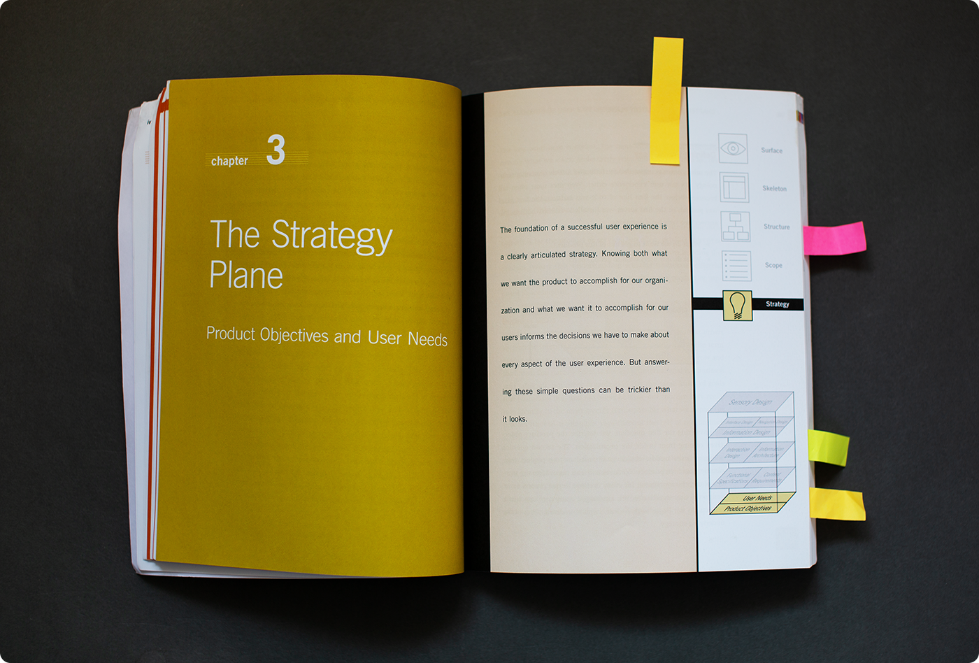
End users
The end users are the people viewing and ordering the images. The process needed to be simple, smooth, and easy as possible, managing their expectations, reducing calls, increasing higher spend, and generally providing a good service.
Good service = good experience.

School staff
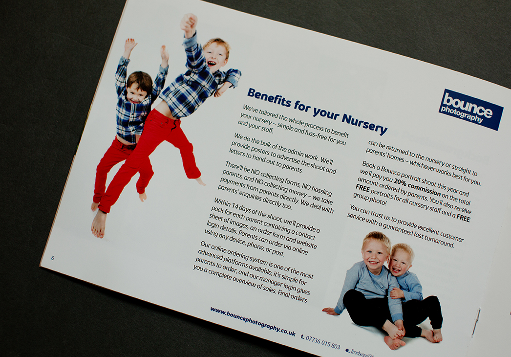
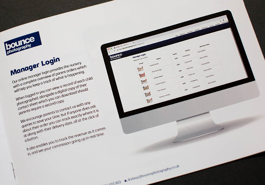
For school staff, the service needed to remove as much extra admin work as possible, and keep them updated with the information they require.
They need to know about parent orders, delivery dates, and if any parents have questions about their orders, they want the answers there at hand.
The whole process, from booking a shoot to delivering the proofs and final orders needs to be smooth and easy as posssible, with the minumum of hassle.

Volume photographers
For photographers the platform was designed as a 100% flexible solution, with great marketing features to help grow their business.
It has the flexbility to create multiple business streams. For example: school, family, wedding, commercial, sports, or events photography etc. Each business stream can have its own front-end brochure pages for marketing activity & sales funnel, and a login-area with unique galleries for customers to view and order their images.
The ecommerce platform allowed for the creation of unlimited packages and products with any configuration. Photographers could structure the site and create products for each business stream exactly as they require.
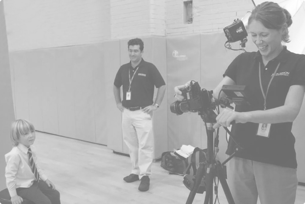
“Lots of photographers use the platforms, but what they find is that they can be limited in what they want to do, and what packages they sell”
Andy, MD DS Colour prints

School photography convention
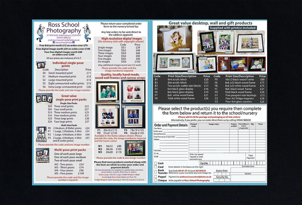
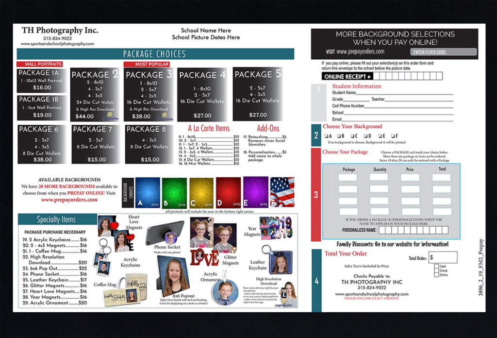
Traditionally, school photography is home to some of the worst designed forms and packages in the history of civilisation. Forms that should come with an asprin and a glass of water.
Older generations of photographers were resistant to the digital era, as they used to make more money selling duplicate prints. Likewise, online proofing was seen to reduce orders.
The traditional school photography model requires schools to collect orders and money from parents, with the onus on school staff to remind parents and push for orders. This creates lots of unwanted work for and hassle for schools and their staff.
Lots to improve on.
Top selling point
Our workflow and ordering process was designed to make things simple, understandable, and easy to use.
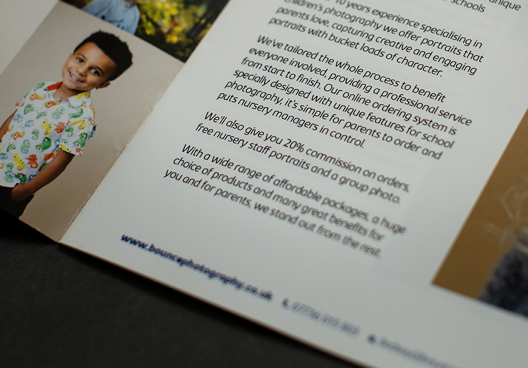
This was our key selling point with the target audience when it came to getting new schools. Most of the brochure was taken up with highlighting this to nursery managers and school staff.
We aimed to provide a better service with a smooth sales process that was easy for parents to order, with the minimum admin & hassle for school staff, and that gave them all the information they needed.
Good service = good experience = UX mindset.
Planning the content
We made our service and sales process simple and easy by carefully planning our content, based on profiling of our audiences.
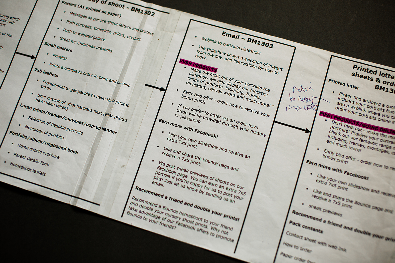
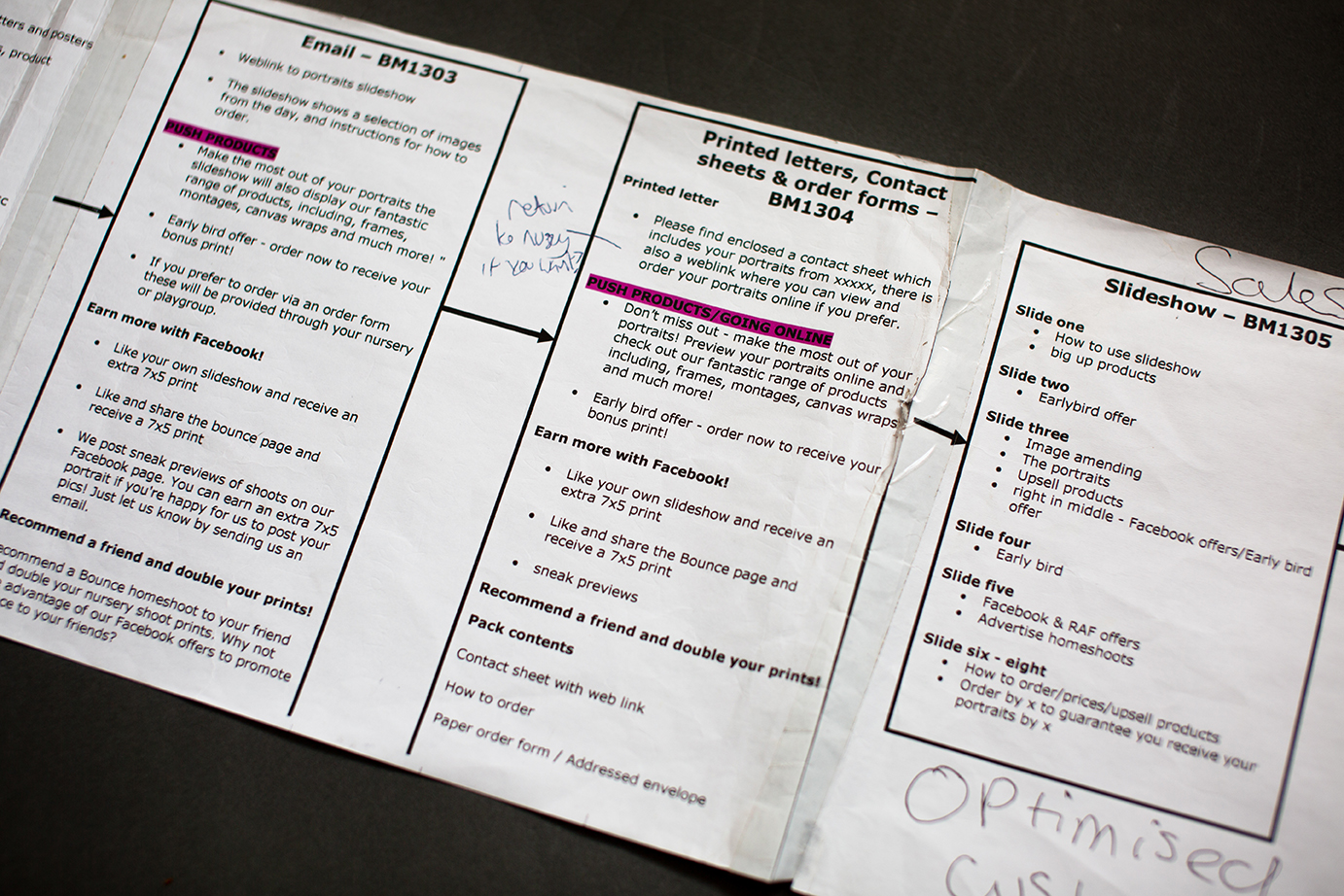
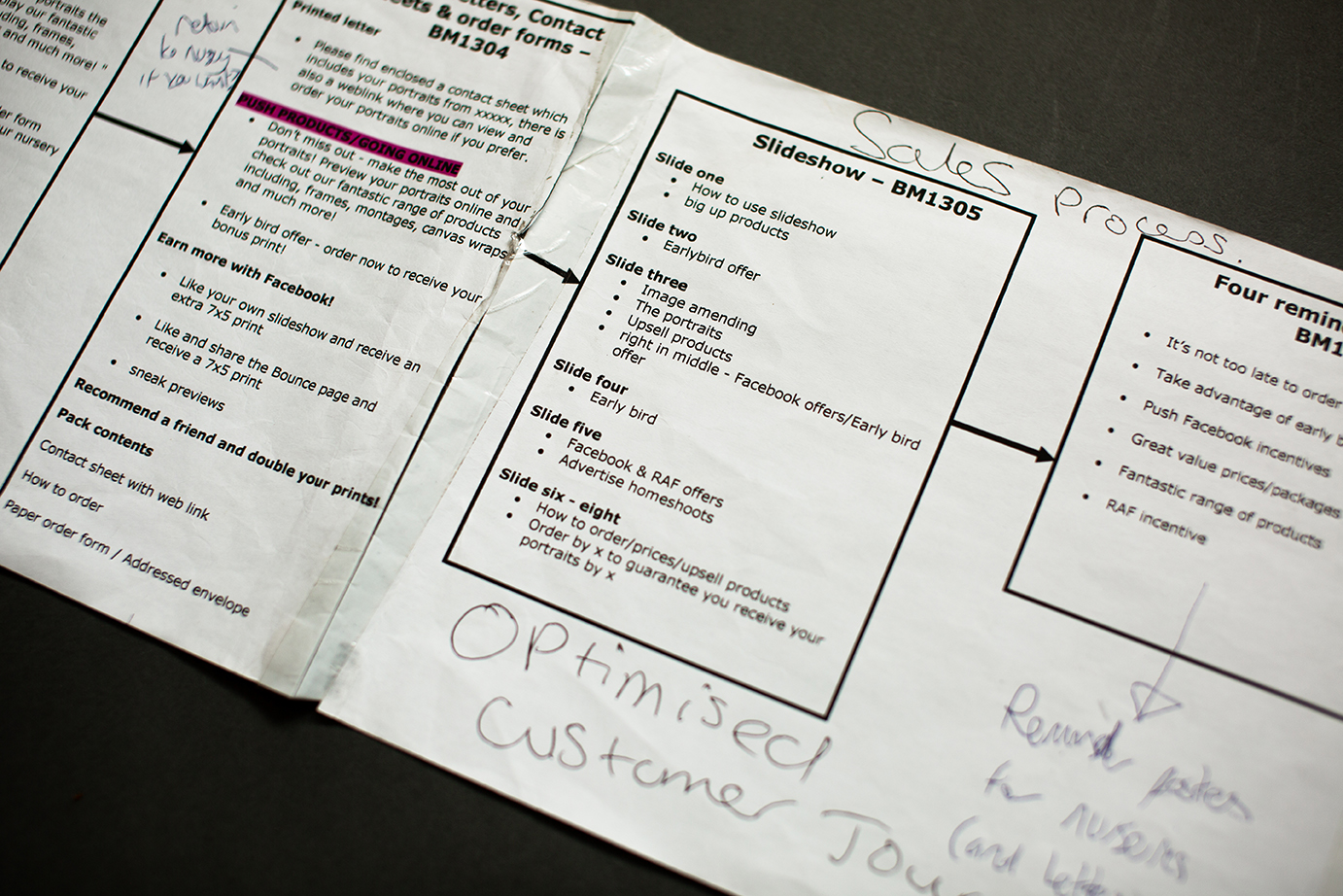
We gave close consideration to the customer journey, planning communications and key messages carefully to achieve a variety of objectives. Every touchpoint was an opportunity to improve our service in some way, and improve how customers experienced our product.
Through well written comms we gained more orders, increased order value, upsold products, managed customer expectations and significantly reduced calls from customers trying to order.
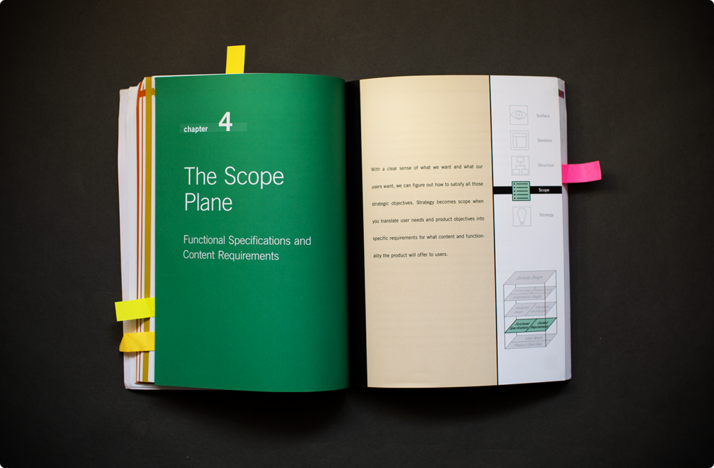
Content objectives
Improve service
Good service = Good experience = Good UX.
Manage expectations
- Outline timescale & delivery details
- Order tracking for both customers and school staff
- Clarity on pricing and packages/product description so customers knew what they would receive
- Reducing calls enquiring about orders
Simplify the order process
The sales process was designed to make ordering as simple as possible, with a smooth flow supported by well planned key messages in the chain of communications. Clear copy and instructions with simple to understand packages achieved several objectives along the customer journey.
- Increasing orders The less barriers to ordering, the more people order.
- Increasing order value Simple package structures encouraged a higher spend. Whereas other companies seemed to deliberately make their packages impossible to understand, ours was simple, and enabled parents to very quickly increase the amount they spent. Whereas a typical order value for the industry was around £35-45, orders of £75+ were regular through our website.
- Less phonecalls Easier sales process means less problems ordering and therefore less phonecalls.
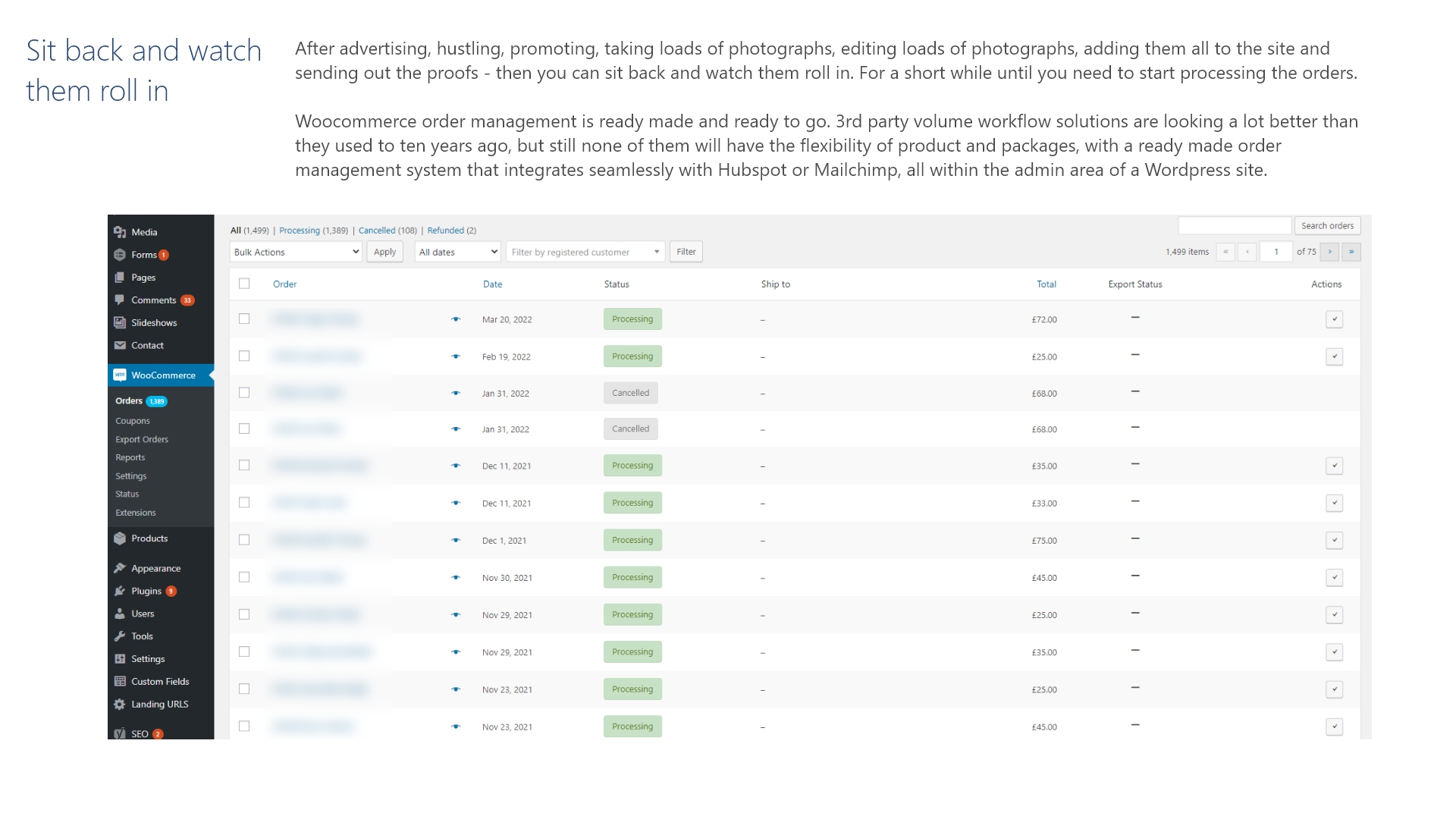
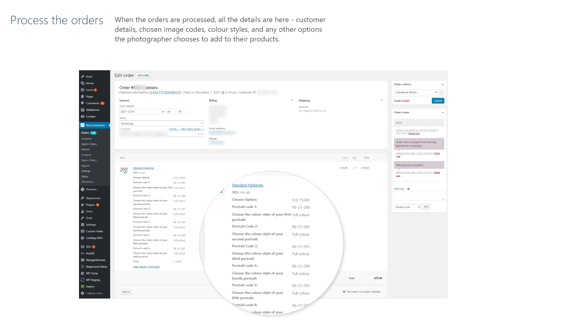
Manage customers and orders
The design of order management and CRM functionality, with Hubspot intergration or alternative solution was the next stage of the project. Using the built in user management system in WordPress and Woocommerce, the platform could allow photographers to maximise the success of communications:
- Manage orders With literally 1000’s of customers and orders, a good workflow and order management system is important for volume photography to reduce work and improve service.
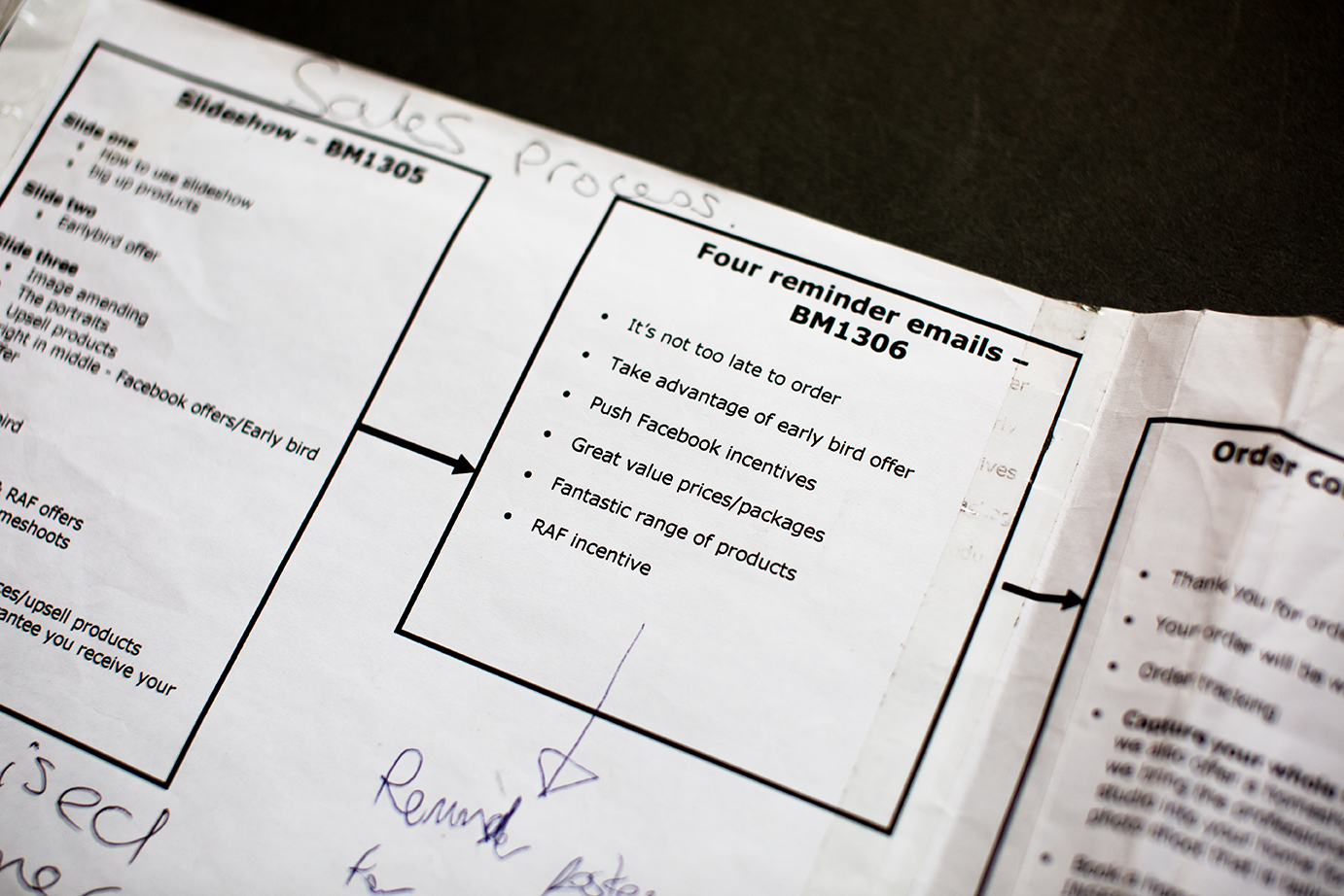
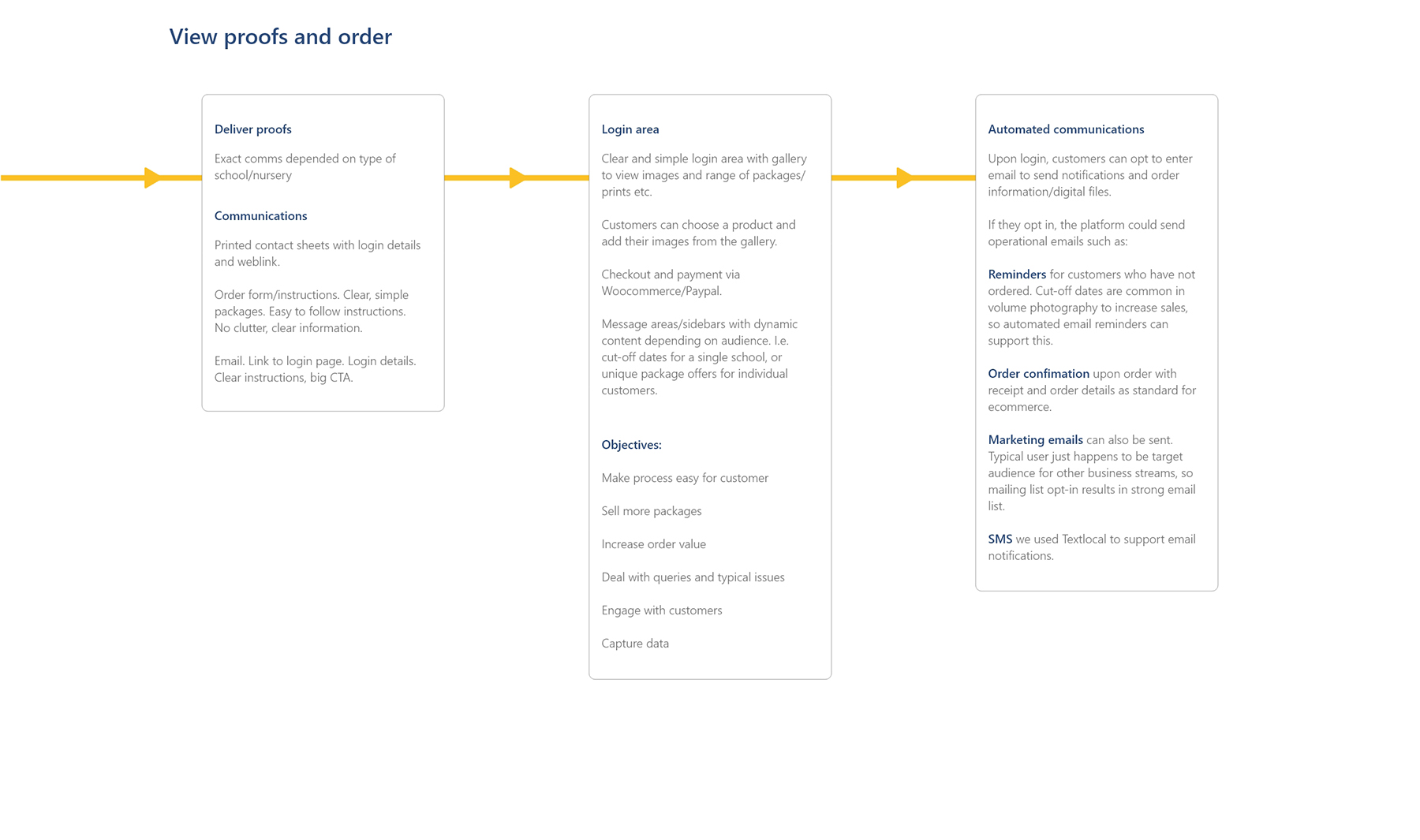
- Automate communications The number of orders in a busy season requires automation to run effective communications, maximising sales and improving service. Order cut-off dates are common in volume photography, and automated email reminders support this to increase orders.
- Segment the datatbase. Great for several reasons – improving the operational communications in busy periods. Targetted marketing to different audiences. Segment the datatbase easily so emails/texts can be sent to different audiences. For example every parent who has ordered from a particular school, or every parent who hasn’t ordered from all current schools.
Digital marketing
- Data capture The platform enabled photography businesses to take advantage of the high-volume of customers by collecting data. Given the reason they are on your website, its easy to build a high-value, well perfoming email list full of warm leads. Its the exact target market – parents who are interested in buying photos of their children. By capturing valuable data, services can be cross-sold to volume customers. For example, a photographer could advertise their private family shoots to their school customers, or in America they could advertise senior portraits to all customers from a high-school prom
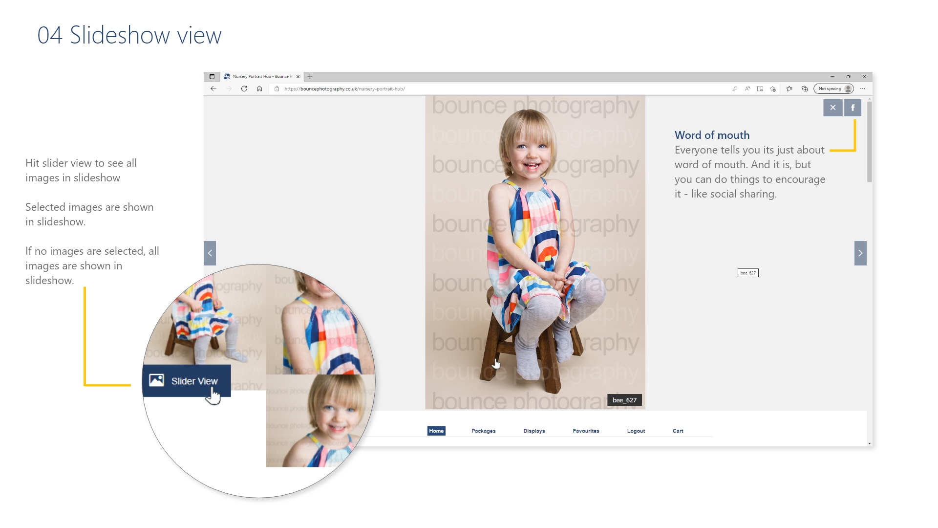
- Sharing encourage word of mouth encouraged word of mouth – our gallery makes it easy to share images to help spread the word.
- Engagement with customers through the customer journey and after the sale, always makes for better service/experience.
- Upsell products With the platform it was easy to upsell products and displays, which also helps increase the average order value.
Key messages and communications plan
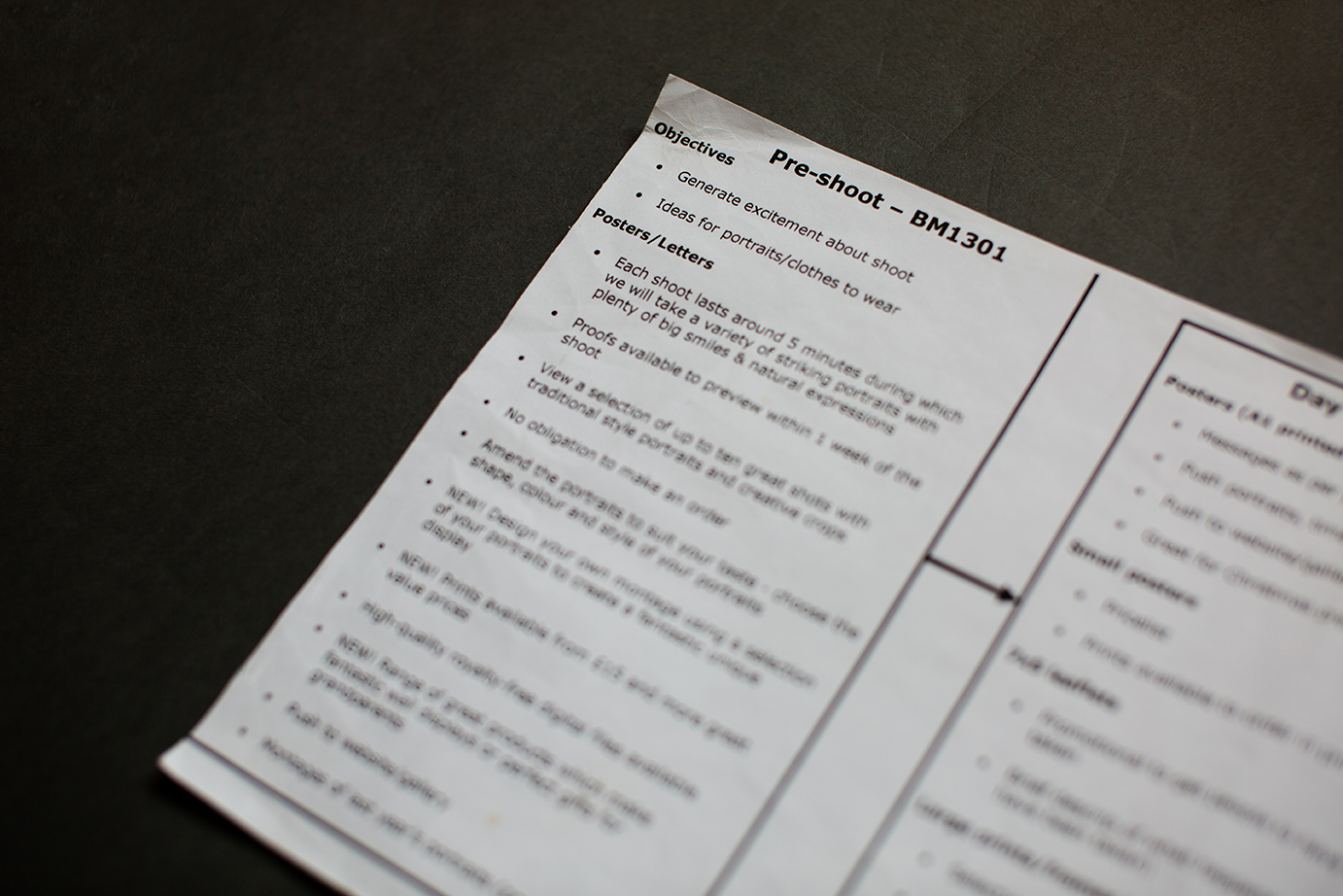
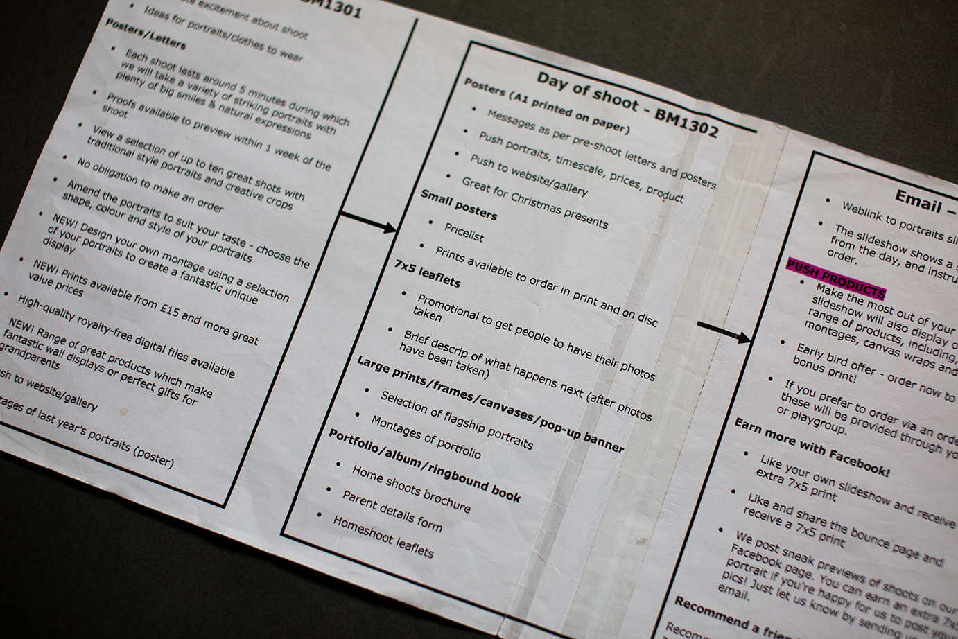
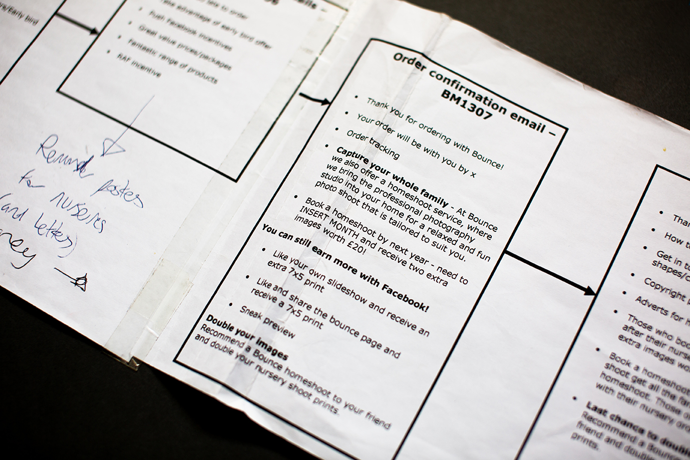
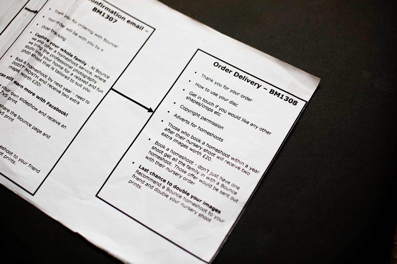
Without Visio or Miro these ancient flow charts were drawn impossibly in MS Word and printed on papyrus reeds, but the content and key messages of each communication along the journey was planned carefully to achieve the outlined objectives. Different business streams had a different plan. Content was tailored to each audience, with appropriate creative, channels and messaging devised based on their profile.
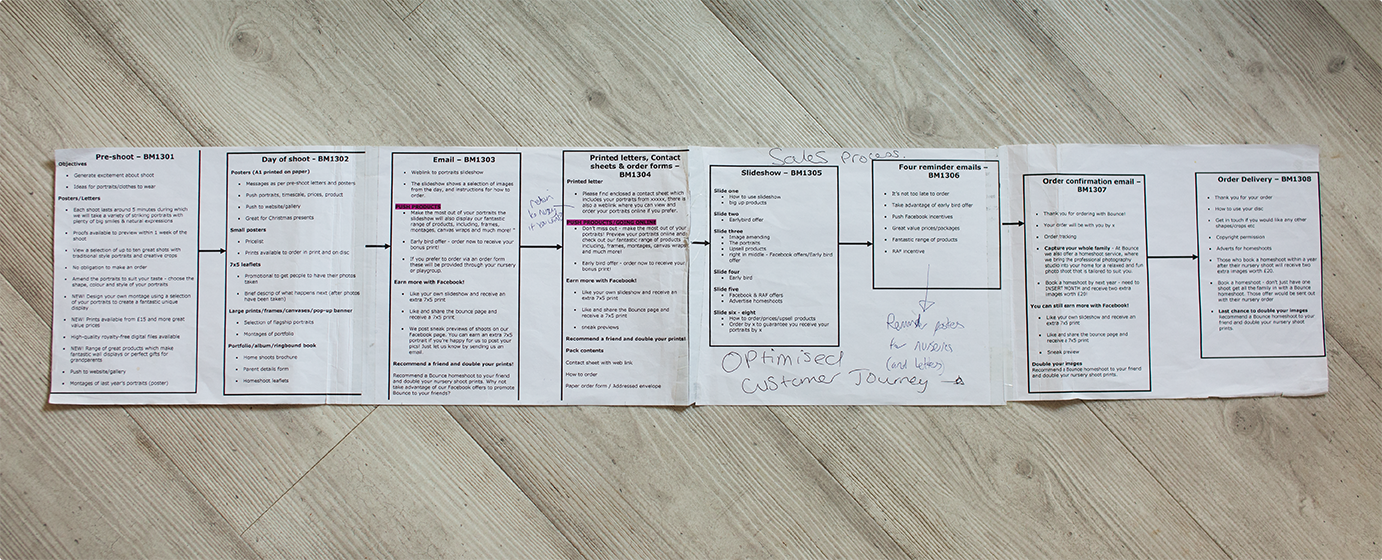
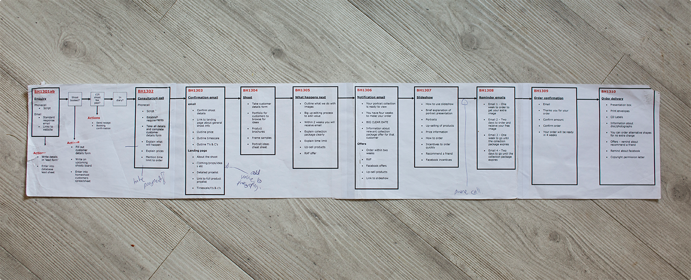
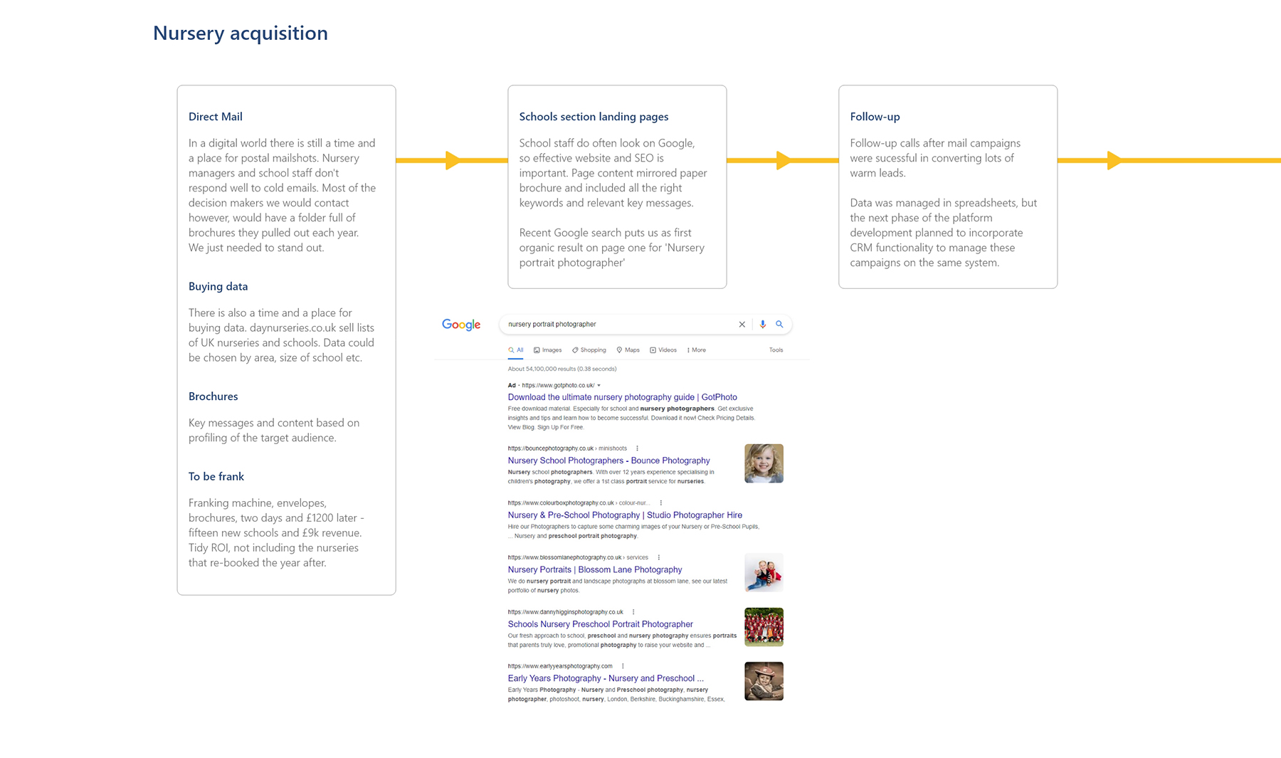
Latest communications and content plan
Papyrus reed is no longer compatible with WordPress since Version 2.4, so the updated customer journey was planned out in XD
View the pdf or scroll through the journey here:
While the online ordering only takes place along part of this journey, the website sits at the centre, supporting the entire communications process.
Website content and functionality supports:
- Acquisition of new schools/marketing
- Promoting photoday
- Smooth process for viewing and ordering
- Order management/CRM
- Data capture and digital marketing
Website design
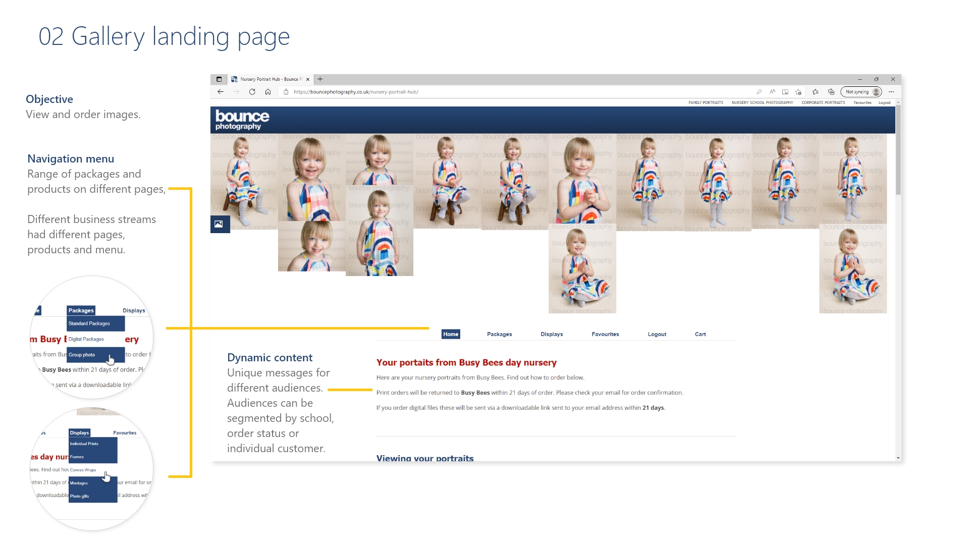
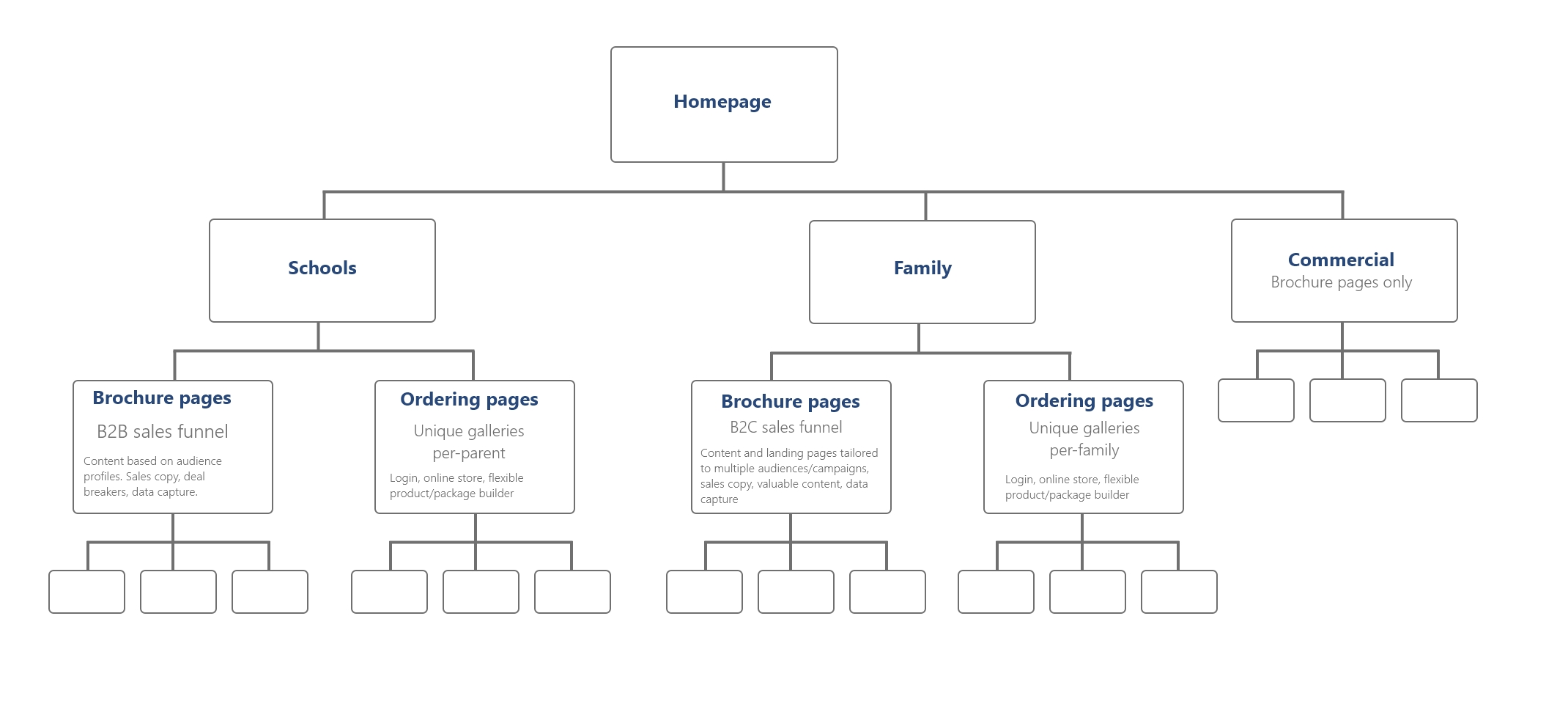
The website content and functionality was structured to achieve the objectives outlined in the content plan. Each section was tailored for the relevant audiences.
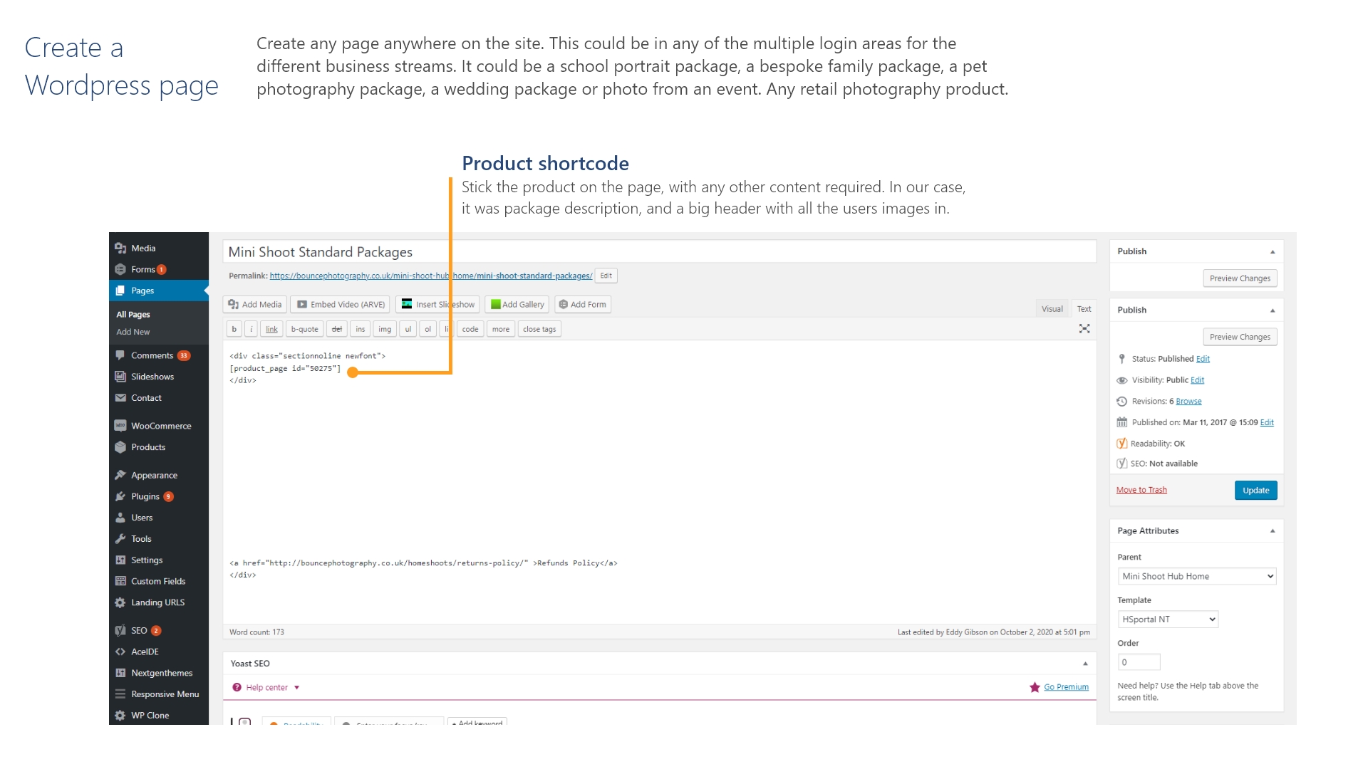
Brochure pages held all the relevant content and key messages to support marketing campaigns, with landing pages, data capture forms and SEO content.
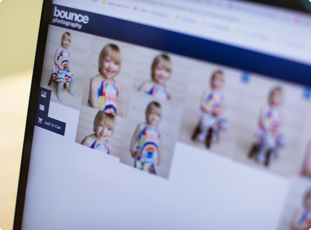
Login area and ordering pages held the image galleries and ecommerce platform for products and packages, checkout and payment.

Online sales flow
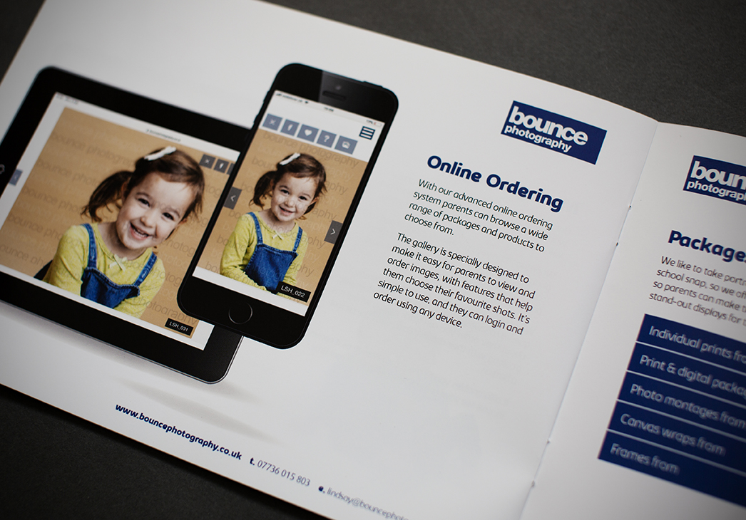
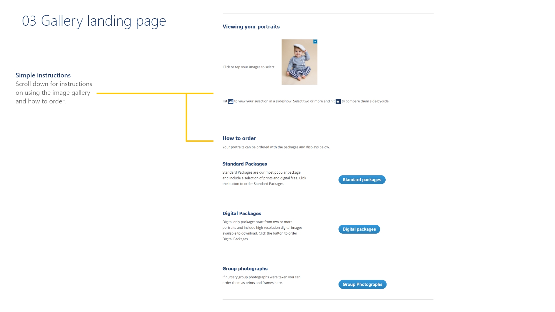
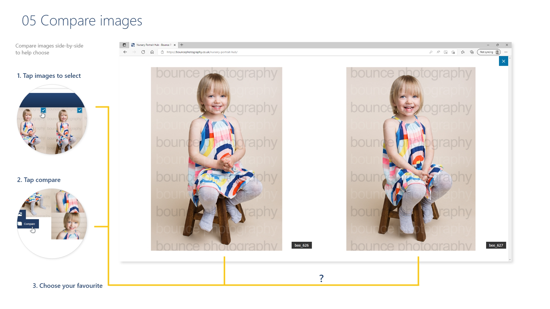
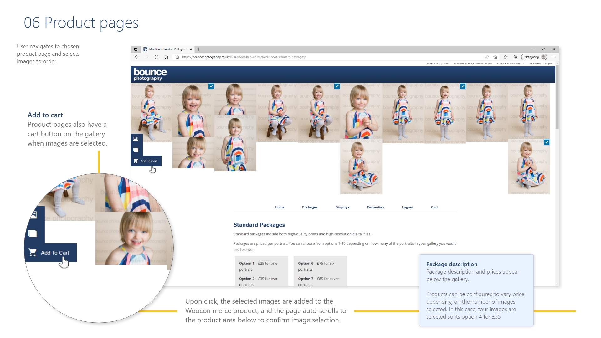
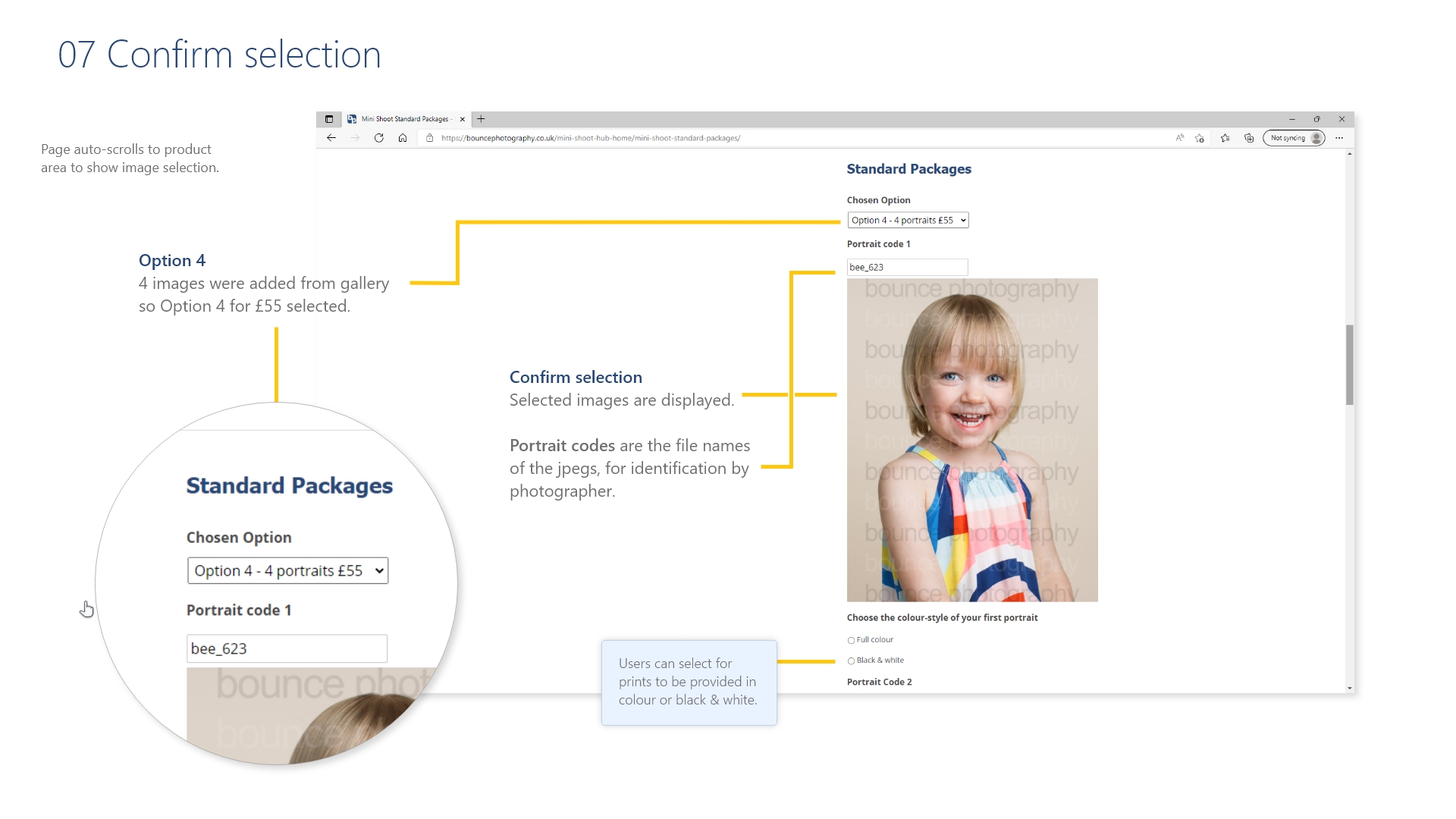
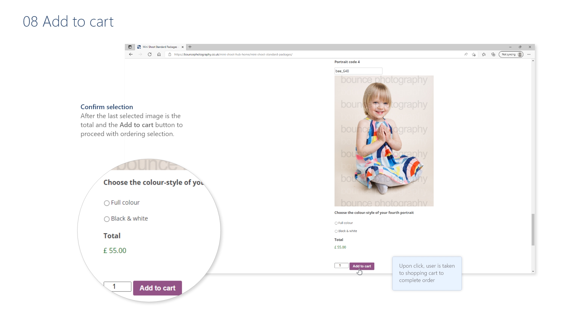
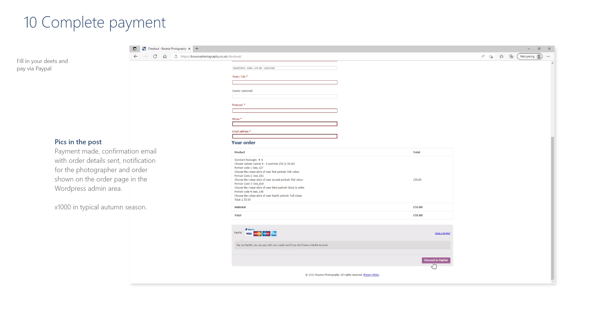
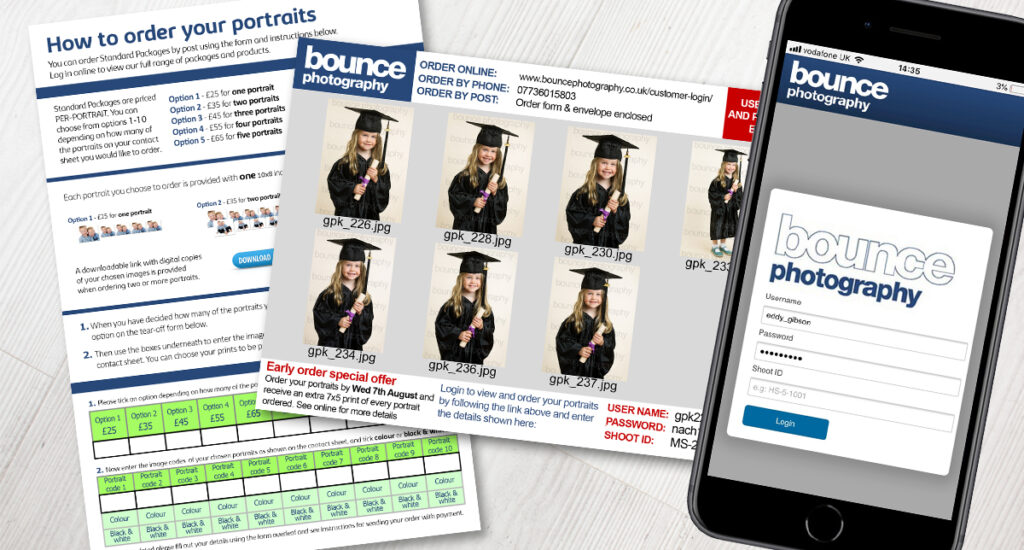
With the page structure and content in place, the main interaction with the website was designed to make login, viewing images and ordering as easy & quick as possible, while allowing the flexibility for photographers to create unlimited complex products.
Check out a brief outline of the high-level flow:
Or scroll through the screenshots below
Working website
Its not just a prototype. Over 2000 galleries created, and over 1300 orders taken since the last website updates in September 2018.
You can see it here. The gallery defaults to sample images when not logged in, but you can see how selecting images and ordering the product works.
Mobile moment
Our ‘mobile moment’ came quickly. From one year with nearly all of our orders via a flash gallery on a desktop site without a single question, to the following year when nearly all of our customers rang to ask why they couldn’t view the images on their phone.
Needless to say, the image gallery and theme are fully responsive so orders can be made on any device.
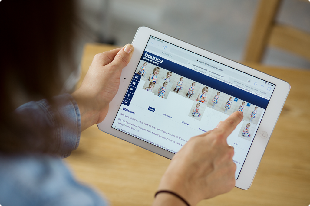

Creating products
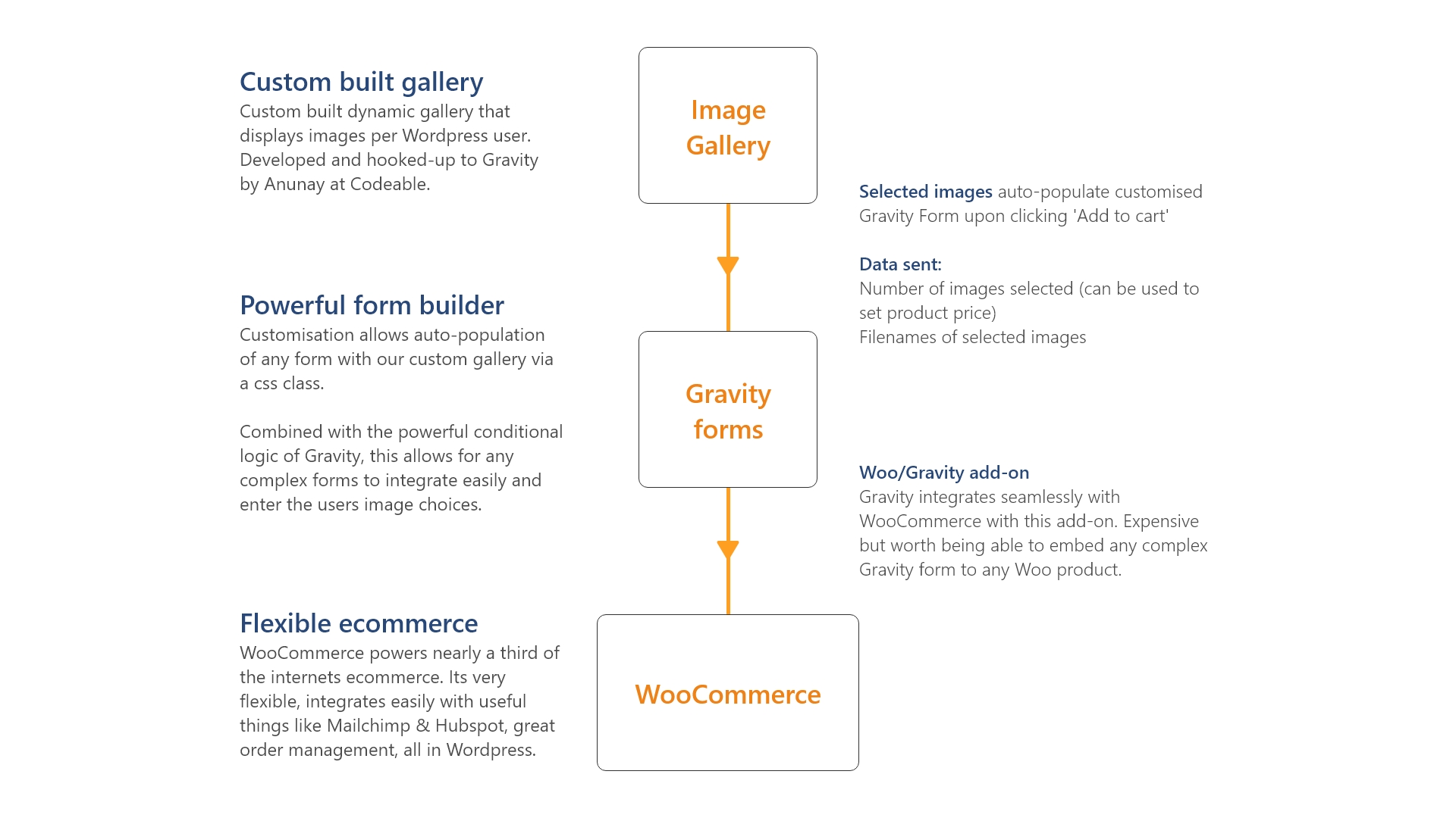
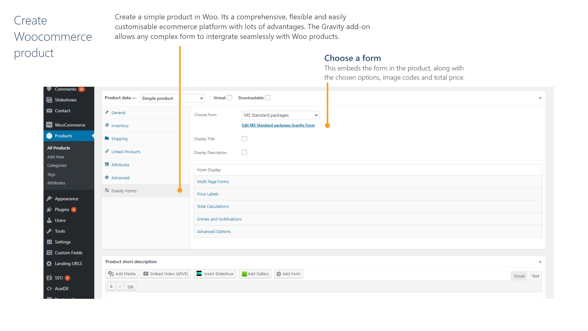
The website uses WordPress, Woocomerce and Gravity forms together to create a system with limitless flexibility in terms of creating products and packages, and with any number of business streams and login-areas.
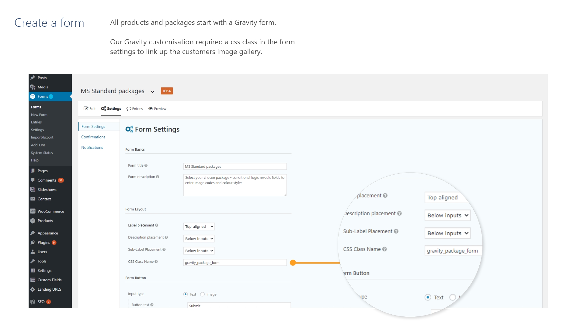
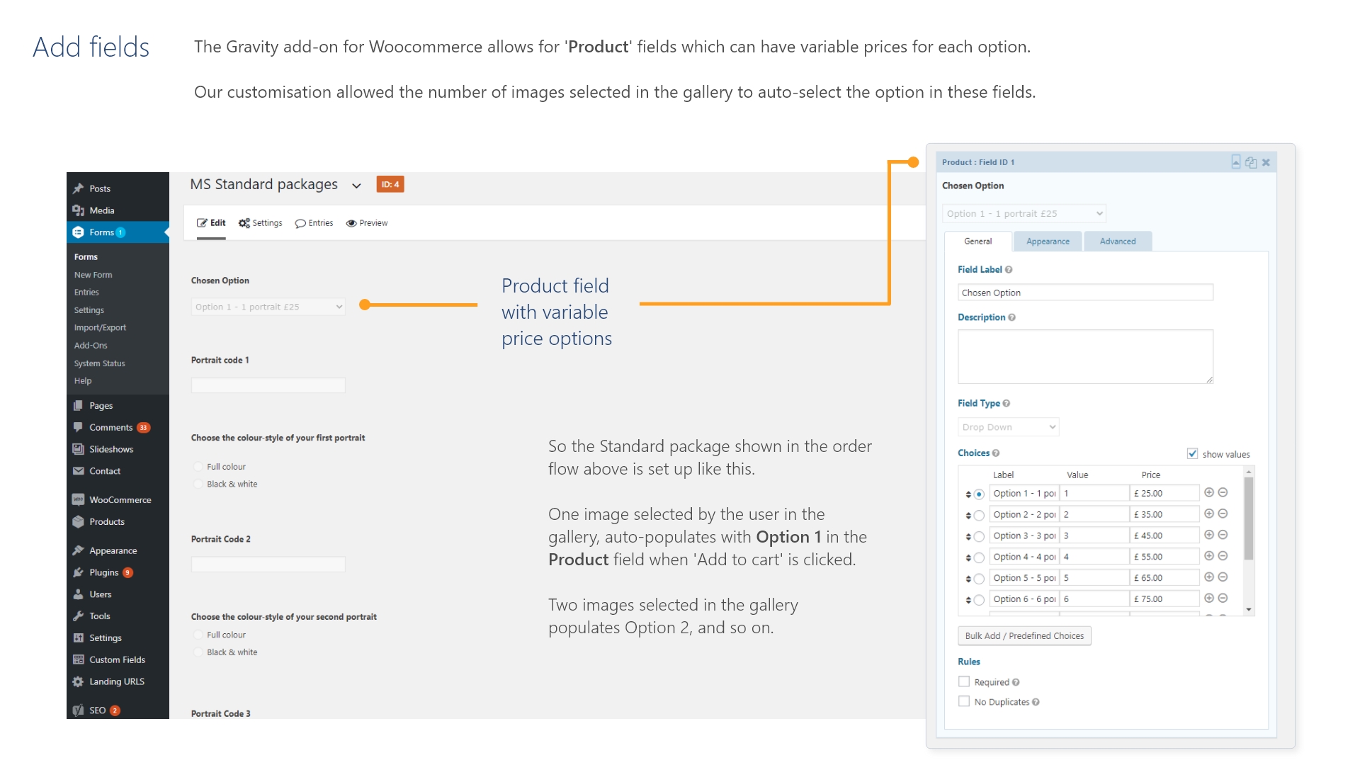
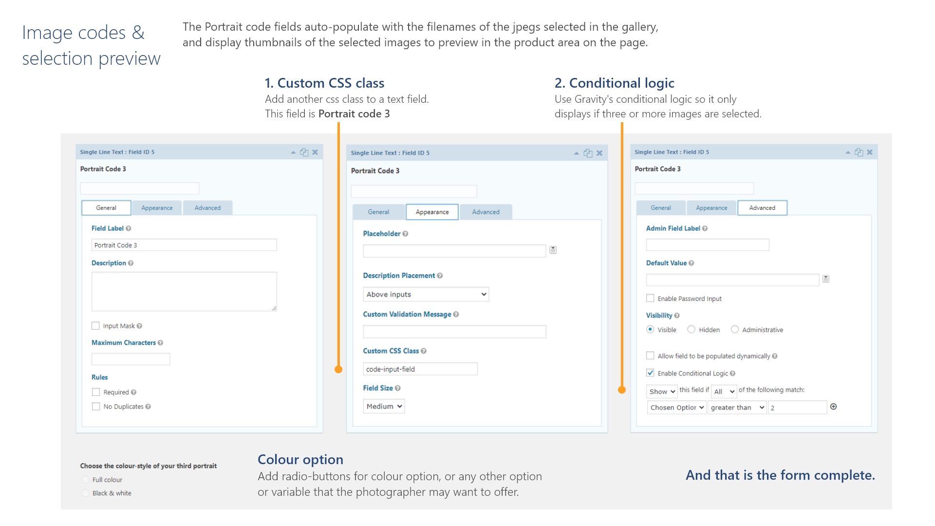
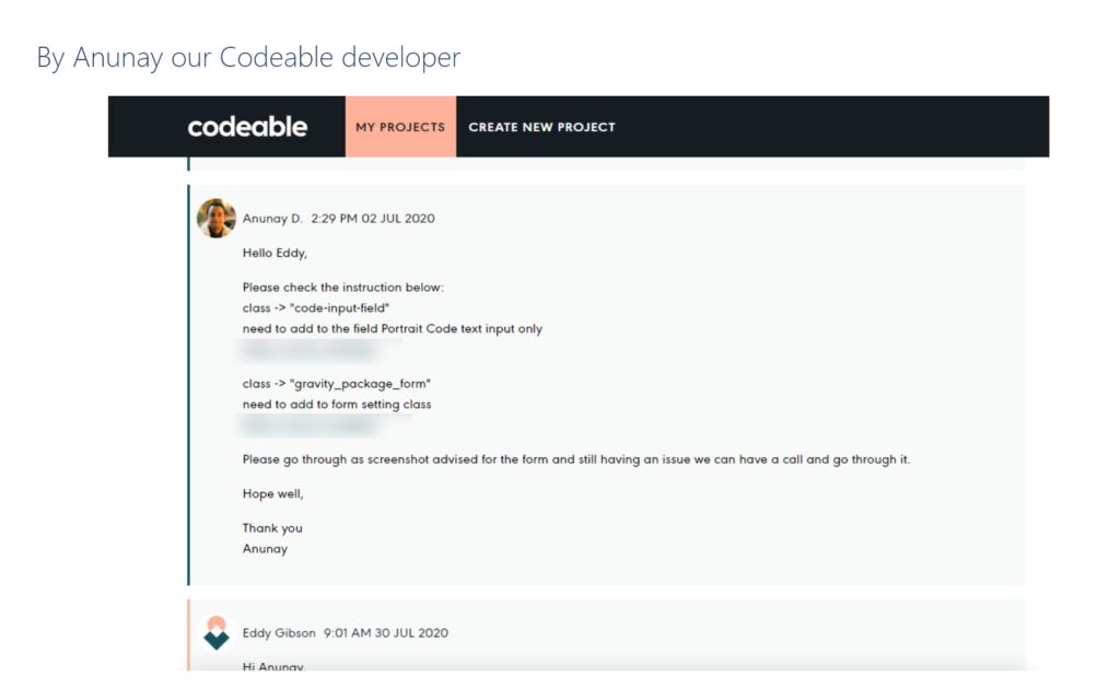
Our custom-built gallery displays each users images, and a modification to Gravity forms allows the gallery to auto-populate products as shown here.
View the pdf or scroll through the screenshots below:
What now?
3rd party volume photograpy solutions are looking a lot better than they did ten years ago, but still none of them have the flexibility of product and packages, with a powerful and customisable order management system, that integrates seamlessly with Hubspot or Mailchimp, all within the admin area of your own website. Add to this a website platform that is structured to support:
- Multiple business streams
- Digital marketing campaigns
- Content strategy
- Automated communications
- Data capture that builds well-performing email lists
- SEO
- Blogging
- Social campaigns
and much more.
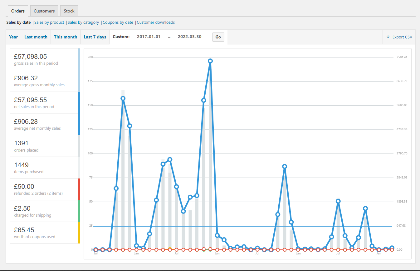
As this chart below shows, the last gallery update was working well for us since we started using it in September 2018. Like an infographic on BBC news, you can see a strong autumn in 2018, our best year of sales to date in 2019, and then the pandemic in 2020.
Like many industries, volume photography work stopped immediately with lockdown. But even in the longer term, there has been a general decline in the digital photography market for a number of years. Even if our platform was successful in America where volume photography is still relatively popular, it would always have been a niche product with a limited, declining customer base. We decided that more time and money spent on this project may not be worthwhile.
It has been a seamless step from this project into my UX diploma, however, and I am really looking forward to continuing this work as a UX designer.
What would have been
The next stage of development, which was underway as the pandemic hit, was to customise the user database to incorporate CRM functionality and automated comms.
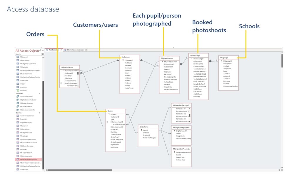
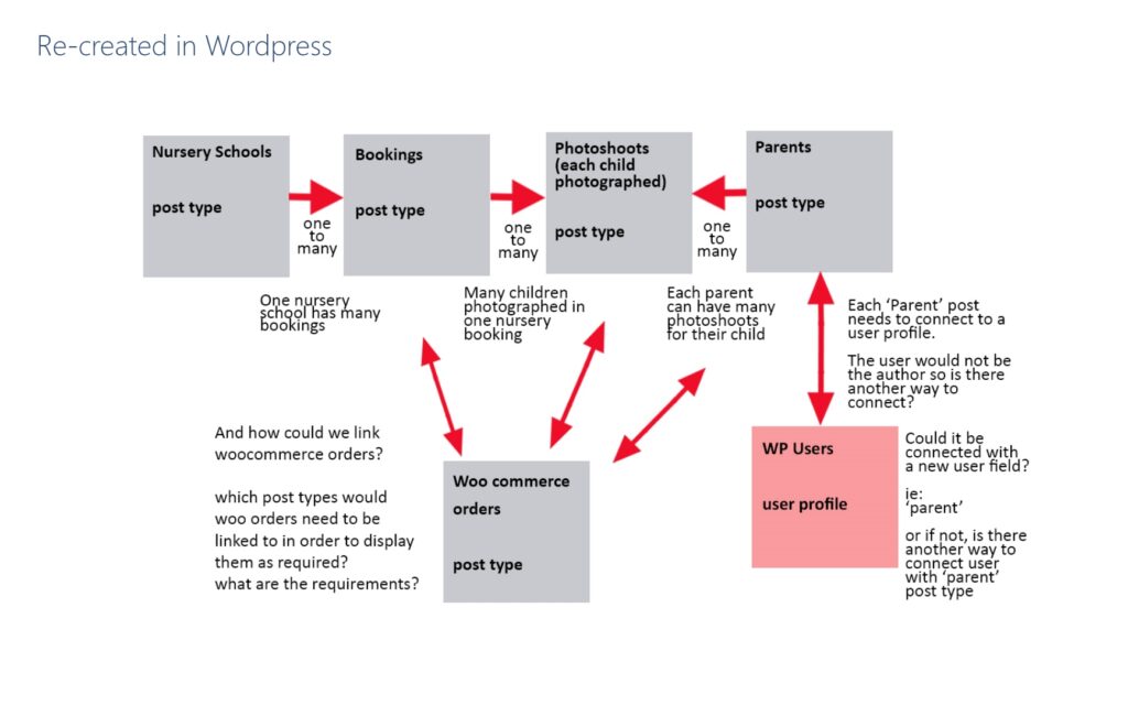
An MS Access database served as a ‘living prototype’ for the design of the tables and relationships to run the workflows. This was to be replicated with custom posts in WordPress, enabling flexible management of the customer database and orders, with powerful segmentation that would support successful busy seasons.
UXDI diploma
Ironically, with my new skillset from the UX diploma, I could design a MUCH better system.
Where would I start? – user research – lots of it. Not only to improve the website, but also to re-write the entire communications process, overhauling the content and key messages along the journey to refine the flow, improve the service, and vastly improve the experience.
UX research wouldn’t just help build a better site, but design a much more effective content strategy and sales process.
