The IDR Network
IDR Law specialise in contentious probate issues, and most of their works comes via referrals from other law firms and private client solicitors.
When a law firm has a client with a will dispute that requires specialist expertise, they can refer that client to IDR law to help find a resolution.
They set up the IDR Network to provide a content resource for legal firms, with a range of guides and information around contentious probate issues.
The aim of the network is to engage with existing and potential referrers, demonstrating expertise and encouraging more firms to refer clients.
What’s the problem?
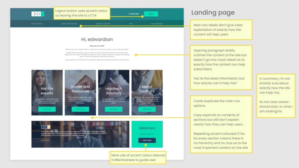
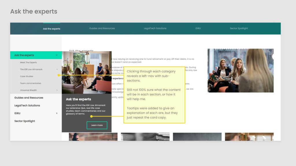
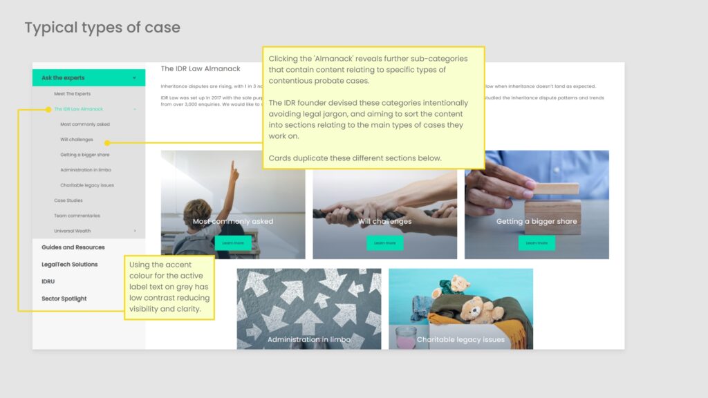
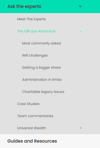
When the site was designed, generic categories and navigation labels were devised, such Ask the experts, Guides & resources, and Case studies.
As the site has grown, there has been feedback from internal partners that it can be hard to navigate and find the content they are looking for.
The information architecture and navigation needed a significant overhaul to improve the experience, and I was hired to carry out this complicated task.
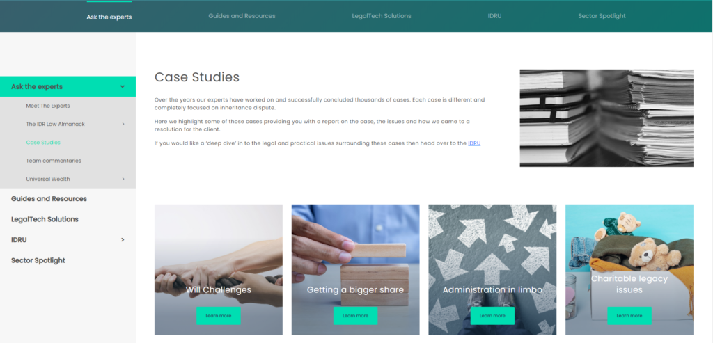
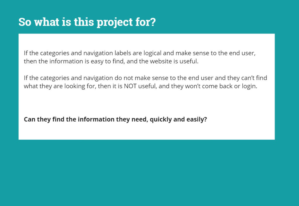
In summary, the purpose of the site and what it will help me achieve is not very clear.
Plan of action
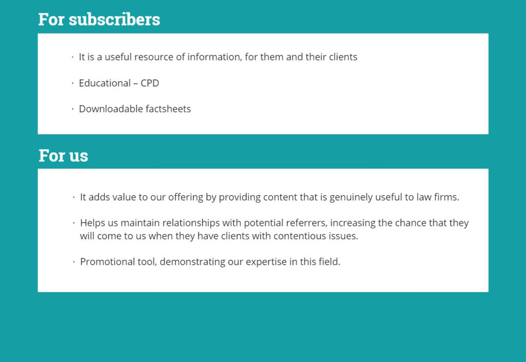
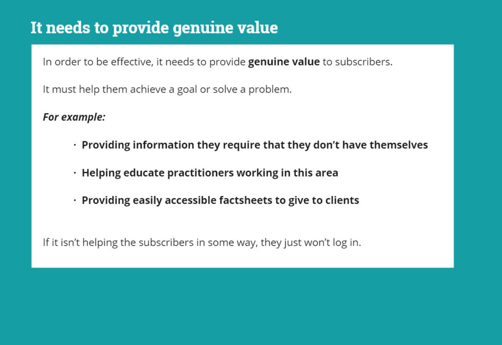
The first step is to learn more about the IDRN, and the goals of its subscribers. What is the exact problem is it solving for end users?
Once this has been established, the content needs a closer look to see exactly how it is helping subscribers solve their problem.
Then it needs re-categorising and sorting into a new, useful navigation system so users can find exactly what they need, when they need it.
By understanding their goals, we can devise the Information architecture so the website makes the most of the valuable specialist content.
Technical legal content
The big challenge with this task was the technical nature of the legal content. How does a lay-person with no legal background go about re-organising specialist legal content?
Which category will hold Proprietary Estoppel or Fraudulent Calumny?
- Site & content audit
- Stakeholder interviews to understand their perspective on the purpose of the IDRN and its content.
- User interviews to discover the goals and context of law firms and solicitors referring clients, and how they might use the content.
- Usability tests to observe users navigating around the site. What information do they need? Why? How easy is it to find?
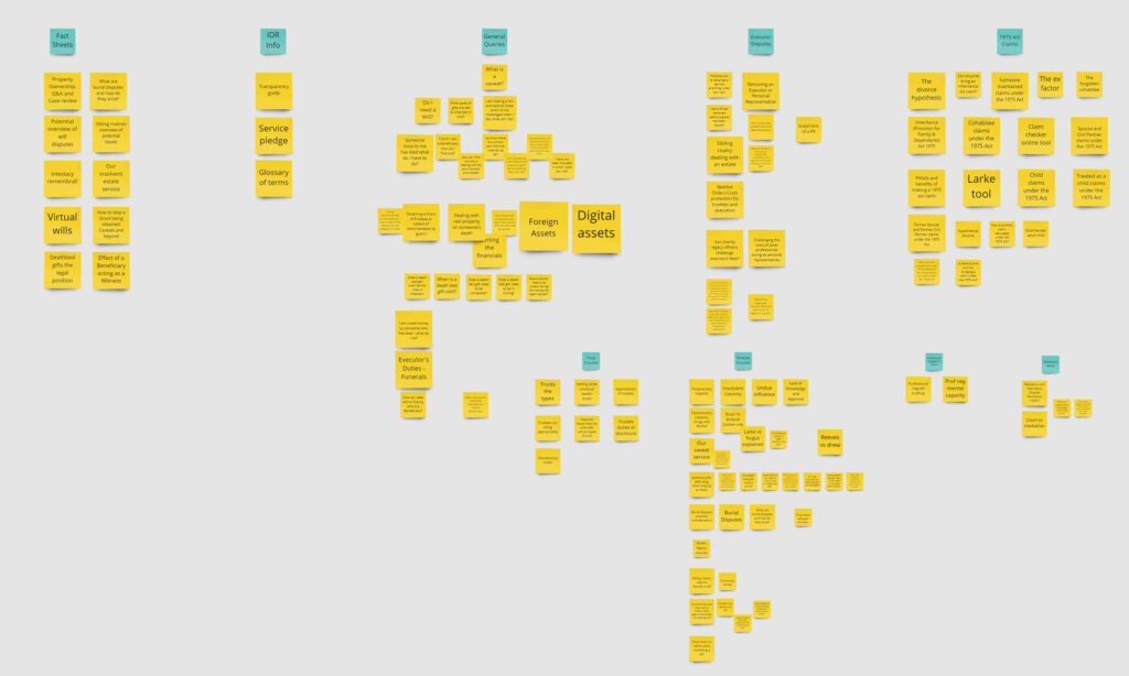
- Card sorts to begin to untangle and make sense of all the content.
- Workshop with internal colleagues to involve whole team, ensuring everyone plays a part in defining the categories.
- Define new categories and establish hierarchy – which are the most important?
- Prototype to design new Information architecture and navigation.
- Testing with end-users and iteration.
- Roll-out of final navigation onto live site.
Establishing user goals
Searching for the reason why the IDRN is useful to subscribers
Stakeholder interview
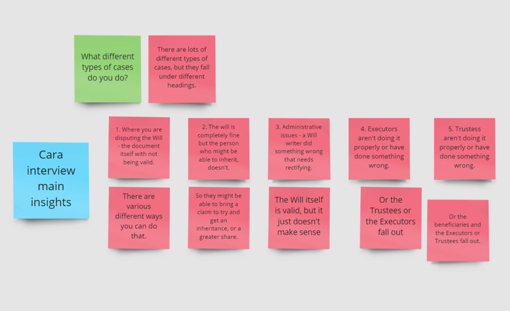
Cara is a senior partner at IDR Law, and is responsible for the planning of the IDRN content.
She has lots of experience as a practitioner in this area of law, and aims to use the content resource to support her business development activity.
As a professional who writes and uses the content regularly as part of her work, it was vital to involve her in the re-design.
In this video Don Norman describes the idea of Community design, and involving people who understand the problem and work with it everyday.
With the technical nature of the content I needed to combine the experience of the partners with design best practice to reach an effective solution.
In summary…
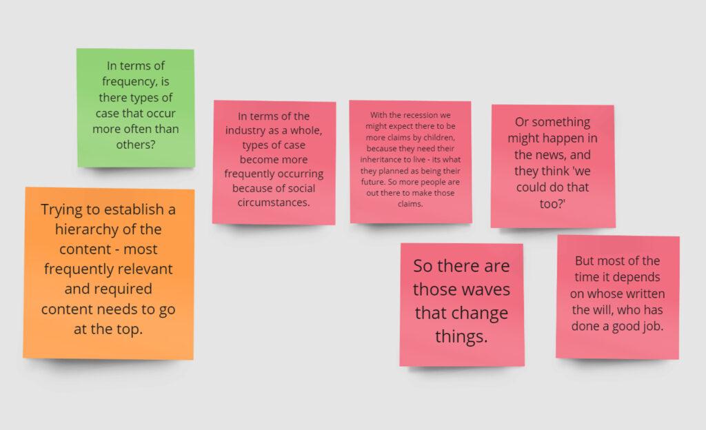
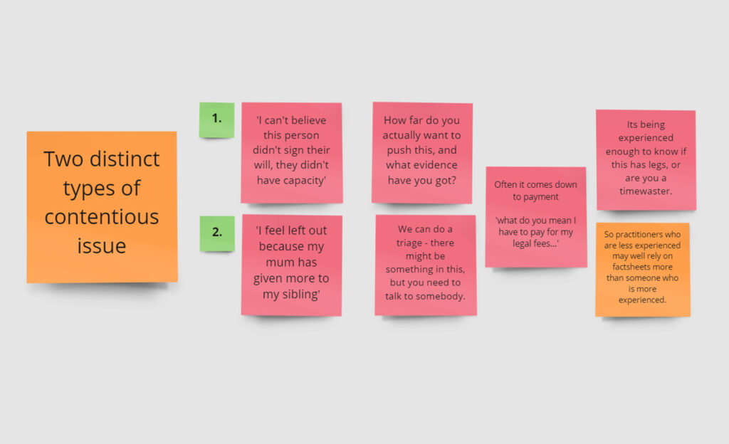
- There are different types of contentious probate case
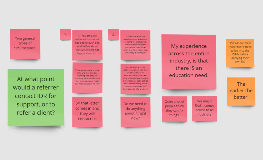
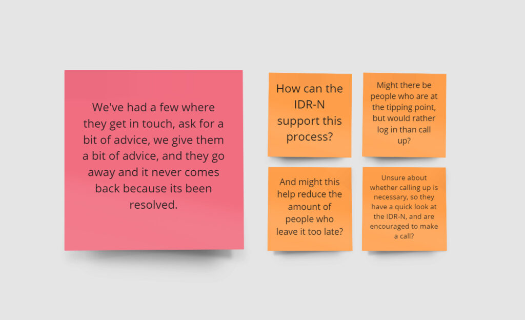
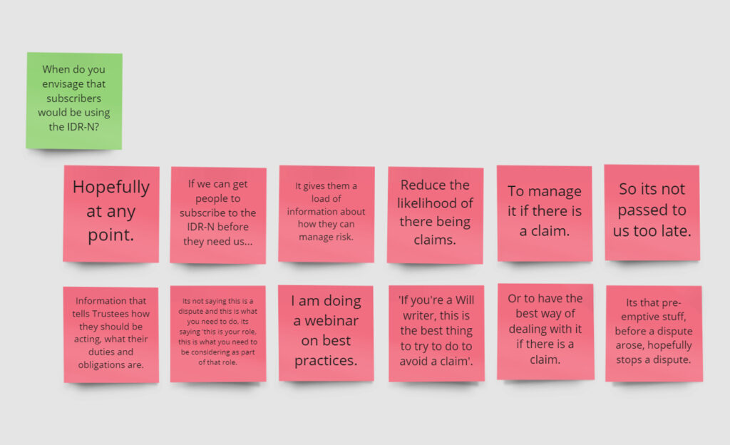
- Ideally, referrers will contact IDR for support with contentious cases as soon as possible, but this is not always the case
- Subscribers may benefit from guidance on when to contact IDR
- It would be ideal if they had this knowledge before a contentious case comes along, so when it does, they already know what steps to take.
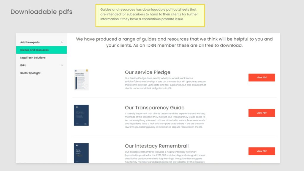
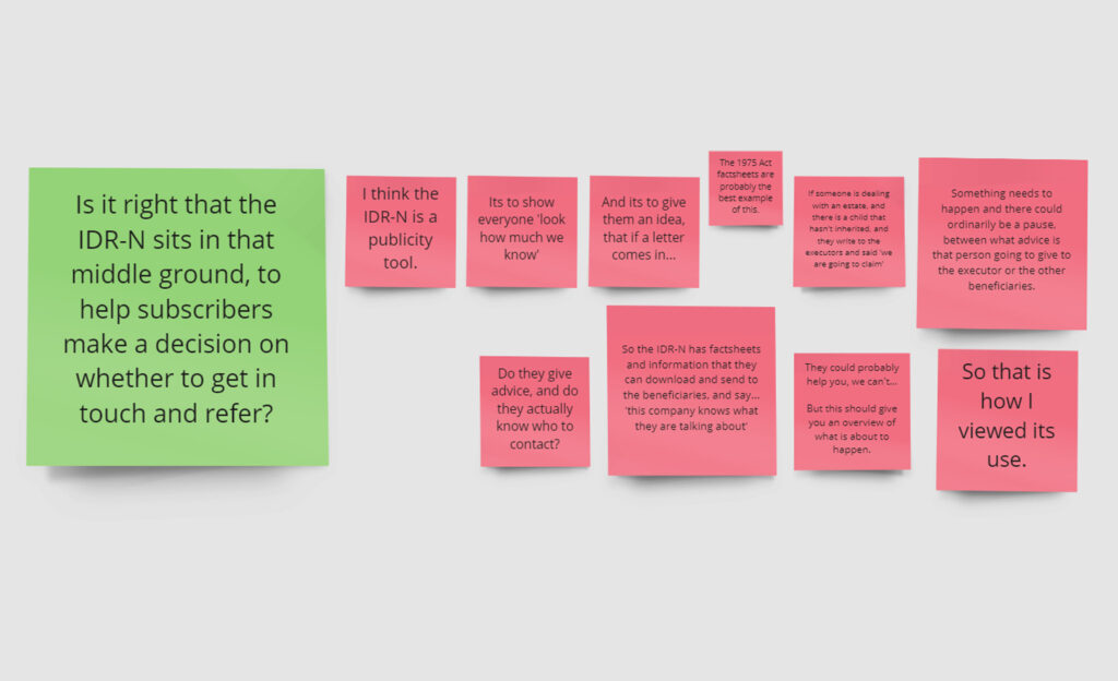
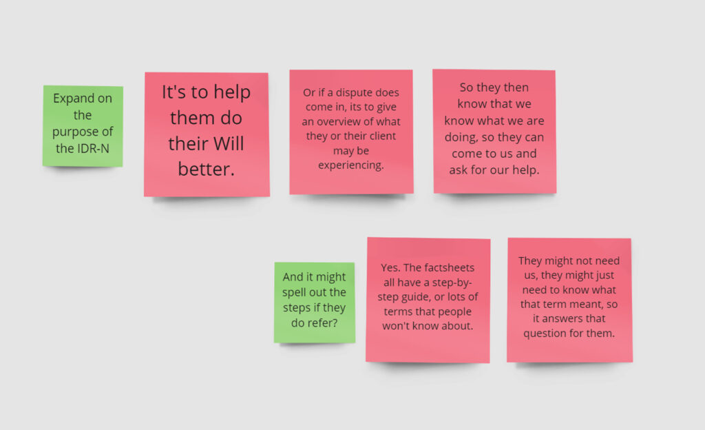
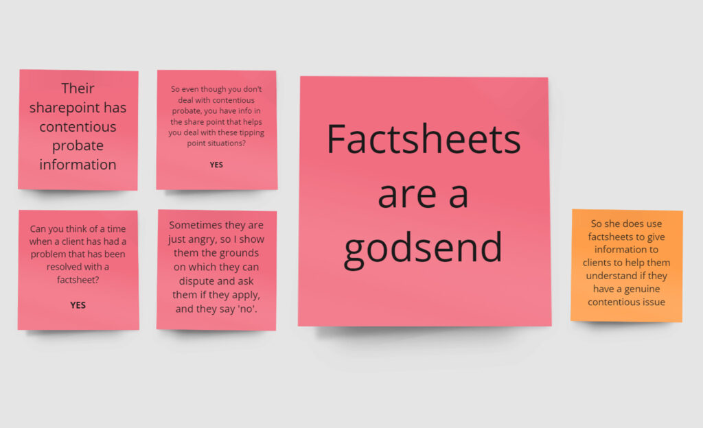
- Practitioners can give factsheets to clients with contentious issues to help them understand their situation and what steps need to be taken
- The IDRN also contains preventative guidance to help reduce the likelihood that contentious issues will occur in the future.
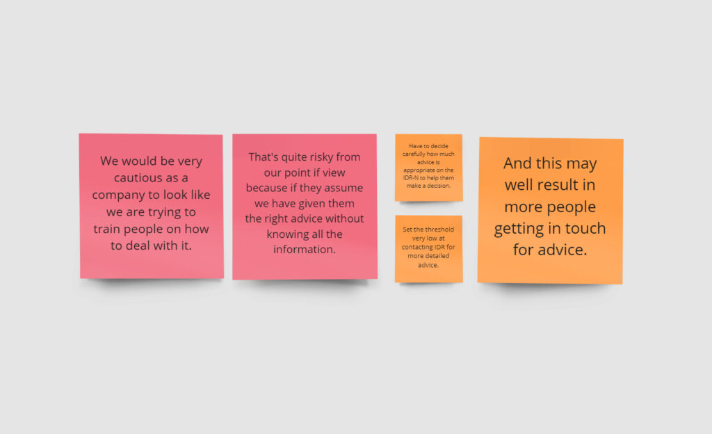
- The content cannot be seen to be giving specific legal advice.
- The current categories are not working as they are.

Given the purpose of the content as described by Cara, the existing website does contain useful content that helps practitioners when they have a client with contentious issues, but the Information architecture doesn’t make it easy to find, or spell out exactly how it can help, or even where to start looking.
User interview 1
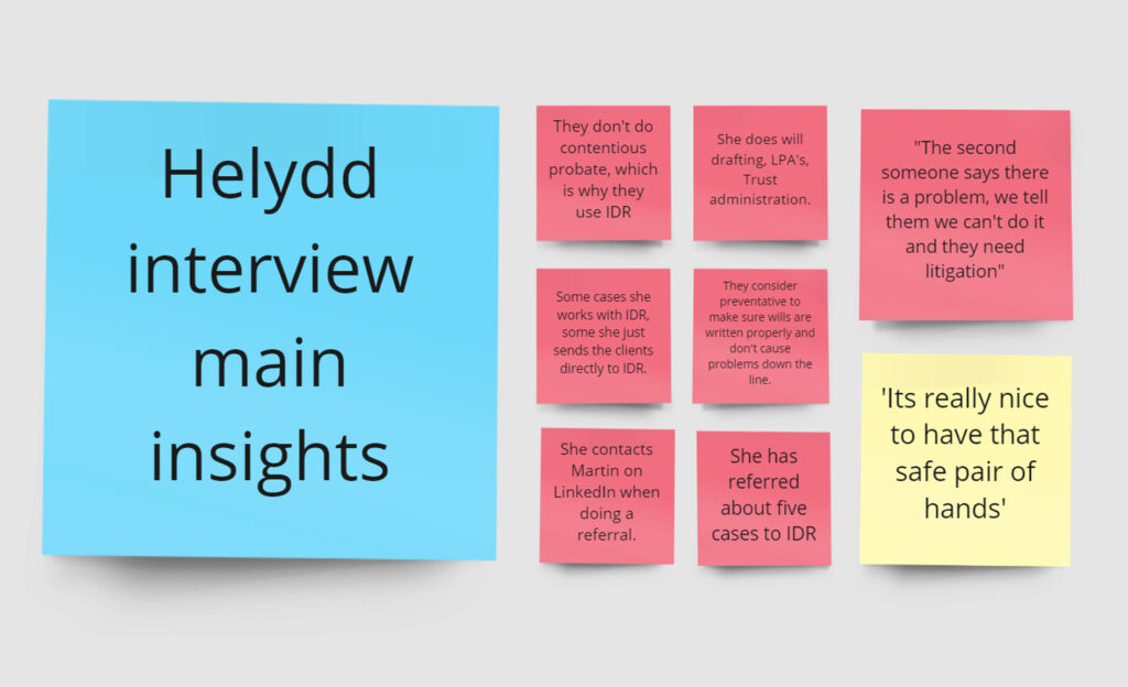
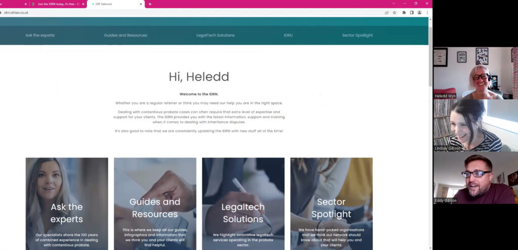
The first user interview was with Heledd, Head of private client at her firm. She has referred clients to IDR Law on several occasions before.
I did the interview and usability test with Lindsay, Head of Marketing at IDR. She created the website and is overseeing the whole project.
The interviews are also useful for marketing, with lots of crossover. They are a chance to ask marketing specific questions, and as always, we got some great testimonial quotes too!
In summary…
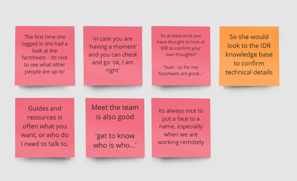
- She is an experienced solicitor who doesn’t do contentious work herself, but knows enough about it to recognise contentious situations when they arise, what steps need carrying out, and when to contact IDR.
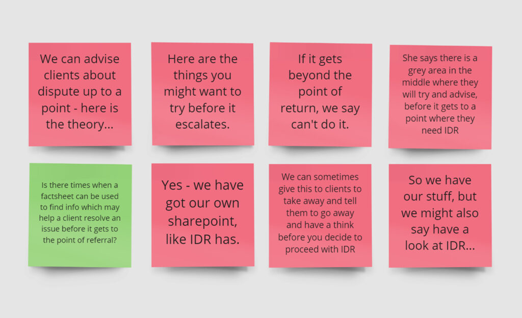
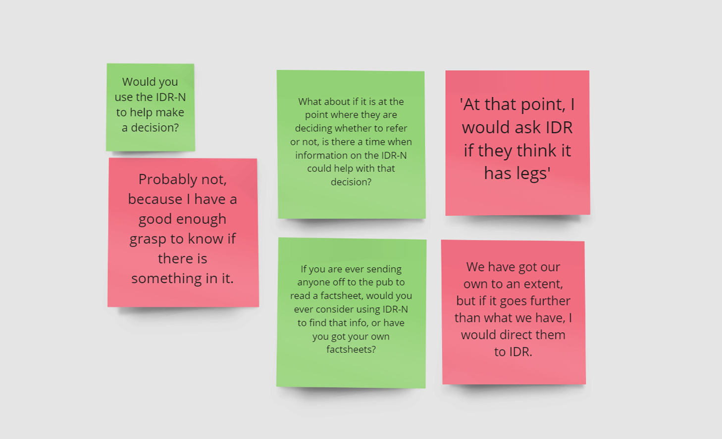
- She advises clients on the theory and the grounds on which they can make a claim, and gives them factsheets to help decide if they are willing to proceed.
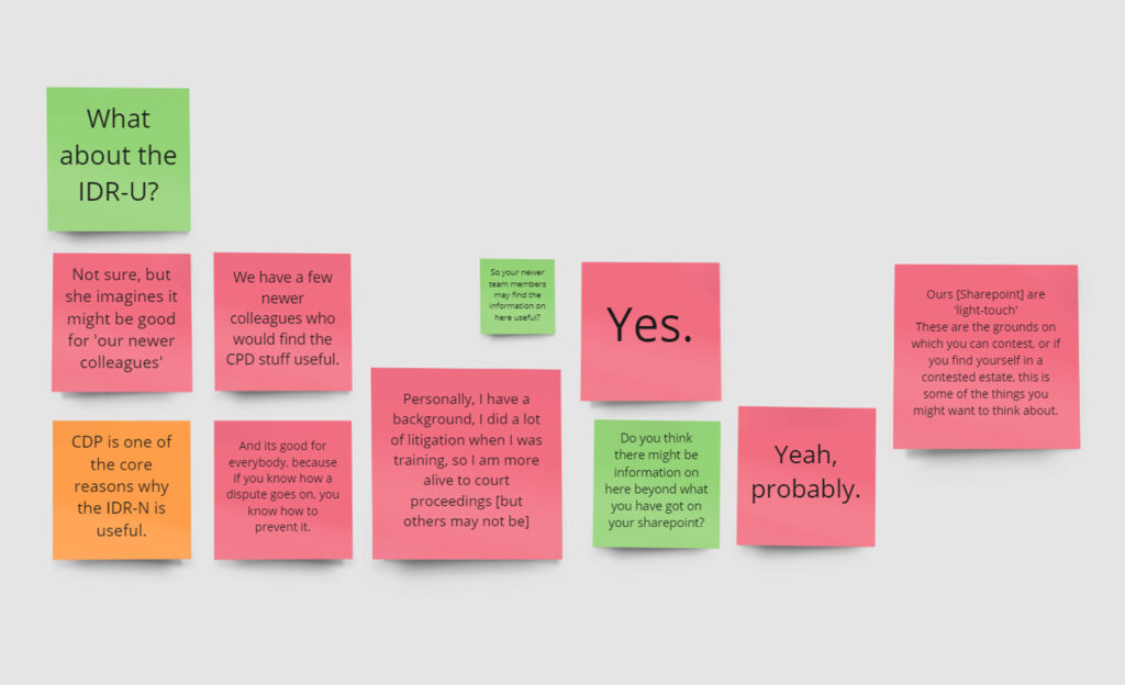
- They have their own Sharepoint with relevant information around contentious issues to give to clients, but describes it as ‘light-touch’.
- She would consider checking out the IDRN to confirm her legal knowledge.
- She thinks her newer, less experienced colleagues would find the CPD information useful.
- She thinks the preventative information is useful for reducing occurrence of disputes.

User interview 2
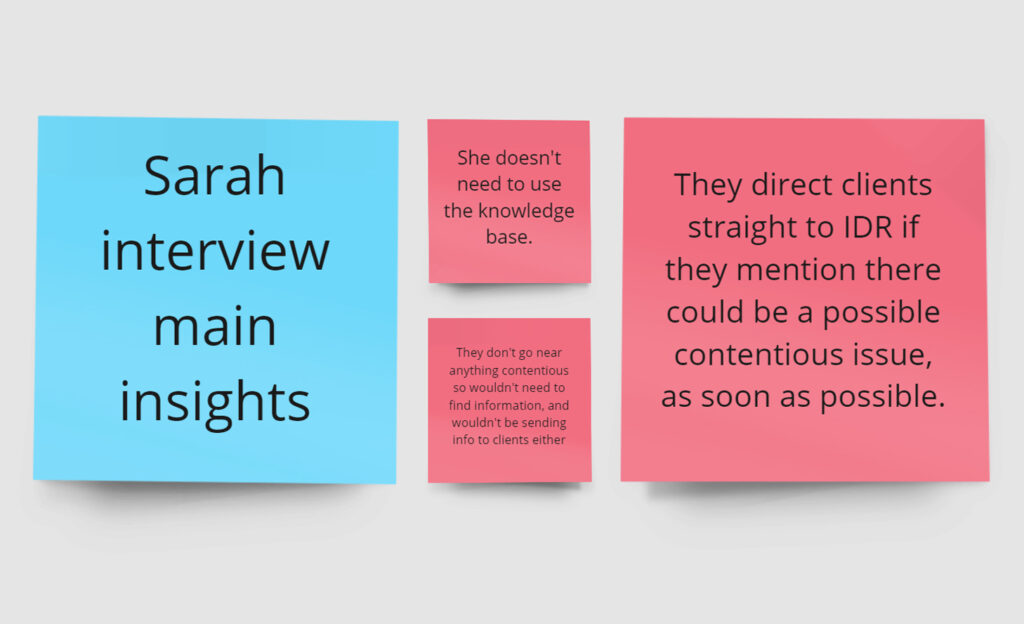
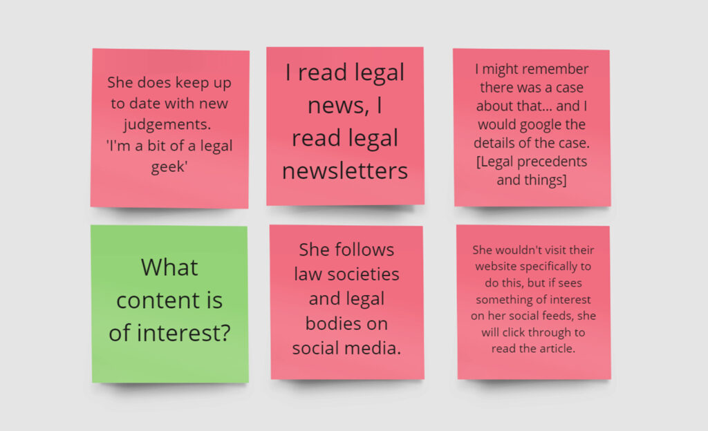
The second interview was with Sarah who works for a probate administration firm that regularly refer clients to IDR.
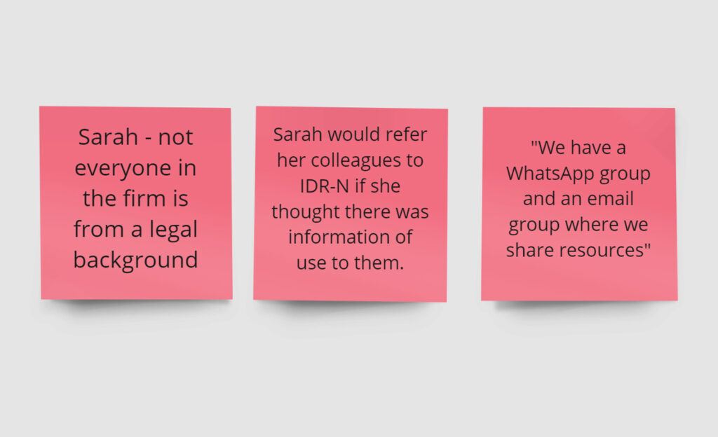
She is knowledgeable about contentious issues, but there are people in her firm who deal with probate admin that are not fully trained solicitors, and therefore may have a knowledge gap around contentious issues.
Her interview highlighted that the legal knowledge on the IDR-N is not the only content that is valuable to subscribers.

In summary…
- She would not use the legal information or factsheets, she would just refer straight to IDR if a client mentions a potential contentious issue.
- She is interested in topical content and legal news content around legal issues, and follows law societies and legal bodies on social media.
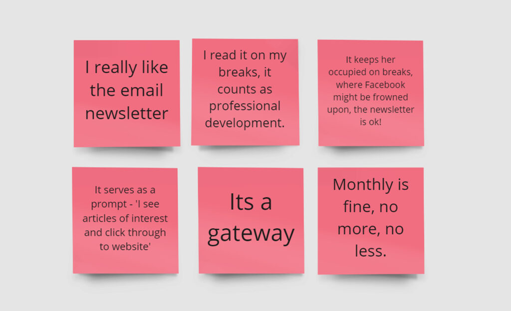
- She also likes the IDR monthly newsletter, and reads it on her lunchbreak as it counts as professional development.
- Her colleagues with no legal background may find the IDRN knowledge base useful. They share this kind of information in WhatsApp groups.
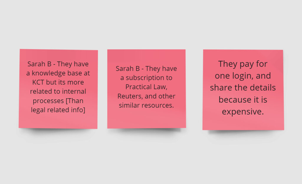
- They have their own knowledge base but it is more about internal process. They subscribe to legal resources to find further information if required.

Categorising the content
Next was the tricky task of re-organising the content into new categories so it is easily findable by subscribers. If users cannot find what they are looking for, then its no help to anyone.
This was a challenge for me as a lay-person with no legal training, so I expanded on the idea of ‘Community design’, and got the entire firm involved. Who better to organise specialist legal content than twenty subject matter experts?
Card sorts
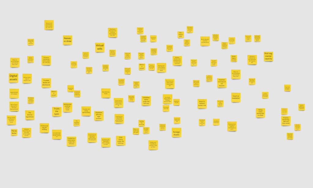
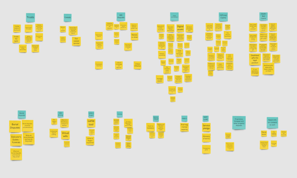
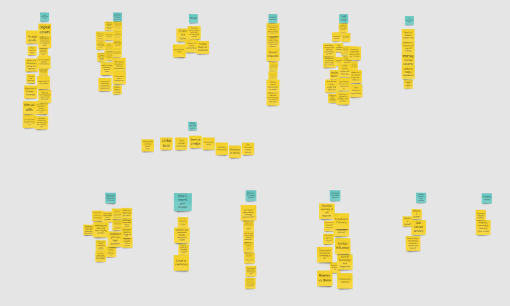
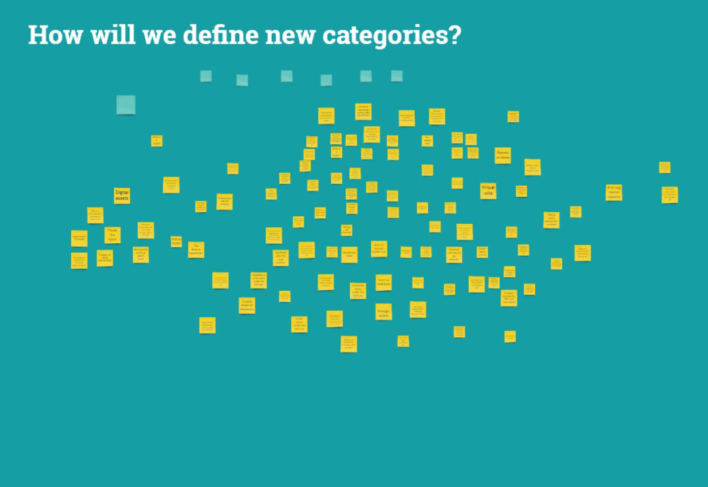
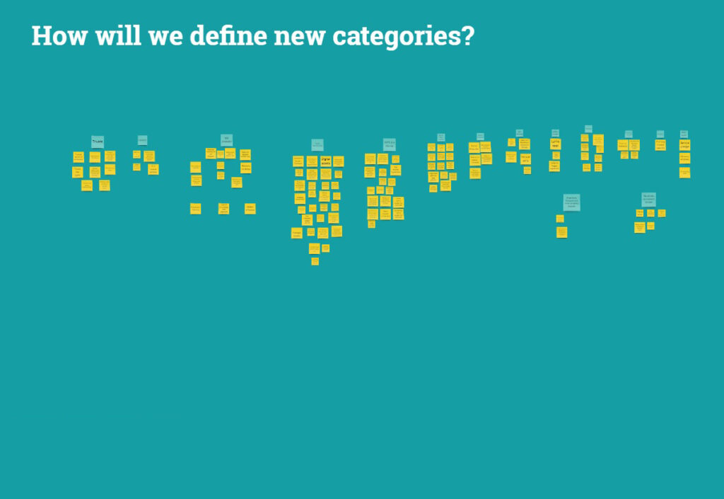
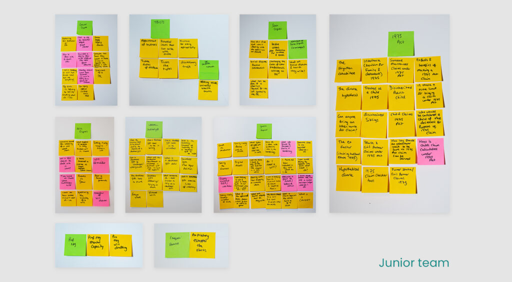
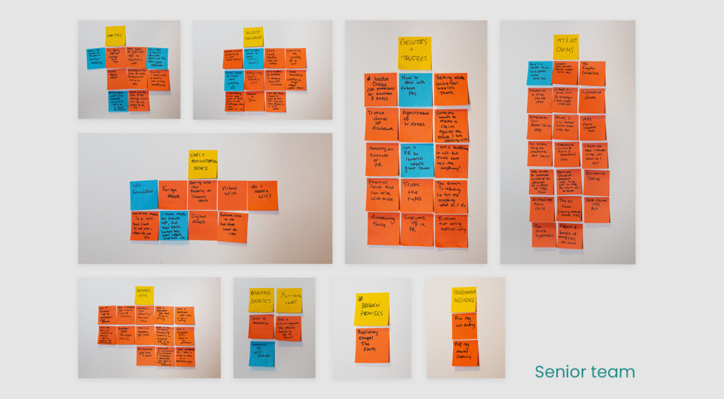
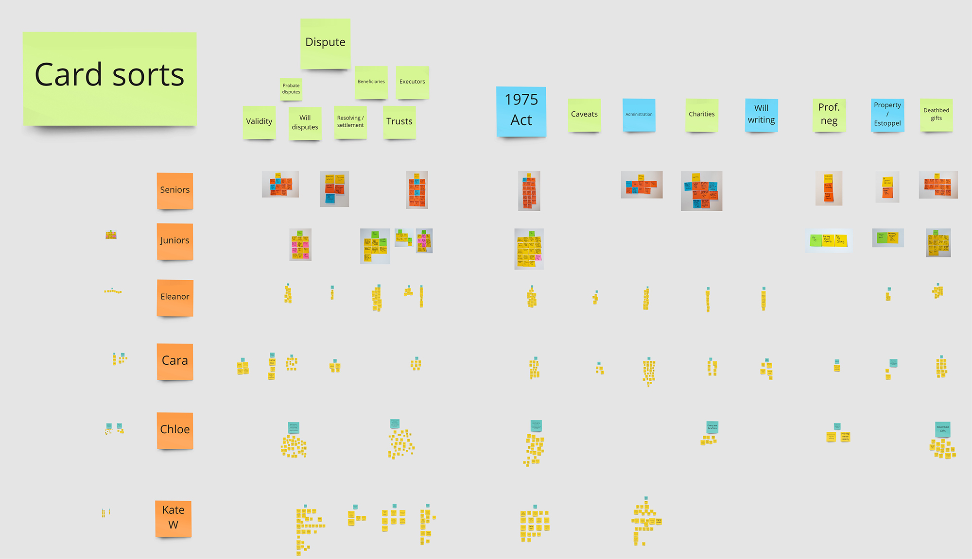
I arranged for a series of card sorts to be carried out by the solicitors in the firm, starting with individuals arranging the content in Miro, then culminating in a group exercise at the company away day, with everyone working together in teams to define new categories.
As well as producing clear results to inform the new navigation, the exercise educated the lawyers on the value of the IDRN and how they can use it, and it was a useful team-building exercise for a remote working firm meeting up for the first time.
Those responsible for creating the content also found it a useful exercise for identifying gaps in the inventory, and which areas had missing content that needed writing.
Individual card sorts
Group card sort
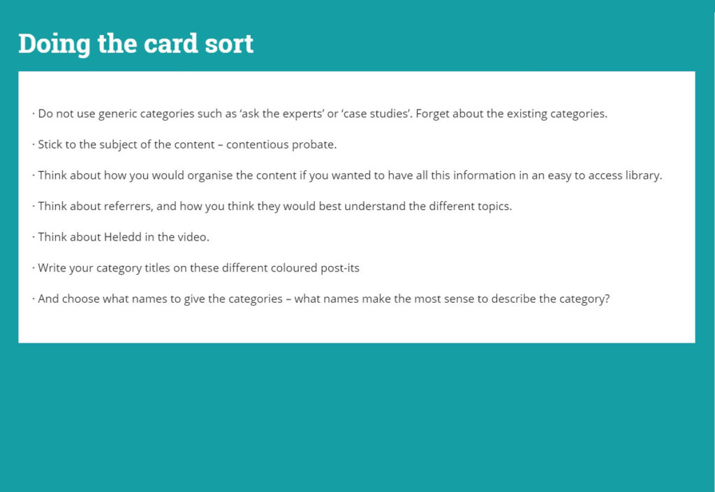
I created this presentation to explain the card sort exercise to the lawyers, to help them understand what we were trying to do, and why.
I prepared a clip of the usability test on the existing site, which clearly shows the problem with the existing site.
Showing this clip to the founder and others involved with the development of the site was a great way to demonstrate the issues with the existing navigation, and clearly made the case for an overhaul.
There were knowing nods around the table when the lawyers saw the part about what people say, and what people do being two completely different things.
They obviously see this in their line of work too!
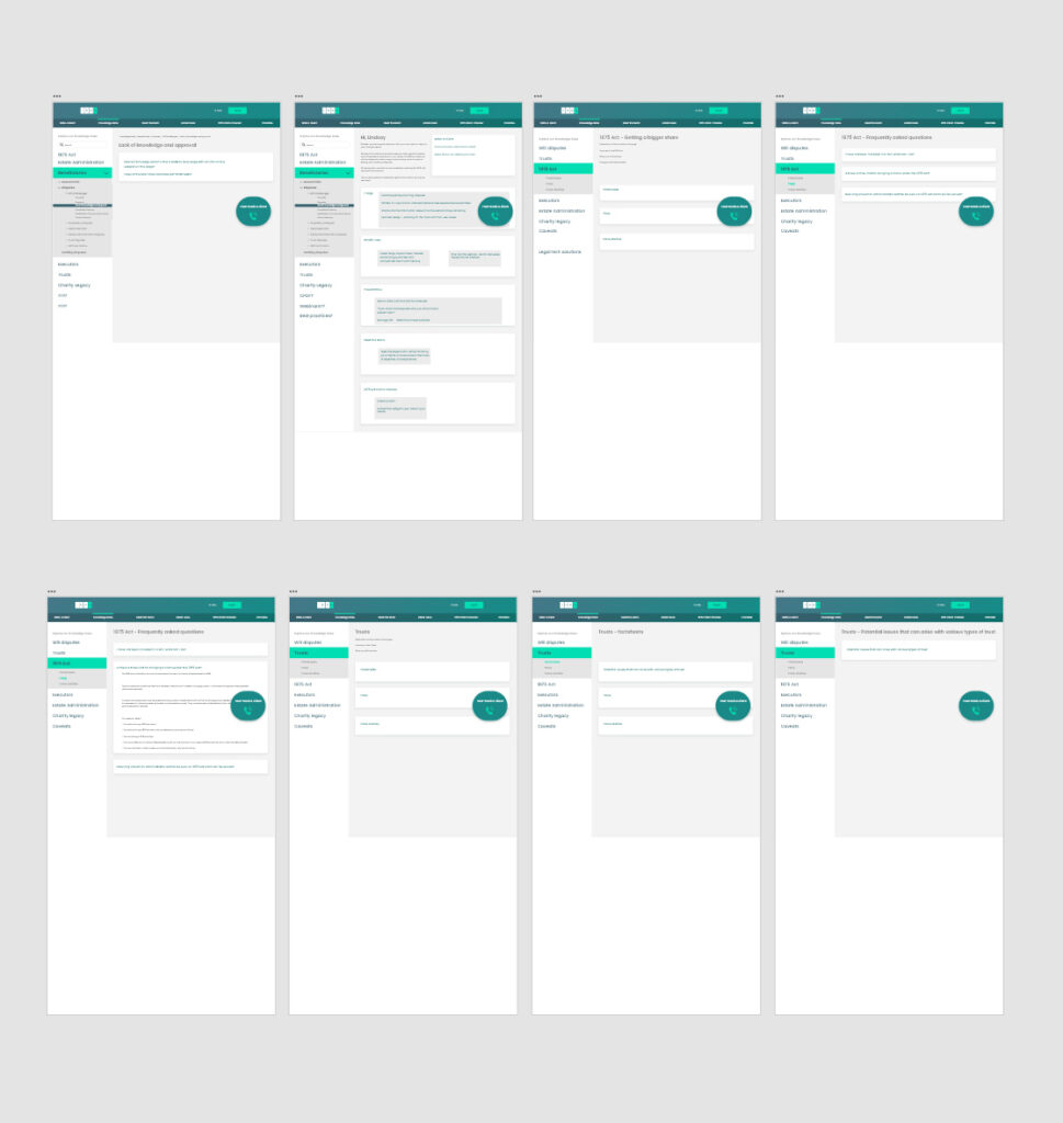
1st iteration prototype
The interview with Sarah was postponed until just after the group card sort, which gave me the opportunity to roughly summarise the new categories and mock-up a prototype to test when we met.
The design was based on these insights…
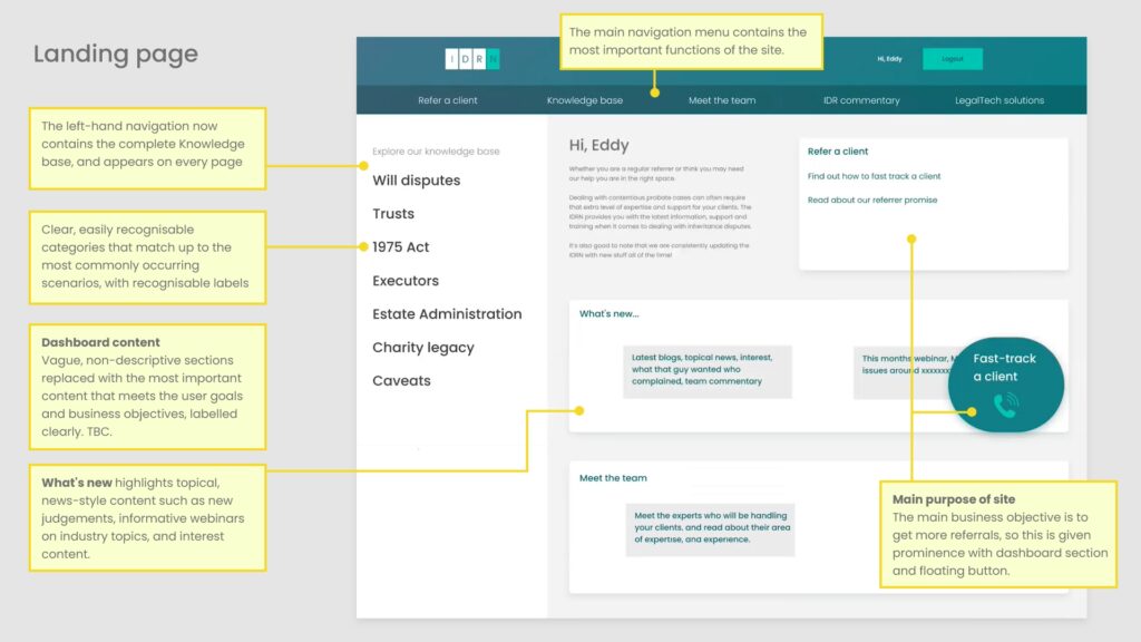
- The dashboard is completely overhauled, replacing the unclear sections with content geared around the primary business objectives, with clearly labelled sections based on the main goals of subscribers.
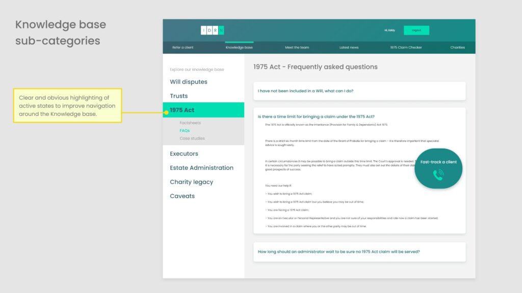
- The knowledge base should answer queries of users facing contentious issues, and the new categories make finding the right content much easier.
- It is also intended to showcase the expertise of IDR Law, so now sits in the left-sidebar and is visible on every page. Even users who do not require this information will see an impressive bank of expert content, at all times.
- To cater for the subscribers who may not require the knowledge base, prominence has been given to topical, newsy content and webinars.
- The primary objective of the site has also been given clear prominence – a floating CTA button to refer a client is visible on every page.
Testing the new categories
A technical hitch nearly sabotaged the session, when Sarah could not share her screen in Teams.
Knowing how hard it is to pin down busy solicitors, I didn’t want to waste the session, so I shared my own screen and asked her to talk through where she would click, while I followed her instruction.
The new categories were very roughly summarised from the results of the card sorts, but even this first iteration was a clear improvement on the last test.
And there was also some more useful feedback on the navigation labels for the other sections, which informed on the next iteration.
Finalising the new categories
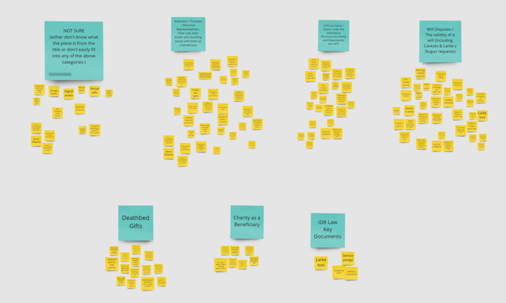
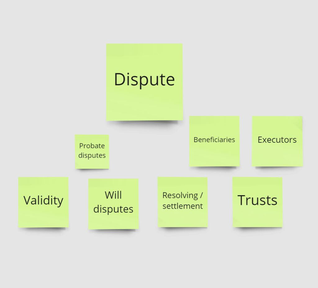
The results of the card sorts were brought together in Miro, comparing the individual sessions with the group post-it exercise.
While there were some very clear categories that appeared in all sessions, there was also a grey area around dispute, with crossover and variation in the way the content had been divided.
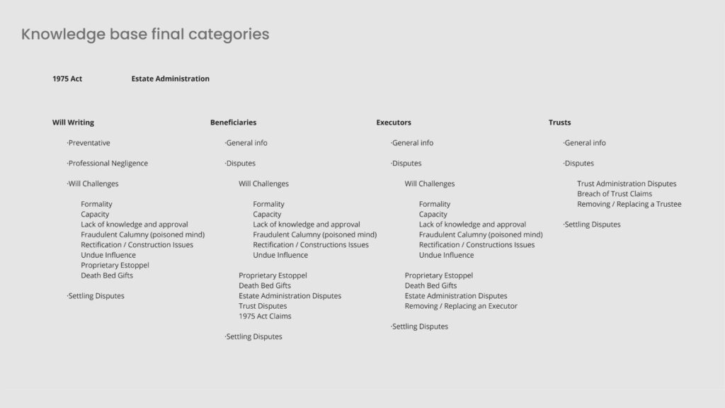
What began to emerge from the analysis and comparison of the different card sorts, was that there were three areas of dispute:
- Beneficiary dispute
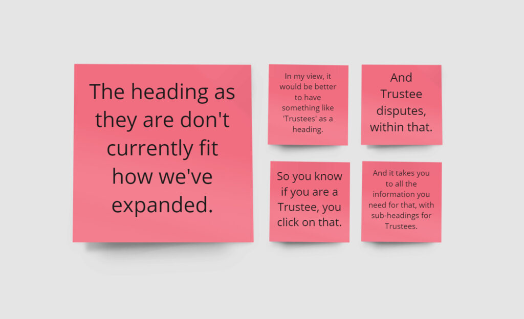
- Executor disputes
- Trust disputes
So despite the crossover, could this be a possible solution? It was time to get back in touch with Cara, and it turned out this wasn’t a new idea…
Community design
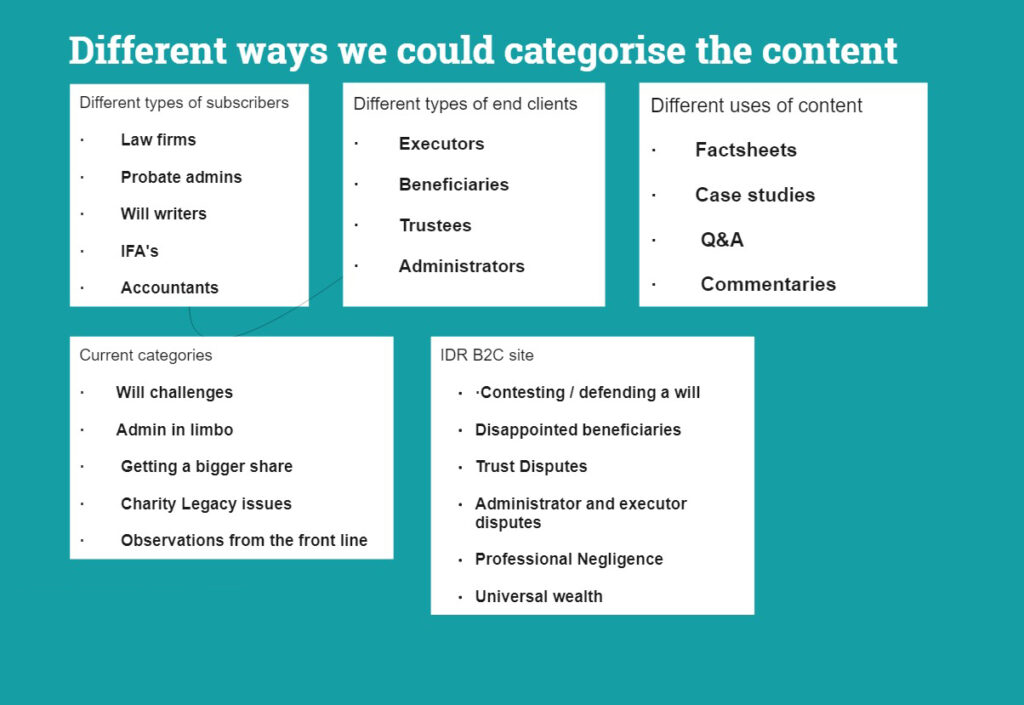
As it turned out, Cara had suggested this approach in the very first interview. Just as Don Norman described, people who are dealing with the problem everyday are best placed to think of solutions.
Cara had already envisaged that this was the best way to categorise the content, and the card sorts pointed to the same conclusion.
In the spirit of the UX design process, the card sorts had confirmed Cara’s initial assumption, and also confirmed that card sorts work! And surely this particular audience are fans of relying on evidence?
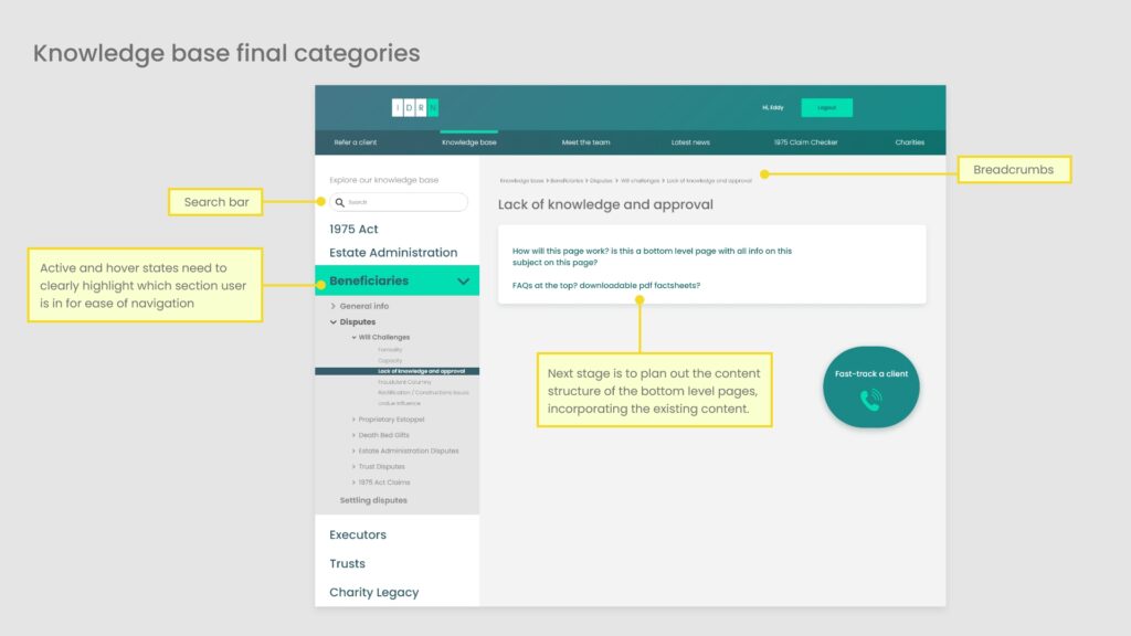
With this new framework, a final list of topics and content was drawn up to form the basis of the knowledge base navigation.

Goal-led categorisation
UX is about creating solutions that help users achieve their goals. The content could have been divided up in any number of ways, but the new categorisation aligns with the goals of practitioners trying to find the right information.
If you have a situation where a beneficiary is disputing a will, then your goal is to find the right information to deal with this situation. This information will be found in the beneficiary section of the knowledge base.
If you are a will writer who had received a letter claiming that a will was invalid, the information you require would be found in the ‘Will writing’ section of the knowledge base, under ‘Professional negligence’.
So the new categories are great, but could we make it even easier for subscribers to achieve their goals? What if it was so easy to find the right information, it was better to log in to the IDRN than look anywhere else?
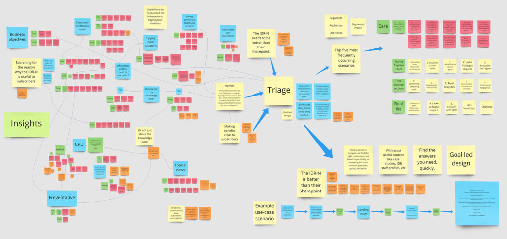
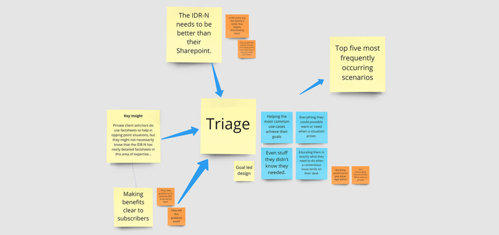
I gathered all the insights together to have another look…
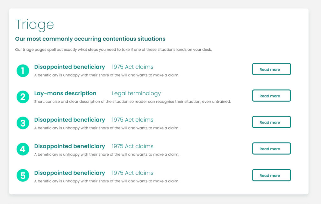
Triage
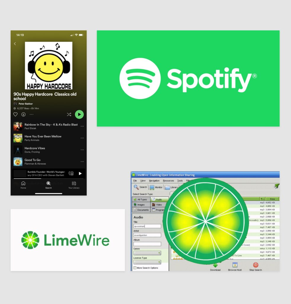
On my UX diploma there was a case study on Spotify, and how the app helped turn around declining revenue in the music industry due to illegal downloads, by making it easier to listen to music on their app than download mp3’s.
People are more prepared to pay the monthly subscription than mess around downloading mp3’s from file sharing sites. They have instant access to nearly all the music in the world, on any device, with easy search functionality.
Compare this to searching for music on illegal file sharing sites, downloading it, storing it in different folders on their laptop, having to move the mp3’s onto their different devices, and risking infecting their laptops with viruses.
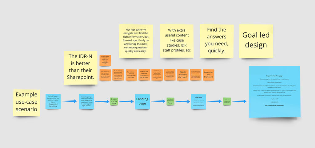
I wondered if we could make it easier to find the information that practitioners need when dealing with contentious probate issues by logging into the IDRN, rather than searching around in folders on their own company Sharepoint.
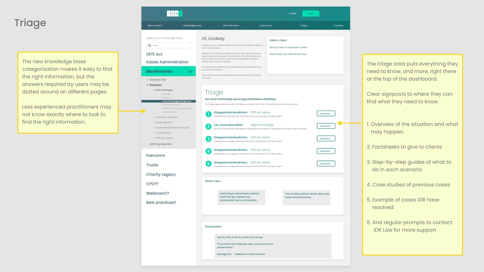
What if subscribers could get all the answers they need as soon as they arrive on the dashboard, with clear signposts to the exact content they need, covering the top five most frequently occurring contentious scenarios?
User goals and business objectives
The triage aims to provide:
- Easy access to the exact information required in the top five most regularly occurring scenarios
- It could be used to find information for people currently dealing with contentious situations
- It helps educate new subscribers, so they know what they need to do if a contentious situation arrives on their desk in the future
- It clearly demonstrates the expertise of IDR, building their credibility
- It encourages potential referrers to contact IDR for support as soon as possible
Site map
I am currently working with Lindsay and Cara to finalise the sitemap, plan the content for the triage pages, and refine the flows from arriving on the dashboard with through to finding the information required for each scenario.
The bottom-level copy needs to correlate to the triage page on the dashboard area so users have continuity through the flow.
Development are building the new menu structure, ready for Lindsay to create all the pages and re-launch the new look IDRN in December.
16.11.2022
