Fly UX for the BBC interview
Brief
Design a website for an airline, focusing on how users search for, find and select flights.

Design target
Anyone who decides to go on a trip that requires a flight.
Any trip. Any scenario.
Approach
My approach was to discover in detail the exact steps a person takes from the moment they decide to go on a trip, through to getting their flights booked up.
What are their first thoughts?
What are their first actions?
How does flight booking fit in with that?
“You can only begin to solve a problem if you truly and completely understand it”
Otherwise know as…
- Root cause analysis
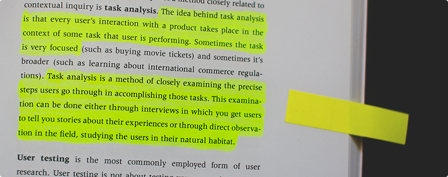
- Task analysis
- Jobs to be done

Competitors
First up was checking out the competitors to establish conventions, looking for things to improve, and borrowing things that work well.
Results page layout
- For most airlines, flight selection is sequential
- You choose the outbound flight, then you choose the return
- Either listed down the page, or even on a new page like British Airways
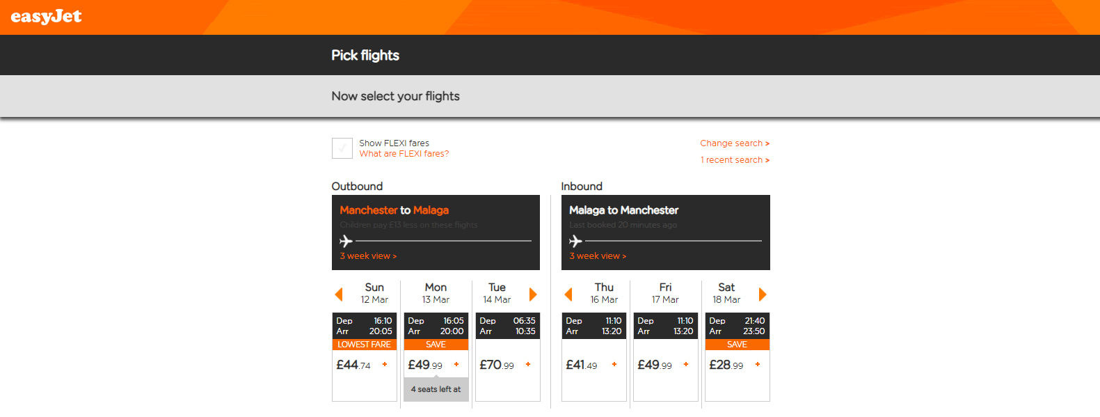
- EasyJet do it differently
- Outbound and return are side-by-side
- This seemed much easier
- Research later demonstrated exactly why
User research
Discovering how people plan trips
Research process:
- Quantitative survey
- Two pre-recorded interviews & usability tests
- Round-up of key insights to explore further
- Two further interviews & usability tests
- Final qualitative survey

First survey
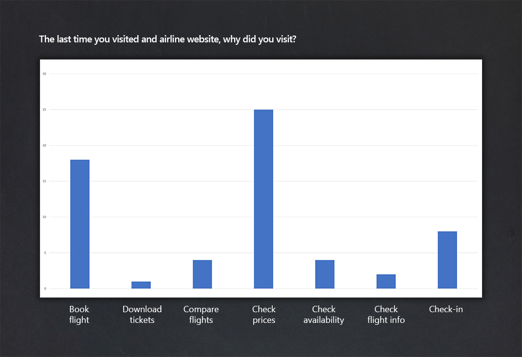
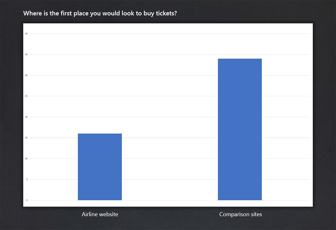
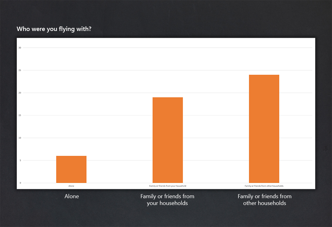
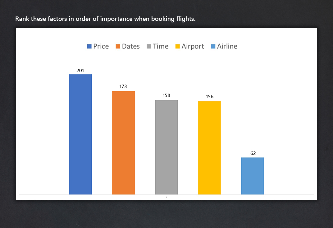
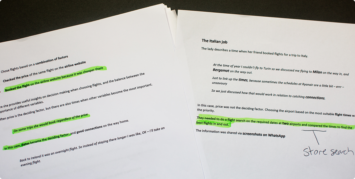
The first of two surveys provided initial insights, with high a response establishing some fundamentals of airline website usage.
- People visit airline sites initially to check prices
- Most people visit comparison sites first
- People mainly book tickets in groups
- Important details – Price, times & dates

First interviews
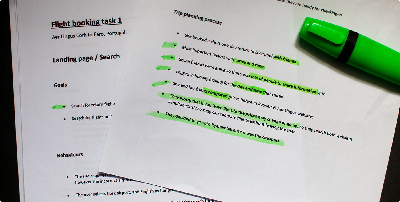
The first of two user interviews were pre-recorded, with benchmark usability tests on the Aer Lingus and Eurowings websites.
Key findings
- Learnt about trip planning in more detail
- Learnt about how users compare flights
- Important details
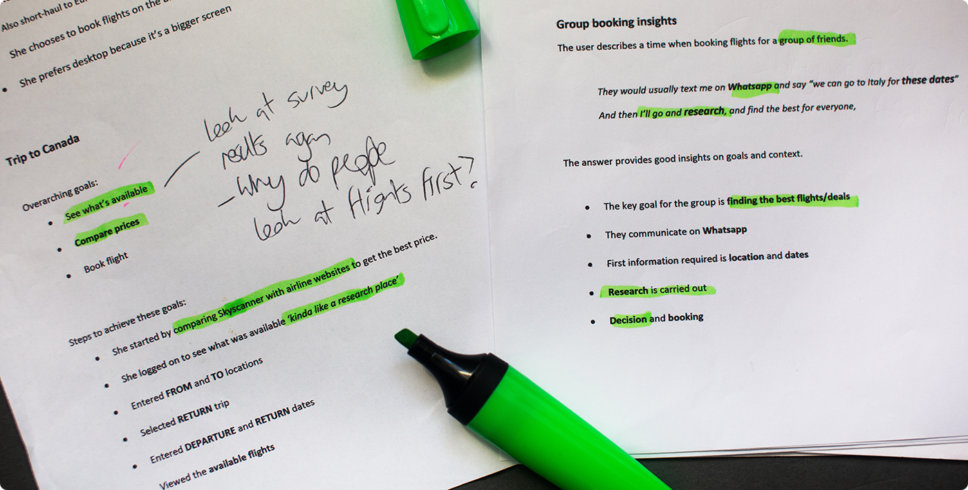
- Group bookings
- Established mental models
- Identified pain points
Preparing scripts
The insights gathered so far informed the next stage of the research and defined the issues to focus on with two further interviews
Second interviews
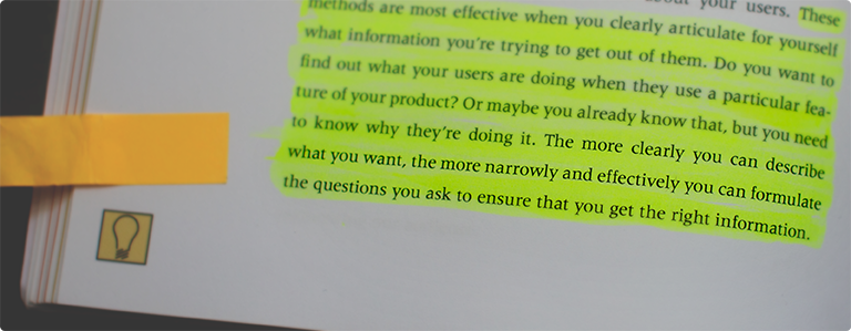
Initial research insights were roughly summarised and used to formulate the interview objectives. Scripts were devised carefully to explore key issues further.
Lesley’s interview explored comparing different airports, times, and deciding on the best flight.
Rachel’s interview focused on group bookings, and how larger groups come to a decision together.

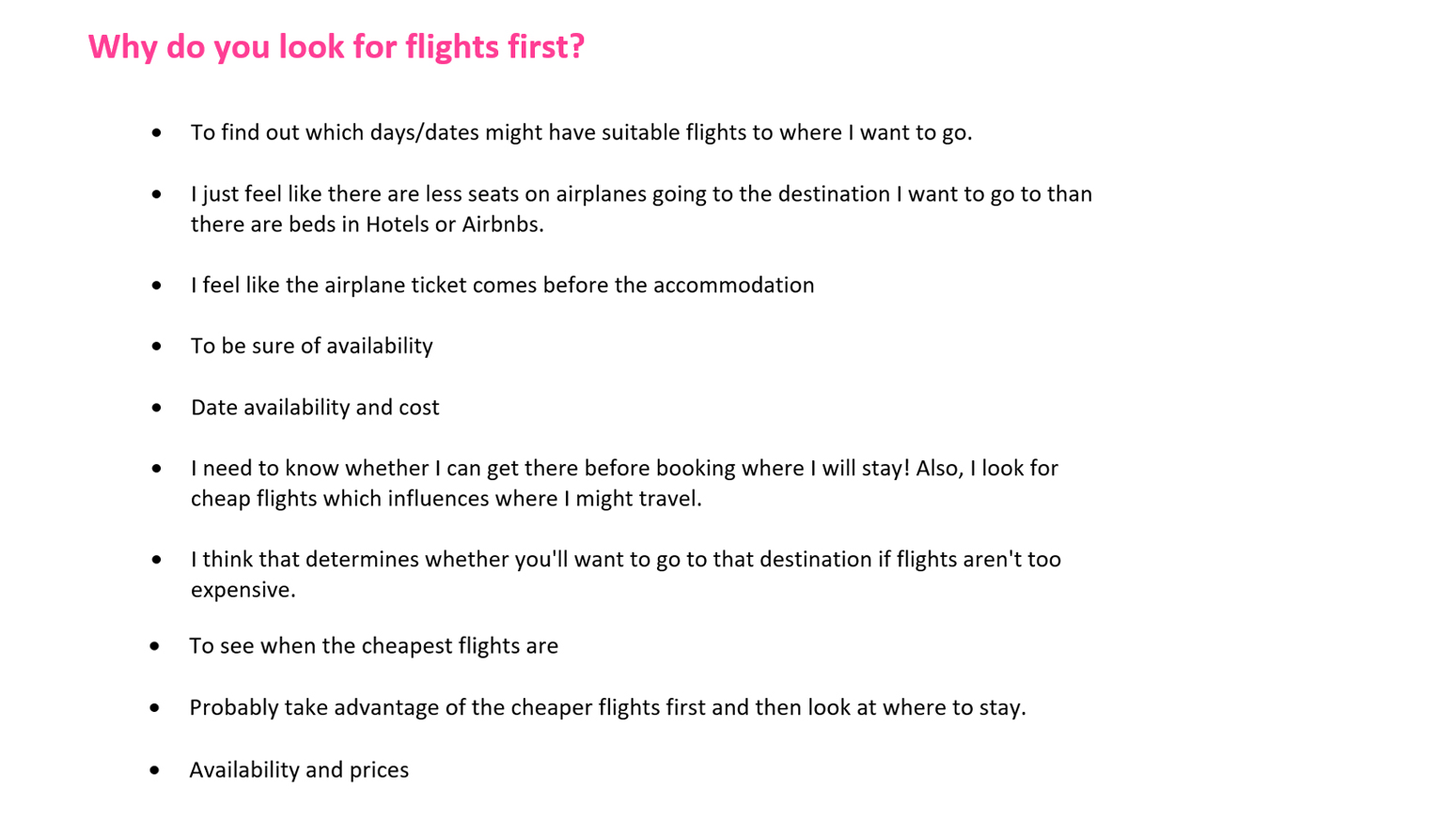
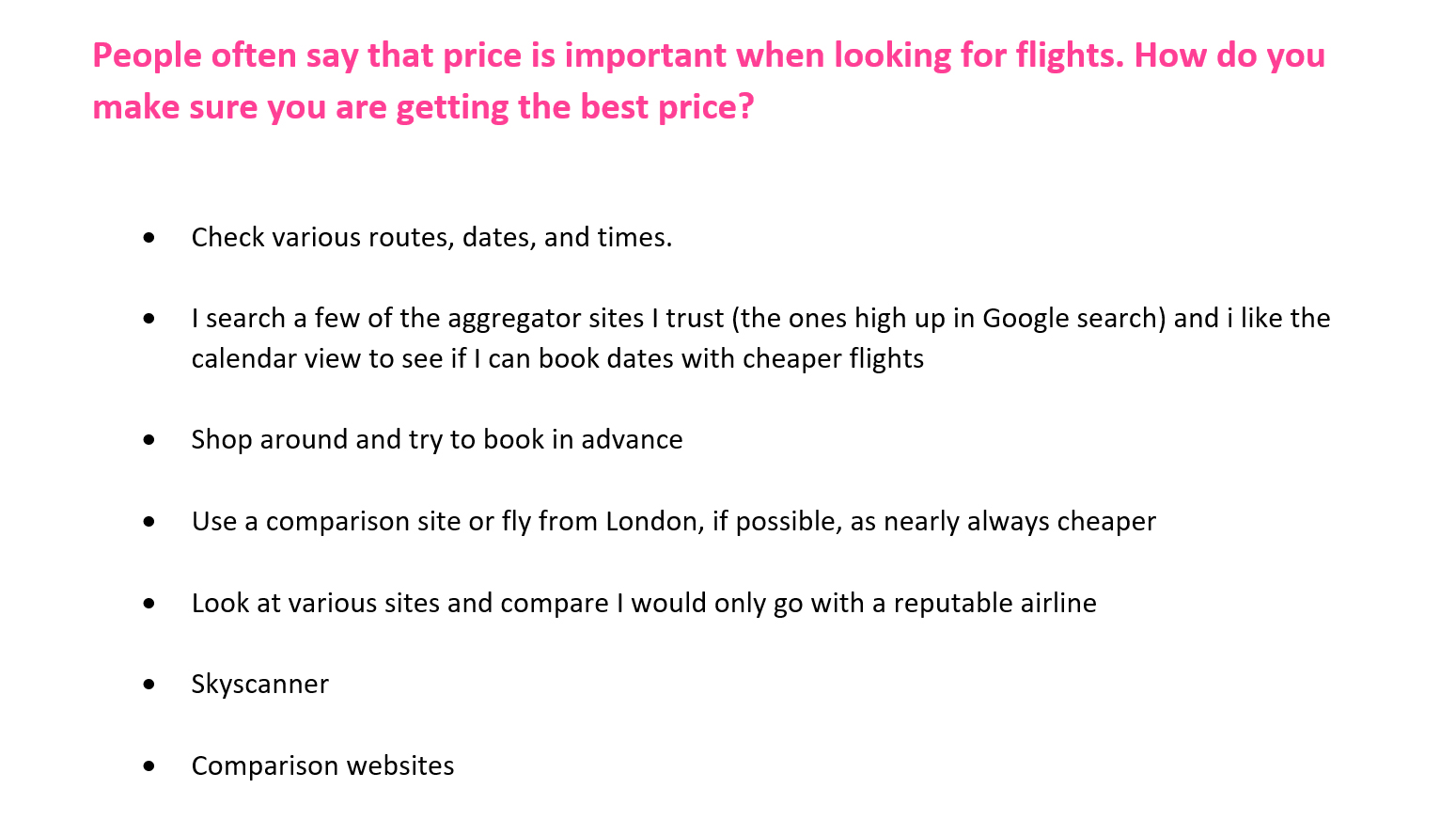
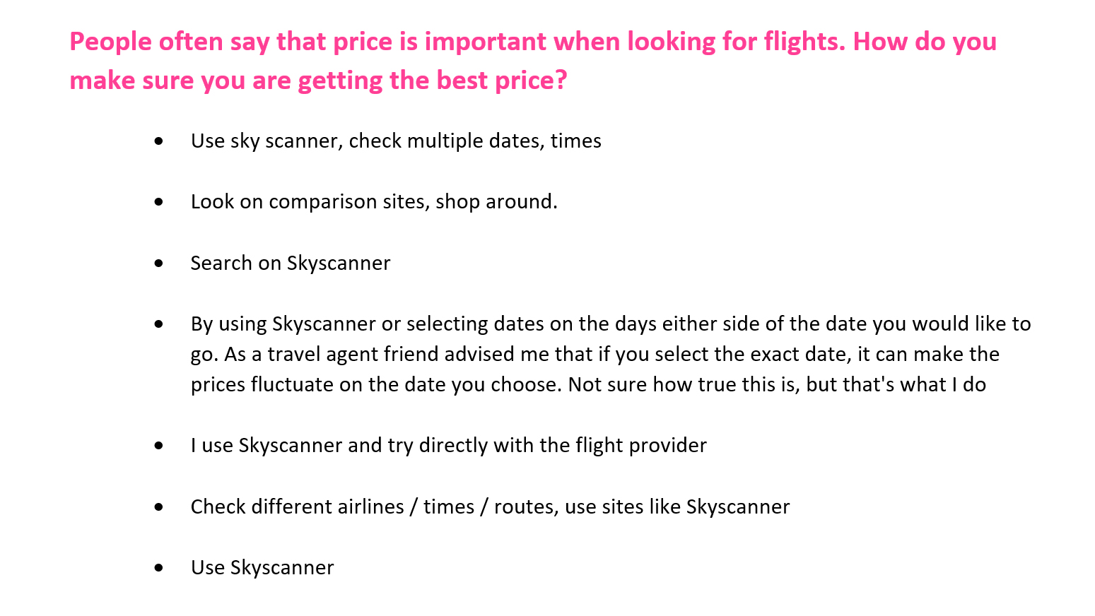
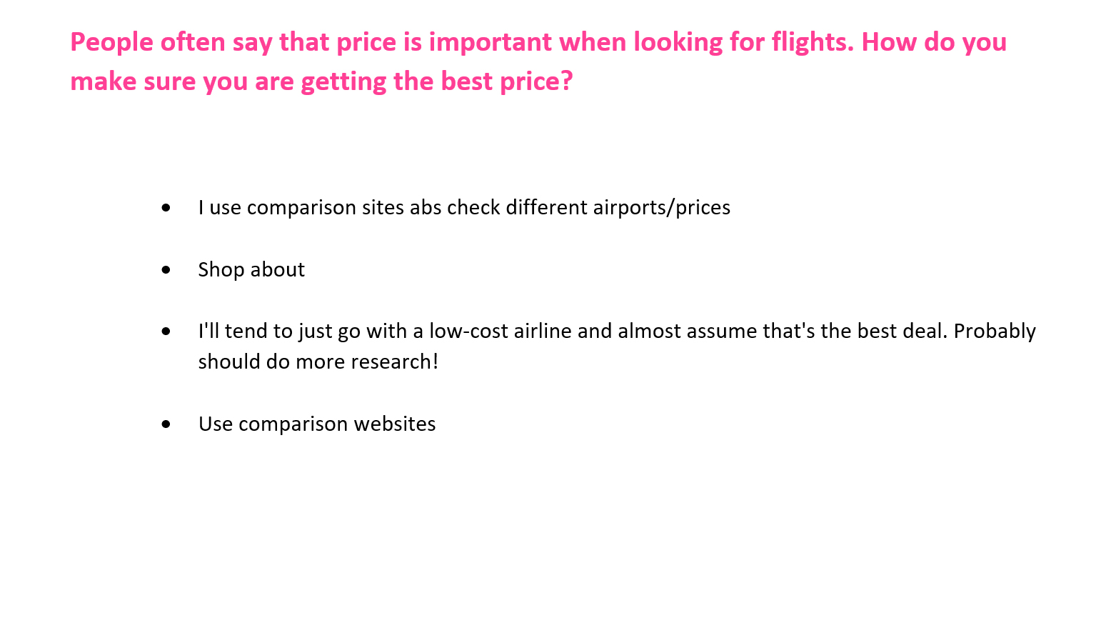
Final survey
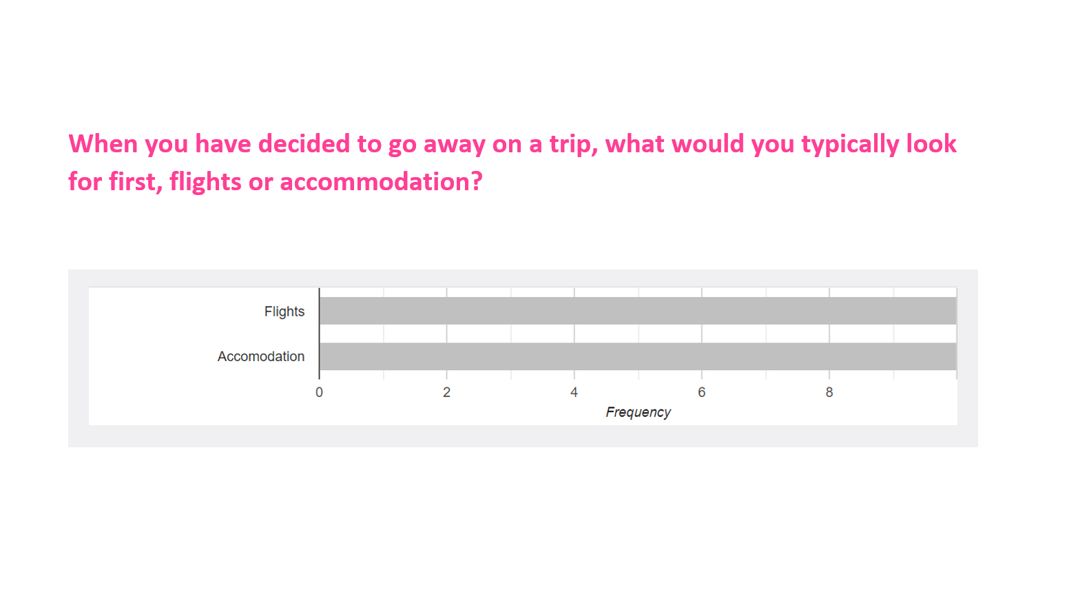
One last qualitative survey was carried out to firm-up the research insights.
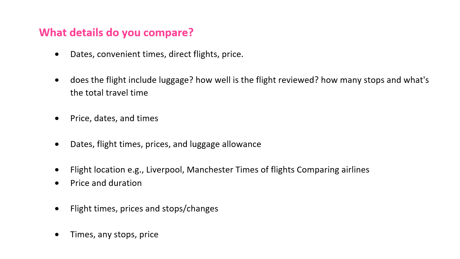
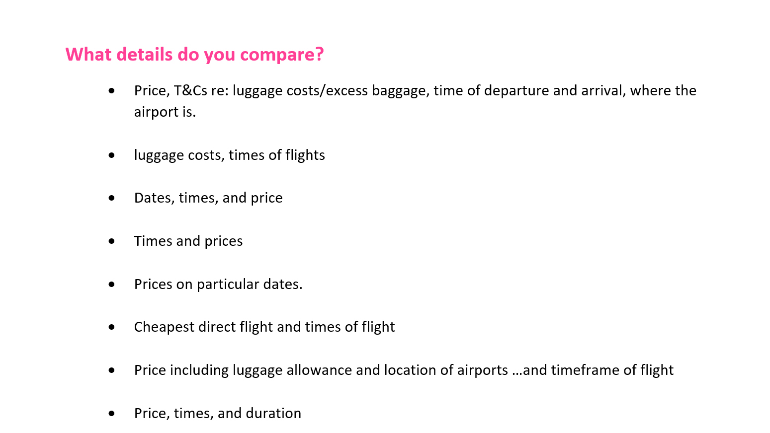
I wanted respondents to describe how they compare flights in their own words
The responses really gave weight to the insights, with some valuable quotes from a low response.

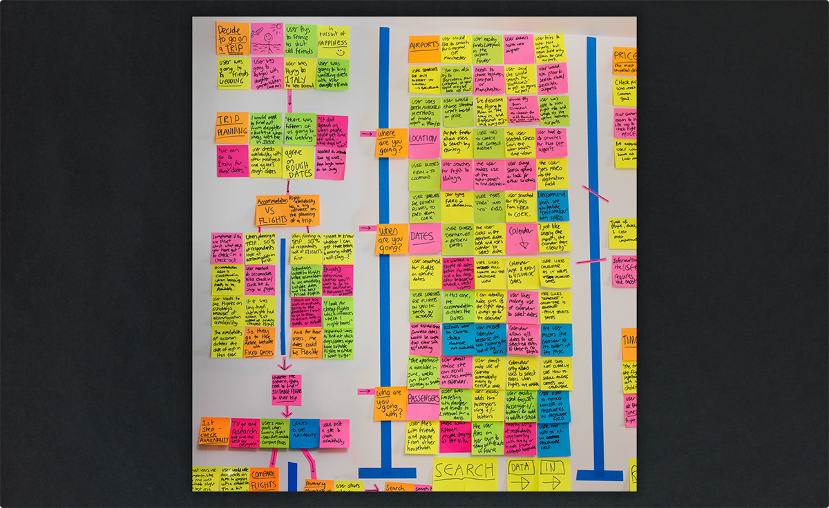


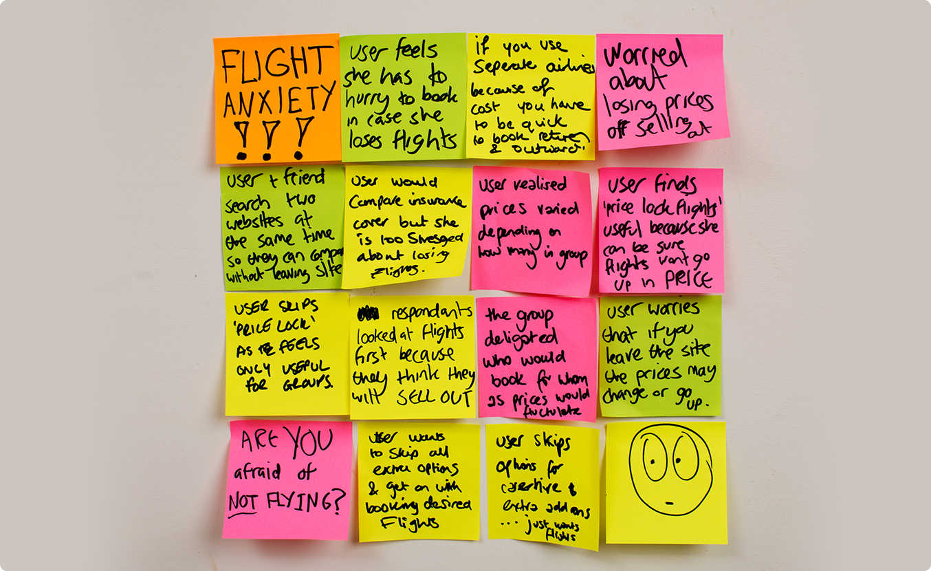
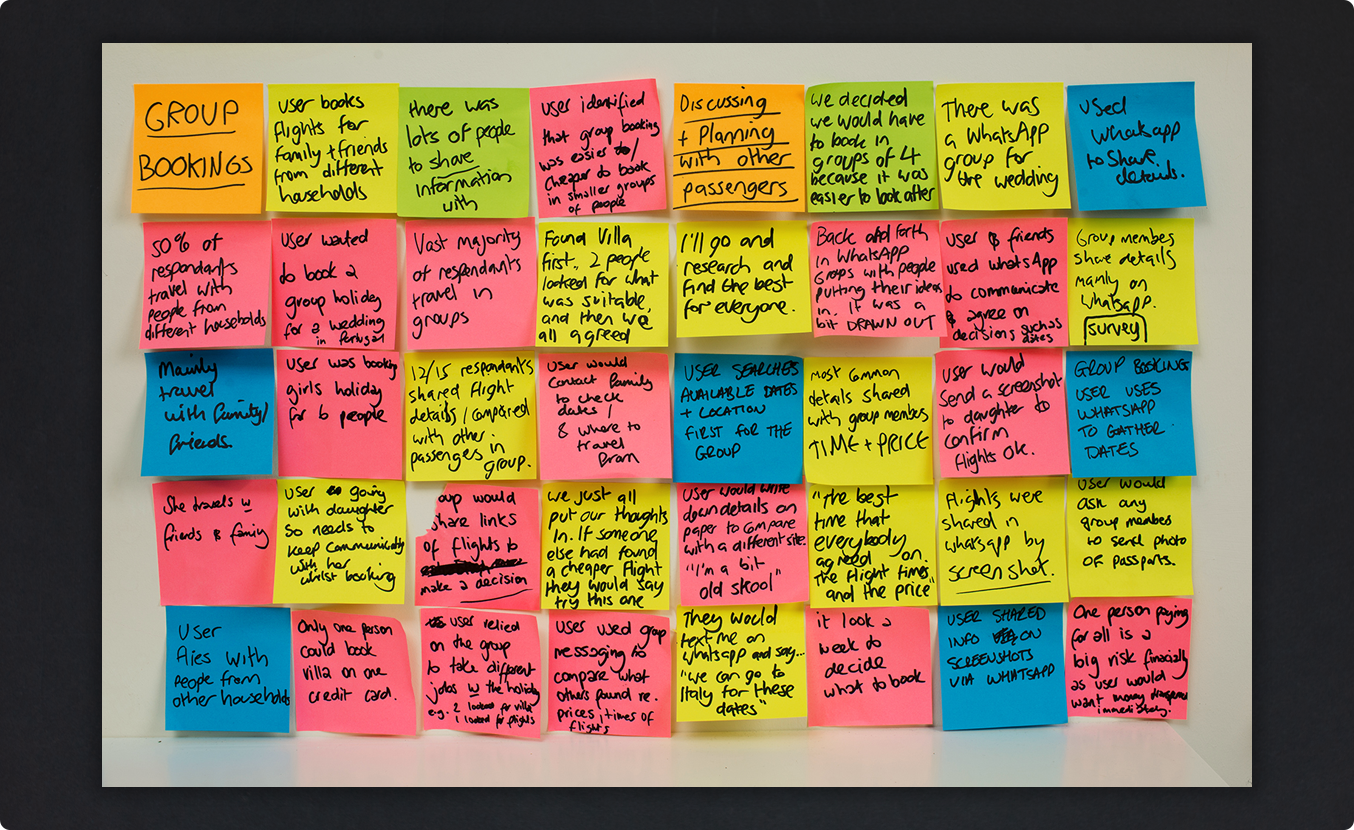
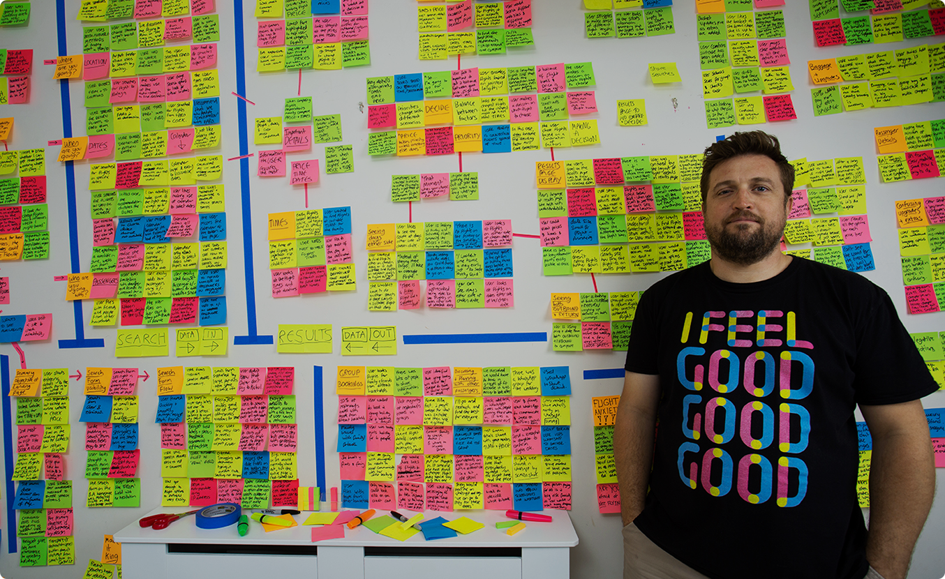
Analysing the research
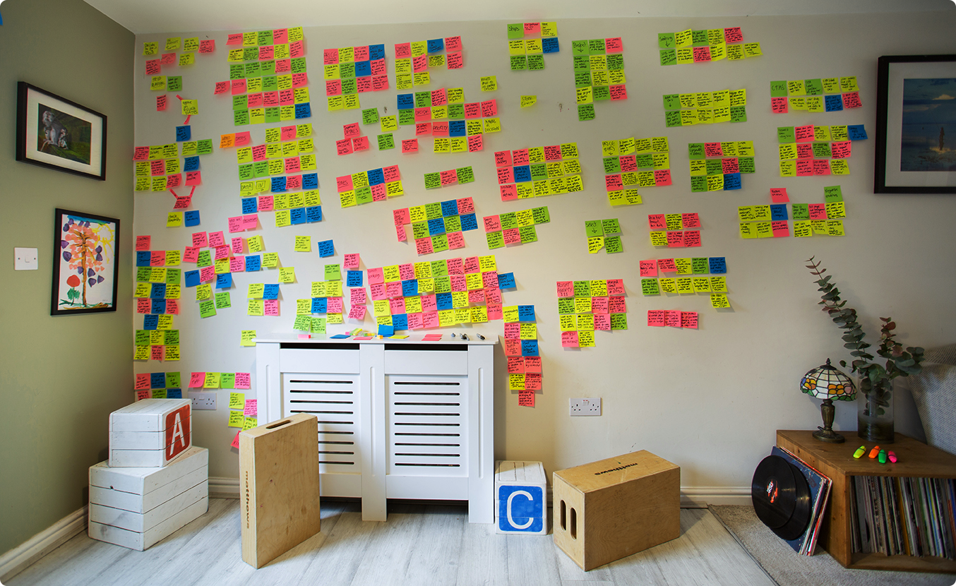
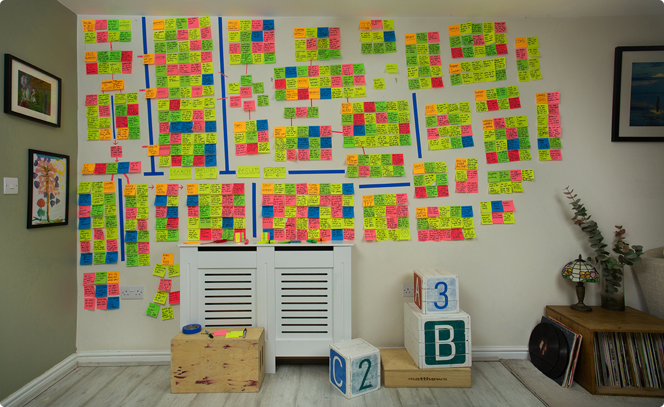
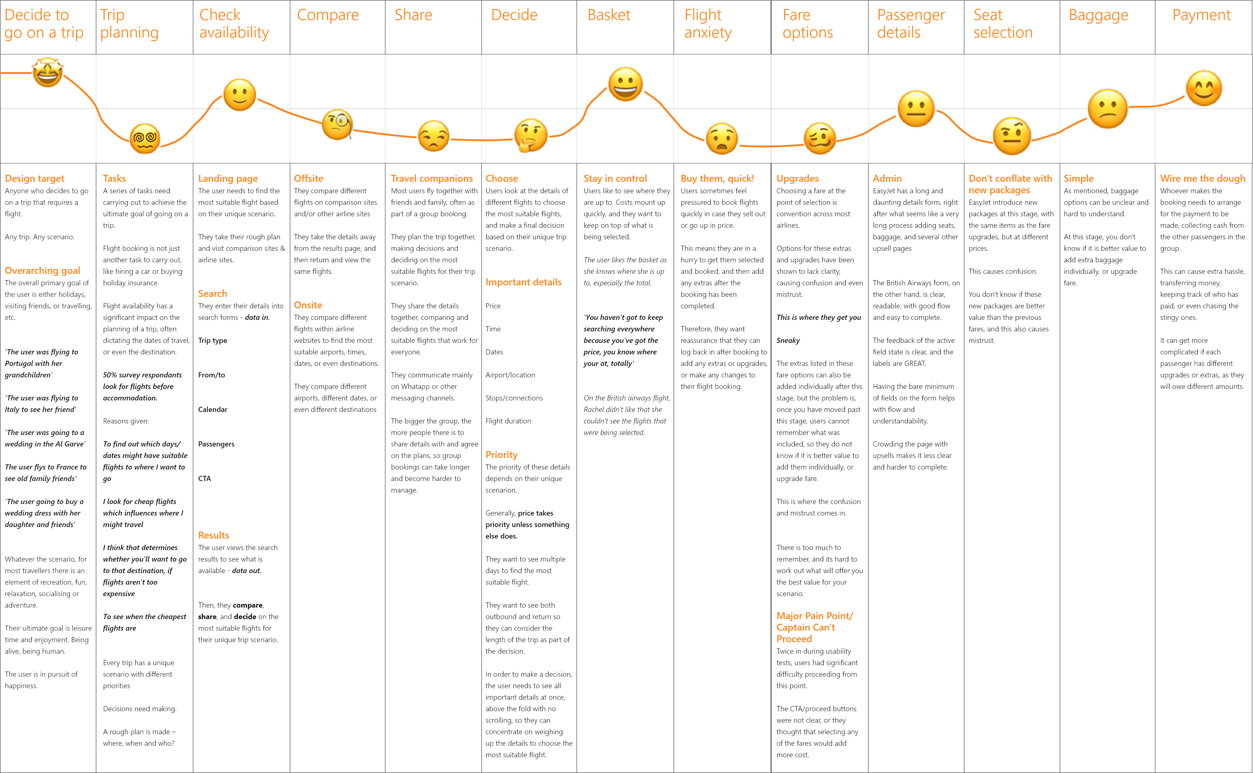
The research data was refined with an affinity diagram, and summarised in a customer journey map
This highlighted all the issues to be addressed by the design.

Actionable Insights

Trip planning
- Make a rough plan
- Where? When? Who?
- Take it to different websites
- Check availability
- Compare, share, and decide
The site needs to fit in seamlessly with this process to make flight booking smooth & stress-free.
Booking holidays should be fun!
Compare
Users compare different flights to find the most suitable for their unique trip scenario, at the best price.
- They compare different airline websites and comparison sites like skyscanner
- They compare different flights within airline websites to find the most suitable airports, times, dates, or even destinations.
Share
- They share the details from the airline websites to find flights that suit everyone
- They make the final decision together
- They often share the details on WhatsApp
- The bigger the group, the more complicated this becomes
Decide
Decide on the most suitable flight by weighing up the important details
Price, times and dates
The priority depends on the unique trip scenario
The results page needs to support this decision making process, with all required details in one place so the user can concentrate on finding the right flight, without scrolling up and down.
Designing the solution
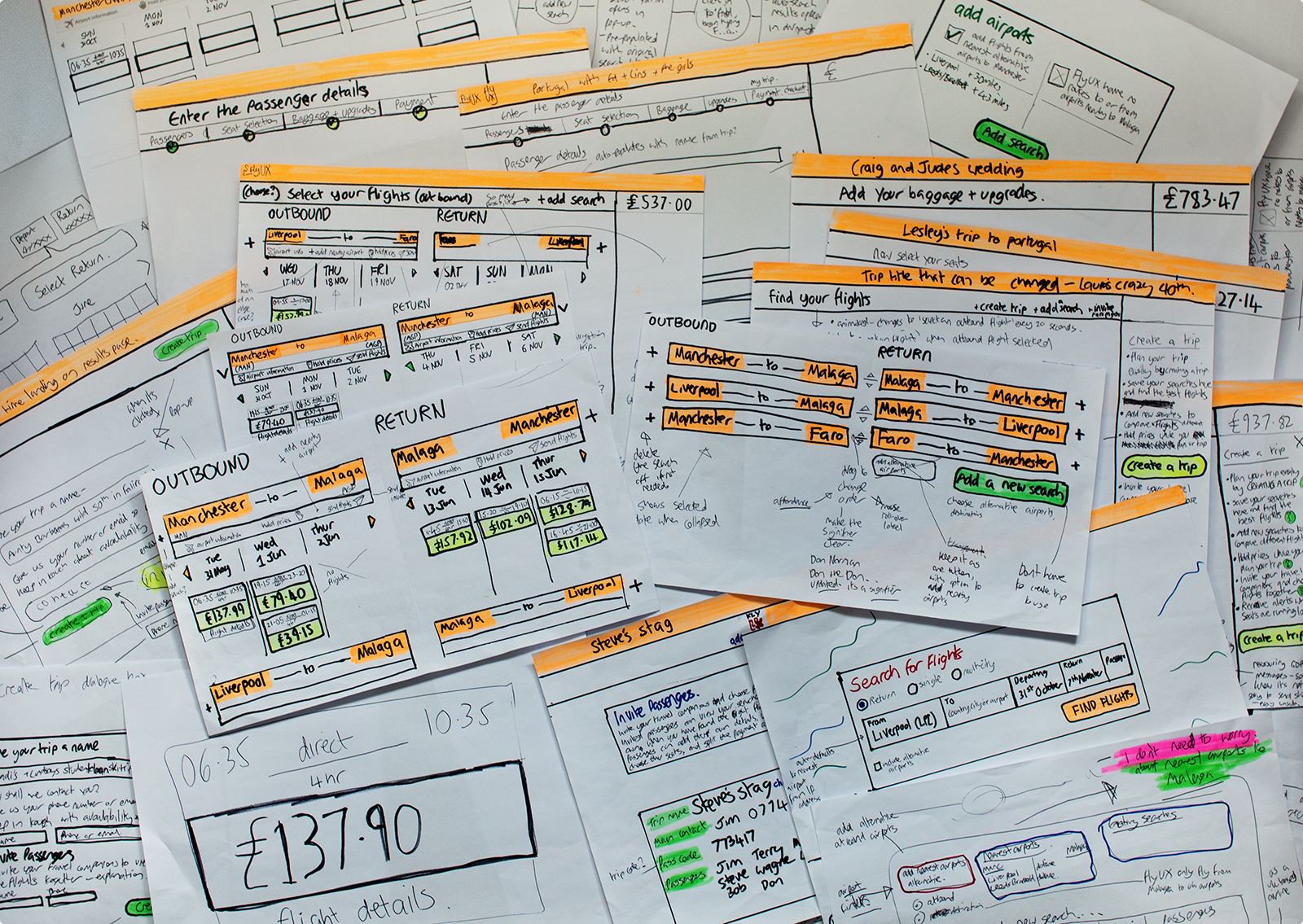
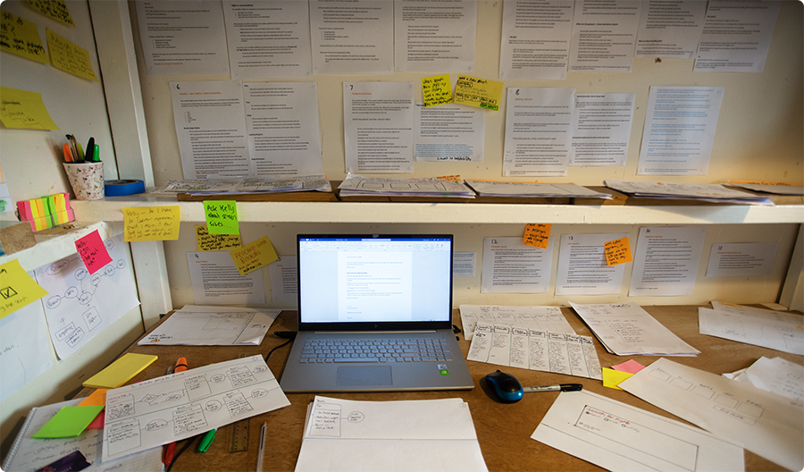
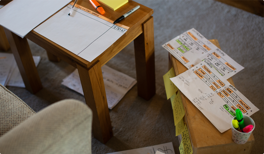
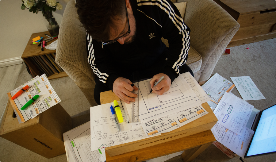
I began sketching a solution based on the insights, designing the screens and user flow together.
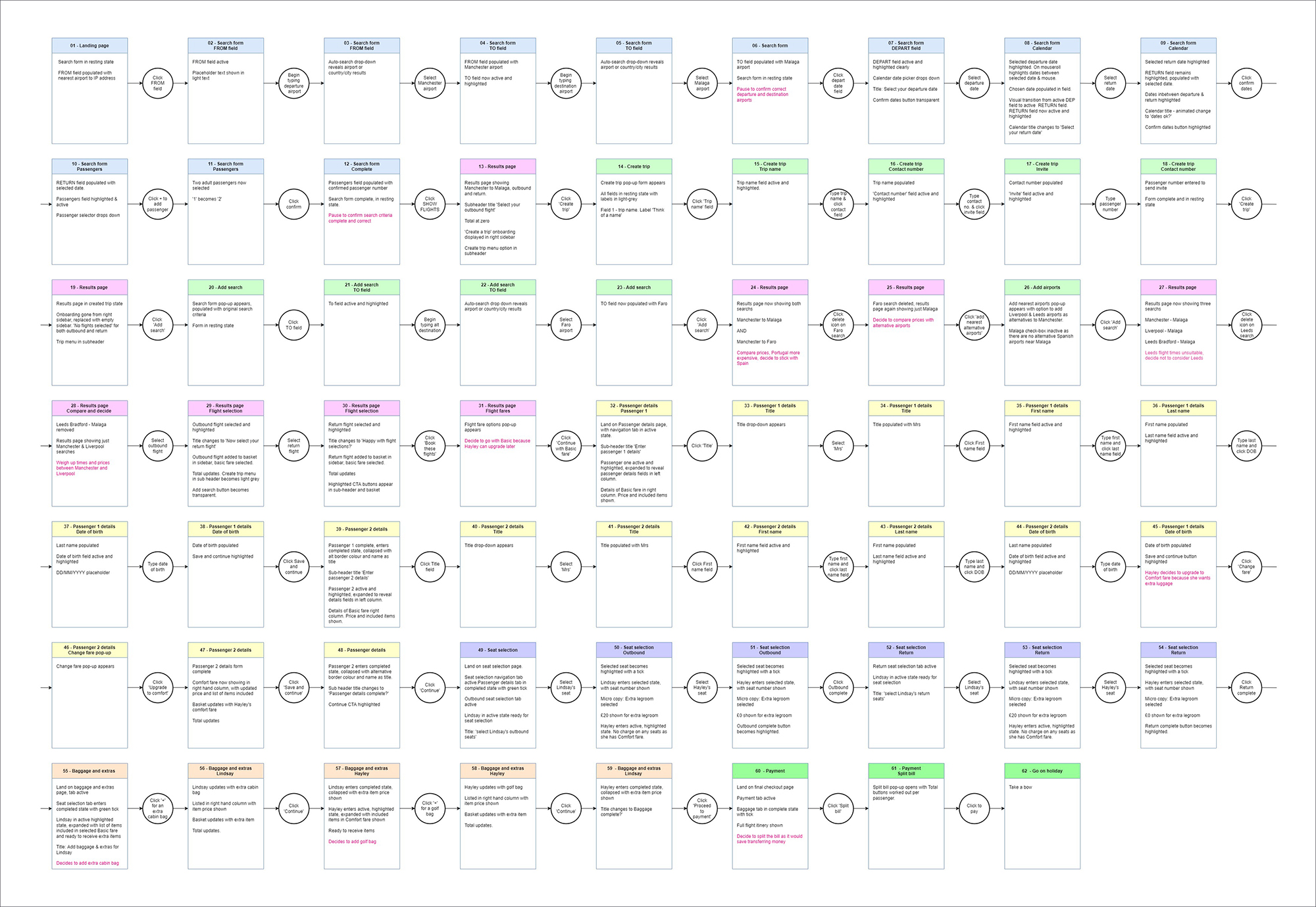
The user flow was based on a single use-case, from landing on the homepage through to completing the booking.

Keeping it real
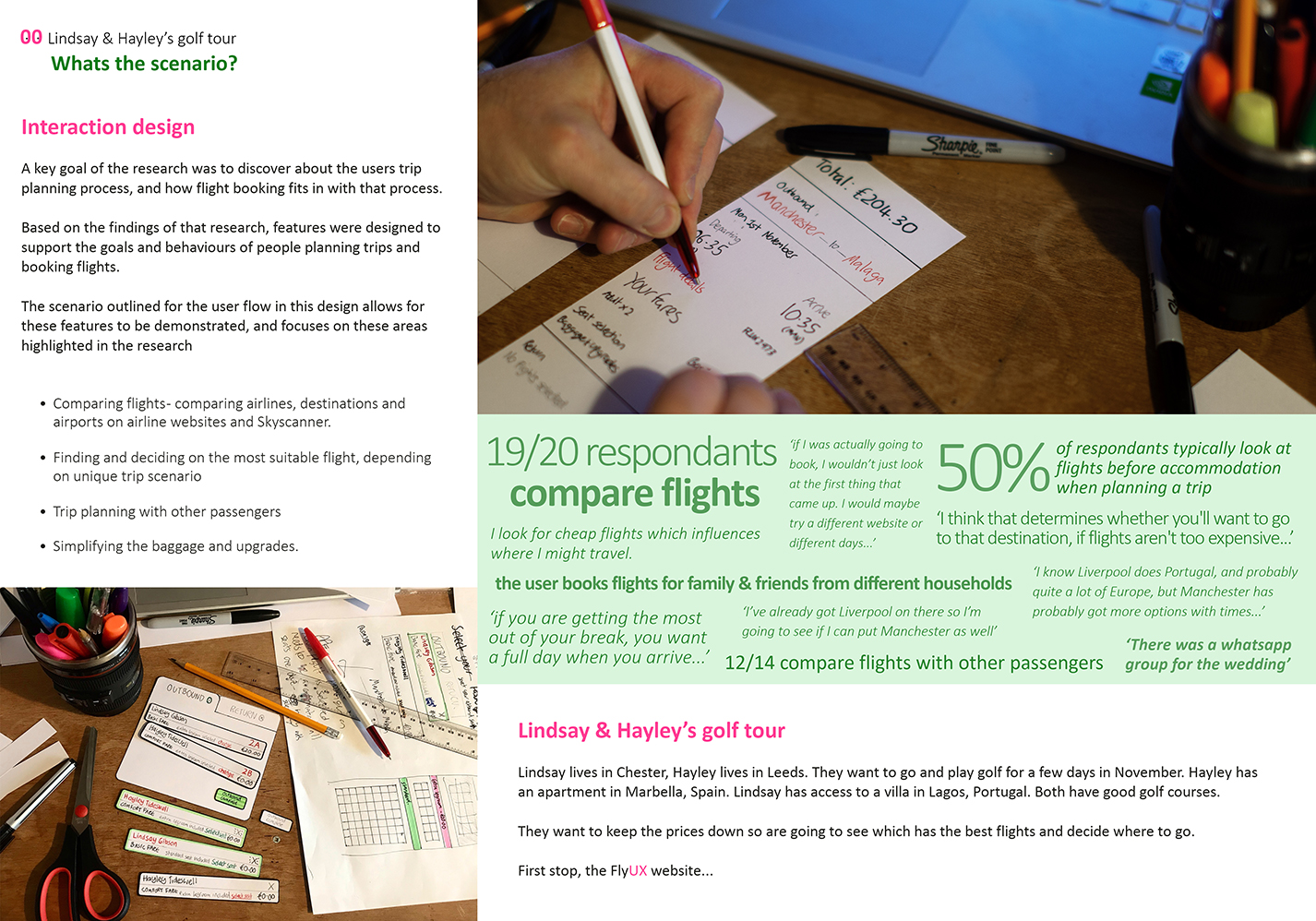
The use-case was based on a potentially real life scenario, a golf trip with two family members comparing prices, times and airports.
Choosing either Spain or Portugal depending on which flights were most useful.
The purpose was to demonstrate the features that support comparing flights
Interaction design
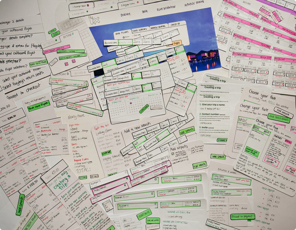
The interaction design was outlined initially with a paper prototype.
It was useful to experiment with the interactions, refining the controls and feedback for each button click in the flow.

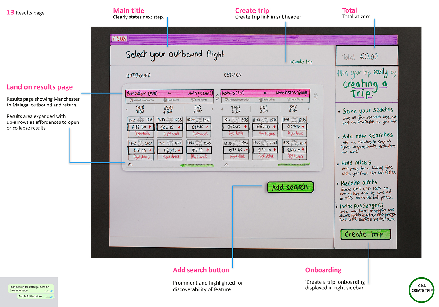
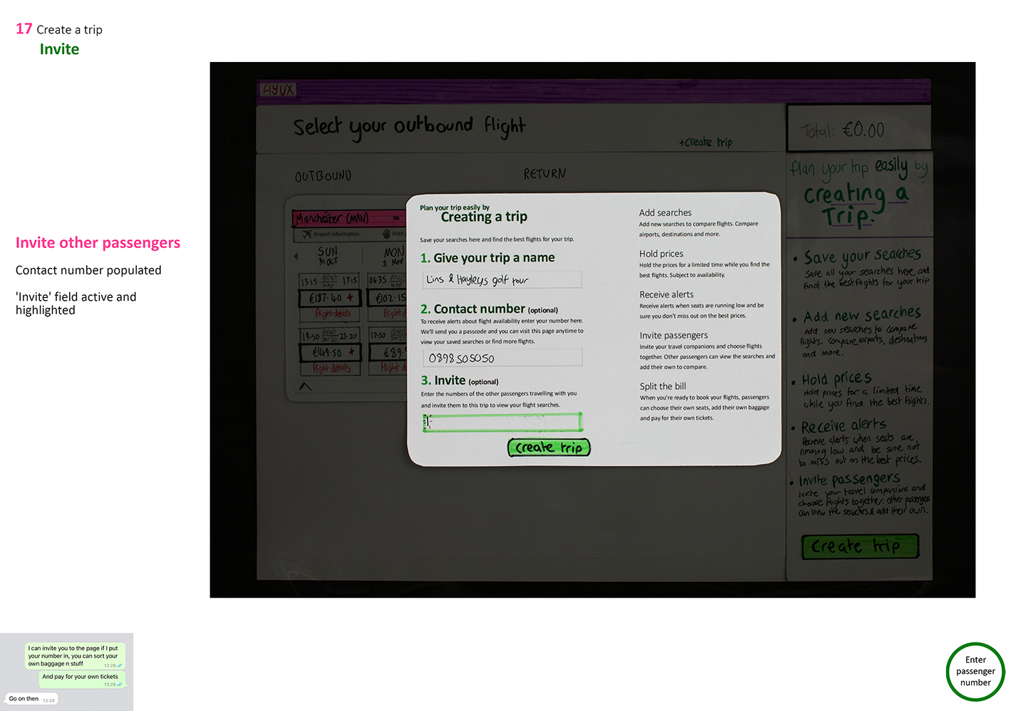
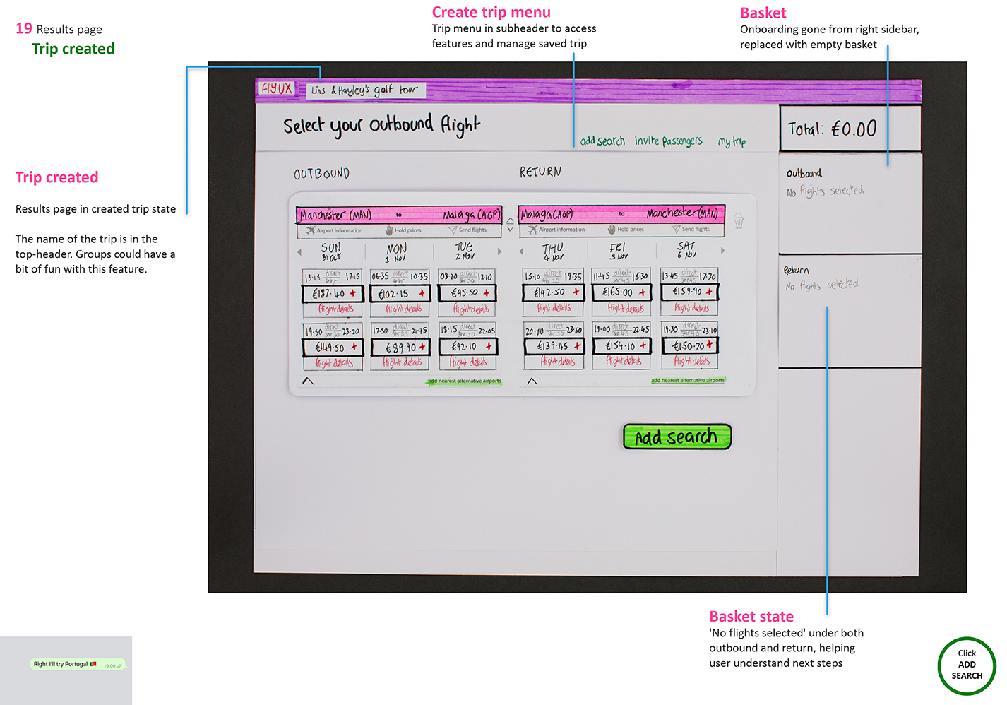
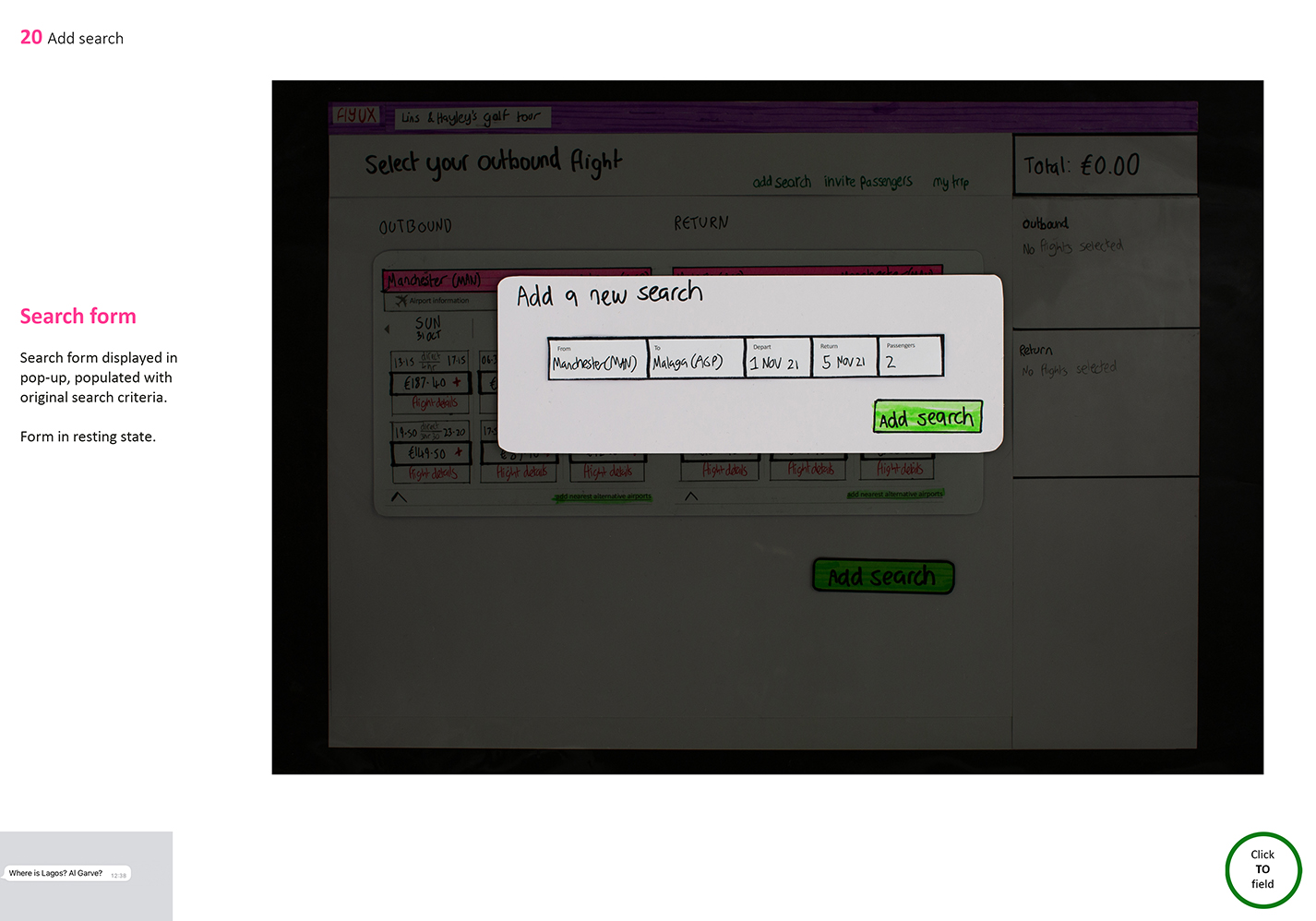

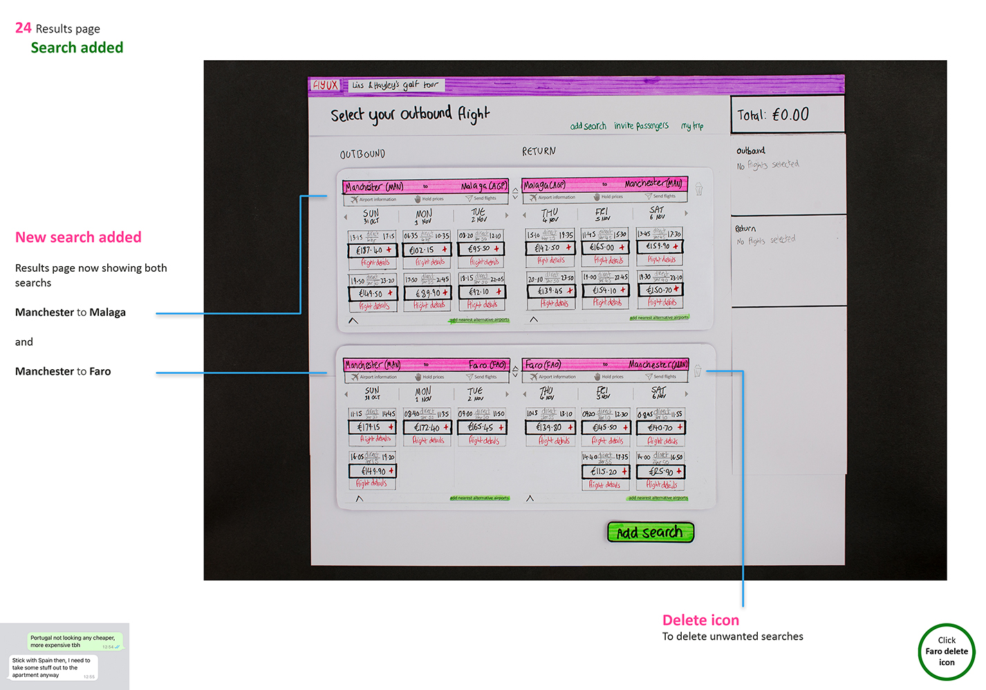
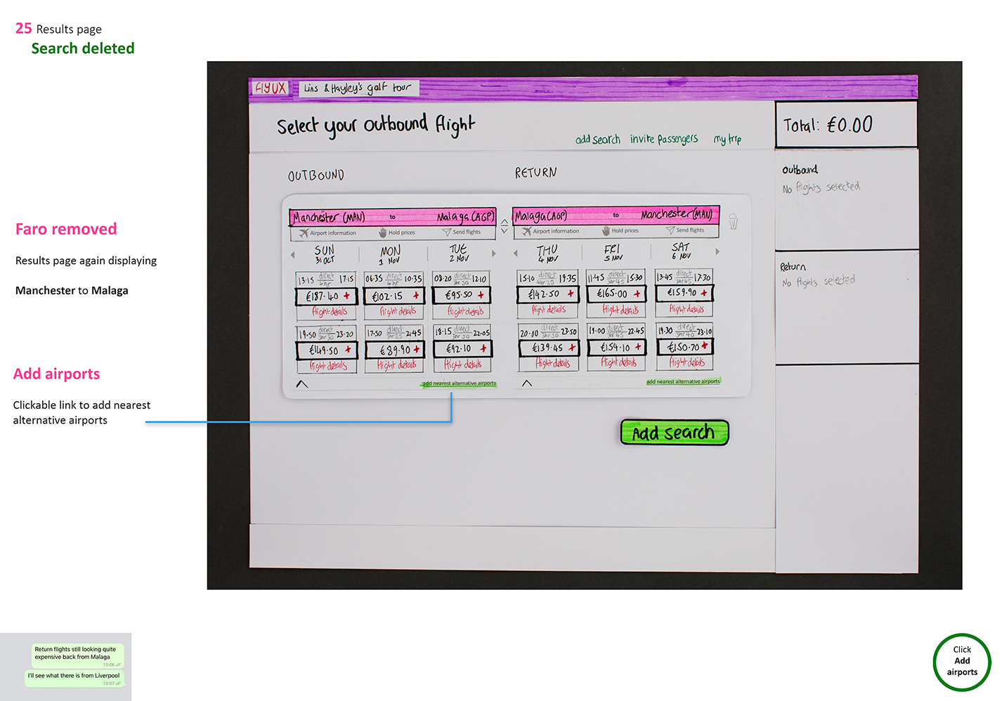
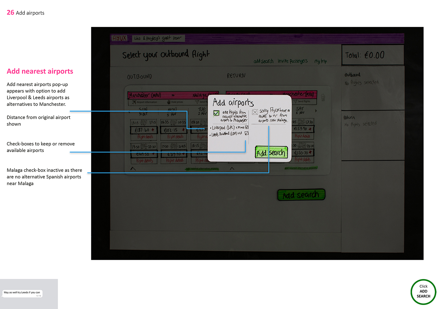
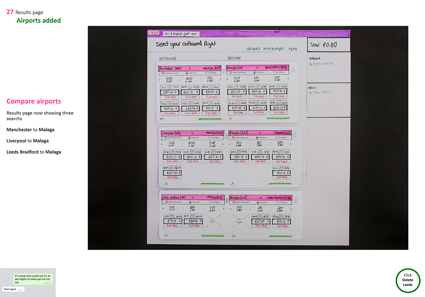
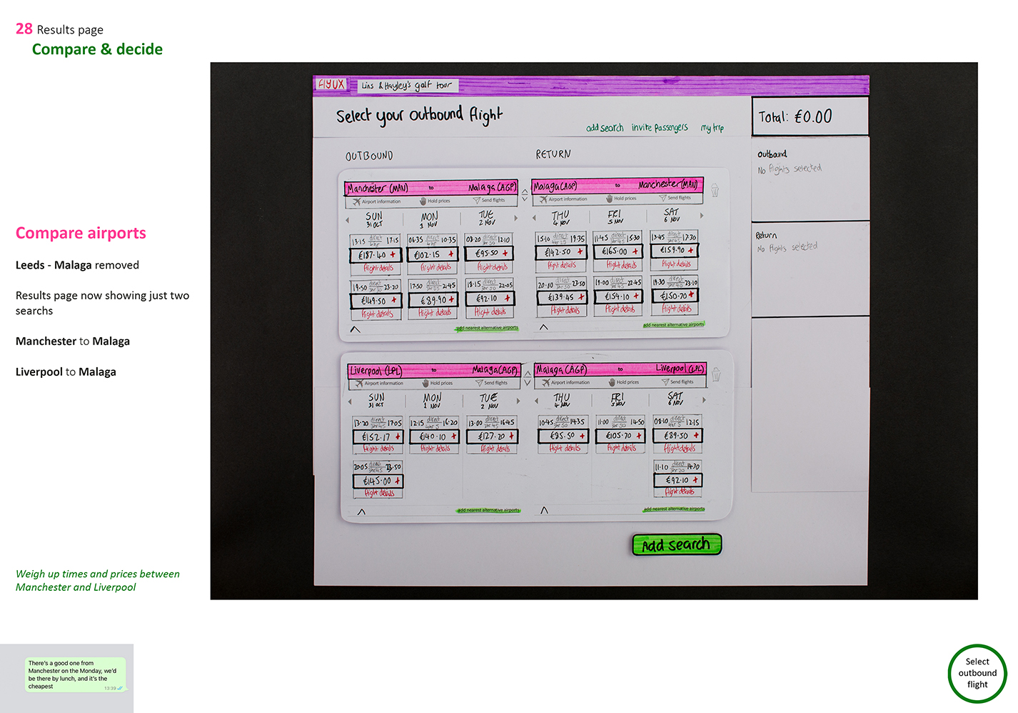
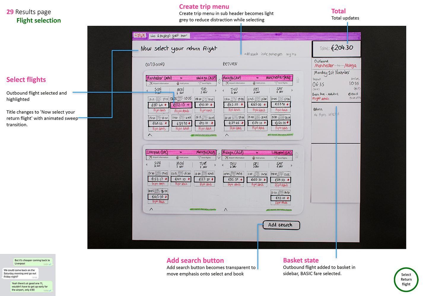
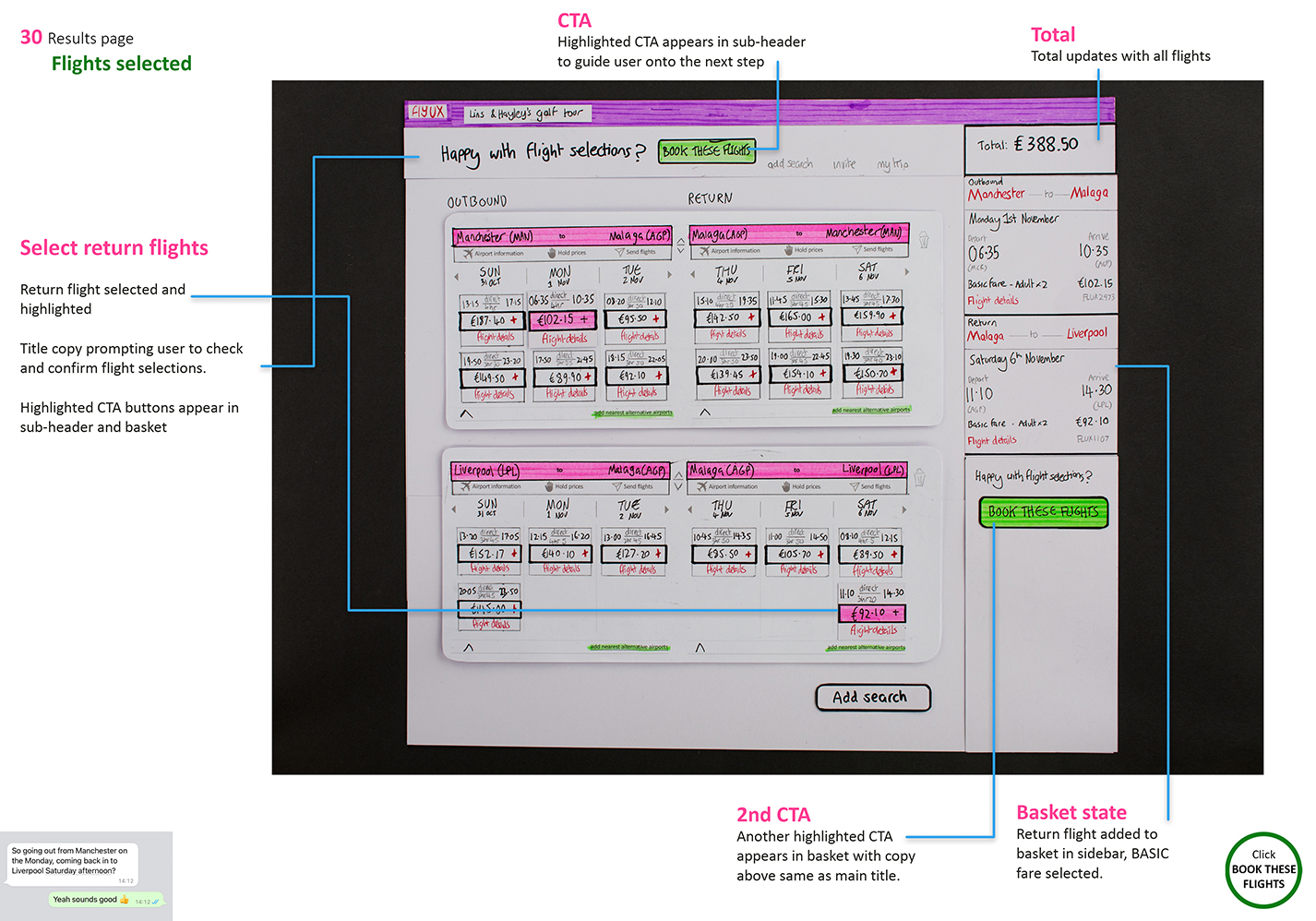

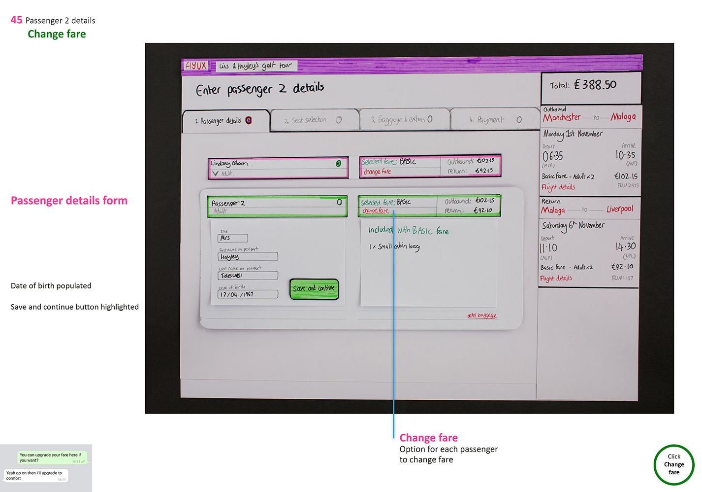
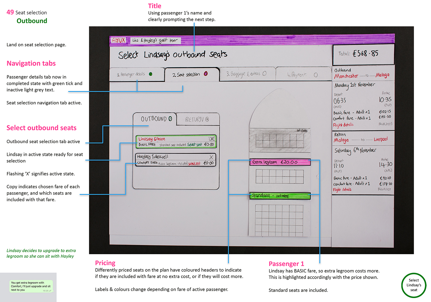
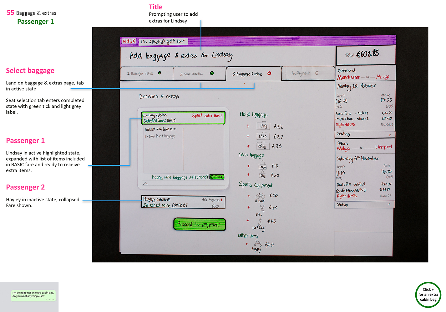

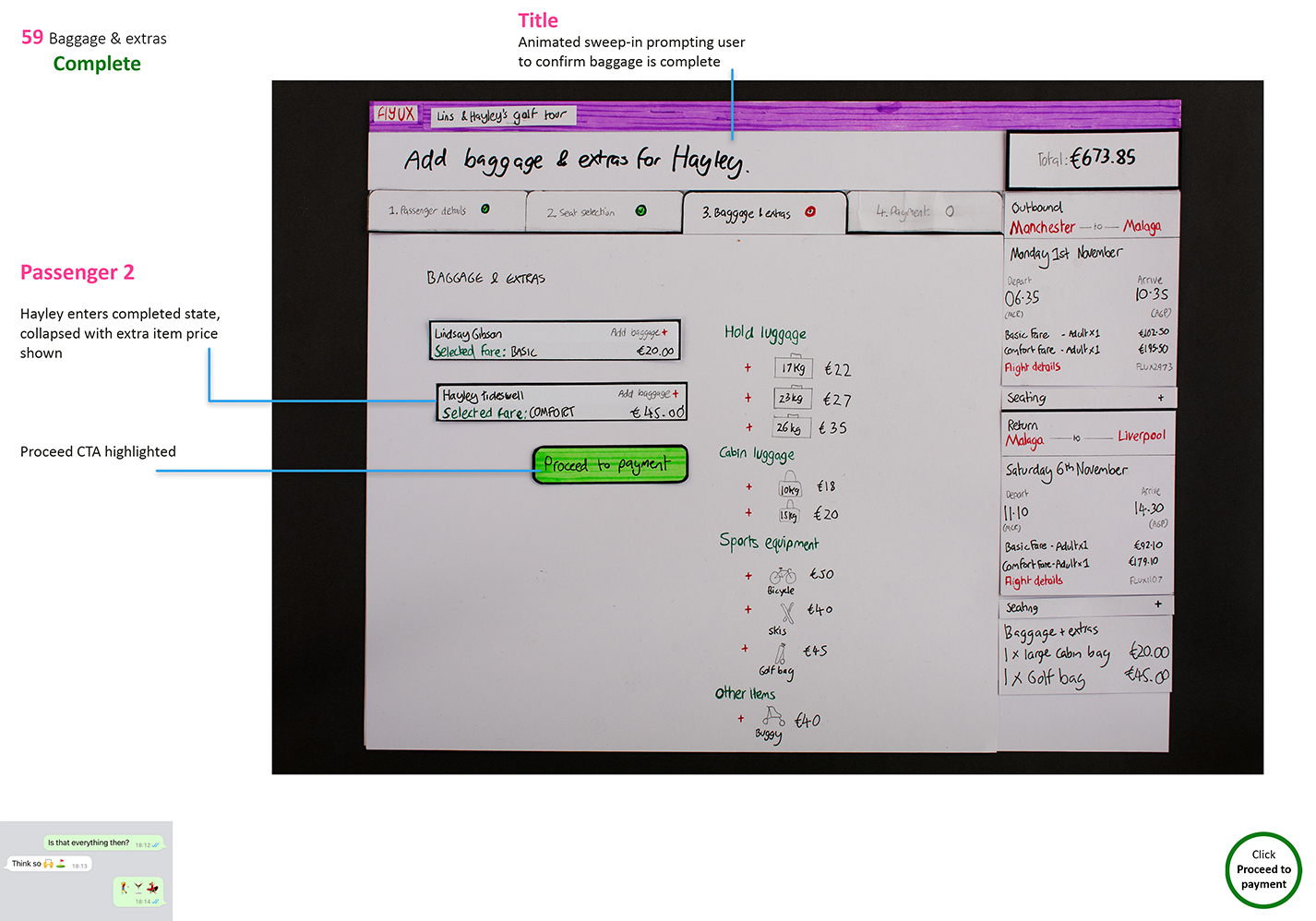
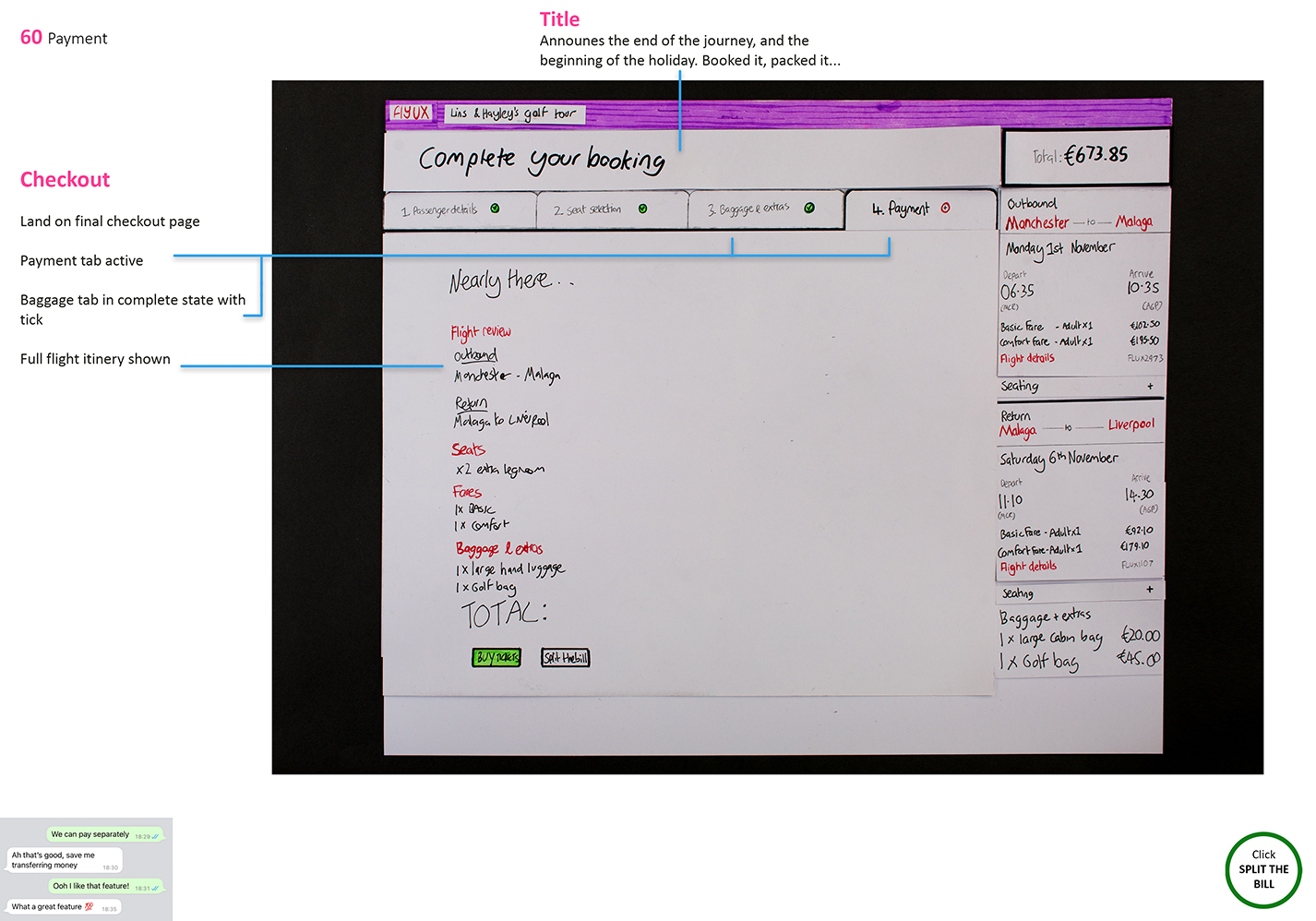

Paper prototype usability test
High-fidelity prototype
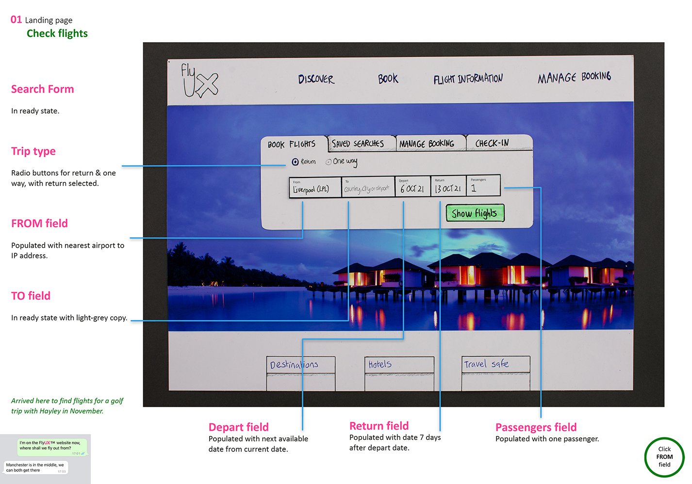
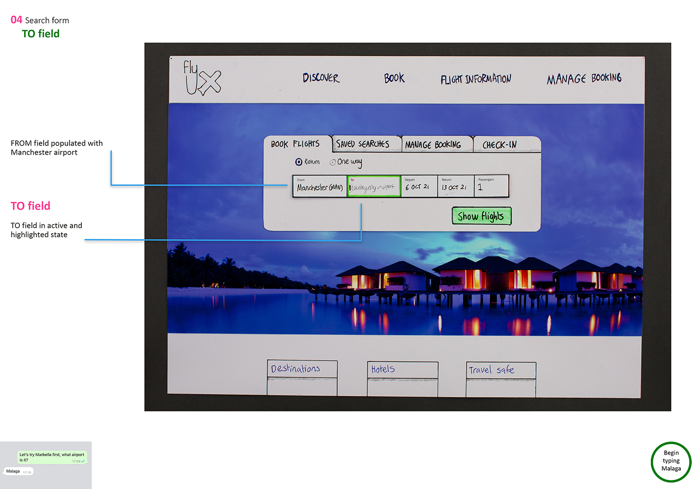
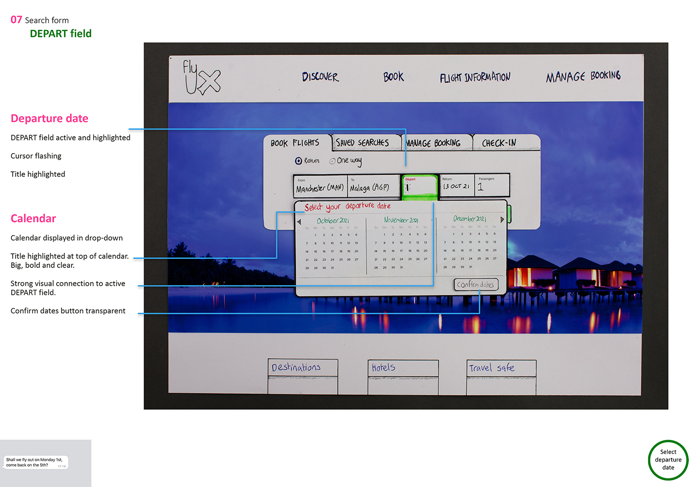
The the screens and flows from the interaction design were then built using XD to create a high-fidelity prototype.
There are some annotated screenshots below but you can check out the full user flow and follow the use case scenario here on the full prototype.

view a pdf of these screenshots to zoom in for a closer look
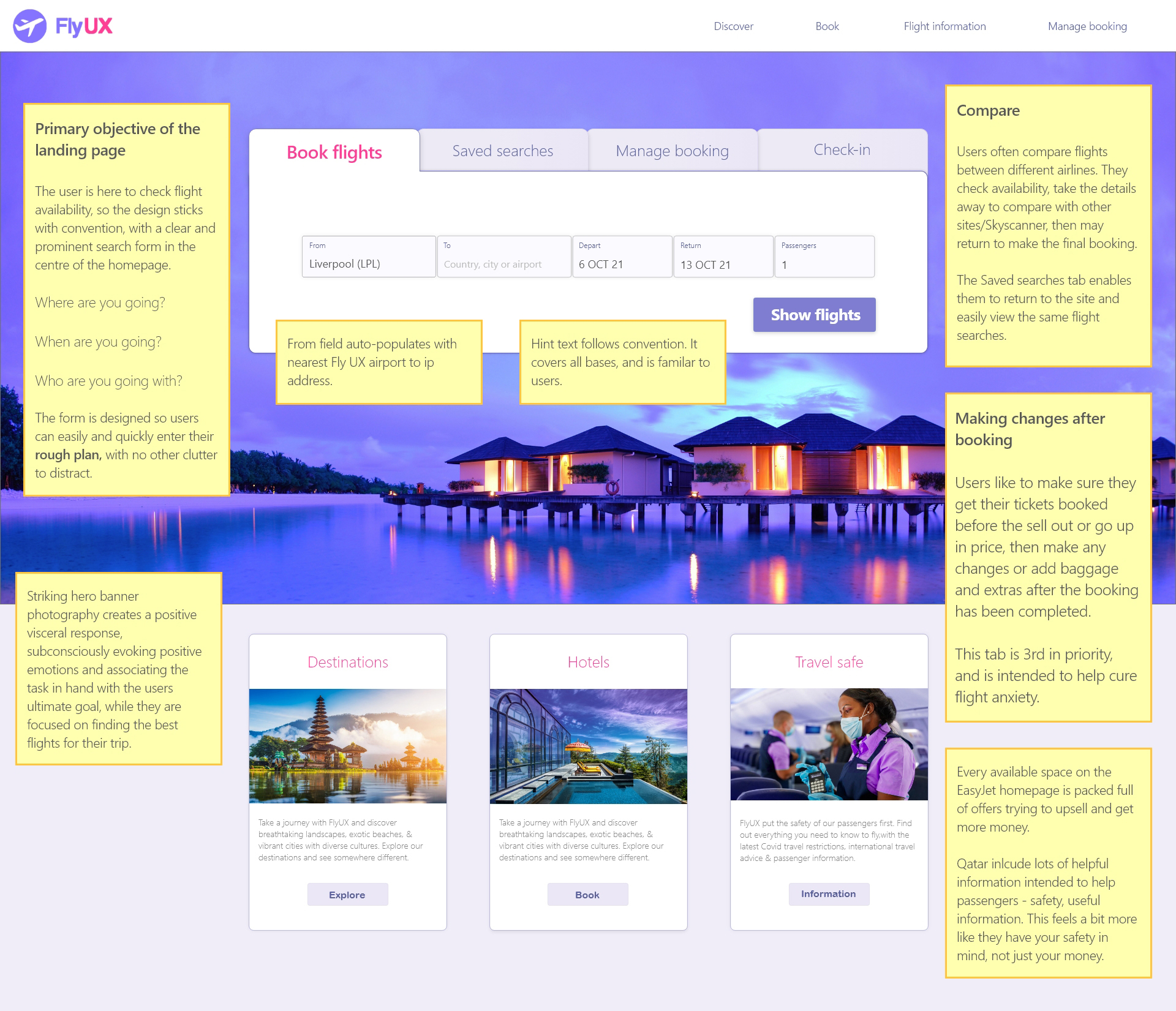
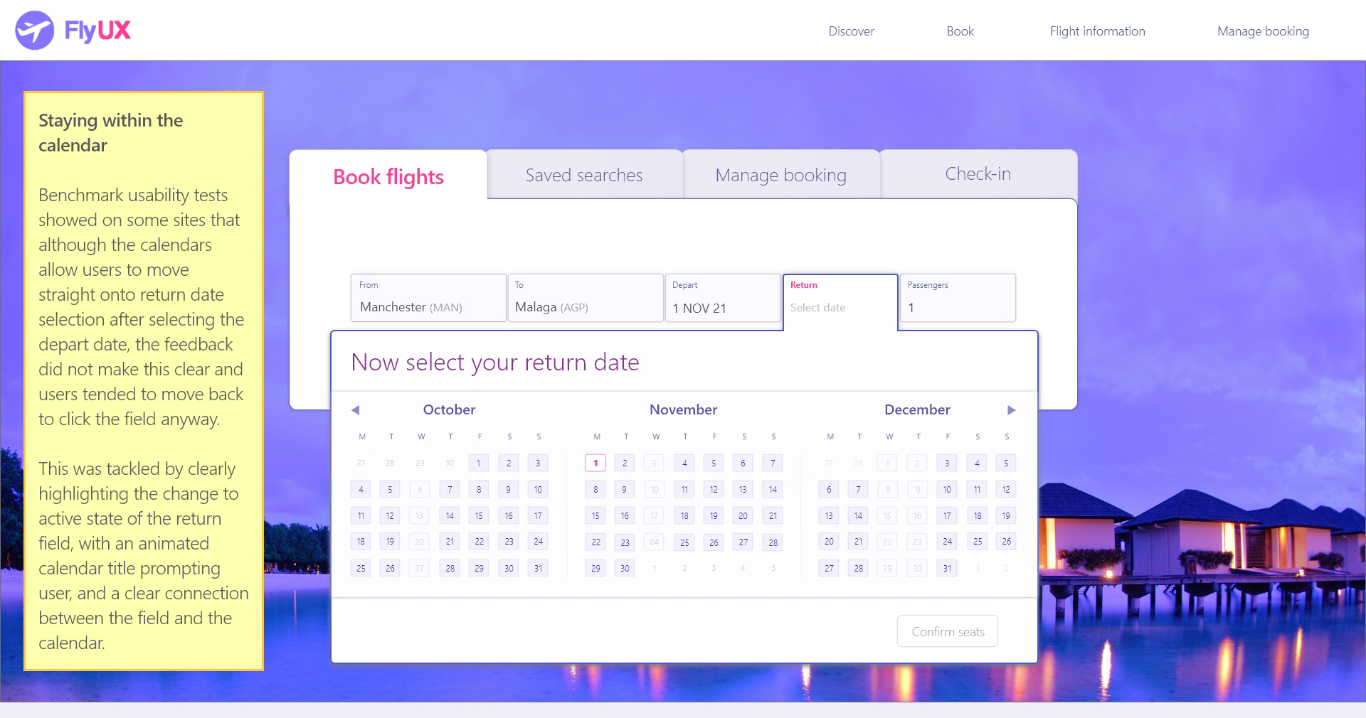
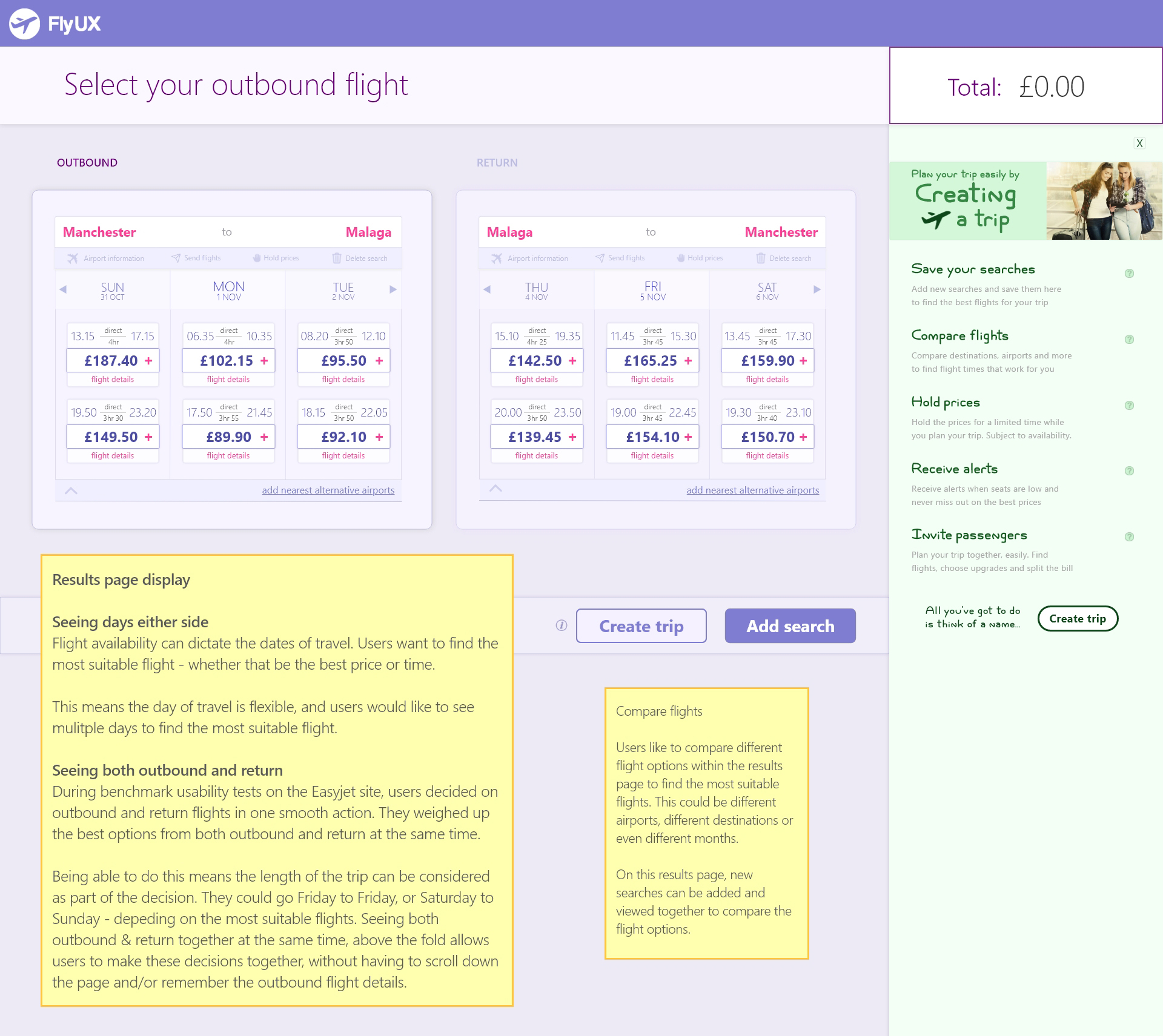


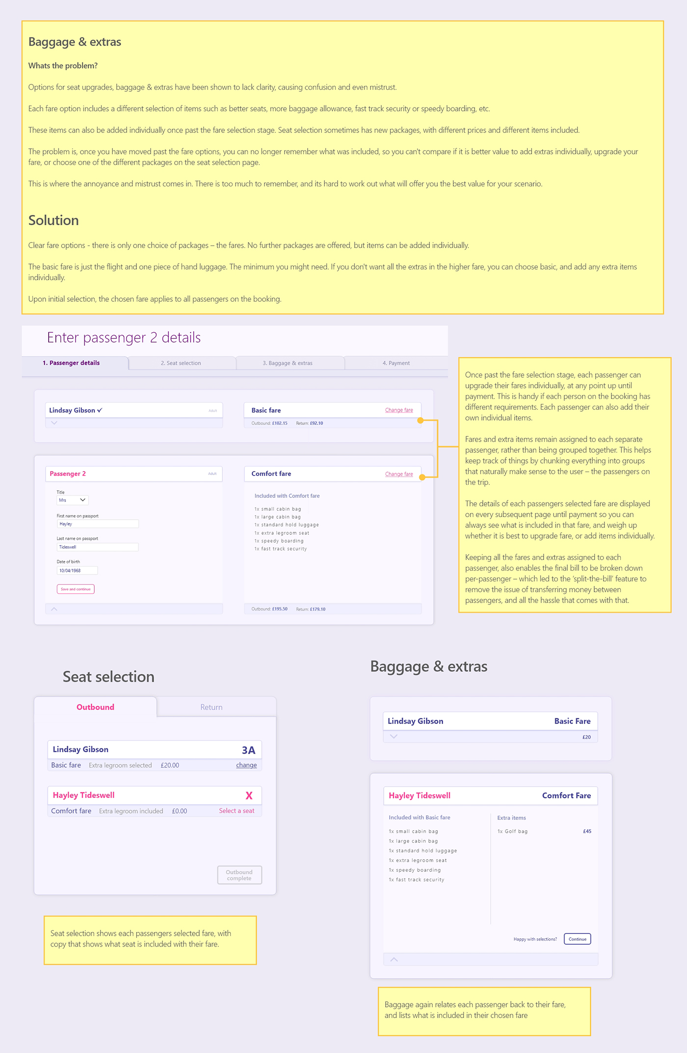
Usability tests
The tasks were devised so the participants could be observed comparing. The times and dates of the flights on the results page were planned out specifically, and the task includes finding the best prices/times. This way they were naturally comparing the flight results as they would do in a real situation. Doing this allowed the observation of how well flights could be compared on the page. Three usability tests highlighted several usability issues that could easily be resolved or fixed.
Outcomes for next iteration
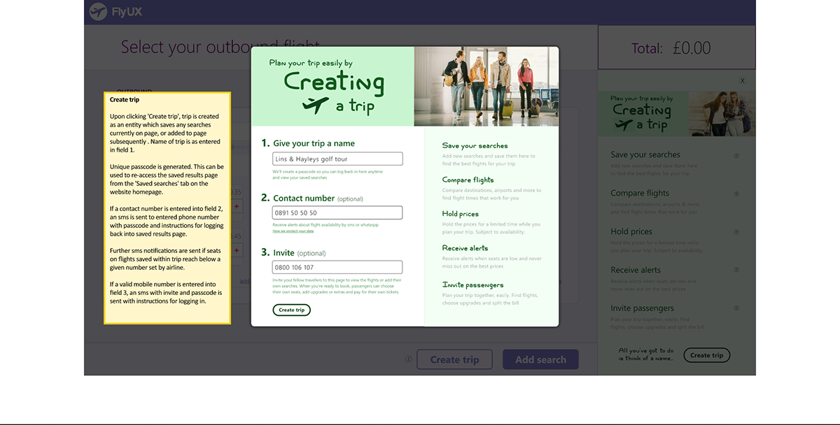
Create trip
Tori doesn’t fully get what Creating a Trip is. She thought it was just going to enable her to send the flights to her friends – which it does, but the main purpose is saving the searches.
She suggested that it should be called ‘share’, which is better than invite passengers. Next iteration would replace ‘Invite passenger’ with ‘Share the page’.
Also the copy on the pop-up should make it clearer that the main purpose of the feature is saving all the searches so users can return to the page and view them again. She did however, describe it as a ‘trip planner’, which is not far off.
Deleting flight searches
All three participants in user tests struggled to work out how to delete the flight searches. Needs a ‘X’ in the corner. Both Gary & Tori were looking for an ‘X’. Rachel said she didn’t click ‘delete flights’ because it was greyed out. Fundamental change in that menu bar?
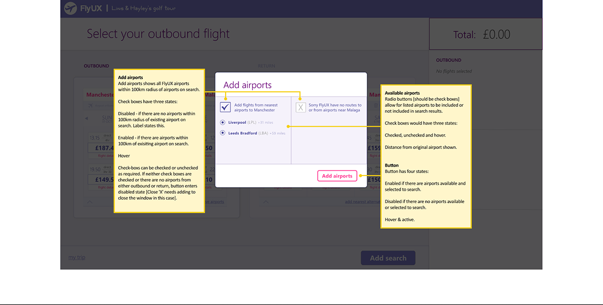
Add nearest airports
Users took a while to find the ‘add nearest available airports’ link at the bottom of each search. All participants first thought was to click ‘add searches’ button in footer. The link needs to remain in the footer of the search, however because it needs to be related to the airports on the search. So maybe change the colour to pink accent colour. Also needs a prompt about the return airport being different to the outbound.
Choose fare
Text at bottom of pop-up needs moving above fare options so user can clearly see that upgrading fare can be done after this stage, per passenger.
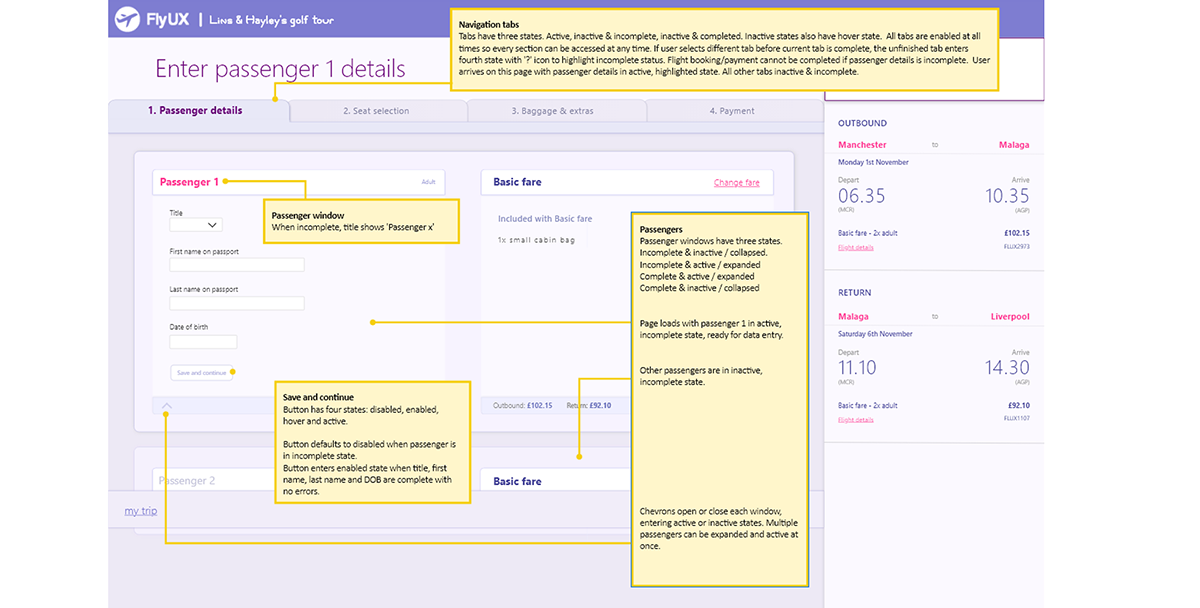
Passenger details
‘Outbound complete’ button needs moving upwards so it appears directly underneath the last passenger, instead of at the bottom of the window.
Split the bill
Button needs copy next to it explaining that the total price can be broken down per passenger and paid separately.
What now
The main goal now is to find some work, but if time becomes available, further iteration and testing will be carried out to implement the above changes and uncover more improvements.
Wireframes
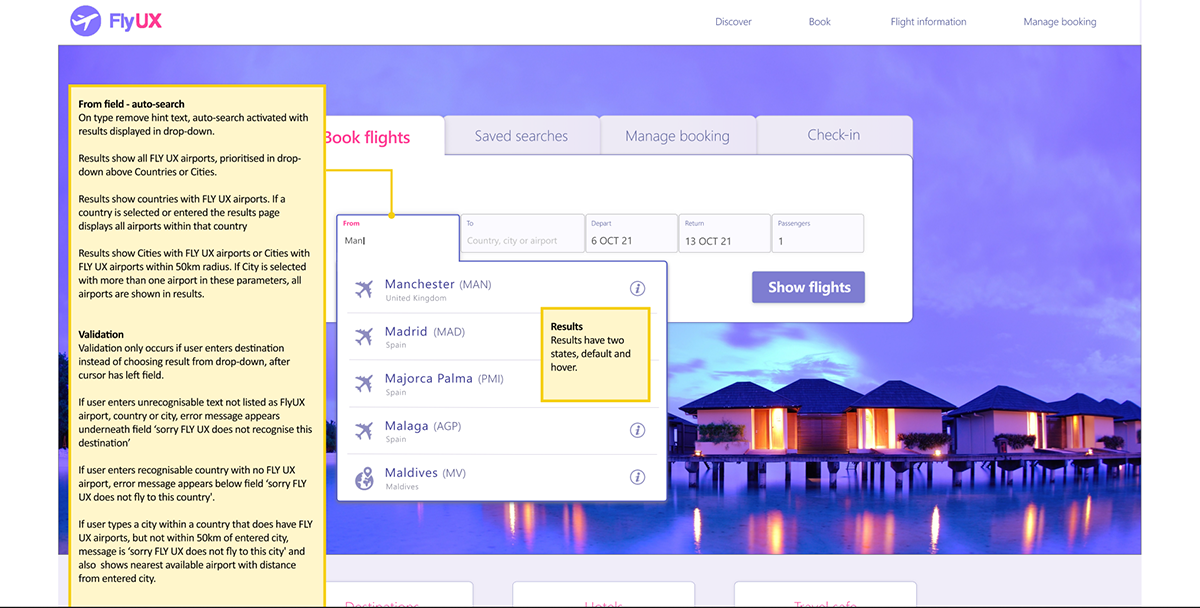
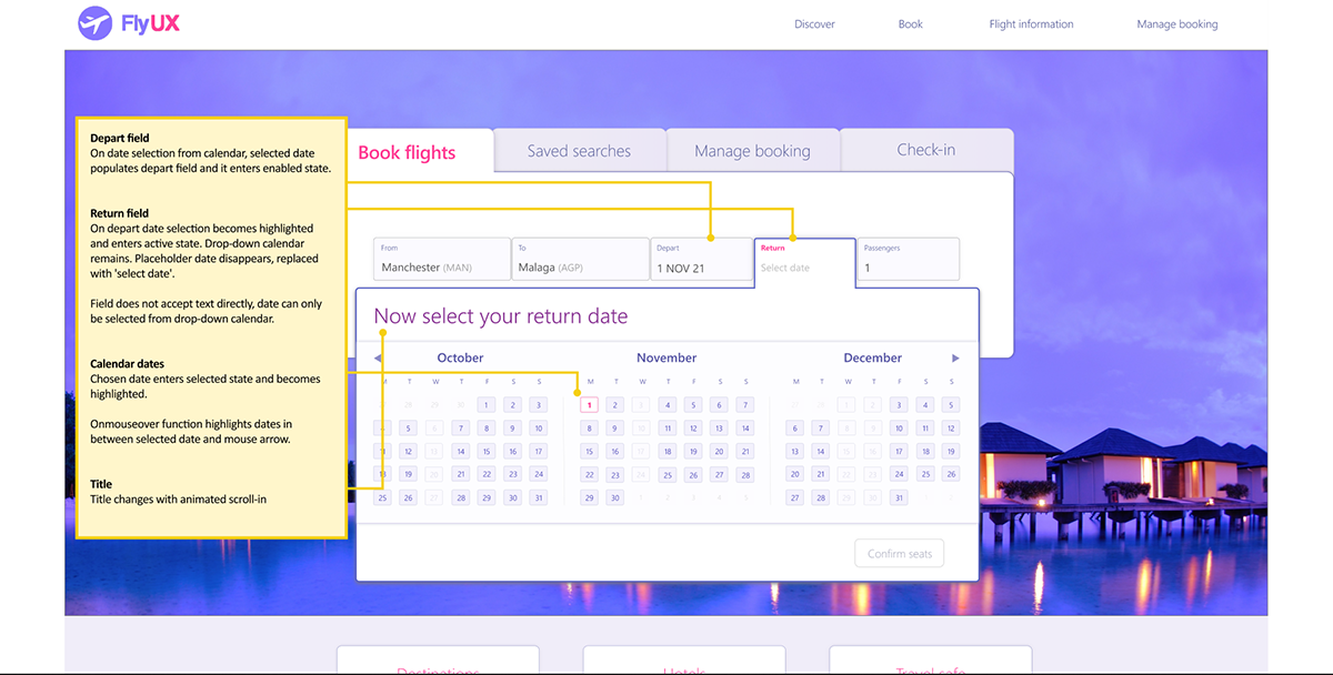
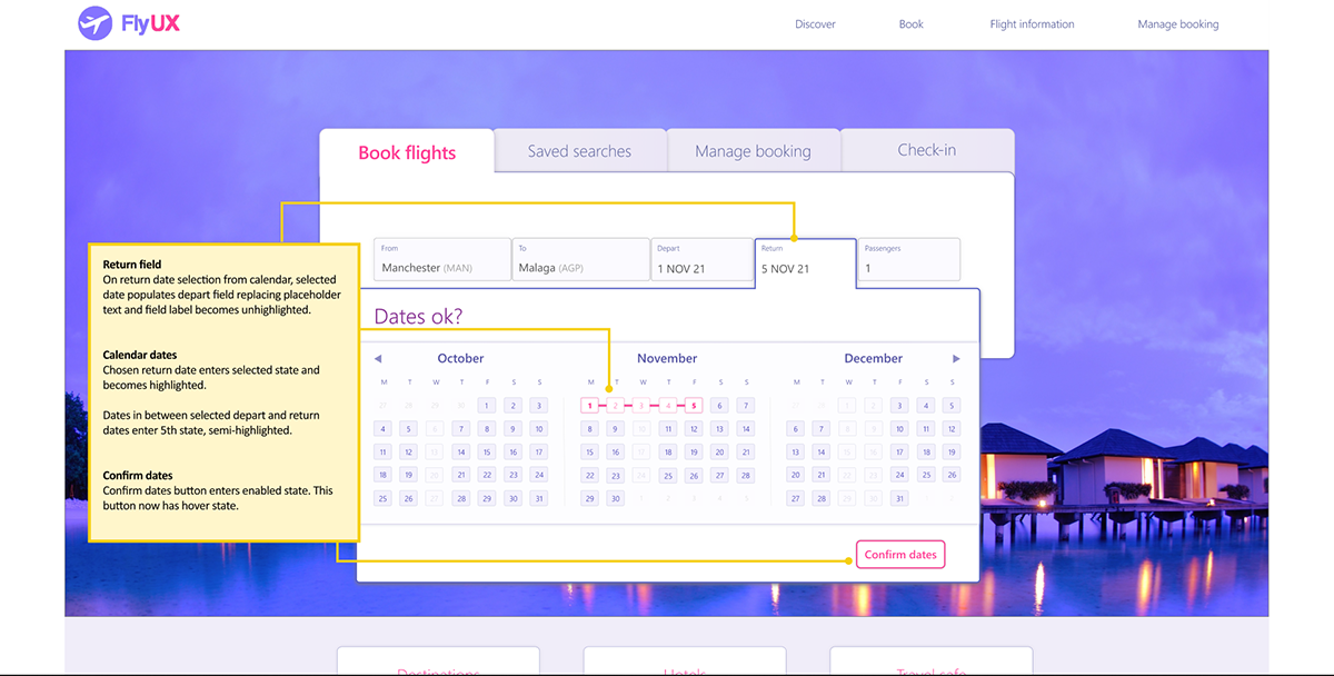
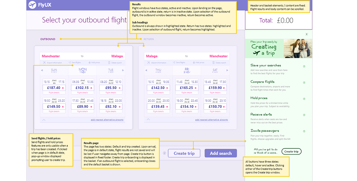
With the prototype complete the final task was to define the rules and feedback for every interaction. Annotated screenshots described in detail all the information required to develop the site.
There is a selection of screenshots below, or the full annotated prototype is here:




As the FLY UX project was completed, an opportunity arose to use the same design process on a real world project, designing an online platform with a login area, dashboard and ready-made content archive for a legal publishers.