Affinity diagram
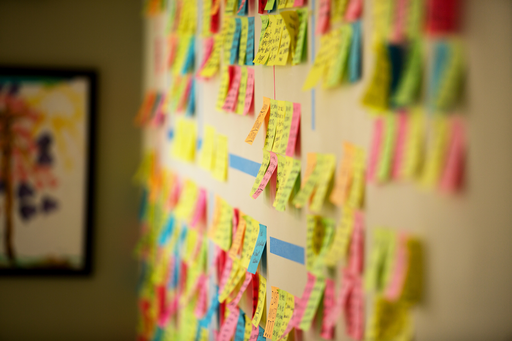
During the research, because the analysis techniques were new to me, I was unaware of what an affinity diagram was, or what they are for. Because of this, I was moving through the research process in the same way I had carried out research throughout my life. As I explained in the research overview, I was making notes and developing ideas as I carried out each research method.
As I was used to doing, I would note down useful insights and ideas on a4 paper, quickly ending up with unmanageable piles of scribbled paper all around. Essentially I was triangulating the research insights in my own way – making notes about issues that reoccured throughout the research, gathering my thoughts and keeping track of it all – a way of expanding my brain onto paper.
The problem is with my technique, its unmanageable. And with a project of this scale, with huge amounts of useful data, its hard to keep track of all the notes, and the piles of A4 sheets quickly grow into mountains of confusion.
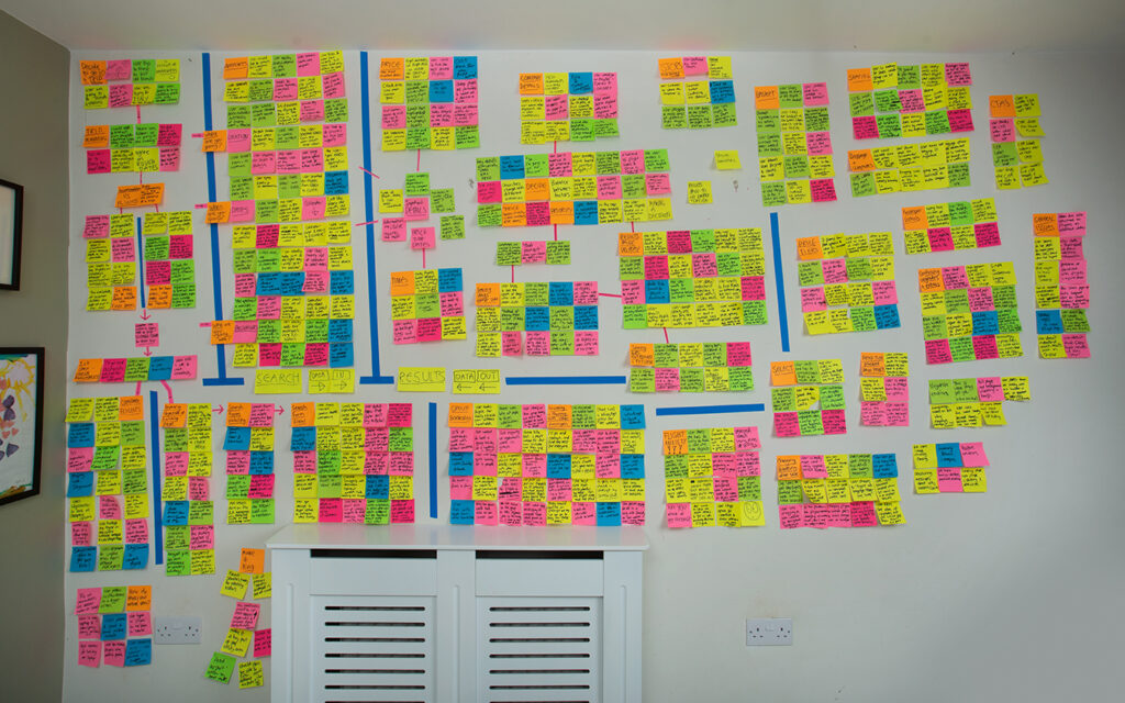
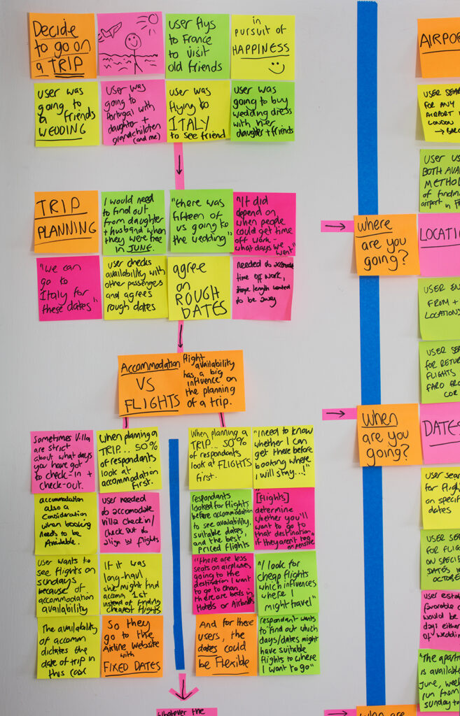
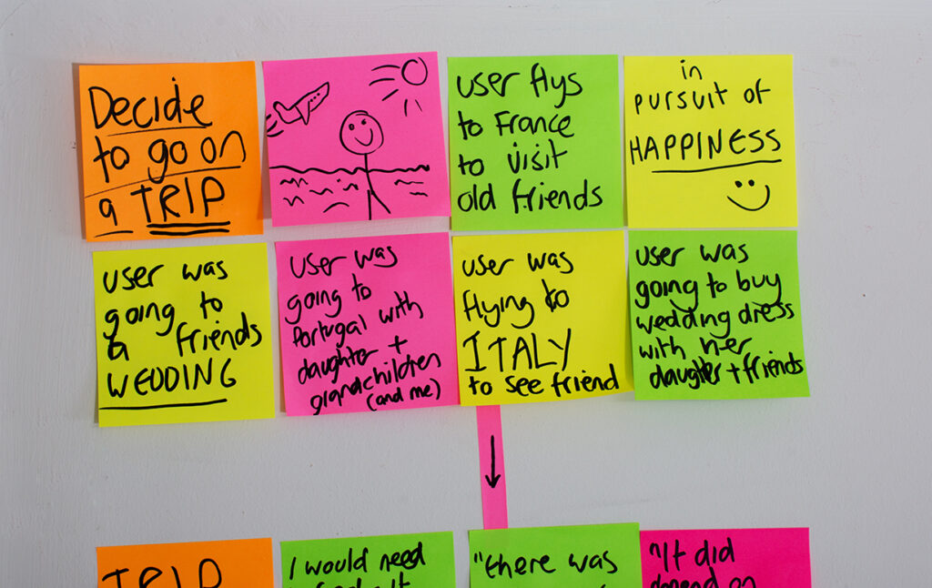
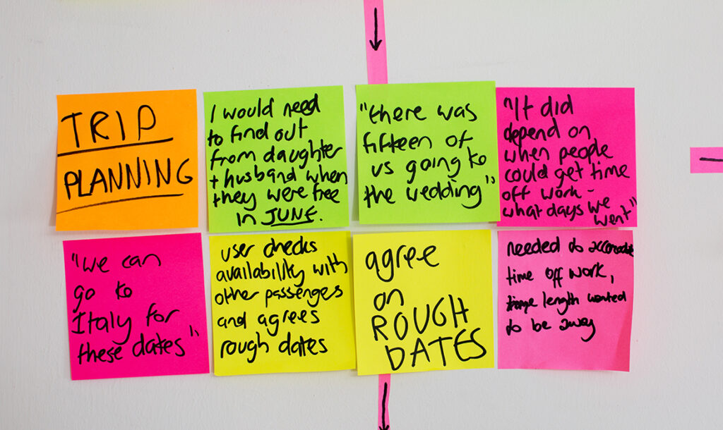
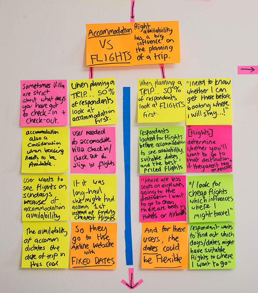
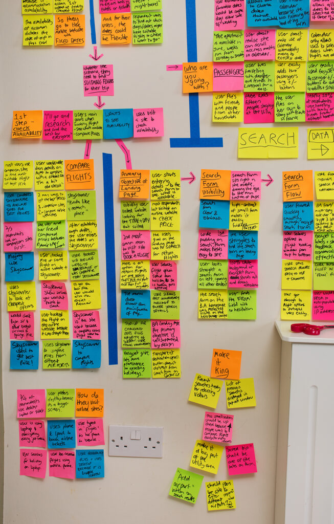
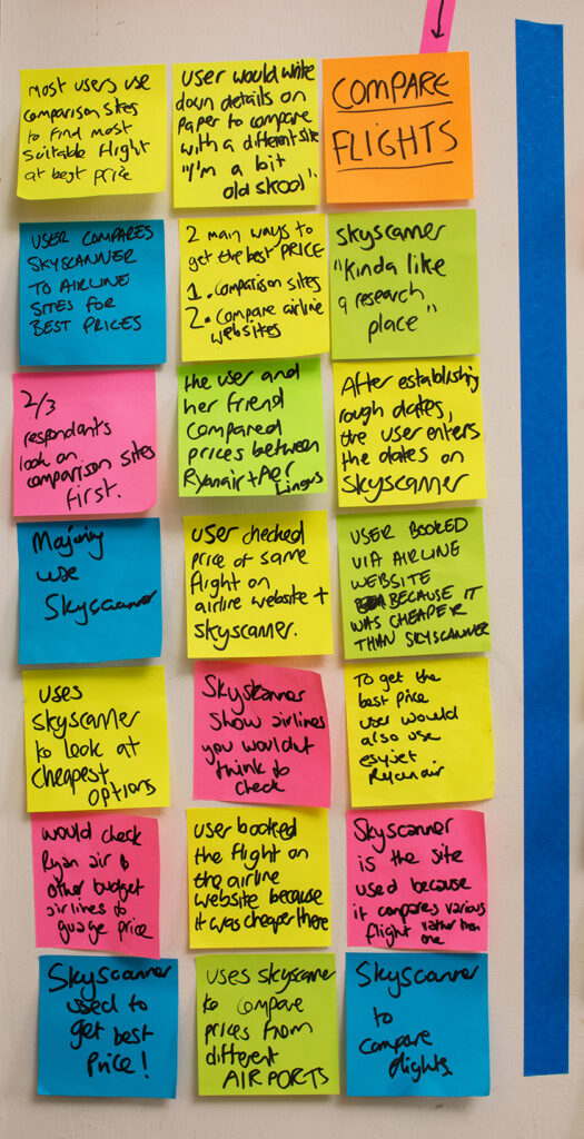
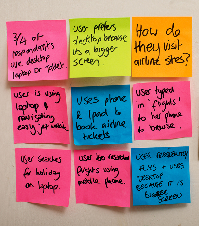
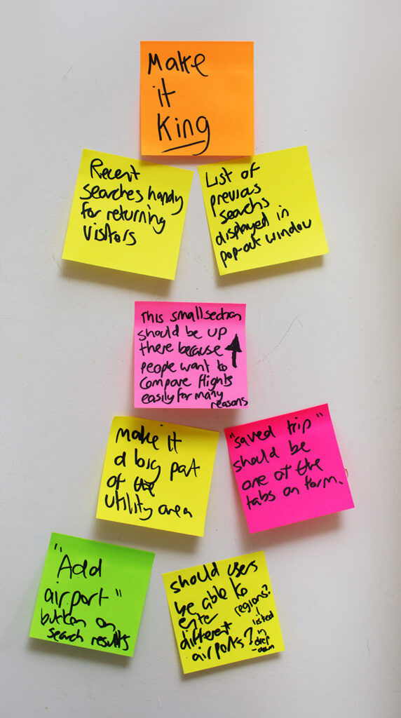
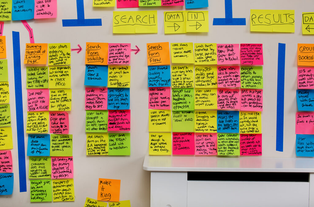
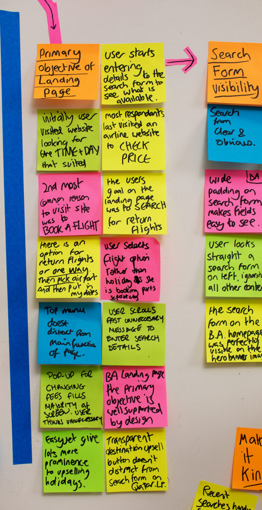
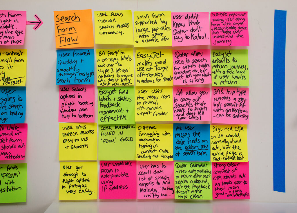
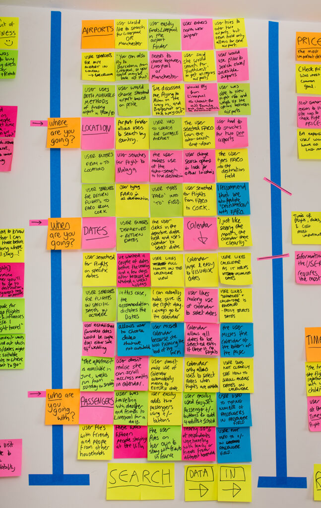
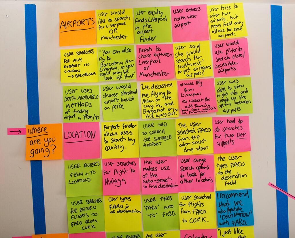
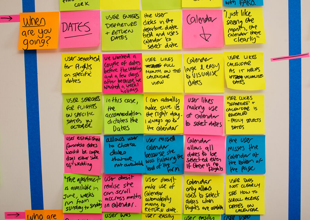
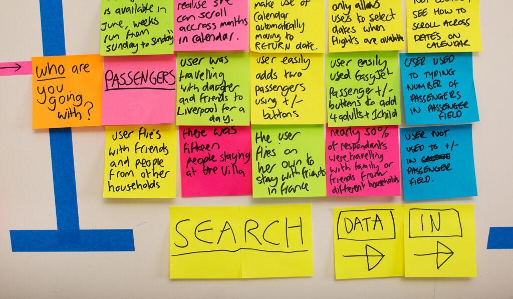
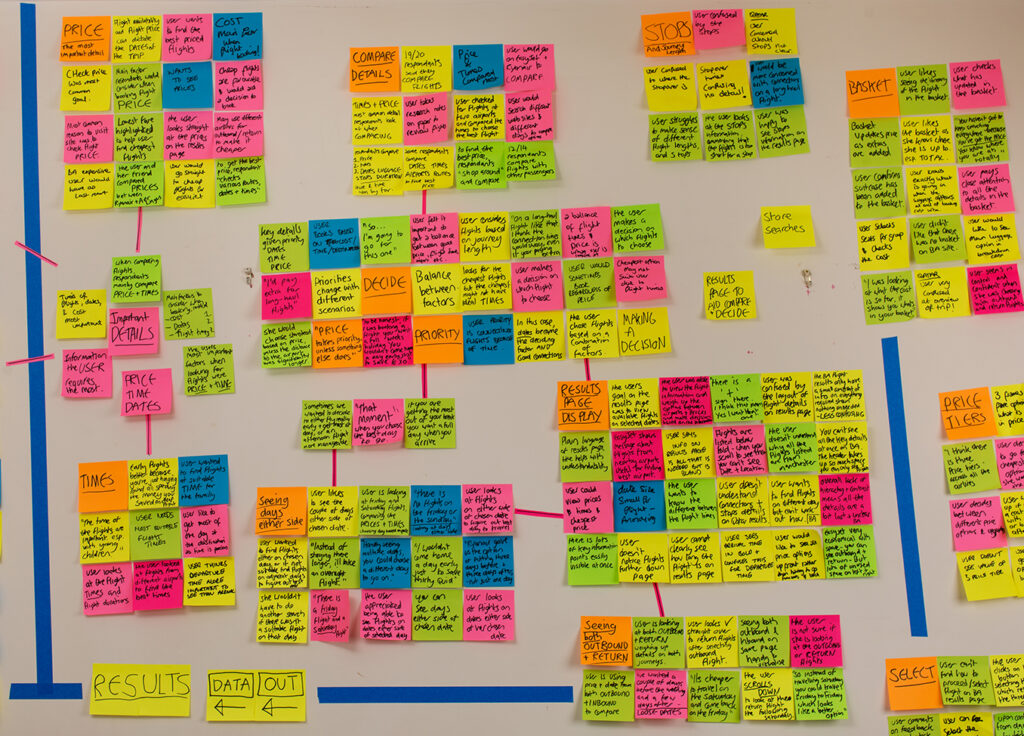
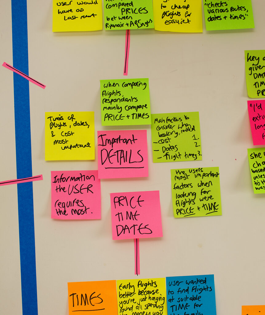
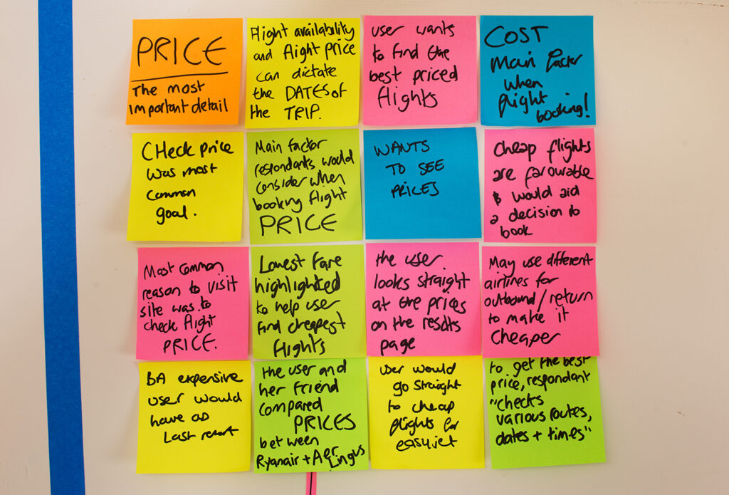
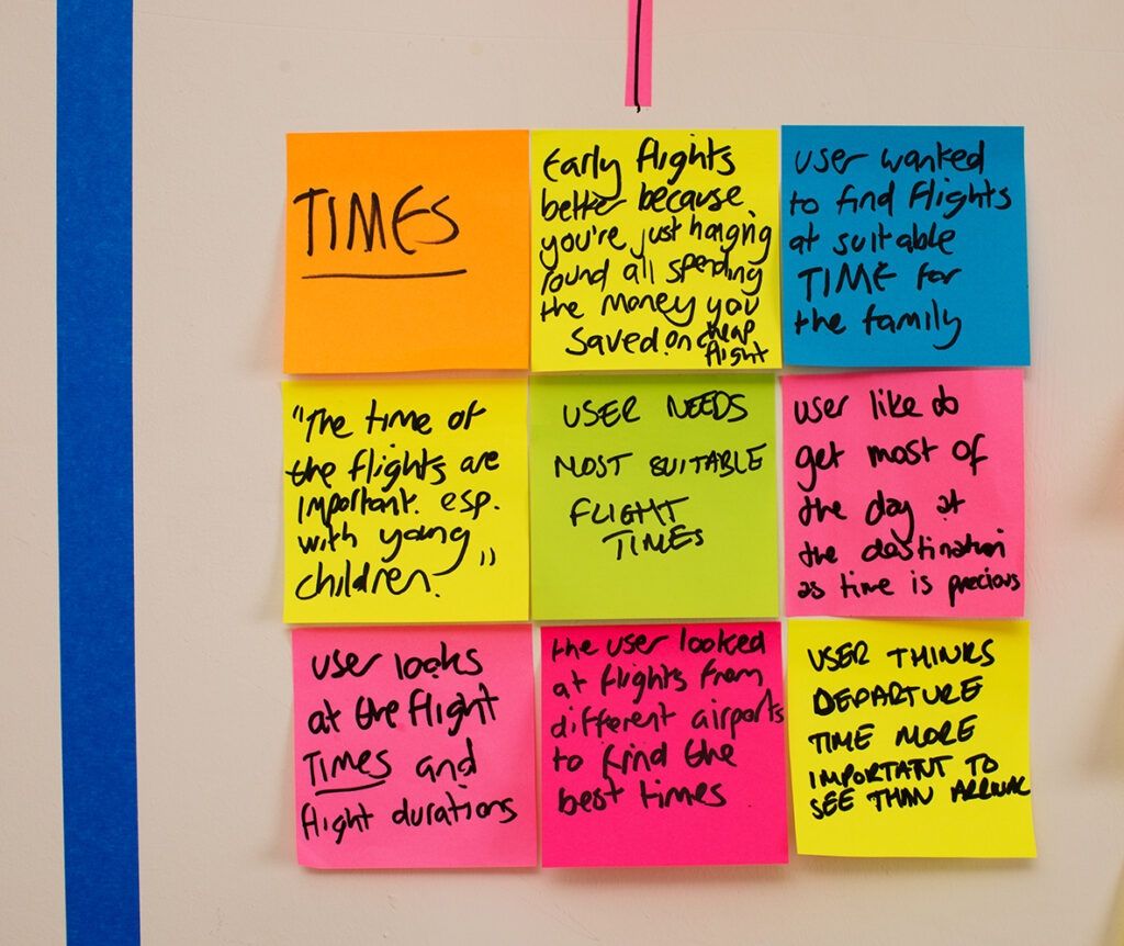
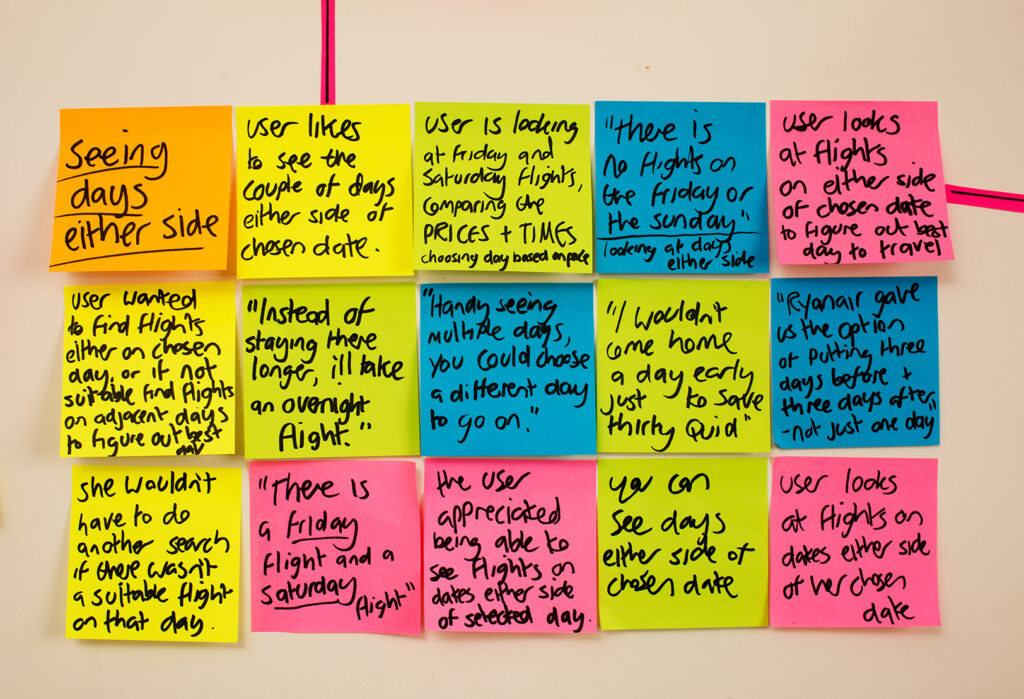
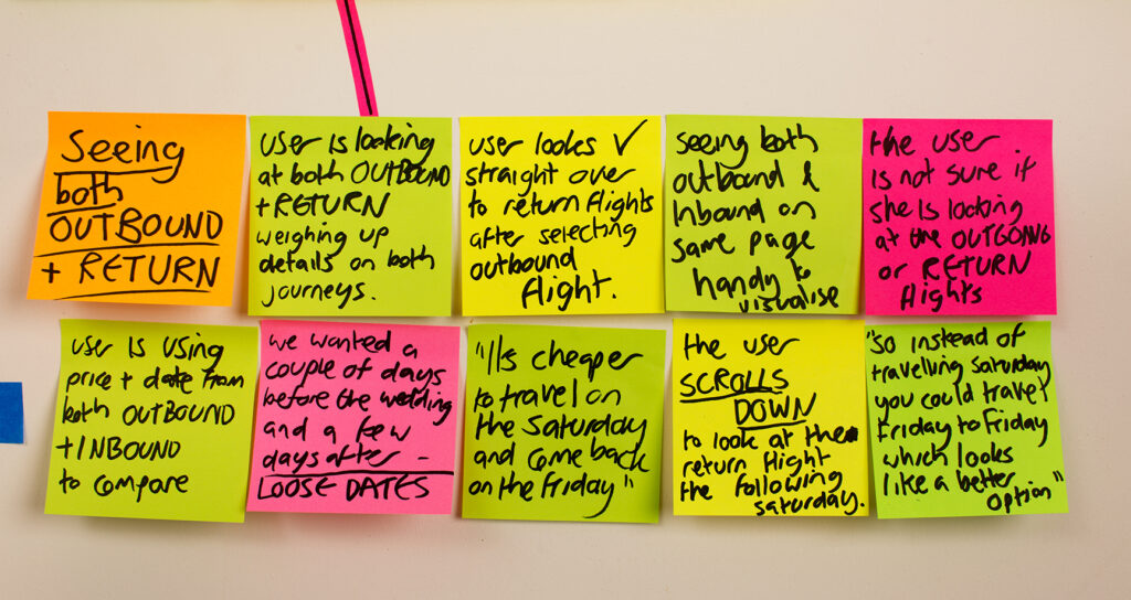
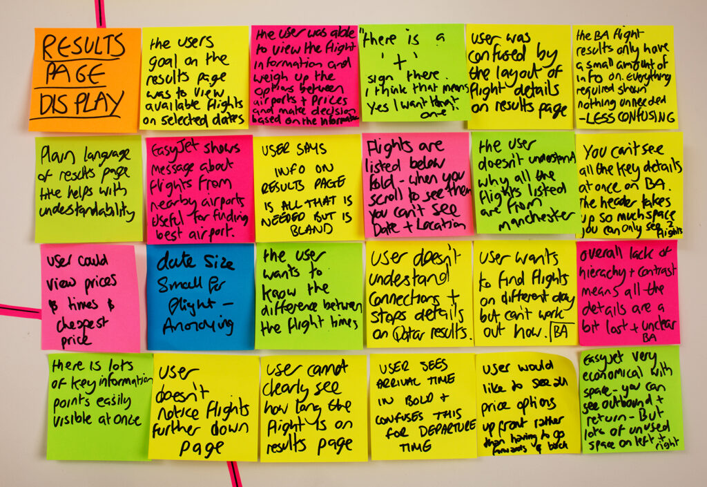
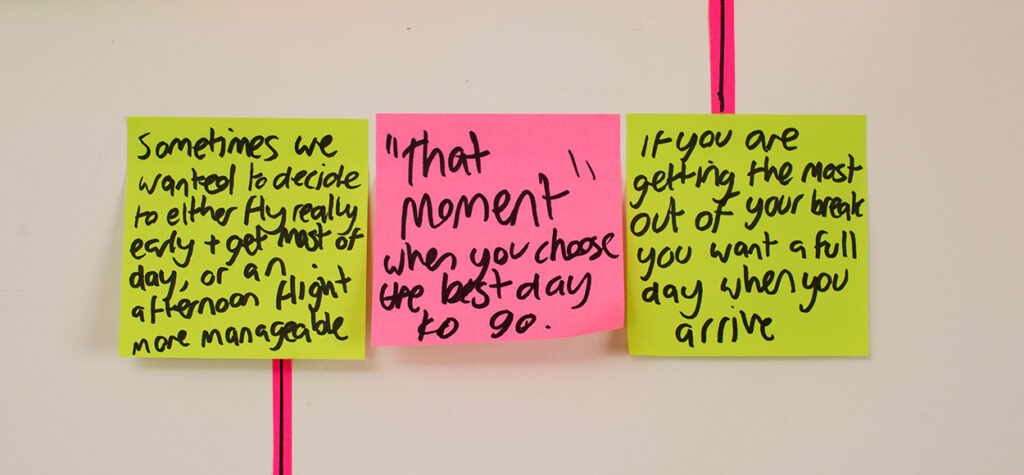
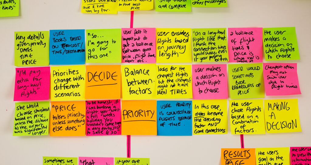
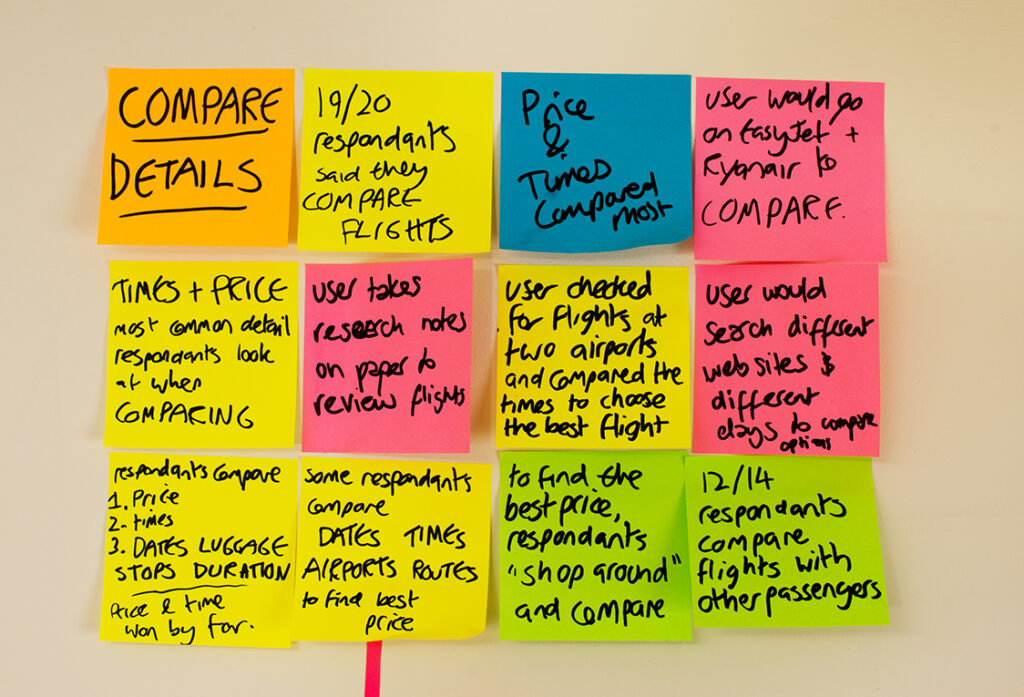
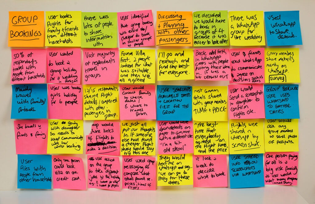
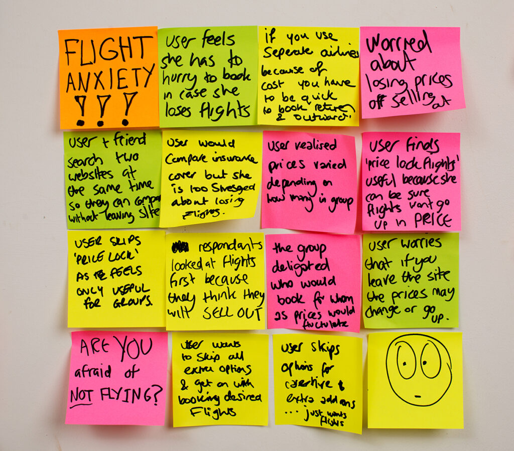
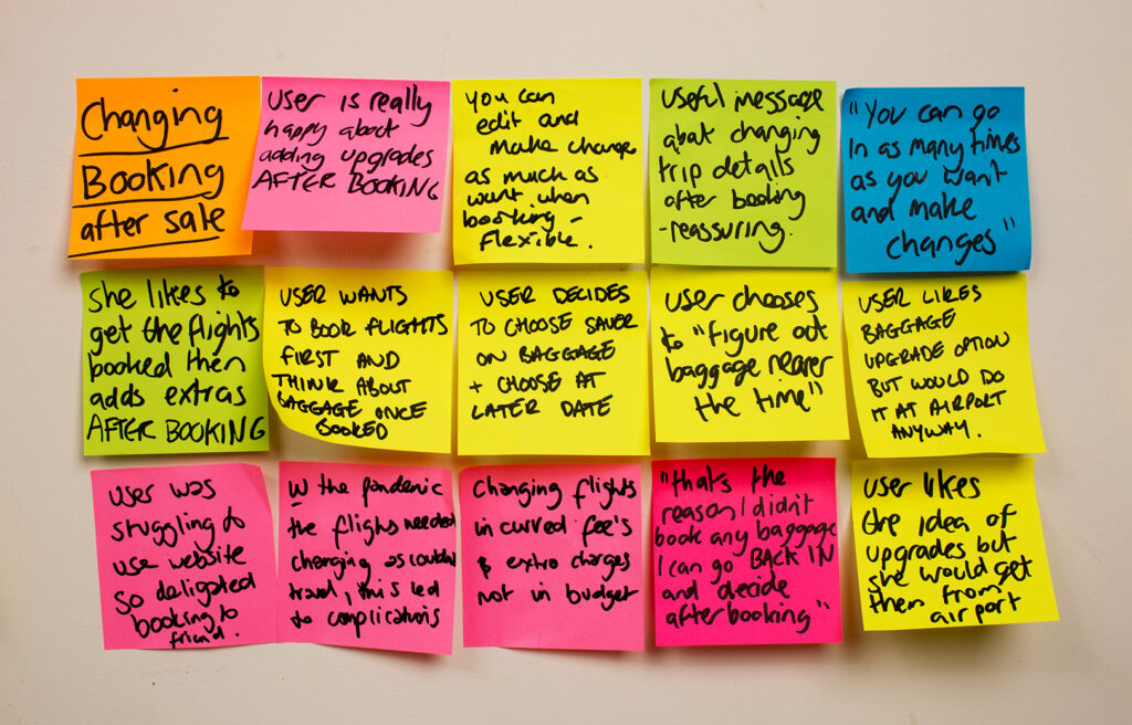
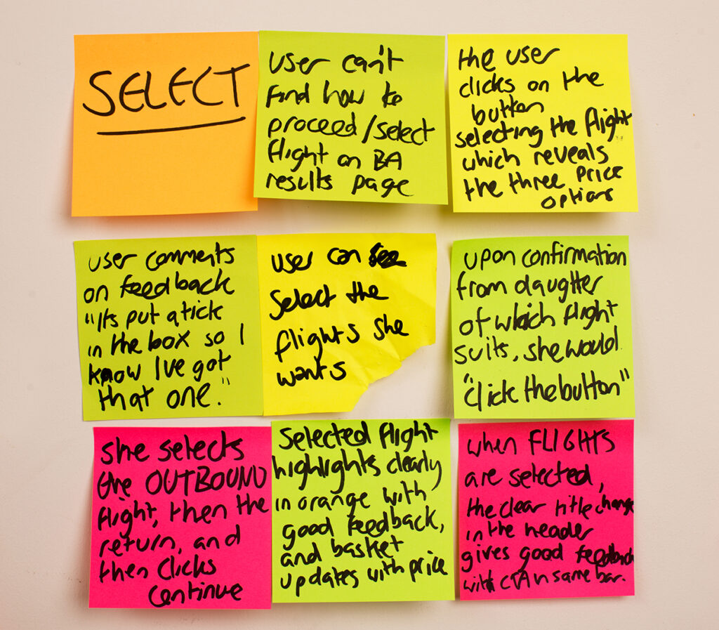
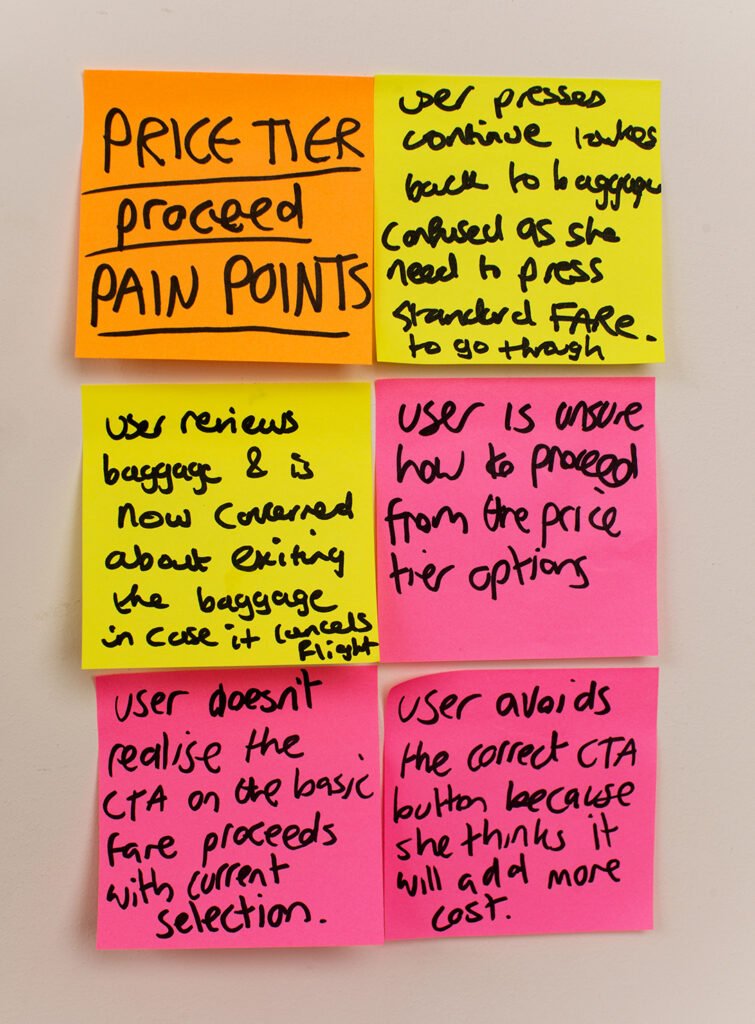
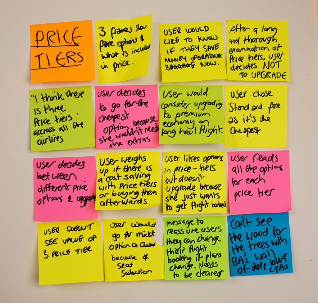
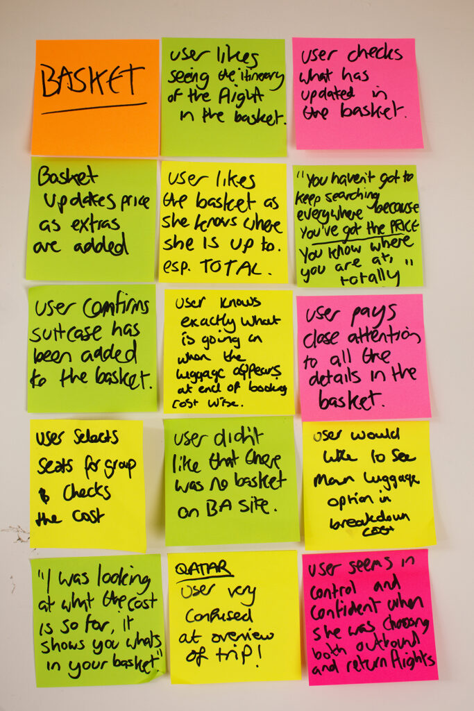
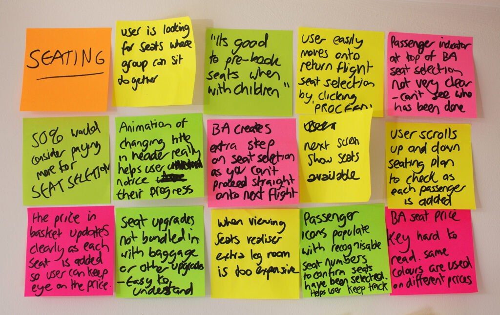
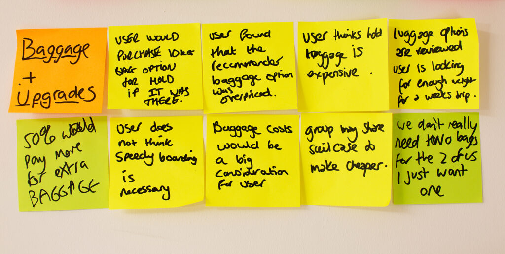
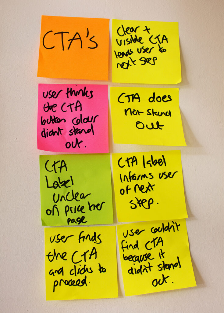
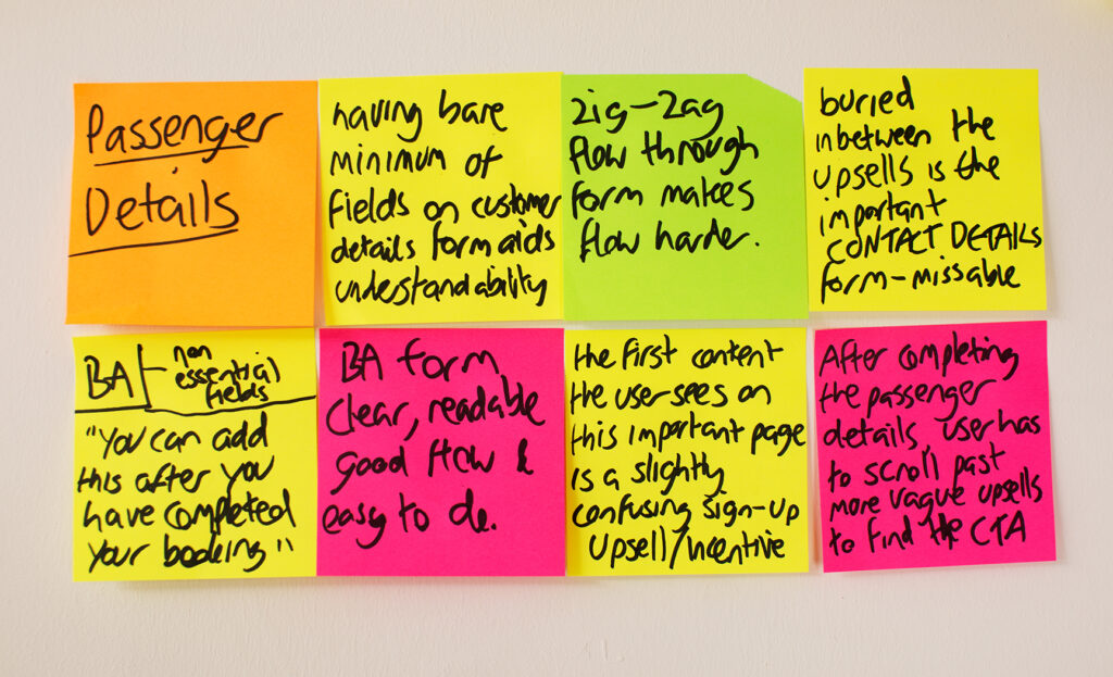
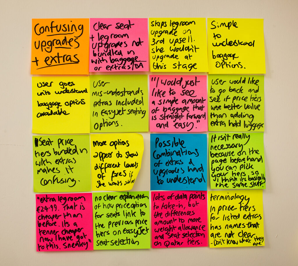
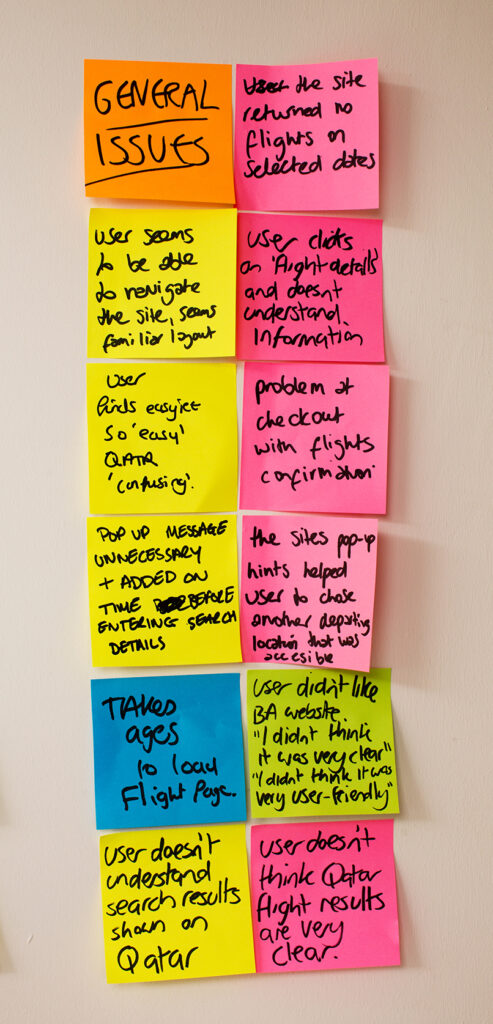
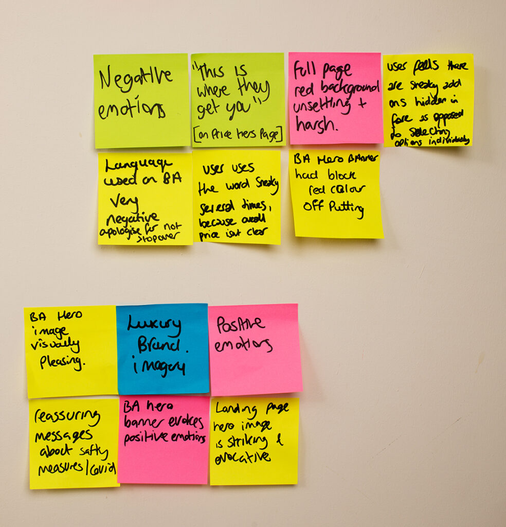
So for me, carrying out the affinity diagram project was literally life changing. Writing notes on post-its and sticking them straight on the wall essentially achieves the same thing I have been doing all my life with my unmanageable piles of paper – only its manageable. And you can move them around to develop ideas, entirely based on the research, identify patterns and organising my thoughts. I arranged the research insights into the same order as the trip planning/flight booking process, and built up a detailed understanding of the user journey.
Initially I recruited help from my partner who works as Head of Marketing at a legal firm, my friend who is a Senior Product owner at the AA, and her partner who is a Junior Product owner at a cyber security firm, so I was off to a good start. We only had one evening planned in however, and it quickly became apparent that Rome wasn’t built in a day. I spent the next two or three weeks reassuring Lindsay that it would be over soon and the post-its would be gone from the kitchen wall. For the remaining duration of the project she became Head of asking when will you be done with the post-its?
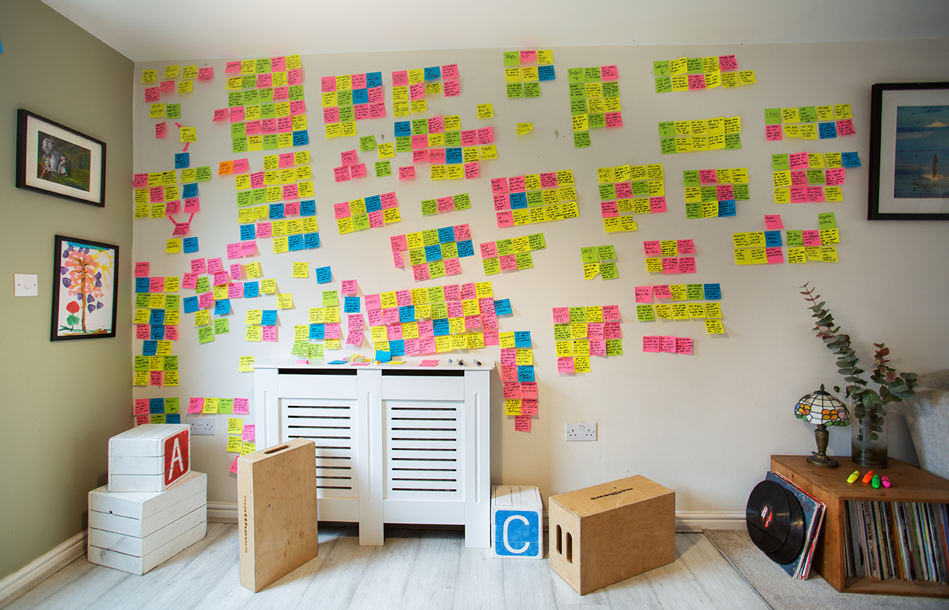
But the technique is great, and as a way of making sense of the huge amount of data from the research it certainly beats piles of A4 paper. The images below speak for themselves, and although this was the research analysis stage of the project before the actual design, it felt to me like it became the basis of the design itself. By the end of the project, I knew exactly what issues I was going to address, and exactly how I would address them.

The perfect T-shirt
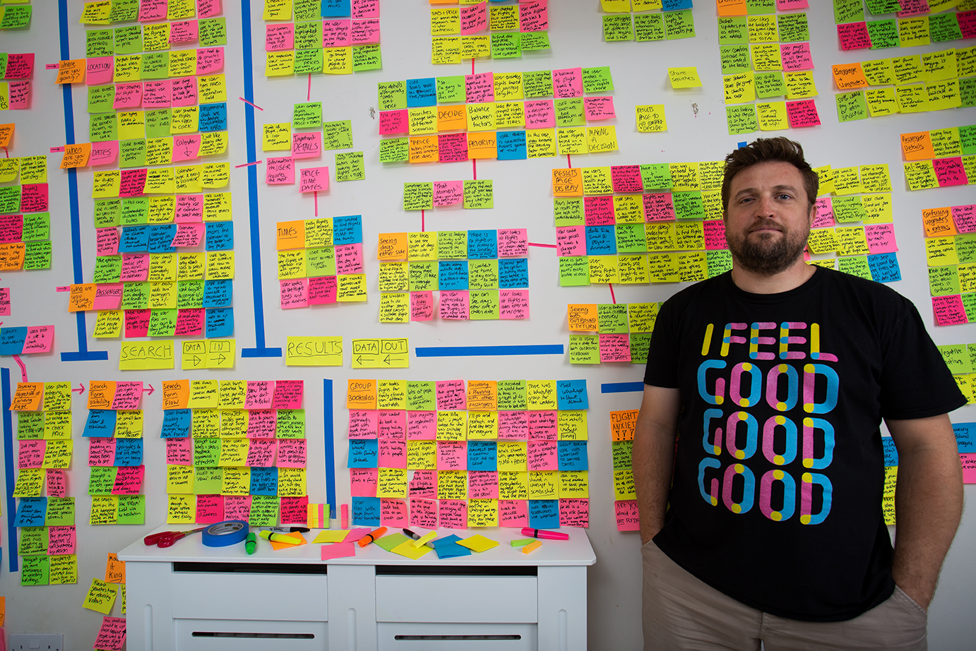
I bought this T-shirt one evening during lockdown after panic-buying more beers than would normally be the case. I’m a bit of a fan of electronic music, and Zed Bias’s 1999 garage track is an old favourite. It seemed like a good idea at the time, but I wasn’t sure at when it arrived, wondering if it looked like I’d been mugged by a pack of highlighter pens, and I couldn’t imagine a suitable time to wear it.
But while I was doing the affinity diagram it really came into its own. Not only do I feel at one with the post-its, but its a constant reminder of how we would like the user to feel when using the software. In fact, I can’t think of a more appropriate T-shirt to wear in this situation.